Zaryin
-
Posts
2,728 -
Joined
-
Last visited
-
Days Won
4
Content Type
Profiles
Forums
Events
Everything posted by Zaryin
-
It's looking pretty good so far. Except for a few collision defects (that I'm sure you know about), it's great.
-
Thanks for the comments Steve. I should be posting another pose in a few days or so.
-
I agree. I think the fingers could be little longer. Other than that, this is a nice start.
-
I've been paying attention to some of the images you have posted for WIPs, and I can't wait to see this short.
-
Your normals are probably backwards for those 5-point patches. To see the normals hit Shift+1. You will see yellow arrows coming from each patch. All of these arrows should face outwards. If they don't on your 5-point patches select the cps that make up the patch, right-click and select "Flip Normal" from the list of options. This should put your hair back to normal. Make sure to refresh your screen (Spacebar).
-
I also like the two eyed version better.
-
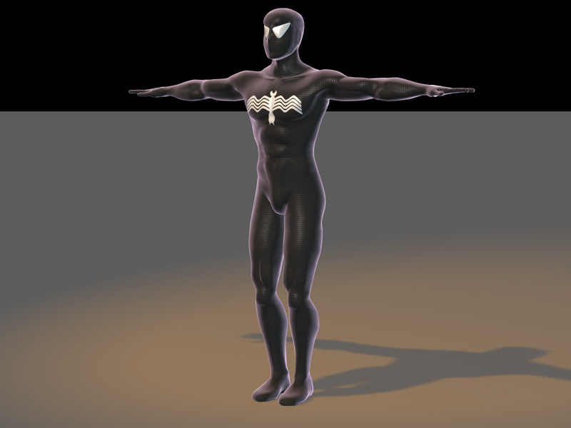
Thanks for the comments. I decided to keep the eyes on the black costume the way they are, but on the traditional costume I have rounded them out more. Also the webbing I am having trouble with is the webbing on the traditional costume, but I might try that for the real webbing. Thanks again.
-
Yes, but since the costume is sentient. It matches partly the personality of the wearer. So I figure the logo can change size as well. I might still change the logo to make it larger. now that ther are two others who think it should be larger I probably will.
-
Thanks ChrisThom. I decided to make the logo smaller than the original because when I remake Venom then I'll make the logo larger. Since everything about Venom is an exaggeration, I will make the logo that size on him. Thanks again
-
I wish you rendered it larger so we could see more details, but what I see I like . Let's see a pic of that church.
-
It's really coming along. I think the stomach muscles look more like ribs to me. I think they need to be shortened to look more "square" instead of "rectangular". It's looking really good other wise.
-
I love the new smoothness of the "nose" area. Please, I'm only being picky here :), but I would smooth the cheek area more. Round it out more to give him a chubby cheek look.
-
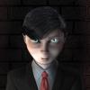
Your character is looking great. I think the area between the mouth and eyes, where the nose would be, needs to be smoother. I'd grab that middle spline and pull it forward to get it smoother. Jeff B.
-
Thanks alot guys. I've decided to stick with the black costume for a little while and build a scene around Spider-man in it. Here he is in a hanging pose. I'm still working on making the web look more silky. Thanks again for the comments. Keep 'em coming. Jeff B.

-
Are you going to be adding a sky dome? What resolution did you render this in. And how long did it take to render with the volumetrics? I haven't used volumetrics since v8.5 Jeff B.
-
Thanks for the comments AMAR. I'm not really going for either look. Just a realistically proportion superhero . I guess I'm going for my own look. Jeff B.
-
I like the color tone of the piece. I think the clouds seem a little too uniform though. Nice.
-
I think you need to add another appendage to the wing where it bends. I also think the wings bottom should connect to the side of the body. This is a good start. Keep posting to let us know how it going.
-
I think you could use a little more form to the calves. Other than that, it's looking pretty good so far. Can't wait to see him posed. Jeff B.
-
Thanks alot, Jim. It means alot from a modeller like you. I decided to go for more of the movie look, rather than the comic. That's why I wanted more realistic proportions. I'm having more trouble with doing the webbing on this one than I did the original, ugh! I don't really know why. So, instead of getting too frustrated I thought I'd put him in the black costume for now -- since it's easier . Comments appreciated. Jeff B.
-
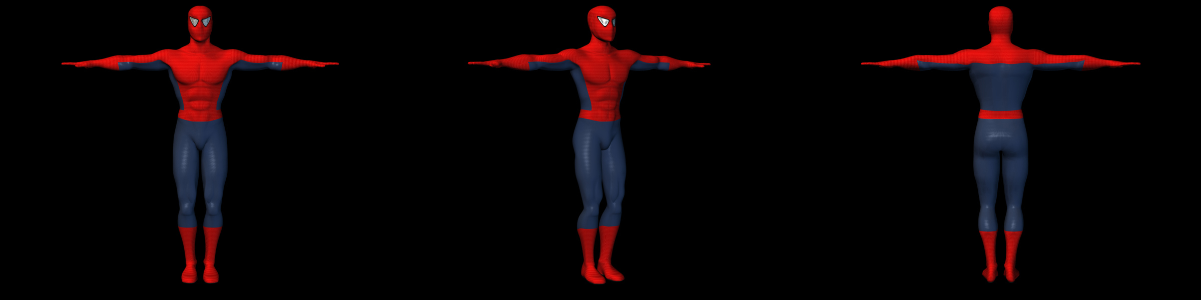
Well, since I posted my Spider-man pic for the Image contest awhile back: Old Spider-Man Pic I got comments that my proportions were all off. Well, they were right on the money there. I never realized that I suck when it comes to making well proportioned humaniods. I decided to break out my old Poser program and make some rotos of a human male (front, side and back). If anyone would want these, I could zip them up and post them here. I brought them into A:M, and modeled according to the size and shape of the rotos. So now if my proportions are off we can blame Poser . Down at the bottom is the attached picture of my new Spider-man WIP from the front 3-4th and back view. I'm still working on the back. The slight color variation in the red, and the specularity in the blue are cylindrical projection map on those groups. The thing that is going to totally suck about redoing my Spider-man is that I will have to re-decal it with the black webbing. Which means I will have to totally redo the decals -- UGH! Comments are appreciated Jeff B.
-
Nice little Budgie there. Congratulations on finishing your first character.
-
Here is about the simplest thing I can tell you about creating a decal for you model. 1: Create you bump map first. 2: Use "Multiply" with 50% gray layers. 3: The most important tools you could use are Dodge and Burn Tools to lighten or darken areas. 4: Use the layers from you bump map to start the color map with. That way your color map will match the bump.
-
It loks like it's bending fairly nicely. Can't wait to get v11.
-
It's looking really good so far, Jim. I'm Windows 98 Second Edition and it's working fine. (edited for bad grammer :))