-
Posts
3,775 -
Joined
-
Last visited
-
Days Won
1
Content Type
Profiles
Forums
Events
Everything posted by Gerry
-
Hey Mike, this is all looking great and it's nice to see you posting here again! I look forward to seeing more.
-
Thanks for your comments! Yeah, this is still rough and not all final bits are in. There will be footprints in the snow for sure. As for the runners, well, then I have to think about the snail's slime trail too I guess! A coworker asked what happens to the snail if they encounter road salt...so I gots to figure out just how far I want to take this. But runner trails in the snow is a definite possibility. I am totally jazzed that I figured out how to put footprints in the snow and feeling very inspired to tweak as far as my timetable allows.
-
Here's the first half, still rough, but I wanted to see how the shots flow. Comp01_02_H264.mov
-
Yeah, I don't seem to have the Repeat option in my settings. Not sure why. Everything else is identical to what you show. However I've figured out a way to put footprints in the snow with foot-shaped boolean cutters! Here's a quick test... footprinttest_02.mov
-
Wow, thanks Nancy! I'll look into that. I'm still tweaking the walk. Here's another render of the front view that I like pretty well, but it seems too smooth and rolling. Also, the bottom hem of the coat seems a little floaty. I'm also on the fence about putting footprints in the snow. While I'd like to, I'm not sure my schedule will allow it. EDIT- I just tried that and it seems Cycle Length and Chor Range are locked and change together. You seem to be working in a newer version based on the interface shot. I'm using 13.0q. Could that make a difference, or is there some other setting I should be looking at? Shot09_H264.mov
-
I worked quite a bit on the walk cycle as it wasn't working in the side view. there was a lot of slipping that wasn't apparent from the front. so here's a closeup side view of the walk. I wanted to get more specularity on the back of the boots from the interior light, and it was there at first but for some reason it's gone. But in most respects I'm happy with this. Shot08_H264.mov
-
That's some great news! The world needs to know about AM!
-
Yeah, here's more what I had in mind. Still a draft, but I think this is gonna work just fine... Santa_walk_closeup_v2.mov
-
Here's a first draft of the shot with the walk cycle. I would like to slow it down (I'm after a true, dramatic slo-mo effect) but I'm not sure how to do this. Should I just stretch out the action over more keyframes, or is there a way to keep the action at a normal speed and slow it down in the chor? I know I could do it in post but if there's a way to do it in the chor I would like to know. Santa_walk_closeup.mov
-
Hey, the Santa model is in fact rigged very nicely and I don't want anyone to think I don't appreciate a free, rigged model like this. I'm working on the walk cycle now and the model is working great, but I expect to be refining the knuckles a little. I don't want to sound ungrateful!
-
Here's a very quick and dirty animatic of the whole piece, just to get a sense of timing and overall length. Actual character animation will be minimal, though I'll be doing a walk cycle. the Santa Lion model isn't rigged very thoroughly and I've been watching some rigging tutes (for the squetch rig, though I won't be using it. Just need a refresher on rigging in general), checking in on the rigging forum, and agonizing over how much I will need to add. It won't be much, just one facial reaction shot that I may do with a pose slider, and I'd like the fingers to bend a little better than what they're currently set up for. I want the animation to suggest a dramatic movie trailer to create some contrast with the action itself, which is all about going sloooow. I've got some crossfades here that will actually be pans/zooms, but as I said this is q 'n' d to the max. animatic_h264.mov
-
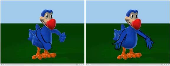
here's two quick suggestions for an ending pose. The one with the fist down needs something more with the other hand I think. Anyway, just a couple of ideas that I hope will help you think this through. Gerry
-
The asymmetrical arm movements muddy the emphasis on his words. Maybe both arms outstretched, palms up on "wonderful". I'll try to post a sketch of what I mean. EDIT: or maybe if you want to keep the fist in, more of an emphatic downward "by golly!" move with it. This is a nice little piece and a good start!
-
Ben, are the walls and ceiling a material or did you paint in photoshop? Also, for textures in case you don't already have it, try http://www.mayang.com/textures/ Hope you get that radiosity working. Gerry
-
This is all looking great! I haven't checked in on this thread in a month or so and the progress is really impressive. It's great to see a solid idea carried through with such style and thoroughness.
-
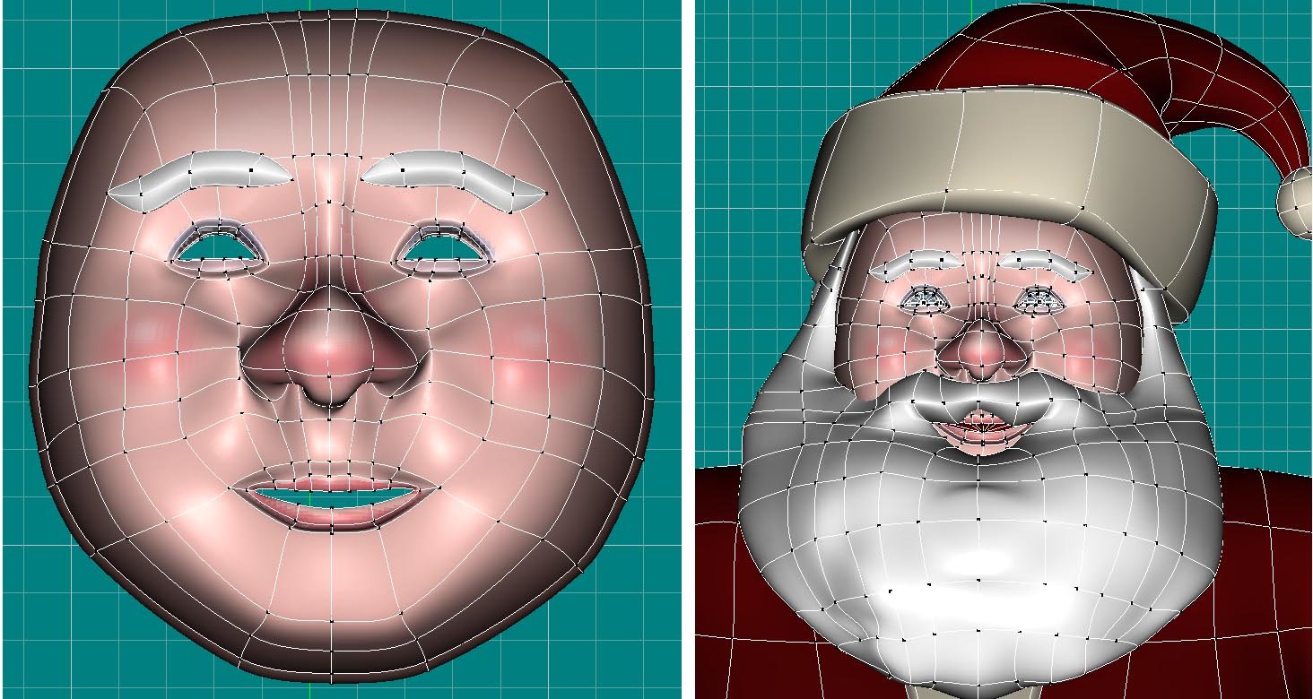
Here's two images of Santa's wireframe, bare face and with all the details. The animation will have only a closeup reaction shot or two, but i want to be able to rig it right so there are no (or very few!) surprises when I get to animating. Any comments on these are appreciated!
-
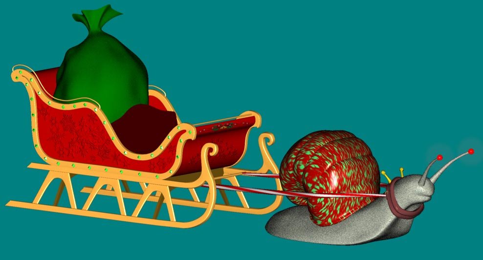
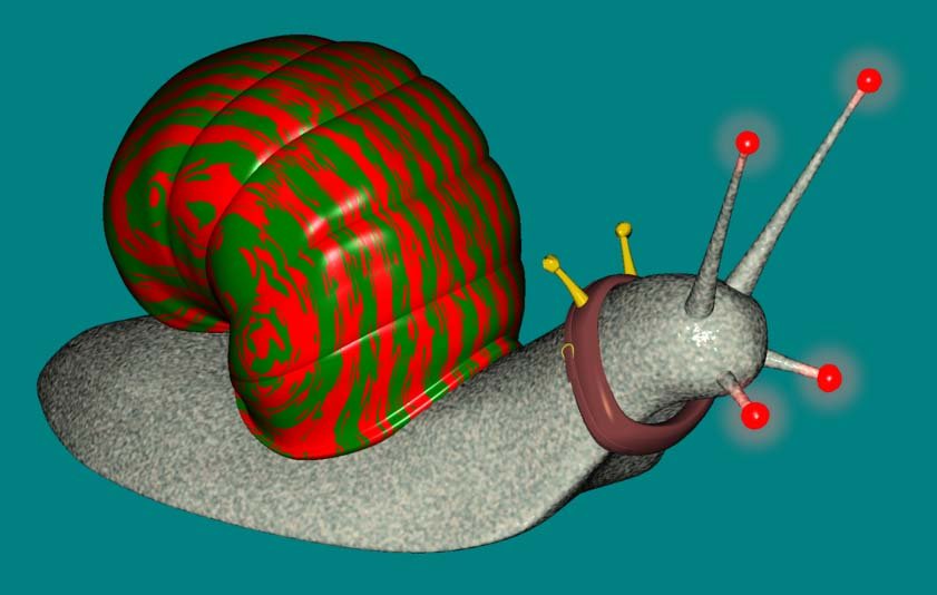
Still tweaking, and combined the snail and sleigh into one model. I've tried a ton of different materials for the snail shell and it's still not final but I think I like this one for now. The snail will be decorated with lights etc so the hopefully the focus will not be on the shell itself.
-
Well, no, but as you'll see that's kind of the point.
-
-
Here's a quick test with the major elements in place and a little body movement from Santa. I busted my butt creating a material for the snail shell, and a coworker came by and said why not make it striped like a candy cane? D'oh!! So that's what I'm gonna do. I'm also figuring out how best to rig the snail for movement. Believe it or not on YouTube there are movies of snail movement! The Santa model also needs some additional rigging in the shoulders and face, and I still haven't added his eyebrows. Mouth needs some work too. I'll try to post a closeup of his wireframe as I think there will be at least one closeup reaction shot of Santa, and I would like some feedback on maximizing his face for animation. SleighSantaandSnail_v2.mov
-
Really nice piece, and everyone's comments, especially Mark and William, are great food for thought. Always helpful to read this kind of crit.
-
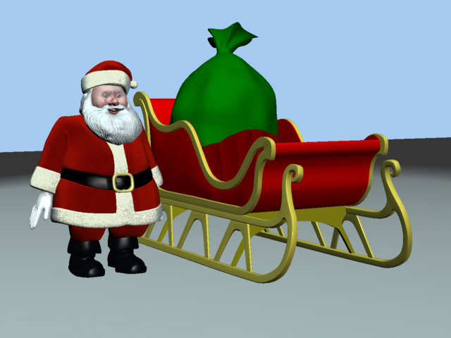
Here's a beauty shot of Santa's sleigh. I think I'm finished with the detailing, though I may come back to it. I'd like to do something more interesting with the fabric of the sack. But for now, it's on to...the snail! Sleigh_beautyshot_rotate_v2.mov
-
Hey Dhar, I just clicked over to your link from the 11-second club and it cracked me up! Good work!
-
Thanks! Not to give too much away, but I'll be introducing a new holiday symbol, the Christmas Snail.
-
I'm working on my employer's animated company greeting again and I'll be posting some renders here as I progress. Thus far I've taken the Santa Lion model from the cd and made him into a "real" Santa, and modeled his sled and bag of presents. here's a still. I'm still detailing things but I wanted to get something up here to get a thread started. More later! Gerry


