-
Posts
1,137 -
Joined
-
Last visited
-
Days Won
1
Content Type
Profiles
Forums
Events
Everything posted by thejobe
-

The Passing of a Titan (Paul Forwood)
thejobe replied to Paul Forwood's topic in General Announcements
From moment to moment we are drifting thru the life and not seeing the wonders around us. many of us will simply stop to look for a brief second but will move on. but for some this brief moment they see the amazing things that life has to bring and what they can do for others in hope that they will see what they see. i believe Paul was one of these people. he shared his vision of the world thru his eyes. showed us how to connect with other people the way that only Paul knew how to do. He will be greatly missed. Thank you Paul for all the great stories and teachings you brought to us all. Thank you josh for letting us know so we can be with you and your family as Paul moves on. -Jason -
wow... that just looks amazing!
-
this is like the lighting stuff i was doing on my thread! cool!
-
you can get the look of radiosity with a few tricks. This post here shows a 5 second walk took about 3 hours to render. i have a few lighting setups in the contributors cue that will give this effect and keep the render times to a reasonable amount. you can also setup a skylight system to get a radiosity effect. the fastest render i got with radiosity is about 10 mins for 1 frame at 640x480 res
-
WIndows 7 differences these are the listed differences between all versions. i have ultimate btw
-
he kind of reminds me of rayman (old PSX game) very cool looks more like an oil painting to me.
-
i been playing around with a few more lighting tests. with these i was trying to go for a more smoothed out version of a 3D render something you would see more in a TV show these days. still needs tweaking This i was trying a faster version of a softbox lighting rig i setup using over 40+ lights this only took about 11-15 mins and it didnt come out too bad. i used robs box crush demo because it had a lot of folds going on toward the end. crunchv.mov
-
If all you new users want to know what it is like to model in A:M i have a real time video of modeling from start to finish. Here is the link
-
Oooooh perty
-
wow its going to take a bit to sink in. thanks a bunch!
-
Congrats! Awesome job!
-
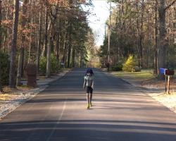
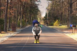
Robcat was working on a little animation walk for me so i could try to blend video with 3D i was so impressed with the walk i had to render it. took about 3 hours to render this shot. animation_test.mov and Yes i know that's its because im using only a 32 bit version of windows. my dad got me the wrong version when i built this machine. hoping for an upgrade in the near future
-
I think i few fixed it but I won't know until It finishes rendering. I'm going full scale this time. Only way i can see all the detail. Says it only has 4 days left to go on the render!
-
What the heck??? Clouds were awesome! But cheese?? I missed something. I know i did.
-
not sure what i was looking at but awesome!
-
ok im getting really close this time. but still feels a bit off. have to look at it a while and see whats still off. also i did the gamma correction on your page and 2.2 is ultra way too high for my monitor. from the test image the perfect gamma for this monitor is 0.89 i know it sounds low but the image looks good on it now. i think its becuase its not a proper monitor.
-
So basically in short its the process of light interpreting color and reproducing that on your monitor. but that's a very water downed explaination.
-
yea thats what i figured as much Yves. im just trying to trouble shoot the problem of the shadows having a blueish tint to them and keeping the colors correct on the model. i would do this in post easily but rather figure it out in A:M becuase i will be applying these techniques to video and that is a lot harder to fix in post.
-
I love this idea! i dont know how much help ill be but you can always call me on if need props modeled or something along those lines. and congrats!
-
i see things like this and smile because i know that one day A:M will be used to make Feature length pictures like some bigger studios with ease.
-
where is this setting located?
-
Yeah I guess the color is off on the shadows. But how do i change shadow color without messing up the lighting on her?
-
the poster is cool but you have to remember that the image as a whole has to flow. not one piece can distract from another. also you dont want it to be to cluttered. my teacher once told that you want your audience to look at your poster in a clockwise or counter clockwise rotation. both posters above demonstrate that beautifully. star trek one you look at captain kirk then spock then the girl (no clue who that is) then the ship blowing up the other ship then back to Kirk. Iron man is the same direction. Iron mans face then his glowie thing then the black guy ( i need to watch these movies) then the girl, the fight scene or the old man (that a good distraction the make you look at poster 2x) then Stark then iron man again. its all about the flow.
-
i think im getting pretty close with these lighting settings. but something still seems off. maybe you guys can spot what im not seeing.


