williamgaylord
-
Posts
907 -
Joined
-
Last visited
Content Type
Profiles
Forums
Events
Everything posted by williamgaylord
-
Some pictures might help...

-
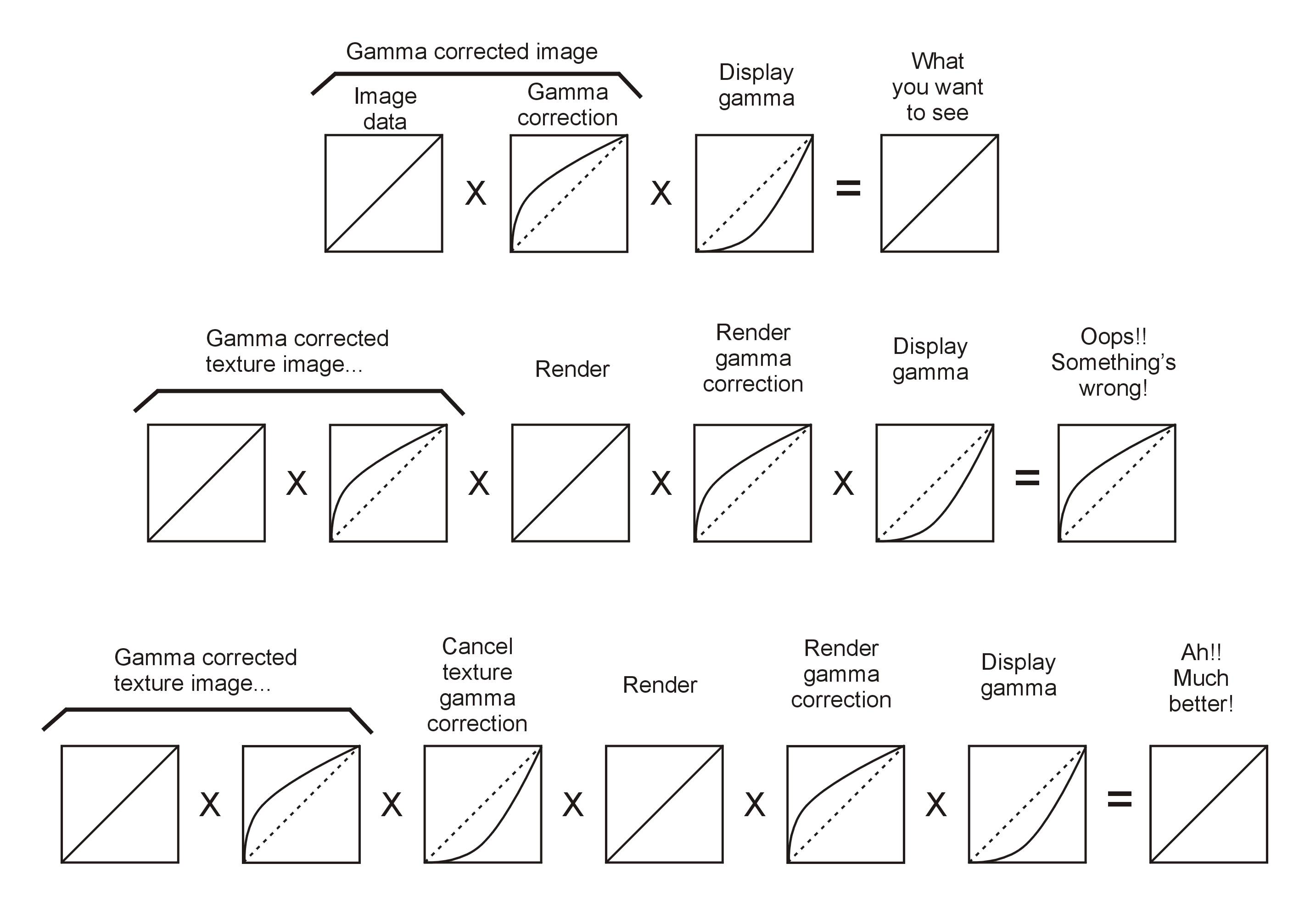
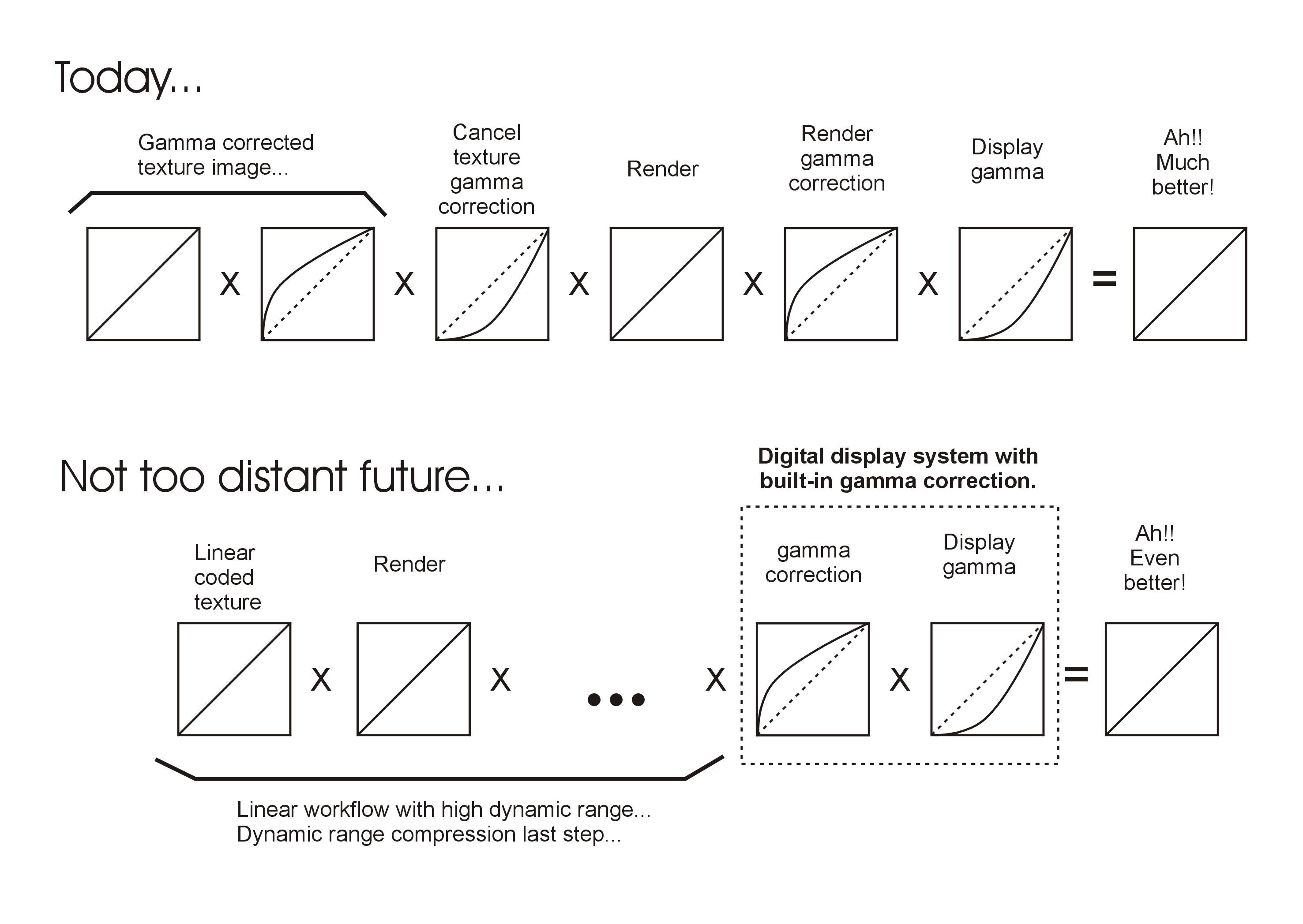
Gamma correction is actually not that difficult to understand. It is becoming less important as more and more displays have the gamma correction built right in--which is really the best way to do it. Almost all types of displays have a non-linear response. They are less responsive at low values and more responsive at high values. Most have a response curve that follows a "power-law" curve that looks pretty much like a loose string connected at a point on the floor and a point on the wall. (The "gamma" is the exponent applied to the original value--the "power" it is raised to. A gamma of 2.0 is the "square" of the value.) The curve is roundest near the floor (where the weight of the string has less effect) and straighter near the top (where the weight of the string pulls it tighter). The overall result is that--relative to mid-range values--dark values become darker and lighter values become more bright and saturated as compared to the values as captured by the camera. Gamma correction essentially "pulls the string straight" by applying the inverse of the gamma. The problem with gamma correction is that it depends on the particular display. In the television world, CRT displays were standardized, so the gamma was predictable. The television signal was altered to correct for gamma. In the world of PCs, and the new world of digital television, there is a plethora of displays with different gammas, so there is no one gamma that fits all. You basically have to match the gamma to each display. However, newer displays with DVI or HDMI digital inputs are building the gamma correction into the display itself. This eliminates the need for gamma correction to be applied to the video signal or still image data and is the smart way to handle gamma. Even with these displays, as the display ages, corrections have to be made, but all this can be built into the display itself, so the user can tweak the display using a built in test pattern. If you have a newer display card that can apply gamma correction to match your display (assuming the display doesn't already apply it's own gamma correction) you can program the card to apply the correction. This case also essentially removes the need to apply gamma correction to the video or picture data. In digital video and images, both the non-linear characteristic of human vision and the need for gamma correction affects the visibility of quantization steps making artifacts like "banding" more visible at some values than at others. As it turns out, human vision and gamma correction have roughly an inverse relationship, so video or images that are encoded in a gamma corrected non-linear code are less succeptible to banding. Higher bit depths are rapidly making most of these issues a thing of the past. The need for gamma correction outside of the display, to correct for the display's effects, has complicated the work-flow of digital image production--something Yves' tutorial explains quite well. As displays (or the display adapters) take over the job of gamma correction, the entire work-flow from the output of the camera, to the input of the display, becomes linear and the work-flow becomes far more consistent and straightforward. We are on the cusp of this era of digital production. So, that's another long answer. The short answer is that a gamma of 2.2 is usually a good rough guess for displays + adapters which do not provide the gamma correction. So your video/image gamma correction would have a value about .45 (the inverse of 2.2). Macs typically have a gamma of 1.8 (still pretty close to 2) so your video/image gamma correction would have a value of about .55 (the inverse of 1.8). If you correct it for a Mac and send it to someone with a PC, the darks will look slightly darker and the lights will look slightly more bright and saturated, but should still look reasonably good. If you send it to someone with a gamma corrected display, it will look pretty washed out. So Nancy was right...it all depends!
-

WIP... she is a beautiful Thai moview star.
williamgaylord replied to StormedFX's topic in Work In Progress / Sweatbox
When you get to the point of making ears you may find this helpful: Ear Mesh You might find the whole thread interesting. If you want ready made ears, even just as examples you can use these: Free Ears -
WIP... she is a beautiful Thai moview star.
williamgaylord replied to StormedFX's topic in Work In Progress / Sweatbox
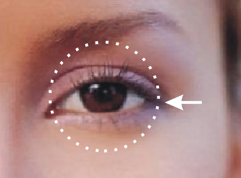
I'd recommend you make a sphere the size of the eyeball as a guide. Then conform the eyelid to the curvature of the eyeball. Notice that the outer corners of the eyelids pull into the eye socket a bit more, especially on the upper side where the flesh from the crease up to the brow overhangs. The tear duct lets the inner corner pull out farther from the eyeball. That you can do by pulling in the splines closer to the curvature of the eyeball on the outer corner. That might fix most of the problem. BTW, this is some nice splinage!
-
At the Mountains of Madness
williamgaylord replied to williamgaylord's topic in Work In Progress / Sweatbox
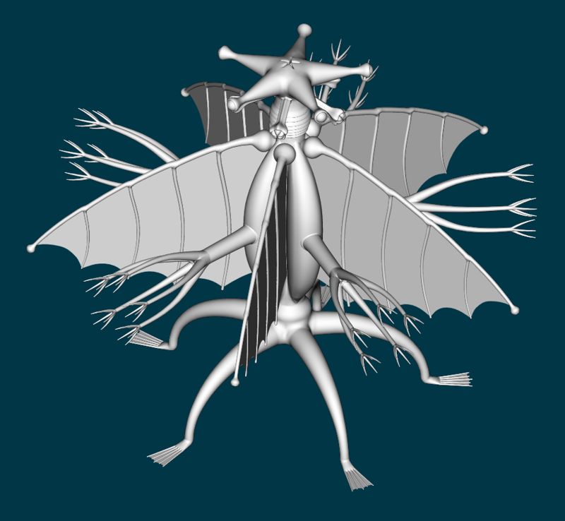
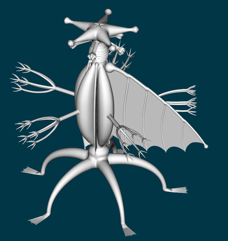
I'm working on making the feet look more natural...something more like this even though there aren't supposed to be any bones. I'm wondering if claws would help. I think I'll build more structure into the torso, not so smoothly rounded. Textures will add a lot to the "menace" factor. Maybe unruly blond hair and red overalls and a black and blue striped T-shirt?
-
At the Mountains of Madness
williamgaylord replied to williamgaylord's topic in Work In Progress / Sweatbox
The menace factor is slowly increasing. New "arms".
-
At the Mountains of Madness
williamgaylord replied to williamgaylord's topic in Work In Progress / Sweatbox
Made a better "wing"--beefier and a bit more organic in form. I started with Lovecraft's description, including the relative proportions. Over time I'll take some artistic liberties and morph it into something more organic and menacing. For instance, I think the "arms" should be longer and a bit thicker--long enough to reach the "mouths" and touch the "toes"....long enough to grab hapless victims and rip them apart, and eat them, etc. The wings look kind of useless, but imagine your surprise as one opens its wings, which start glowing with an electric corona discharge, with intense arcing to the arms which bend down. It then takes off flying like a rocket, propelled by five plasma jets created by the arms and wings. I have a feeling this thing is going to be a real pain to rig...I mean "interesting challenge" to rig. It will be intersting to animate. At first it might not look all that creepy, but once I get all the parts moving, and figure out how this thing will walk, I have a feeling it will be plenty creepy to watch. Imagine trying to sneak up on this guy.
-
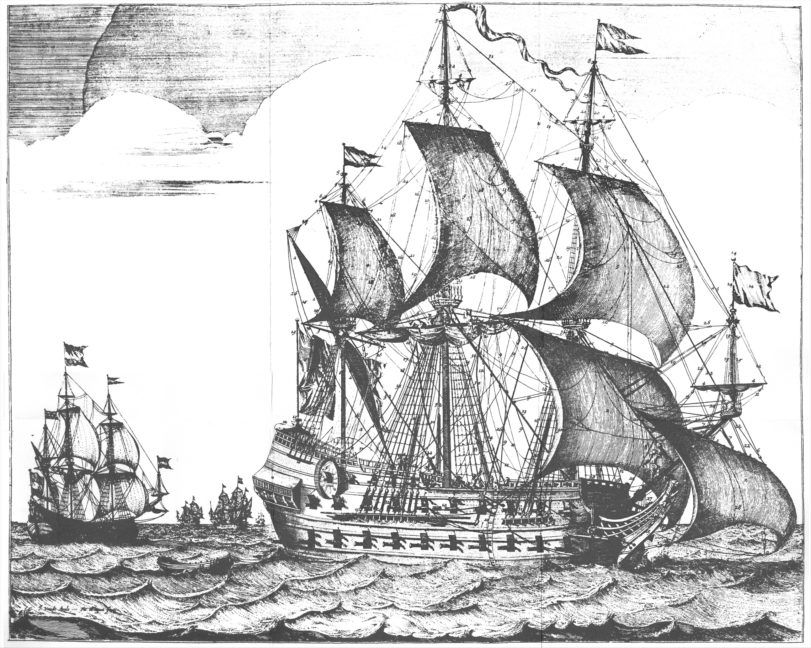
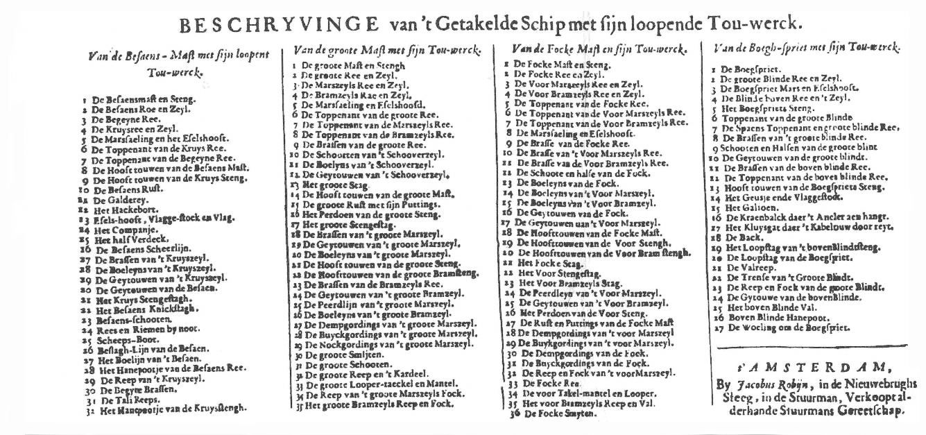
Glad you found it interesting. Didn't mean to clutter up your "thread" with large files. Today I discovered a square-rigged ship type I'd never heard of before. Ever heard of a "jack-ass barque"? It's sort of a ship that can't make up it's mind whether to be a barque or a barquentine.
-
Gorgeous work regardless of the "boo boos"! The rat lines on the shrouds do look like licorice strings glued onto them, especially since they stick out beyond the outermost shrouds. Amazing work as usual, Eric. You probably have this reference by now, but if not, you might find it interesting (I'm sure you have more directly useful ones):
-
The thumb pivots on a small carpal bone that is right at the wrist joint. If you feel where the largest bone of your thumb pivots you'll notice it is to the palm side of the rest of the carpals. If you face your hand palm towards you, you can see the most prominant tendon attaches right at this carpal bone. Think of it like a small extension a right angles to your palm on which the thumb sits so it can swing in front of the palm, while all the other fingers fold onto the palm. The carpals, metacarpals, and four fingers are sort of one layer of brick and the thumb and it's carpal start another layer. Most anatomy illustrations don't show this very well. Remembering this when you add bones to the hand might make the movement of the thumb look more natural when you animate it. Great looking hand! I agree about the "webs" between the fingers--the webs are level with the surface at the palm side and slope back between the fingers toward the back. Look at your hand end-on and this becomes obvious. Also the flesh between the thumb and the index finger runs almost straight across from the second joint of the thumb to the first joint of the index finger. Also the joints of the four fingers follow arcs with the middle finger at the peak of the arc. The joints at the palm follow the same arc. Basically subtle tweaks to a very good start.
-
At the Mountains of Madness
williamgaylord replied to williamgaylord's topic in Work In Progress / Sweatbox
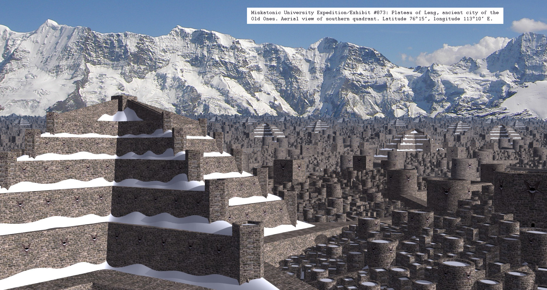
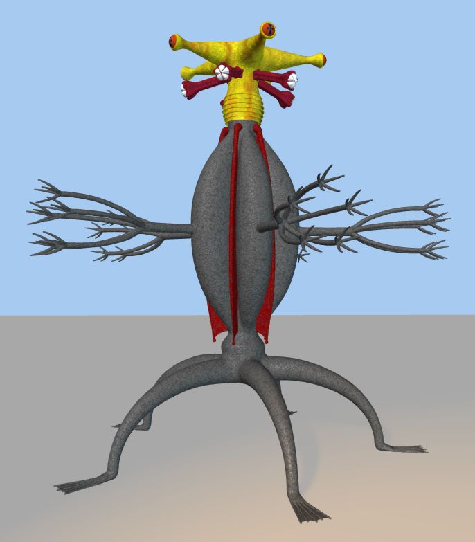
It's one of the "Old Ones" from H. P. Lovecraft's novel "At the Mountains of Madness". Its a story about what an expedition of paleontologists discover in the mountains of Antarctica--an impossibly ancient city and what they thought were fossilized remains of the original inhabitants. The Old One is one of the inhabitants. Here is the city I did for the "Lost Worlds" contest. I didn't have time to make it look impossibly old, but I did get the scale of the city down:
-
This has been on the shelf for a while, so I thought I'd dust it off and work on some improvements. Might incorporate it in an entry for the September image contest. So far this design is far too mechanical. I want to modify it quite a bit to give it a more "organic"--and menacing--look. Any suggestions will be quite welcome. The really interesting challange will be to rig it for animation. Any suggestions for that will also be quite welcome. It is basically a "boneless" anatomy according to the novel, so it will probably look best if it can move much like a squid's tentacles or an elephant's trunk. Really looking forward to Guillermo Del Toro's version of "At the Mountains of Madness"--currently in the works for release ~2010.
-
Thought I'd post my latest WIP
williamgaylord replied to Eric2575's topic in Work In Progress / Sweatbox
Wow! Nice work! Have you tried rigging a tank tread for animation yet? I've not tried rigging a tank tread, but I wonder if attaching bones to a Path Constraint is the most straightforward approach. You could even animate the shape of the path to animate the track suspension as it follows the terrain. I'm sure somebody on this forum has done this sort of thing. -
Well, I experienced a crash of sorts trying to watch the clip within MS IE, so I just downloaded it and it played fine locally. Looks great, though I agree the end is a bit too abrupt to give a feeling of weight. Just making it rock forward when it stops (tail rising up and rocking back down--like someone's legs going up as they grind to a hault face first in the dirt) could be enough. Make it just slow enough to give it a good sense of weight. Looks like you have enough at the end to work with. Maybe, prop digs in, and the plane rocks up on nose and one wing and then drops back down. Altogether, though, pretty darn good! I have to say I envy your sense of lighting. OOOh! How about some squash and stretch!
-
Thanks for posting how you did it. Very interesting! I've been working on cigarette smoke for a short film I'm working on. Similar in some ways to your black hole. Cigarette smoke thread...
-
Wow! Would be interesting to see how you set this up.
-
Happy (Early) Halloween
williamgaylord replied to frosteternal's topic in Work In Progress / Sweatbox
Quite enjoyed it! Love the "bounce" in his step. -
Oooh! I could use this! I'm working on "The Old Ones" from H. P. Lovecraft's "At the Mountains of Madness". Their starfish shaped heads are covered with hair that is supposed to be "irredecent". This sort of animation could give it that really alien touch I've been looking for. Thanks, John!
-
Very interesting! Actually that works quite well.
-
Amazing work there, Lee!
-
I missed this! Perhaps we can try this again.
-
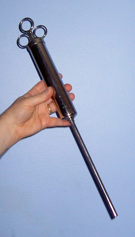
Nice work! Here is a real "mad scientist" syringe for comparison. This is a veterinary syringe I found at an antique shop.
-
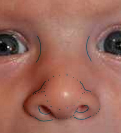
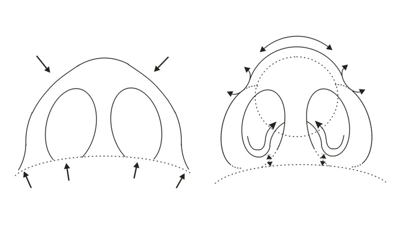
Nice work all around! Suggestions about the nose (all very subtle changes): The back side of the nostrils should stand out more from the face. The tip of the nose should be a tad rounder so that where the "upside-down bowls" of the nostrils meet the tip of the nose there should be a slight reverse curve that differentiates the nostrils a bit from the tip of the nose. (Imagine a marble as defining the shape of the tip of the nose.) The bridge of the nose is fairly wide by proportion on a baby's face since it doesn't stand out much and the flesh on either side softens the curve across the bridge. These fleshy bulges slope down from the bridge to each side. They also emphasize the crease around the back and top side of the nostrils a bit. Like I said, these are suggestions for subtle changes, since overall you've done a fine job on the nose, and indeed the whole head! A couple illustrations:
-
And here is the ship the engine was made for! Emma Maersk Sorry, Stian! Don't mean to steal your thread. No more distractions...I promise! That is indeed a very fine model of the Peterbilt 379. Are you going to do any interior details? Bill Gaylord
-
Nice work! You are way ahead of me! I guess vanity is bogging me down in the modeling stage... Maybe an animated seft portrait category should be added to the list of contests. The emphasis would be on the animation--especially doing things with your virtual self that would be hard to do in real life. Like a superhero alter-ego, or a squash-and-stretch persona, clones...let your imagination go wild!