-
Posts
907 -
Joined
-
Last visited
Content Type
Profiles
Forums
Events
Everything posted by williamgaylord
-
Stian, maybe this could be your next project! Your Peterbilt got me wondering what is the world's largest diesel engine. I found it! Largest diesel engine in the world. Thought you might find it interesting. 25,480 liters of displacement, 108,920 hp at 102 rpm, 5,608,312 lb/ft of torque at 102rpm. Engine weighs 2300 tons, 300 of which is just the crankshaft! It consumes 1,660 gallons of heavy fuel oil per hour, at %50 efficiency, which is actually pretty efficient. (Most engines run 25-35%.)
-
Those are the air filters for the engine. Stian, you always amaze me how fast you produce these models at such amazing quality! You are quite a gifted 3D modeler. Bill Gaylord
-
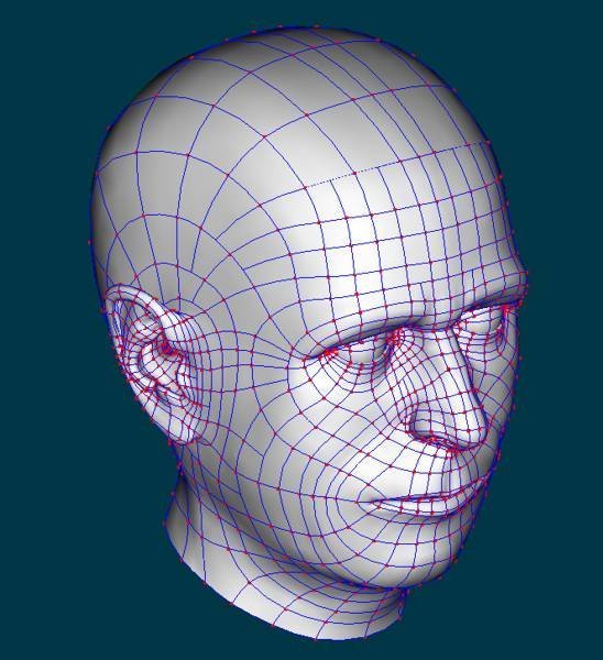
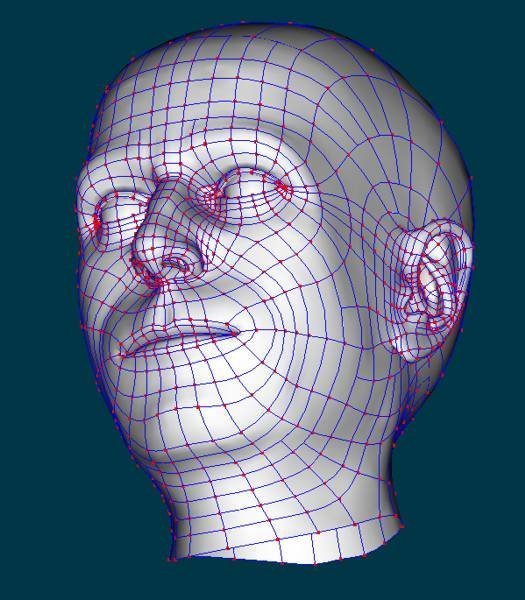
Thanks for posting these, Rusty. They look great to me! I think getting proportions around the eyes and getting the eyes themselves to look right is a challenge, but I could be wrong. I think we are just programmed to be very sensitive to subtleties of the eyes. You've done a great job! I'll enjoy seeing animations of these two! Suggestions for some minor tweaks on the noses: Round the tip of the noses (mainly yours) a tad more, tucking the front side of the nostrils in a bit so the reverse curve between the tip of the nose and the nostril stands out a bit more. Imagine the tip of the nose as a sphere and the two nostrils as two upside down bowls intersecting it. Sculpt above the nostrils a bit more so the slight dimples on each side of the nose stand out a bit more. The crease around the back side of the nostrils that starts under the mounds of flesh that slope to either side of the bridge of the nose should wrap around the nostril almost all the way to the ridge between the nostrils (the "columella"). The nostril openings should stand out more from the face at the bottom/back...think of it more like applying a loop of clay starting from the side of the tip of the nose, wrapping around and then attaching about the middle of the "columella" instead of the corner of the nostril. These are all subtle tweaks...a matter of adjusting the shapes slightly rather than any mesh restructuring.
-
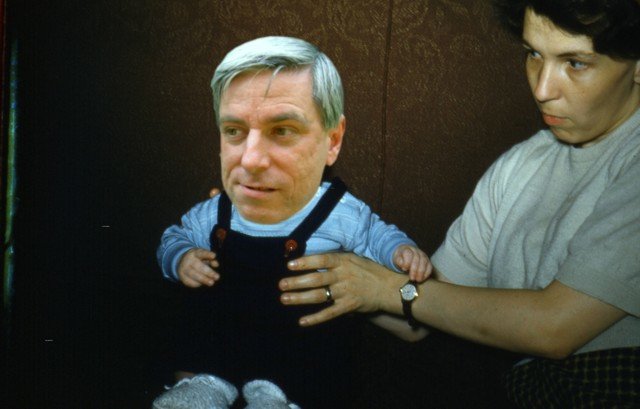
Indeed, Bill Young's tutorial certainly gave me a big "head" start! Seriously, most of it followed Bill Young's example very closely. I used photos of myself for rotoscopes, and large machinist calipers to take more precise measurements (a mirror also helped). The ears were mostly my own work though, with some big hints taken from the fine splinage of Mark Strohbehn and Yves Poissant. By the way, if you take photos for rotoscopes of someone as your model, use as long a telephoto lens focal length as you can and take the photo from as far away as you can short of losing details. Otherwise the point of view will cause distortions (most obvious in an extreme closeup) that will make it hard to match the front view with the side view. You want to approximate an isometric view rather than a perspective view. How about one of my baby pictures:
-
I'd love to see your portraits, Rusty. Go ahead and start a parallel thread. Have you rigged yours yet? I'm looking forward to giving the Squetch rig a try once I get all the missing pieces added. Also might try some facial rigging ideas of my own. Bill Gaylord
-
Anzovin Studio's "Model a Face with Bill Young" is a good tutorial to start with. Anything that will help you learn art anatomy, like Berne Hogarth's "Dynamic Figure Drawing" would also help. Jason Osipa's "Stop Staring" is one of the best books on facial animation and modeling, so you might check that out, too. And practice! Check out the examples you can find on the forum as well. Ears are the hardest part, so check out how I worked them out by tracing back to the "Ear" thread through the link at the beginning of this thread. Since this all started with an ear, I should do a short where a whole human grows from the ear! Bill Gaylord
-
Yes, probably could reduce the number of splines in a number of places. I've seen some amazingly efficient splinage, especially in some of the semi-realistic models posted. Haven't done this before so I've got a lot to learn. I'm trying to work this so it will animate well, so any suggestions for improvement along those lines will be much appreciated. I have Jason Osipa's book "Stop Staring" which is a good reference in that respect. Look forward to trying out the Squetch rig, too.
-
My "real" job has kept me from getting much done in A:M for some time now, but recently the situation has improved and I'm working more normal hours. I might even get back involved in TWO. This is something I did last year: Self Portrait Thread I still have some tweaks left and of course eyes instead of mere spheres...and teeth and gums and a tongue and throat and texturing and hair and rigging...and maybe even a body! Here is it's current state:
-
Thanks, John! I'll check out the project and then run some experiments of my own. By the way, which vintage of A:M did you use? 13.0 or 14?
-
That is some amazingly good looking foliage! Especially if it was easy to set up. I would love to hear how you did it! Is it perhaps adaptable to animating the foliage growing (like a time-lapse movie)? My growing tree animations (here) have been collecting dust on the shelf since I had so much trouble getting the foliage to look natural and lush without causing rendering problems. Guess it might be time to dust the project off and try some of the new possibilities for foliage. This is the gist of what I was working on: Growing Tree Animation ...and one branch: Growing Branch Animation My full-blown tree took several hours to render just one frame: Tree Mark, I know you've been working on trees from way back! Thanks for your help in the past! Bill Gaylord
-
OK, I tweaked the ear a bit more to improve it's shape. Pulled the recesses a bit deeper and so on. Then I made you an ear for Mr. Spott. Both will still need plenty of more tweaking of gamas, etc., plus some porcelain material to smooth them out a bit. You'll need to adjust them to suit your characters and your taste. Here they are for anybody who wants them: Ears A bit of (somewhat gruesome) trivia: Porcelain derives its name from the fact that it was made with pork bone ash mixed into the clay. The really gruesome part was scraping the rotting flesh from the large piles of bones collected from slaughter houses.
-
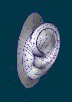
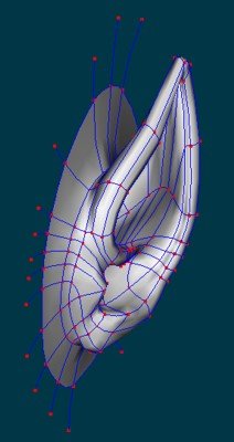
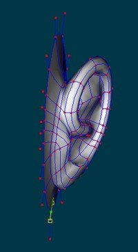
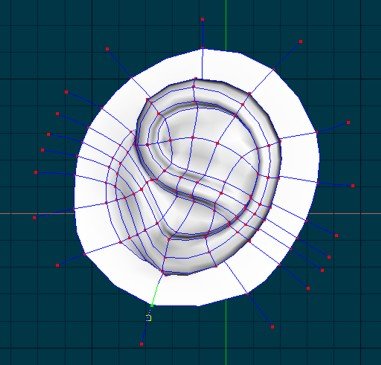
I made more of a cartoon ear. The trick is to basically start with four splines looped into a "9" and then fill in the gaps. No ear hole, which really complicates things. Here are a couple of pictures to show the basic mesh. You can probably improve on this. Your Spott ears actually look good! And Krok's are pretty decent as is. I can post the ear model if you want it, but I can see you are quite able to make one.
-
Spott on! (Sorry, couldn't resist...) But really, I think the Spott character is a great characature. I have "ears for the taking", by the way, but they are a bit too detailed for this kind of character: Ears Might at least give you some ideas. Some day I need to work out a simplified version for more stylized or cartoony characters. Anyway, this project of yours sounds very interesting and so far the characters are looking great.
-
Maybe you could alter the construction of the model just a bit, such that the edges that visibly oclude objects behind them are not , for example, the actual edge of a box, but just the decal edge on a transparent form. So instead of the castle being build completely in a 3D form, just use a plane folded at the nearest corner of the outer castle wall and project a decal with only the brush strokes for that part of the painting. (You can use brush strokes for the mask in Photoshop even, but I would just paint on separate layers.) Inside that would be similar forms for the towers, etc. As long as your camera angle doesn't travel extremely far, this should keep the edges looking like nice bold brush strokes, with the 3D character as you move the camera. I'm not sure how to do this where the water and the land meet. The reflection itself would preserve the brush stroke edges, of course, but the sharp edge where the smooth water surface meets the land would stand out.
-
-
That brings back (ancient) memories of building "Rat Fink" car models way back then. (Do you remember those?) Cool! Now you just need a monster! Bill Gaylord
-
The example references posted so far are good. Probably the best printed reference is Jason Osipa's "Stop Staring: Facial Modeling and Animation Done Right". It's not specific to A:M, but the principles apply very well. A very good investment if you are serious about character animation. The mesh design is very important in realistic facial animation. Bill Gaylord P.S.: Realistic ears are probably the hardest body parts to model (at least they are for me). I don't have an easy method worked out to model ears accurately, but I do have some example ears I have posted that anyone is free to use. Ears
-
Great work on the nose! Looks like you've got it licked! (Accidental pun...Honest!) I've been studying my dog's eyes. The lower lid is fairly puffy and runs kind of straight across the eye at an angle from the tear duct up to the eyebrow. The upper lid is much less puffy and pulls up to follow the brow. The tear duct is actually fairly large on a dog's eye, extending out a ways along the snout. The lower lid connects at the bottom of the duct and doesn't move much up or down. The upper lid stretches the tear duct straight up along the side of the snout and eye as it raises, which is part of why the eye looks a bit triangular. Hope that helps. I can't say I've got four legged locamotion completely figured out yet, but I have noticed that in a walk the back and front leg movements are staggered so that three paws are on the ground at a time. One back paw and two front paws, then two back paws and one front paw. Almost like two bipeds, one following the other, but out of step just enough that only one foot out of four is off the ground at a time. Trots and gallops are much easier. Trot: depending on the animal, either two on one side, then two on the other side, or left rear leg and right front leg, then right rear leg and left front leg, two landing at the same time as it alternates. Gallop: rear legs push off in a leap; front legs land one slightly later than the other; then the rear legs catch up, again landing one slightly later than the other, close to the front legs; rinse and repeat. Also in the gallop one rear leg lands slightly forward (and later) of the other, then the same goes for the front legs. Great progress! Bill Gaylord
-

Marshmallow Safety Film
williamgaylord replied to williamgaylord's topic in Work In Progress / Sweatbox
Al Desrochers did a fine job of translating the script into French! I am very pleased with the results! This will add a lot of "character" to the episode. Thanks, Al! Bill Gaylord -

The Premiere of Dhar's first short.
williamgaylord replied to Dhar's topic in Work In Progress / Sweatbox
Greate work Dhar! Loved it! Bill Gaylord -
Have to say you have a real talent for creating mechanical models. I'm really impressed by the scope and level of detail in these models. Fantastic work! Sometimes I'm amazed at how quickly you crank some of these things out, too, given the detail and precision you put into them. I can see why the author wanted to use your model. Bill Gaylord
-

Marshmallow Safety Film
williamgaylord replied to williamgaylord's topic in Work In Progress / Sweatbox
Whipped up a script in English. It's short and sweet (pun intended!). I need to translate it into French, since the dialog will be done in French with English subtitles. I studied French for six years long ago, but, I am embarrased to say, I never took the opportunity to speak it enough to become fluent. I sometimes say I've forgotten more French than I've every learned. I can read it aloud as a script for voice acting and my pronounciation is fairly good, but I'd be hard pressed to carry on a conversation. Therefor, I'm putting out a request that anyone who is a native French speaker help me translate the dialog into French. I want it to sound natural in French. Anybody out there interested? It's barely a page worth of dialog, so it won't be a daunting task. You'll definitely get full credit for the script translation. I can send the script to whoever volunteers. Thanks, Bill Gaylord -
-
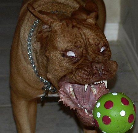
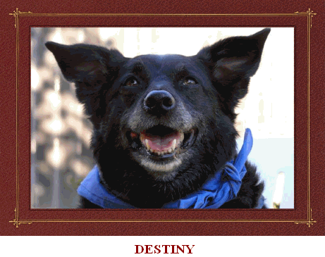
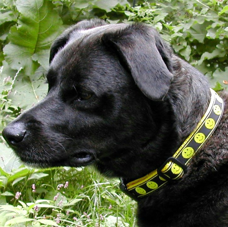
Looking really good, especially the legs. The face has improved a lot. Here are a couple of pictures (not dalmations, though) that might help a bit with the face. Dogs jowls tend to drape over the lower jaw. They are usually "puffy" (rounded) near the nose and more lean (almost floppy) toward the corners of the mouth. When the mouth is closed the corners stick out a bit, as though the skin were folded (which it is actually). Usually a bit of an open loop at the back with the jowl sloping down toward the front. From the front the upper lip curves downward like a frown under the nose. Usually not much of a groove in the middle. The nostrils are open along the sides, too, so the nose sort of has two flaps draped over the nostrils instead of two roundish openings at the front. From the front the nostrils spiral a bit. Body tends to be more rounded at the chest and tapers at the waist, though you can't tell looking at my dog! The eyes are a bit tricky (I still don't quite have the hang of them) because of the way the eyelids appear. The lower lids sweep in a smooth arcs down from the corners of the eyes (they are usually very prominant). The upper lid pulls back in more of an angle than an arc...it stretches sort of straight up against the bony ridge on the side near the snout and an arc from the outer corners or the eye to the top of the "angle". Makes the eye opennings look somewhat triangular. All around great looking dog model! Good work! Bill Gaylord
-
It occurs to me that I might be able to use composited renderings to get around the computational load of rendering the whole tree animation, along the lines of the techniques thread below: Compositing Particles I could even use the same branch or two, just relocate it and render it in different location of the tree! That might allow me to render the animation from a wide angle view relatively close to the tree. Worth a try! Just need to squeeze in some time to try it out... Bill Gaylord Update: The most obvious flaw to this is how the branches and leaves in each layer of rendering cast and receive shadows among themselves. Not sure how to overcome this drawback.


