-
Posts
401 -
Joined
-
Last visited
-
Days Won
3
Content Type
Profiles
Forums
Events
Everything posted by jirard
-
Whoa........ Sorry guys the previous link was pretty graphics intensive. Try this one out. U can view all the 3000 pics 50 at a time instead of all of them loading at once
-
I am sure some of you guys like asian vinyl action figures and know about kidrobot.com. For the rest here is a link to some character designs most of which (especially the urban influenced stuff) gets me inspired when I am lazy.
-
Very nice work Jequed!
-
I like the style, proportions and construction of this model. Nice work!
-
Good advise on using hooks Darklimit. Actually Jamagica if u wanna see the 2 models that helped me understand how Hash spline worked study Darklimts Bot model and this one.
-
As far as creases go the best thing I have found to fix that is use less splines. U will be surprised at how far a few splines will go. I have yet to tweak a bias handle so I cant comment on that. Other than that it looks like your off to a nice start.
-
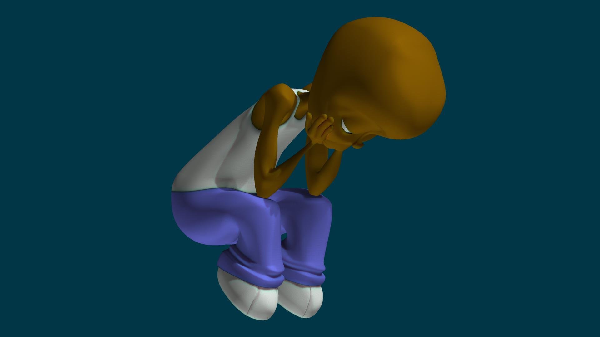
I just wanted to say thanks to all those that responded. I decided to see what the model looks like when it is bended at most of the joints. Here is a pic of how it turned out. I definitely need to remodel the arms and hands. The main problem is to many splines. I have 8 sided cross sections when I only need 4-6. If I move 1 point it effects 4 or 5 that are next to it. After I fix that I will post the results. That will also help with widening the arm out. Also, after the rest of my nieces and nephews heard I made 1 of them they decided that all of them want me to make them to. I have 8 in all (including my daughter). I will post the results in this topic as I finish them. Thanks again for the replies and suggestions.
-
-
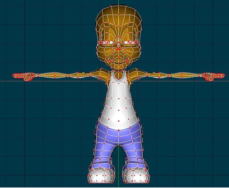
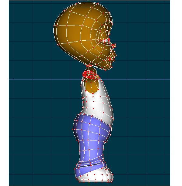
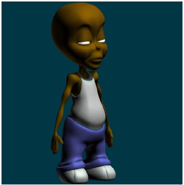
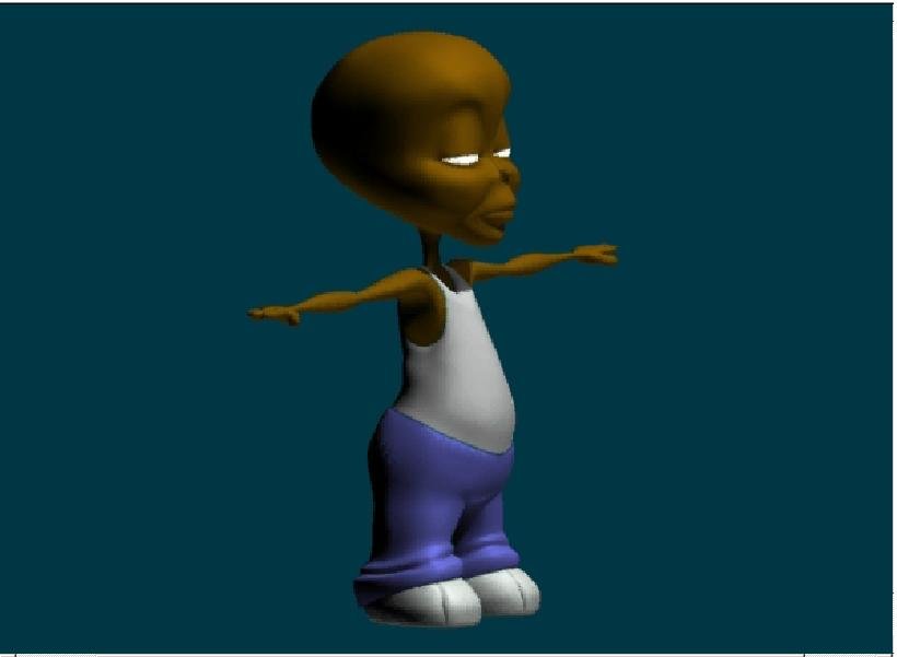
Thanks for the responses guys. The hands and neck were the hardest parts for me to get to look right. The hands are off the KeeKat model and I had a hard time making them look right, and the neck has some poorly placed hooks. Everytime I tried to scale it (the neck) I would get bad creases. I had my nephew in mind when I made this model. He is 3 1/2 and has a chubby stomach with skinny and well defined arms (at least for his age). Part of the problem with the arms was there length. They were way to long and caused them to look to skinny. I decided to place them on his side to measure and scale them out. Here is the wireframe of the (now) old model and a pic of the adjusted one. Sorry, I guess I could've used better lighting to show the changes but I'm impatient with rendering (even with how much faster v14 is) cuz i have an extremely slow computer. Thanks again. Edit: I also scaled down the stomach but I think I'm gonna put it back how it was. I think the thin stomach makes him look older than 3 or 4
-
-
Hey how did I miss this? It looks good to me Darklimit. Can I see a wireframe of it?
-
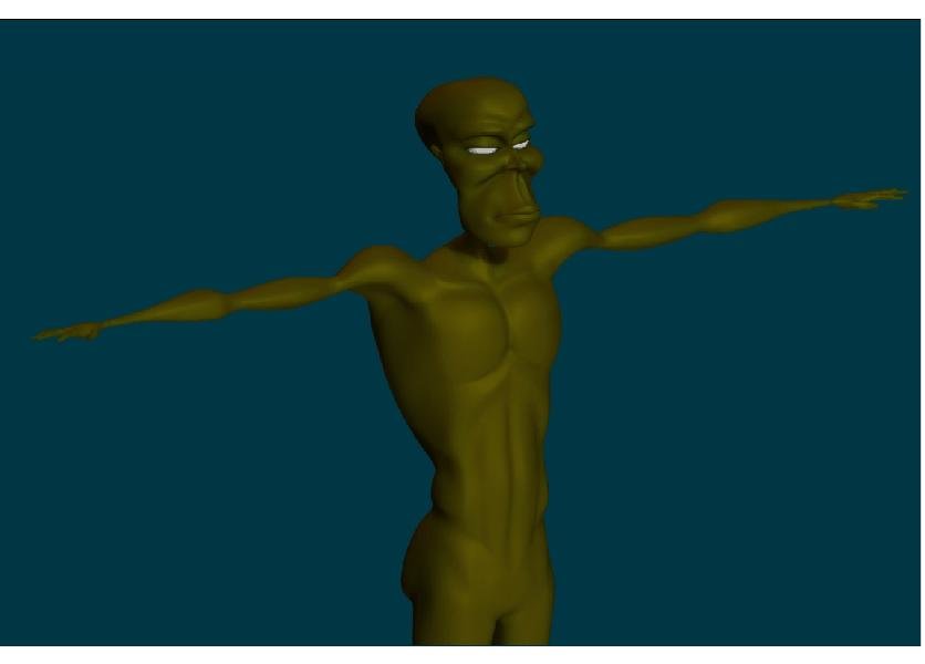
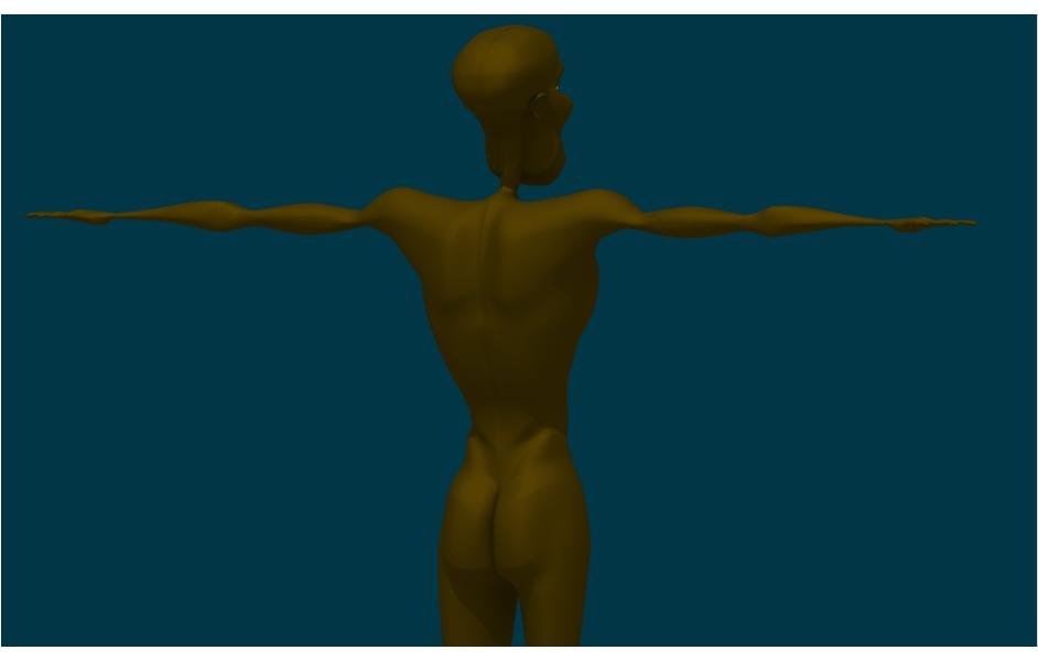
Decided to try my hand at a little anatomy. I still have a lot to do but this is where I am at so far.
-
Looks good to me. Can I see a wireframe?
-
Thanks Totlover! I am planning on using this model on my shaft/kungfoo/kojak/superfly/foxybrown/columbo inspired project haha! I have some other models that I posted but I feel like I am still learning the software and every time i see them I think they suck. I'll probably feel the same way about this one once I start learning how to texture right. If you want to download some of the other models and u have v13 I can post some here tomorrow. I tried a couple of times to do this tonight but my computer is not acting right.
-
Thanks Paul! I think your stuff is great too I've bee checking it out for awhile . Thanks Lee. I felt the brown I was using wasnt showing the model well enough with ambient occlusion so I chose another color. I'll try playing with it. The proportions suck on this model They just kinda got away from me. Its the same when I used to draw I just didnt know when to stop shading. now I dont know when to stop modeling and adding splines. The disproportion shows up better on a front view thats why I didnt post one.
-
I'm floored! Very nice work. I thought the ship was great to. I'm amazed with how much detail you got with relatively so few splines. Keep up the great work.
-
-
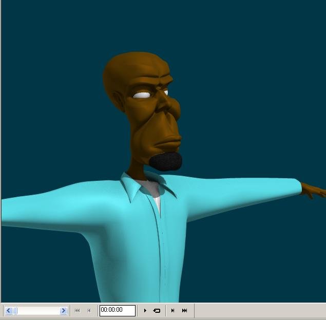
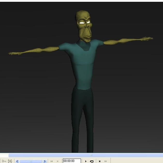
Sorry guys I was gonna try and tweak a few things and upload the pics but I got lazy. This model is from the "playing with shaders" post I did. I still have alot of tweaking to do with it though. The proportions in the face are bothering me and the shirt is just a "rough sketch".
-
I'd be intrested in goin. Im abour an hour north of Los Angeles
-
It looks good to me. I keep trying to make a realistic head mesh but they always come out kinda cartoonish. This definately gives me some ideas as far as setting up the splines goes. Keep up the good work and keep posting your progress.
-

Texturing Common Assault Marine By Dark_Jedi
jirard replied to LeeAnderson's topic in Work In Progress / Sweatbox
Very, very nice work Lee! Stuff like this keeps me inspired! Your gonna have to give me some tips on the process. -
I like it! Im interested in seeing what the rest of it will look like. What kinda project were u gonna use this for? Keep posting progress pics.
-


