-
Posts
515 -
Joined
-
Last visited
-
Days Won
2
Content Type
Profiles
Forums
Events
Everything posted by Dalemation
-
I have been working on a short animation - originally intended for the the recent Hash animation competition - but I just haven`t had the time I`d hoped to complete it. Anyway, I`m back after a weeks holiday and have gone crazy on it and it`s nearly done now and, who knows may be finished in time for SIGGRAPH if it`s suitable. As a joke, because work colleagues and Ollie, who did the voice track, kept asking me how it was going, I had a T Shirt printed with this image.
-
-
That was great! The opening shot is gorgeous and I really liked the `focus pulls` with the two crickets in the foreground. All very nicely done. It should go down well at SIGGRAPH. I wish I could be there but it`s a bit of a jaunt from the UK I will have to plan a holiday around it one year when I have something to show.
-

Greek Statues: Textured and Colored!
Dalemation replied to HomeSlice's topic in Work In Progress / Sweatbox
A fantastic piece of work. The detail in the models is incredible and the presentation you`ve created really shows this off. -
Hi Gary, I like the limages. The brick and rock textures are especially nice. You mentioned that you had finished your second story. I recently got a great book quite cheaply from Amazon - Gardner`s Guide To ANIMATION SCRIPTWRITING by Marilyn webber. I found it very useful in checking I was on the right track and also managed to improve my script quite a lot I think. Maybe you should animate some scenes now and put together a trailer. Have you looked at the Animwatch site? There are lots of animation shorts `in progress` on there. Very inspiring. Look forward to seeing your next post. Dale.
-
You`ve been busy and experimenting hard! The new branch and leaves looks great and an improvement on your earlier heavier patch count version. The Brownstone Apartment is very impressive too. I like it all.
-
Wow, thanks for the great advice everyone. I never expected this many replies and you`ve given me lots to think about. I`m at work at the moment so haven`t got time to go into detail but the project is for kids so I don`t want the forest to be too scary but, I agree, it does need to be darker. I will try and post an update tonight. Thanks everyone
-
I`ve just come back to this after working on other things so thought I`d post the latest of my Spooky forest images.
-
I really like the design of the set and cars. The whole thing is amazing looking. It`s going to be a great short!
-
It`s looking great to me. Did you make the hair more transparent at the tip? It appears to get finer along the hairs length. Very nice.
-
Thanks for the encouragement everyone. I hadn`t added claws, even though I thought he looked to be missing them, as not many cartoon dogs seem to have them. However, that`s probably more to do with the tedium of having to constantly re draw them in 2d. So, I think you`re probably right and I will try claws I`m doing about 10 A:M related things at the same time at the moment but I do intend to attempt some animation with the dog in the next couple of weeks and will keep you updated. Thanks again. Dale.
-
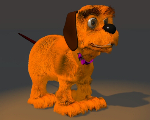
Hi Ken, I decided to make his fur a bit shorter but I may change my mind again! These are taking around 4 mins to render on my 1.8Gig HP Laptop. I did a render using a skylight rig but got some really weird results. Streaks appeared from the fur in places. I`ve used this before so I think I`m setting everything up correctly. I`ve now gone back to experimenting with normal lighting but, in my attempts to rid the model of the heavy evebrow shadow, have overlit the face a little on this render. I`m going to concentrate on rigging now.
-
Hi Animus, I think the fur is a bit strange on his ears too. I only had chance to have a quick go on the character last night. I will probably post another image tomorrow night. He is looking something like I imagined now and the pre fur version (which I originally was quite happy with ) now looks very naked! I`ve animated four legged characters in 2D and stop-motion, and always found it quite difficult, but I`ve not done this on computer before. The rigging should be interesting too. Dale.
-
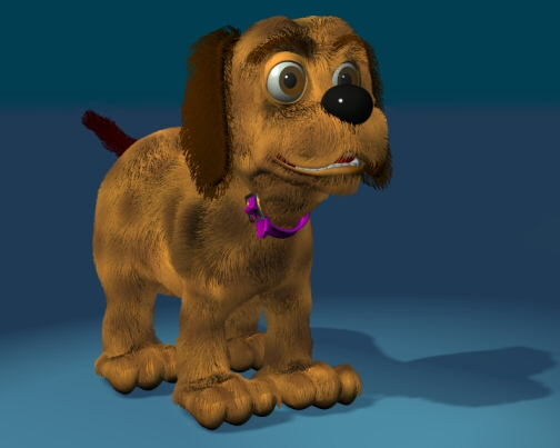
Thanks for the suggestions everyone. I`ve acted on most of them and adjusted lighting / fur on feet / added fur to tail and ears / more colour variation to fur.
-
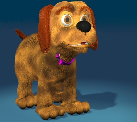
Ha ha, yes he is a bit orange. I rendered the image on my laptop - I really should calibrate the monitor properly. As soon as I loaded the image to my desktop for posting I realised the colours were way off. I`m going to adjust the colour variation on the hair and give him a bit of a trim around the toes. Thanks for the comments. Dale.
-
Atlast I`ve got around to putting fur on my dog character. If anyone can suggest improvements I`d be glad to get any advice.
-
Thanks for the tutorial Sam. My experience of using proxies so far has only been with using a character without hair for tests and then rendering with hair. Your tutorial was very interesting and useful. I`ve only just found this thread (I`m finding it difficult to keep up these days) and I was amazed by your animation. The lip sync is perfect and all the little gestures and character acting superb. I love his steps towards camera and the dramatic lighting change. Great stuff indeed Btw, the character design is brilliant too!
-
Thanks for the comments everyone. TheOdfellow - The sky will be composited later as I want to have clouds drifting on seperate layers. VeridisQuo567 - Thanks, I wanted it to be more cartoony than `real` looking (I hate straight lines ) and the project is for kids so, Hammer Film fan that I am, I have to restrain myself! The entire model is quite large as the house stand atop a hill with a path winding round which leads to the spooky forest I`ve posted previously. Thanks again for taking time to reply, Dale.
-
Very nice! Good snappy animation and the leaps into the air are great. The only very minor thing I noticed is a continuity thing. When it cuts to the wide shot the character is in a different pose so it appears as a bit of a jump cut. Otherwise it was excellent.
-
-
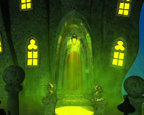
A couple of images of the Haunted House set I`ve been working on. It`s almost completed now - just a few things to finish off and tidy up.
-
Congratulations on achieving this. Several months ago I asked if I could drop a day at work and was refused. (Obviously I didn`t tell them it was mainly to work on my own projects ) No, I`m not bitter Animation is a slow process isn`t it. I am lucky to have others working with me but they are getting up to speed with the software at the moment. I am just slightly ahead of them. Lighting - I purchased the book that David Rogers mentioned. Digital lighting and rendering by Jeremy Birn. It`s excellent and covers more than just lighting. Texturing and compositing etc are also featured. I really wish you well with your project. Every time you post it just looks better and better. I think it`s going to be really impressive by the time of completion. Dale.
-
It`s looking good Gary. You`ve obviously been working hard. Can`t wait to see some animation.
-
Your first head!! Wow The ear obviously isn`t quite right but that`s the only thing that stood out for me. It`s incredible for a first head I think.
-
This is just a little thing that caught me out at first and I`ve noticed a lot of new users asking about after they have excitedly attempted their first animation. ------------------------------------------------------------------------ Why won`t my animation play past 25 frames? You need to open the timeline and drag the greyed out bar, right at the top of the timeline, up to or past the last frame of your animation. ------------------------------------------------------------------------


