-
Posts
515 -
Joined
-
Last visited
-
Days Won
2
Content Type
Profiles
Forums
Events
Everything posted by Dalemation
-
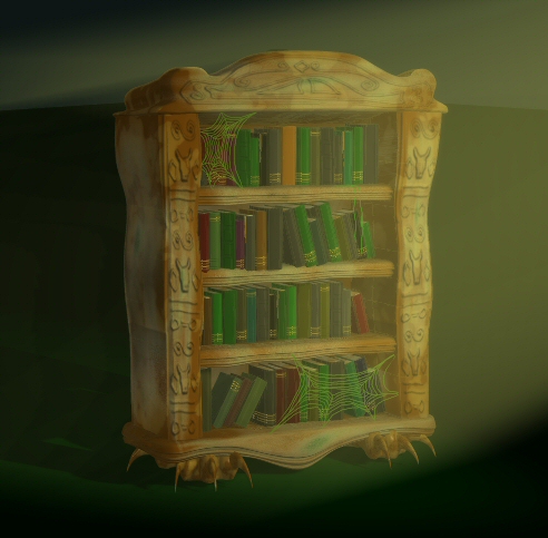
.....And this bookcase. Yes, I think the feet look strange too. Clawed feet seemed a good idea but I think I'm going to go with just a plinth.
-
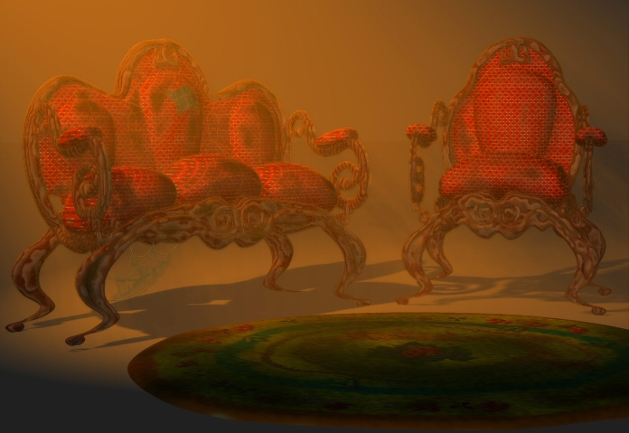
A 2 piece suite. I have done a quick 'Wink' tutorial on creating dirtMaps for the chair that I have just posted a link to in the Software Tutorials section. A bit of a cheat but it works
-
The models look very well done and faithful to the originals. In my mind I am imagining what the story will be - some conflict between the two characters? The animation looks quite impressive too so far. Look forward to the third shot
-
I find it quite creepy - especially with the extra clarity of this version. The soundtrack is perfect in enhancing the 'mood' I think. Great stuff.
-
Tried several times but can't download for some reason. Will try again later.
-
I took a look! For 20 minutes that's impressive He almost seems a little embarrassed as he looks to camera after his outburst. Funny. He's a great character. I didn't notice until now just how long his arms are! Obviously he has considerable strength - what are his superhero powers?
-
I really like it. A great comic book look....reminds me of the Fleischer Superman shorts from the 40's.
-
I can't say much more than has already been said....brilliant work again!! The animation of the girl, in particular, is superb.
-
Looks like you've put a lot of work into this so far. I really like the rendered characters. Have you done any animation yet?
-
That was great to watch. It's really come together and works so well. Some very nice animation in there too
-
Thanks for the comments. Jamagica - As stated it was only a quick test with not too much attention paid to secondary motion. Mark / Jamagica - The ears were animated by hand. Id rather do that as I prefer to have that control.
-
This is a very quickly done animation to test out the new quadruped rig created by Mark Skodacek. Dog Run Animation 2MB QT
-
That's a great looking dragon! I like the detail and the whole composition. I'm wondering if the image could be improved if the sky was darker and the dragon had more light thrown on it? It might just be me, or my monitor, but the dragon looks almost sillhouetted against the sky. That model is stunning though. Really good work
-
I just wanted to bring peoples attention to this film made by a friend and work colleague of mine, Charlie Hopkins. This is the first thing he's created with A:M and he's only had the software for a few months! It's now on A:M Films (thanks Ken) and I know Charlie will be very interested to know what people think. Mischief Movie
-
That looks superb. I love all the little rivet details. Great
-
He does have eyelids but I haven't done pose sliders yet. Yes, these are his third pair of shoes - all quite different - and I've not been happy with any of them. Obviously things don't look right on these which is good to know so I can adjust things. Oh, and Steven - you haven't annoyed at all. Everything you said was helpful and I'm greatful that people like you take the time to look at work and offer advice Thanks Ken. Well, as long as I don't get worse then I think I'm doing okay. Thanks Steve392 for your comments also. Dale.
-
I love the animation. Great walk with the tail flicking around - and the hair dynamics are very impressive. Cat has loads of character
-
-
The 'tweaked' version is stunning but then I thought the original was amazing. Brilliant work.
-
Thanks Mike. Nothing complicated or revolutionary here I used a blue fill light to the left and slightly above the trees. The keylight is to the right and slightly green in colour. Another keylight is aimed at the house. Several rim lights are aimed through the trees and at the house. Another rim light is the moon which is simply set very bright and aimed at the Sky Dome. I have another light that moves across the clouds from left to right and lights up the clouds during the lightning. I also vastly increased the brightness of the house keylight for the lightning. Eric - I think the above should answer most of your questions. If not let me know. As everyone else seemed to prefer the second version without the rain I think I'm going to forget the rain or maybe just have very light rain. Well, here is a third version now with creatures added and also, the above mentioned, lightning. Haunted House 3
-
Alternate version. I've re modeled some of the path that I wasn't happy with and adjusted the scale on some textures. One of the path/tree models badly intersected another in the first version too which has now been corrected. Still gotta adjust the camera move though. Haunted House 2
-
Thanks Starwarsguy. The QT does appear jerky for some reason. The original Avi seems fine. Although I know a little slower fairing at the start of the track is needed. Hypnomike - There are now 4 of us working on it. Two of us 'seriously' and the others mainly do bits of modeling here and there. At present we are only able to commit to it in spare time so it's very frustrating but great fun
-
Test animation. I used Anders Avero's excellent 'Rain effects' plug-in for the rain hitting the puddles. Some post effects were done in DogWaffle (I over did it a bit I think) and there are obviously other things to correct but I thought I'd post to show we are actually doing some work on this pilot film Haunted House movie
-
I`m really excited by this. It`s looking like being a beautiful piece of work. A lot of people lose momentum along the way during a project like this. It`s obvious that you are not one of these people. Respect.
-
Ofcourse. It`s a very simple set up That I`ve done. I know I could have created a dynamic constraint and had everything work automatically (and I may still try this) but I like to be in control as much as possible. It is, therefore, all hand animated. Belly Bone 1 is a child of the back bone. Belly bone 2 is a child of the back bone and set to orient like the Belly Bone 1 at 50%. I hope the image helps.


