-
Posts
1,064 -
Joined
-
Last visited
-
Days Won
59
Content Type
Profiles
Forums
Events
Everything posted by Wildsided
-
No Steve you're totally correct about the skirting board. It needs adding in. The issue I'm having is that the school model became so complicated with so many parts that it now takes forever for A:M to respond when I ask it to do anything. So I've started making separate models that match the dimensions of the area I'm working on, building the interiors and then assembling it all within the choreography. So at some point I'll be making a model that's the corridor details and that will include skirting boards. Doug - thanks for the support. Do you mind Doug or prefer Douglas? Same with all the forum guys. We all have User names but we tend to use our real names when talking to each other. But I for instance hate Danny (personal) as an abbreviation of my name. So what does everyone prefer? Rodney or Rod? Robert or Rob etc.
-
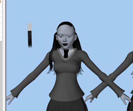
Thanks for the feedback and suggestions guys. Steve - The devil is in the details as they say. I've found during my studies (read watching animations and playing videogames) that one of the keys to realism is 'stuff'. The world is full of stuff and little details and I've realised that when there isn't enough 'stuff' an environment starts looking unrealistic. It's weird because you don't notice the stuff when it's there. But you immediately notice when it isn't. Rodney - You know me, I'm always tweaking things. I shall take your suggestion about the ceiling tiles under advisement and have a tinker with the sizes. The bricks are just a photo of a wall I found on a google image search that I edited for colour and then made a greyscale copy with the brightness and contrast tweaked for the bump map. Thank you for bringing the Pixar free texture pack to my attention. It is now sitting in my resources folder. If they're good enough for Pixar they're good enough for me and yeah I just put Annie's arms down by her sides from the standard T-pose and plonked her into the corridor. I haven't rigged her head yet so I didn't want to move her around too much.
-
Just rendered out a frame with the sepia filter switched on, very 1920's.
-
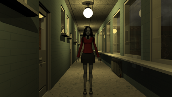
Hey guys, The more realistic Annie is now complete. I successfully transplanted her new head onto her body yesterday (with some of the proportions tweaked to make it less cartoony). Just did a quick render of her standing in the sealed corridor (circa 1952, before it was burned and sealed up). Her school sweater is currently red because I was playing around with the colours and will be made grey again before I make the promo. My plan is to recreate the Audiobook intro with the new models. Just as an excuse to see how far the project has come since then.
-
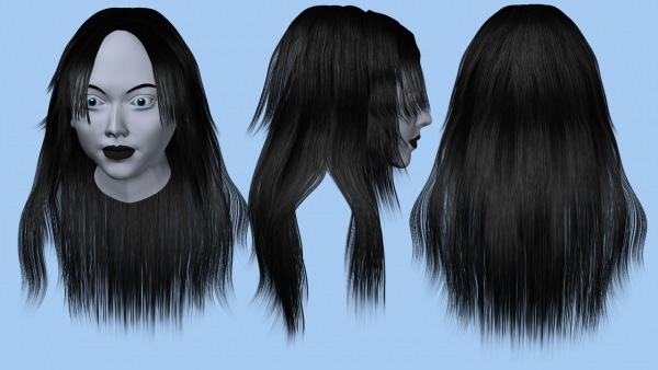
Thanks guys, I'm really chuffed about how this turned out. Still lots to do on her but this is easily the best hair I've ever managed.
-
From personal experience I'd say Blender is a powerful and probably wonderful piece of software for those who are willing to dedicate time to learning how to use it. I personally found it very cumbersome as a beginner and it has an incredibly steep learning curve, there are lots of tutorials on the web for learning blender and you're definitely going to need to go through them. I'd go on record and say Blender is not a software package you can play around with and self learn. It does have the advantage of being free though, so there's no reason not to download it and have it on your computer should you ever find the time to learn it. A:M is in my opinion the easiest to learn 3D software available. I picked it up back in 2010 and from mostly just playing around with it I became pretty competent. The forums here are a great place for information and support. I've found the community to be very supportive of one another and criticism is only ever from a constructive stand point. I'll be honest when I first bought a license I wasn't expecting much for the price point, but I was more than happy to find a very capable bit of kit that has never ceased to surprise me as to what it can achieve. Dan
-
Thanks for the feedback Steve, sorry I didn't answer sooner. I like the smoke idea, although that would be a 3rd state of the room. Original, Burned and actually on fire. I'd deffo do something with smoke if I did a flashback to the night of the fire as one of the teaser clips. On a different topic, I was thinking about what style of art would most fit the story and also be most marketable. If it was just me it'd be anime all the way. I love me some anime. But I decided that a more realistic style would be the most readily accepted by a general audience. I didn't want Joe Public to take one look and judge it based solely on the anime or cartoon style. As such I spent the last couple of days doing a realistic Annie. First by using a head generation package to make a base head, importing it into A:M and tidying up the mesh and then making her geometry based hair. Much as I love the particle hair it takes forever to render whereas this method only takes about 30 seconds and is just as good in my opinion. Now I just need to rig it with some dynamic bones. Should be fun.
-
Recent work marrying CGI with live action TV spots
Wildsided replied to John Bigboote's topic in Showcase
Nicely done Matt. Did you do the parrot too? Or am I seeing C.G where there was no C.G. -
Yup seems to have been the case. Just swapped out to another transparency and seems to be working fine. Wish I'd tried that earlier and now spent ages trying to fix the broken one.
-
Thanks for checking Rob. Might just have a dodgy map somehow. Not ideal but it looks like I'll just have to start over with the texturing using a different transparency.
-
Don't think so Rodney. Just tried deleting everything but the transparency map from the decal and same result. looks fine up close but wrong from a distance
-
As far as I know black is invisible and white is visible. So you can see there's no white at the bottom.
-
Does anyone know what might be causing this? Up close the transparency map I'm using is working correctly. But from a distance, not so much. I've used transparencies before without this issue, but no matter what I try it's displaying the hair strands as if I made a space at the end and then continued.
-
Ah yes that classic A:M seems to have stopped doing anything....I'm sure it's nothing....wait did I save?.....NONONONONONONONONONONONONO!
-
TBH I don't think the name of the company means a whole lot anymore. There's a videogame studio called Sumo digital and another called cly5m. Like Rodney said it's your content that ultimately defines you. Disney is literally just a guys surname but it's what the name represents that everyone remembers.
-
How about Primary Entertainment: Next Iteration Studios, oh wait that won't work, never mind. Although joking aside Next Iteration Studios does have a nice ring to it. Nice abbreviation to N.I.S
-
It does indeed work. Thanks dude, see what you mean about the snapping to wrong CP's but at least I have a point to start from now.
-
This goes out to all the smarty's in the audience. I found a piece of software that'll allow me to make realistic looking faces. The software's exporter will export a neutral face model and then a bunch of morph targets based on that model. So when it's done you end up with Neutral.obj and Angry.obj for example I can obviously import both .obj's into A:M as 2 separate models. What I'm wondering is if it's possible to make a new %pose in model 1 and import or copy over the CP positions from model 2 in order to make a pose slider that shifts from neutral at 0% to Angry at 100%. The two models have the exact same spline allocations as far as I can tell but the CP's are obviously rearranged to match the face expression. I've tried making a new pose for both models, going into angry, setting things control point mode, select all and copy, then try pasting into the model 1 pose but it does nothing. Any ideas? As this would save a ton of work on facial animation.
-
Cheers Nancy, that'll save a lot of faffing about making those transparent frames. I was looking for something that specifically said transparency. Didn't realise that the percentage thing was actually how visable it was. Cheers though.
-
Figured out a way to do it. Need to make the decals an animation with 2 frames, one frame with damage and one transparent. Then just have to switch between between the frames as needed, essentially on and off.
-
Thank Steve! There'll be plenty of spooky sounds in the trailer I can promise you that. On a different note I had an idea to use materials to decorate the rooms in the sealed corridor and then using decals to burn the living hell out of it. I've overlaid a test of some floor damage to the floor (obviously) but the idea was to render a camera sweep across the room flashing between the room being fine and the room being burned. I'd hoped to achieve this by switching off the damage decals at certain points. But I can't find a setting to make them invisible. I've got extra options enabled but there isn't an active option for the decal just things like application method. Is there a way to do this or do I need to rethink? Thanks guys
-
Fair point, I s'pose sparse could also be interpreted as 'clean' from a medical stand point. Also this picture in with the regular stock medical room images. Out of place much...
-
For what it's worth I think if you decal a couple of medical looking posters and charts onto the walls it'll make the scene look more complete. I think that's why the room might feel a bit sparse.
-
Looking good Simon, liking the cars going by effect. Also "Light Penetration" *Immature chortle*
-
Good luck Rodney, 3D printing is a very cool technology. How much did your printer set you back?


