Rodney
-
Posts
21,649 -
Joined
-
Last visited
-
Days Won
119
Content Type
Profiles
Forums
Events
Everything posted by Rodney
-

glTF (Kronos Groups Open Transmission Standard for 3D)
Rodney replied to Rodney's topic in Open Forum
That is certainly one of the documents that addresses core aspects of what this 'new' standard proposes to do. But then again... VRML was going to win over everyone back in the day too. (I only mention VRML because some of the folks involved in glTF apparently were supporters of that standard and in a way glTF seems to be a modern day equivalent... just with more commercial need/support behind it than VRML had way back in those days. I believe one of the other papers addresses streaming although when most of these papers were written the internet wasn't streaming much of anything due to low bandwidth. That's rather the whole point of Martin's earlier forays into 'lightweight' models however. Splines/patches automatically circumvented many of the issues found with denser models that were going to be problematic to transmit in any way... streaming or otherwise. Thus the term 'orientation' that I used to suggest that Martin's approach was ideal specifically for a time when bandwidth was at a premium BUT that notion is just as relevant today when one considers the scale that 'big data' represents (and hopes to be able to use!). But we are straying a bit from the original topic into an area that we aren't even ready to approach because we haven't come to an understanding of the basics. Here's a hint though; how does one transfer an extremely large amount of data from one place to another with minimal expense/effort? The folks at Facebook and elsewhere think they've got the answer. Look for them to employ that in their efforts to 'teleport' matter/data. Of course, the easiest solution is not to transport any of that data in the first place but rather just to turn a facsimile on with preconfigured matter/data; then you just have to trigger it to happen. If by 'Get rid of detail' you mean 'dispense with unnecessary data' then sure. This is certainly a premise of glTF... perhaps especially demonstrated by what Cesium is trying to do by having data appear 'just in time' as it is cued up for viewing. But this too is covered by any technology that is sufficiently scalable. As we see the data that interests us and zoom in to inspect it closer more detail appears which leads us to other just in time deliverables. In the realm of character animation it's not unlike the telling of a story; aspects revealed in the last act are foreshadowed in the first. As that is covered in the core of spline patch technology I must assume that is referred to or assumed from the outset by those that follow the underlying technology. WIthout rereading the document I'll guess it may even be referenced or alluded to in the first paragraph. -
glTF (Kronos Groups Open Transmission Standard for 3D)
Rodney replied to Rodney's topic in Open Forum
Martin has posted most of his papers here: http://www.martinhash.com/forums/viewforum.php?f=25 I think this document can be found via Martin's forum too but don't see it by this specific title: Articulation concerns for specifying generic class character animation Edit: That one is actually his Masters thesis from 1989. It's collected at the first link. -
glTF (Kronos Groups Open Transmission Standard for 3D)
Rodney replied to Rodney's topic in Open Forum
Thaz whi youse haffa reed Martin's pehpas. As far as plain text is concerned.... Is html a transmittable format? What about code in that plain text or binary formats? -
For those of you that keep track of file formats and other technical aspects of the trade you may want to watch the glTF (Open GL Transmission Format) standard as it seems to be gaining a lot of traction especially in light of current interest in augmented (and virtual) reality. Perhaps more specifically, flTF optimizes assets for rendering instead of modeling frameworks; primarily via JSON (Javascript Object Notation). Of interest, glTF is not a file format so much as it is a scheme to move 3D data from file formats into a standard encoding that can be compressed/decompressed for transmission (primarily over the internet). The example used is that of other standards such as MP3 (for music), JPG (for images), and MPEG (for video). glTF is hoped to be the standard for 3D (to include mesh, animation, shaders and textures). The 1.0 spec for glTF has recently been published. Here's a video that goes into some of the technicalities: xhttps://www.youtube.com/watch?v=YXPeh2hy6Tc Introductory presentation (much of which is covered in the above video): https://www.khronos.org/assets/uploads/developers/library/overview/glTF-1.0-Introduction-Oct15.pdf From the website: For those likely to just skim the material it can look like the collada format is an essential part of the process but the folk involved go out of their way to suggest that glTF doesn't need collada. Collada is simply one of the early extensions put together to demonstrate use of the standard. Heres a link to Kronos Group's github for glTF: https://github.com/KhronosGroup/glTF Where I believe the benefit to A:M Users will be is going back to Martin's look toward what is being presented with glTF but from the view of where he saw the process some 15 years or more ago. The underlying reason being that A:M's file format is already oriented in the right direction (as displayed prior via Arctic Pigs and HAMR) and that orientation transition from into glTF with the added benefit of leveraging A:M's considerable strengths.
-
What image format are you trying to render out to? You may need to share the Chor that is causing trouble with someone to properly troubleshoot.
-
Fuchur has hit upon the core issue and solution. The solution being to render out to sequential images. This is usually a good idea even if you aren't having problems. Why? Well, for one thing, rendering out to mov and avi takes more memory as more than one frame of animation must be stored in memory. When rendering to an image sequence this guarantees memory will be freed upon the completion of each frame of the animation. So what to do with that sequence of images once it is rendered? Simply zap in into the appropriate animated file format in A:M or any other program you have available. With A:M you have the option to reassemble into .AVI or .MOV but there are a host of other options available. I like to use (free) programs like Fusion (now available for Mac) as additional effects, color corrections can be applied while converting the sequence. It sounds to me like you are running afoul of memory limitation when you render out to .MOV. As for converting image sequences to .MOV or .AVI in A:M... that can be done quickly via Right Click on the image sequence container (under images) in the Project Workspace listing and choosing 'Save As Animation'. Then choose the format and codec you wish to use. Another consideration: Because you are using Windows under Mac this eats up additional RAM that would otherwise be available for A:M to use. For a number of reasons It's almost always better to render out to sequences. Consider for instance that you might be rendering a hundred frame sequence happily out to .MOV (of high resolution) when suddenly the power goes out on your computer. The rendering may have gotten almost to the end of the sequence but because it didn't finish... you'll have to start rendering again from frame 1. If rendering out to image sequence all you have to do when the power is back on is determine which frame the rendering stopped on and start rendering from that frame. . Your installation of Quicktime should not make any difference. Quicktime is just a useful program for playing and converting. As you are on a Mac I believe you have the full Quicktime (while running on Mac). Quicktime player itself (i.e. the one that is not the Pro version) cannot convert/save files.
-
You sure are running into a host of problems never encountered before... I have no idea why you wouldn't be able to upload a jpg file. Perhaps it has an incorrect file extension (such as .jpeg)? Make sure you are actually uploading the file. For some odd reason there is a three step process in the attaching of fiies to forum posts... one to select the file, one to actually attach the file and then the clicking of the submit button to launch the post. Have you been able to upload an attachment of any kind? Disregard that last one... I see that you've attached a TGA file before. A:M's file format is exactly the same for both 32bit and 64bit. There are only some differences in the actual programs. There are many benefits to running 64bit... and there are some benefits to using 32bit. Luckily you can install and use both. The primary drawback of using 32bit is that RAM is limited/ With 64bit you can use pretty much any amount of RAM you've installed. A downside of 64bit (on Windows) is that we cannot render out to .MOV format. Another downside might be that older 32bit plugins that haven't been recompiled for 64bit will not work. Again though... we can install and run both 32 and 64bit versions. I have no idea what specifics apply to Macs that don't apply to Windows as I've never used A:M on a Mac so won't guess at those.
-
Matt's Big Tangerine Drop (Newton Physics and SimCloth)
Rodney replied to John Bigboote's topic in Showcase
I can see why they liked the curtain closing/opening transition... that looks great! -
Sorry. Try again as you should...now... have no limit. There was a limit set for you and it looks like it was just under the size you posted. 13MB is a pretty good sized file so consider compressing where possible. You'll get more downloads where folks can easily access files.
-
It's a bit presumptious for me to suggest that as the reason the plugins wouldn't be included with A:M. It's more likely Steffen has just never gotten around to packaging it with the installer. As for a name, I suppose the the shaders can also be called Material Capture Shaders as that is from which the term Matcap derives; or MCS plugin for short.
-
Yesterday and this morning I messed around with the rotographer and broke stuff. In one case used a sequence of colored points/circles (rendered out via A:M). It yielded some pretty colorful results.

- 12 replies
-
- 1
-

-
- tool
- generative
- (and 1 more)
-
When I search for matcap I get pages of hits. Perhaps you were searching in 'this forum' only? I note that by default the 'this forum' option often appears rather than the 'forums' option which will search throughout the entire site. As 'matcap' is a term trademarked by another company (Pixologic) I'm not sure what the rules of usage/distribution are but perhaps that might be why Hash Inc wouldn't distribute the plugins.
-
Matt, They are probably available elsewhere but I believe this topic (In the Shaders forum) has the most recent Matcap download (for PC). The zip file linked by Willi has both 32 and 64bit shaders. : http://www.hash.com/forums/index.php?showtopic=38756 At the end of that topic a link to a program to create Matcaps is posted as well. The program is called MaCrea. The author has created several programs of interest that have been plugged here in the forum before.
-
Matt's Big Tangerine Drop (Newton Physics and SimCloth)
Rodney replied to John Bigboote's topic in Showcase
Nicely done Matt! You should have posted that in the Showcase forum. -
Bunch o' Nails... in slow motion (cloth demonstration)
Rodney replied to robcat2075's topic in Work In Progress / Sweatbox
A great demo of the versatility of cloth. -
Very cool Serg! Very innovative. And lots of fun! Programming with A:M without dropping a single line of user code.
-
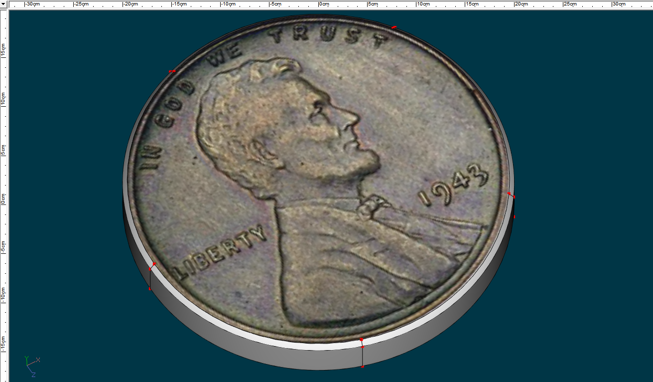
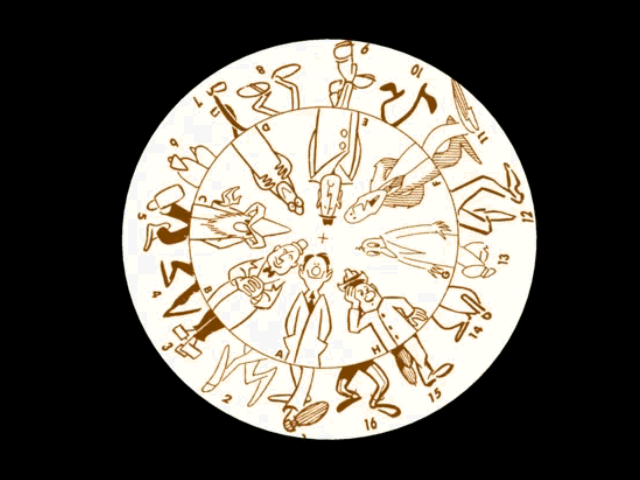
This doesn't specifically address your problem, which others have answered well but because you are using A:M we have an alternative means to decal in situations like this. Specifically, anything that can be lathed can easily usually be lathed with 5 cross sections which allows us to close the ends with 5 point patches. Here are two examples, coin and character spinner. In the latter case the decals are placed on two 5 point patches (click on image or click here to see it spin/animate). The underlying point being that there are several ways to create a patch that can be decaled.
-
Ah, life is good again. Mark Largento back in the game... even if only for the posters! Great poster... great characters! Great fun.
-
This whole issue is of course repeatable so it perfect for a bug report. One question though... In what way does this bug effect use of A:M? Is there any effect outside of the issue going on behind the scenes with the random number? Can you still undo anything? More importantly does it effect anything else? Also, while testing I would uncheck anything that is normally not checked, such as limiting redraws, etc. It's important to start from the normal settings and those checkmarks seen in your screenshot are usually not checked by default.
-
I do remember that! Nicely done!
-
Don and Gary have sweetened the pot of rewards considerably since I first posted and they've been posting regular updates, feedback as well in an effort to show they are serious about their project. At present, with 24 days still to go, they have 1,175 backers who have contributed $114, 393 toward their goal of $550K. It's looking to me like they're gonna get it done. Don and Gary have been listening to feedback from folks that say they would contribute it this or that and so they've added a few resources to include original art, etc. Of possible interest are a few new lower teir rewards such as a digital copy of the 39 page 'Animation: One way to approach it' which was handed out at Don's masterclasses. As mentioned before in another topic I believe this collection includes notes Don has pieced together over the years and passed out to aspiring animators to include Eric Larson's series of notes. I'm not entirely sure about this... Edit: I just check the document I have locally and it contains about twice the number of pages, some of which included material often seen before (Walt Disney's notes to Don Graham about starting up a training course for animators to get their talents up to the task that eventually they could animate 'Snow White' and more). It's possible this document might be the same minus the material technically owned by others... that would bring the page count closer to the advertised 39. At any rate, I'd say the document is sure to be well worth the price of admission as a reward at the $5 tier for contributions. I haven't seen his name mentioned but I'd guess that poor ol' Dave Monahan, who has long been Don's trusted technical assistant behind the scenes will be involved in keeping the flow of information (video feedback, etc.) going. Hat's off to you Dave if that is the case. I may not be especially into Dragon's Lair but I have to say I'm excited to see Don Bluth animating again. What a joy it is to see a master of animation at work. For those that didn't care to watch the interviews above, the results of the animation demo with Dirk swinging a sword has been posted: Link to video.
-
Oliver, Glad to have you with us. You'll be up to speed in no time.
-
I take it checking 'unlimited' doesn't work? I wonder if this has anything to do with the 'finder' issue experienced on the Mac in ages past. Since you are booting to Windows I'd guess not. (Wait a sec... your post says Mavericks so I might be getting that wrong. Try the number 20... just in case. I think that is the default.
-
Thanks Robert! And thanks to those whose renderings more often than not occupy them!
-
just a wooden sword ...Kat's last thread :(
Rodney replied to kwhitaker's topic in Just a Wooden Sword
I know we were just folks hanging out here in the forum but I feel like I've just lost a family member. I wonder if her family knows just how much we enjoyed having her here with us. I hope she knew too. I left a short message on the guestbook.