-
Posts
21,649 -
Joined
-
Last visited
-
Days Won
119
Content Type
Profiles
Forums
Events
Everything posted by Rodney
-
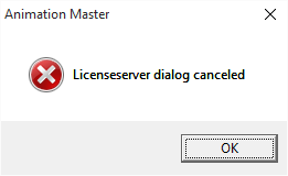
Same error/dialogue box here. Perhaps it is Windows 10 related? (Note that I tried installing in a variety of ways... to include a clean install in its own directory. I've never seen the classroom dialogue before so my first impression was that the installer was for schools etc. that run A:M on a distro'd network) Upon canceling the classroom server dialogue I get a license server cancellation error: Disclaimer: This is definitely not a showstopper for me personally as I run the 64bit release almost exclusively.
- 48 replies
-
- Software Update
- Animation Master
-
(and 1 more)
Tagged with:
-
Jason, The 64bit installer works fine but with the 32bit installer I get a classroom server IP dialogue...
- 48 replies
-
- Software Update
- Animation Master
-
(and 1 more)
Tagged with:
-
Here's what looks like a useful resource in the same general area of interest. (from the folks in the UK) http://www.lipreadingpractice.co.uk/ Here's one on lip reading/sync with rhythm from that same site: http://www.lipreadingpractice.co.uk/Lip-Reading-Exercises/Rhythm/
-
A fun part of the book is near the end where there are practice pages to test your lip reading skill. One joke (from 21 different jokes): What do you get when you cross a flea with a rabbit? Invisitext Answer: (Select and Scroll over) Bugs Bunny
-
I assume it has worked for some folks. Keep in mind that this is an old program. (the book has a 1994 publishing date). Its a simple volume at 97 pages. There is a sample video on youtube: xhttps://www.youtube.com/watch?t=69&v=CQ3L8Hcs8R0 I just looked up the site and they still sell the course. It'd set you back $45 (plus shipping) to find out if it will work for you! Here's their site: http://lipreading.com/ There are some other free lip reading videos out there on the internet that very likely should be explored before spending any cash. Where learning lipsync would probably pay off would be to assist with rigging the face for dialogue for use with fairly realistic characters. The standard open/close model being on the opposite side of the spectrum for cartoon characters. Added: All this makes me wonder if deaf people/lip readers would make better animators of dialogue. .
-
It may be worth noting that all three vowel shapes can generally be replaced by consonant shapes. For example: Blowing is similar to Pinchers Wide is a similar/exaggerated form of Lifters Smiling is a slightly more relaxed form of Teethy
-
-
I've been meaning to post a few examples from a book I picked up years ago at a Library book sale. The book, part of a series of lessons on learning how to lip read... with accompanying video... which was missing when I purchased BTW... echos what most animators have been taught about lipsync but adds a few descriptions to assist with categorization. Those categories include: Blowing Wide Smiling Sealers Pinchers Forwards Lip Biters Peekers Pushers Teethy Lifters In theory, all dialogue can be shoe-horned into one of these categories. This is perhaps something to consider when rigging a face to achieve articulation for dialogue... although they very likely won't cover the entirety of expressions used for exaggeration in animation *unless* considerable exaggeration is pre-built into the expression (i.e. extreme posing that will likely never be used). Note that these phoneme breakdowns are designed to be visual breakdowns of what is observed more than what is heard; thereby making the lessons more applicable to deaf and hearing disabled persons. Here's the first of the images on phoneme's from the book:
-
This is my kind of movie. I'm looking forward to seeing it. xhttps://www.youtube.com/watch?v=O-RgquKVTPE
-
While we may be proud to see folks master all the ins, outs and technical arcana it's a sad day when folks stop asking questions. Folks love answering questions (and exploring areas they haven't explored before) here in the A:M Forum. So keep asking those questions!
- 13 replies
-
- transparency
- font wizard
-
(and 1 more)
Tagged with:
-
We don't need to export a different file. Netrender uses both Project and Choreography files. Just save your Project or Chor as normal then open that file directly in Netrender. These are the same PRJ and CHO files we use to render with Animation:Master. If you cannot run a Render Slave we have two options (that immediately come to mind): - Use regular A:M render to render the files. (my personally preferred solution) - Troubleshoot to determine how to get Netrender fully operational on your particular setup (Linux/Wine).
-

Davinci Resolve (Non Linear Video Editor/Color Correction)
Rodney replied to Rodney's topic in Open Forum
I almost hesitated to post that system requirements stuff because it's not easily decipherable... Yes, keep in mind that Black Magic is first and foremost a maker of digital cameras and associated equipment. So the specs at the high end go more deeply into esoteric equipment than will apply to the average guy/gal. I believe the presence of the spec itself (in this case) means that *if* you have that particular equipment *then* it will need to conform to that (firmware) spec in order to operate optimally. As I don't have that equipment, other than operating a little slow at times due to limited RAM I haven't experienced any issues with Resolve. At times I do think that having a dedicated editing device with the roll balls etc. would be nice BUT THEN I remember that I don't really have a lot of footage to edit to begin with to make the purchase of special equipment worthwhile. One thing I like about Davinci Resolve is that it can be programmed to render out to multiple formats simultaneously (by adding to the render cue) which is quite nice. A workflow therefore might be to render out of A:M (or Netrender) to a targeted (optimal) resolution and then have Resolve color correct and reformat to other formats and styles. I cannot help but think of Yves Poissant when I see options to process image data in the various color spaces and specifically options to process in linear color space. I won't pretend that I know what to do with it all but I'm happy that I know Yves. It helps to know that others understand the more deeply technical stuff so that if I should ever need a more thorough understanding that knowledge can indeed be had and that once the knowledge is gained it can be (appropriately) applied. -
I couldn't locate the previous topic on Davinci Resolve bSo... Black Magic has announced the release of Davinci Resolve from Beta testing. It is now available in free and paid versions. If you don't have a dedicated video editor this is well worth a look, especially as Black Magic also produces the compositing software Fusion (which is not a dedicated video editor) and integration between the two will surely continue as time goes on. The primary difference between the free and paid release ($995) is higher resolution capabilities used in professional studios. The free versions (of Davinci Resolve and Fusion) operate on Mac and PC while the full version works on Mac, PC and Linux. According to their site: Here's a quick run down of minimum requirements for smooth operation: Minimum system requirements for Mac Mac OS X 10.10.3 Yosemite 16 GB of system memory is recommended and 8 GB is the minimum supported Blackmagic Design Desktop Video version 10.4.1 or later CUDA Driver version 7.0.36 NVIDIA Driver version – As required by your GPU RED Rocket-X Driver 2.1.19.0 and Firmware 1.3.19.7 or later RED Rocket Driver 1.4.36.0 and Firmware 1.1.17.3 or later Minimum system requirements for Windows Windows 8.1 Pro 64 bit with SP1 16 GB of system memory is recommended and 8 GB is the minimum supported Blackmagic Design Desktop Video version 10.4.1 or later NVIDIA/AMD Driver version – As required by your GPU RED Rocket-X Driver 2.1.19.0 and Firmware 1.3.19.7 or later RED Rocket Driver 1.4.36.0 and Firmware 1.1.17.3 or later Minimum system requirements for Linux CentOS 6.4 32 GB of system memory is recommended and 16 GB is the minimum supported Blackmagic Design Desktop Video version 10.4.1 or later NVIDIA/AMD Driver version – As required by your GPU RED Rocket-X Driver 2.1.19.0 and Firmware 1.3.19.7 or later RED Rocket Driver 1.4.36.0 and Firmware 1.1.17.3 or later
-
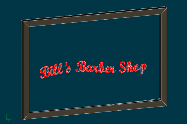
You can also model the entire thing using the font wizard to create the lettering. In that way you don't need to use an image. See attached model for example: Window Lettering.mdl
- 13 replies
-
- transparency
- font wizard
-
(and 1 more)
Tagged with:
-
Radiosity is awesome but takes considerable time. If you just want to splash some color (ala psuedo-radiosity) there are faster ways to get that done. One way being to add a second image into the mix that 'radiates' the scene as desired (such as the original image blurred heavily and then placed back over the frame). Here's a quick proof of concept for quickly adding radiant color to nearby objects (floor, walls, etc.): *with apologies to Matt Bradbury whose image I grabbed from Yves's Radiosity thread. His original image is displayed on the left for comparison Edit: Perhaps starting with an image rendered with radiosity is cheating a bit so I need to find/render another image and start with that. fakerosity_comp1.mov
-
Hmmm... I did click on the link to make sure it worked and... it worked back then. Just now I re-edited the link to remove a doubleURL... and it works again. See if it doesn't work (now) on your end.
-
I don't recall seeing John Lasseter's Cal Arts video before. It's a fun little... at 5:25 minutes actually a rather lengthy... piece. xhttps://vimeo.com/86365423 There are many things that could be said of the short film but one is that... like everyone else who gets the itch to dive into animation... you've got to start somewhere. The prevalent thing on display in the short from my perspective is John's ability to imbue inanimate objects with character followed with a knack for putting those characters into a story with multiple emotional payoffs. Yet another is his extensive use of repetition. In this short... repetition is a major element handled masterfully.
-
IMO this will be your best upgrade (to run the 64bit version of A:M... as I understand it the 32bit version will max out of RAM at 4GB... which most operating systems and associated processes need all by themselves). In short, you really need all the RAM you can get. I run A:M on a Dell Inspiron desktop with Intel HD Integrated Graphics (running Win 10... very happy with that) and approx. 11.9 GB of useable RAM). A few days ago I experienced some odd graphics glitches on Win 10 that I hadn't seen before (and each time the problem signaled that I would soon have to restart A:M). I installed Intel's driver utility and it identified a proper driver update.... installed the recommended driver update... and haven't had the problem since. I would recommend running Intel's driver utility on any system you have in order to make sure you have the best/most current or most appropriate driver. I see no issues with your other specs but will defer to others with better understanding there. I can't speak to NVidia cards as I haven't used one of those in many (10 or more?) years. To answer your question of upgrading from v12... Yes, definitely worth it! Do undrstand that the file format changed at v13 to a more XML friendly formatting so you might want to lock your old files down on a read only format (CD ROM) before saving them in the new format. Newer versions of A:M should identify the files as older version files and prompt for a decision to leave in old format or update to new BUT... it doesn't make sense to stay in the old format because you wouldn't be able to take advantage of newer features/formatting stored in the new file format. Hope that makes sense. Ask if you have any questions and folks will happily join in the conversation. Bottom line IMO: Keep the old files in a safe place and update the ones you want to use to the new format as you move forward.
-
Great show Robert. That was a lot of fun! Congratulations to everyone.
-

resolved Actions work in action buy work differently in chor?
Rodney replied to rusty's topic in Open Forum
It's hard to say without knowing more... Two things come to mind: 1) Perhaps you haven't added all the Actions required 2) Perhaps you've added the Actions but they are offset to a later time in the animation Those would be the first things I'd check. -
Others are joining the effort to create patent free and open media formats: http://aomedia.org/press-release/alliance-to-deliver-next-generation-open-media-formats/ From the Alliance for Open Media site: From Techcrunch:
-
Yes, your activation code will work only on that computer.
-
It's good to see you again Steff. Yes, a good computer is essential. I'd say using WIndows and/or Mac is important but for the brave (that sounds like you) other recipes may work too. It may be worth noting that Hash Inc doesn't support A:M on other platforms.
-
Think you are safe from being tracked in WIndows 7 or 8? Think again: http://www.pcworld.com/article/2978239/windows/microsoft-slips-user-tracking-tools-into-windows-7-8-amidst-windows-10-privacy-storm.html
-
I'll recommend that if travel and attendance is obtainable your daughter attend an event like this: http://www.creativemasterminds.com/ The event itself won't be entirely adequate (it's not a long term thing like diving into college) but will orient the mind and get her connecting with other creative types with similar interests. I'd call it a 'primer of the pump' which is often required to get the full flow in motion (successful understanding and achievement of realistic goals). Events like this, especially if they can be found locally can help orient a person and help them achieve realistic goals. The biggest expense is usually not the course/event itself but the transportation and lodging required to attend. As such finding a 'local' event is optimal. I once attended a week long animation course with Don Bluth. The course itself was worth the price of admission but the travel from Japan to Arizona made the event entirely too expensive. The grounding of expectations... that was worth every penny and more. There is another aspect of this that is important... besides in any course there are (at least) two tiers of people we learn from. While we will learn a lot from whomever instructs a course it is very likely that we will learn even more by interacting with other students. This is especially important to note if one considers that those students will often be the instructors (and peers) of the future. I'm a little impressed that prices of admission for events like this are in the $150 range (low end access). The downside of reality is that the underlying theme is one of 'money grants access'. While understandable... the speakers/event have to be paid for... this is always most unfortunate. The lack of financial means (i.e. money) is always going to leave key people (the yous and the mes) out in the cold. There are tons of events like this being run and more and more appear every day because there is growing interest in our media-centric world. Added: **Events like this are often attended by folks that have spent a whole lot of money and time attending colleges and courses that you (the student) can and more likely than not should avoid.


