-
Posts
21,649 -
Joined
-
Last visited
-
Days Won
119
Content Type
Profiles
Forums
Events
Everything posted by Rodney
-
I should have asked... You might have stated it and I just missed it... What type of constraint is this? Orient Like? Also, make sure your interpolation for enforcement isn't set to Hold or something that is driving the settings to someplace you don't want.
- 10 replies
-
- constraints
- enforcement
-
(and 1 more)
Tagged with:
-
My first thought is that where it comes to rotation is that you may need to change the driver to Euler rotation to ensure smooth rotation throughout the enforcement. Otherwise you might be seeing a bit of gimbal lock in that rotation. In other words what you might be seeing is 40% of one axis of rotation but 50% of another... or some mid term blend of both. Added: I have seen some cases where I need to save/reopen a file before rotations appear as I think I've edited them. This includes seeing the channel spline representations of rotations which don't appear until the file is refreshed.
- 10 replies
-
- constraints
- enforcement
-
(and 1 more)
Tagged with:
-
Got a chance to see it today and the rendering was most definitely impressive. The story... I'm still trying to assimilate it. I won't give away any spoilers here. I saw it in a standard theater but this may be one of those movies that is well worth seeing in 3D or better yet IMAX.
-
-
I haven't plugged anything from Aaron Blaise in quite awhile (although he's been quite busy). Aaron has just released a video that outlines what I find to be missing from most computer animation lipsync/dialogue and something that quite often character rigs don't allow for out-of-the-box. In short, it's not about the mouth shapes so much as it is squash and stretch and shape change of the whole face and body. Well worth the few minutes it'll take to review the lesson: xhttps://www.youtube.com/watch?v=rYPx6sGZzow
-
Very interesting juxtaposition of timing. Disney needs a movie like this in its lineup. *I'm (not so secretly) hoping 'Zootopia' is Disney's ramp up (furry critter tech-wise) to a new 'Robin Hood' feature or better yet... series.
-
It almost sounds like you are talking about Add Mode (A key) versus Add Lock Mode (Shift A). Both are still in A:M but Add Lock was removed from the menu back when stitching was introduced (circa v11). It can be added back dragging and dropping the icon onto the menu bar. Regular stitching (in my estimation) is so much better though. It'd be interesting to see a screen capture of the problem. I feel like I've stepped through a distortion zone as I don't understand this expression either. What would you change the point type from/to? (in other words, I don't know what a point type is) Fuchur said: Shift-Clicking splines still works to connect non-continuous splines. Those still create patches. So, not sure what you refer to here that wouldn't still be working. I'd be good to solve this mystery. P.S. If you don't have the most current v18n downloaded and installed be aware that the first v18n installer didn't work... but I don't think this is the problem as that would be very obvious by now.
-
Shift Clicking to create a patch... does not compute. What exactly is it that you are Shift Clicking? Connected splines are what normally create a patch.
-
I'll have to confirm but I think it was, "You can draw. Why not try?" on the back cover. But yes, that's the book. Keep in mind that Preston Blair created two books on animation... that confuses people, myself included. Multiple editions, a few with title changes, further adds to the confusion. The current edition (mostly) combines those two books.
-
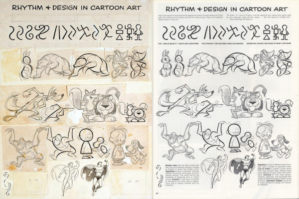
Here, I believe for the first time ever, is a side by side comparison of one of the comp pages and it's final format. For those of you who were born after Photoshop... this is what folks had to do before the advent of digital compositing.
-
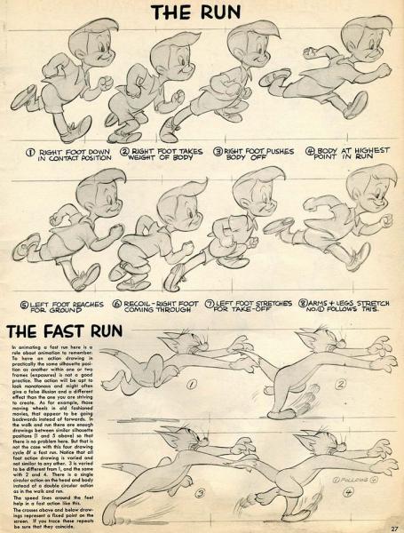
Here's the final art for the work setup above: And up next, a page on 'The Run' and 'The Fast Run', the latter of which has the character Tom from 'Tom and Jerry'... obviously a copyrighted character that might prove to be problematic.
-
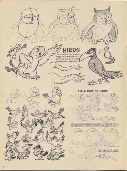
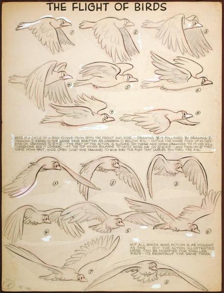
The book on animation by Preston Blair came up in anther topic. I thought it might be interesting to see some of the original art as it was put together to be published. (I'll try to organize these a bit more later) And here's the place where most folks go to find the books original scans: http://animationresources.org/instruction-preston-blairs-advanced-animation/
-
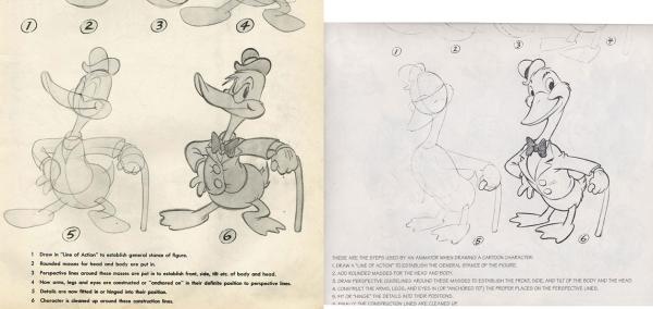
This isn't the content of the entire book(s) but it is a side by side comparison of the primary pages under consideration: http://duck-walk.blogspot.com/2006/05/variations-on-theme.html Attached is one of the page comparisons. Original on the left and updated character on the right. I ran across some copies of the original artwork (scans that is) that were up for auction... now that was neat... seeing what was pasted onto the page... what was whited out. it's fun to see the actual creative process. Most of those scans are still online. It's interesting to note how much text was changed from version to version as well.
-
Thanks. I fat fingered that typo! I'm innocent I tell ya! You should have seen all the typos I fixed prior to posting but that the forum's spell checker grabbed and underlined in red. Hmmm... yes, most definitely... and this may be why enthusiastic/exaggerated expressions in recording sessions are favored as they lend themselves to 'better' character animation. I can't count the number of times I've read/listened to interviews with animators/directors who talked at length about the process of finding just the right voice for an animated character. Then there are the times when an artists praises the work of voice talent by stating just how much was there in the voice that allowed them to express the personality of the character. This relates to Richard William's emphasis on 'progression' in dialogue and how that progression improves the delivery of dialogue. My recollection being that he said he struggled for quite some time with a performance until he hit upon the idea of progression (specifically in that instance of moving the character forward in the available space as the dialogue was delivered).
-
As translucency is primarily a setting in a Named Group I'd would say that image maps (patch images) can be created to drive that translucency. I don't recall decals specifically having a setting for translucency.
-
I haven't check out the link yet but decals do effect the SSS in A:M. I'd have to check again to see what effect patch images might have but varying the color on layered patch images should also have an interesting effect. While I know there is some difference to the current approaches when I first saw the idea of SSS being controlled by image maps my thought was... I think A:M can already do that. It's well worth the look into what effect various maps can have. Thanks for the video link. I'll check it out.
-
Incidentally (although off topic)... It was while working as an instructor in Minneapolis, MN at Art Instruction Inc. that Charles Schulz worked with a fellow instructor Charlie Brown, who along with many of Schulz's acquaintances would also lend their names to the famous 'Peanuts' gang.
-
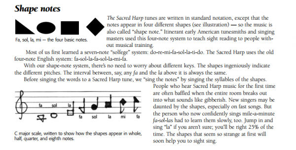
Once upon a time I was attending the wrapup gathering at Martin's house for initial foray into 'Tin Woodman of Oz' and suddenly felt the urge to depart wisdom to Martin Hash. Martin had just revealed he had a boxful of the original Preston Blair books on Animation and wow, what treasures they were*. With regard to the Preston Blair approach to lip sync I explained that I thought it should only take four or five shapes to account for all that was required for lip sync**. Martin graciously nodded and smiled as if to say, 'thanks for stating the obvious Rodney' and the conversation pressed on to other things. But the idea of using limited shaping for lipsync still reoccurs from time to time. As this is something I've wanted to explore for awhile but lack the musical skill to properly investigate I thought it might be worth exploring or at least setting into a more proper perspective here in the forum. Firstly, the general down-side... This whole realm of interest is not unlike use of mechanical methodologies such as use of an automated dopesheet to drive movement (lipsync or otherwise). In A:M this would extend to such plugins as the Midi or Amplitude plugins, or any other method to use data to articulate movement. This is akin to programming using a script or expression to state 'for every x do y'. For the uninitiated 'shape note singing' is the basic genesis of the idea. Shape note singing, often referred to as 'Sacred Harp' due to the hymnals that first were published for its use, was introduced in order to expedite the teaching of music where other methods were considered harder used. As near as I can tell there are two primary approaches to shape note (singing). The first uses four notes and the second seven (to account for all the notes in the Do, Re, Mi, Fa, So, La, Ti scale. The four notes used in the former are 'Fa, Sol, La, Mi'. Although I am aware of no direct connection, I equate these two approaches with that of the general idea of using FACE and EGBDF on the notation of a musical scale. I've attached a couple graphics that illustrate the general idea of note shapes. Two are from the wikipedia write up about shape notes and the other from 'Beginners guide to Shape Note Singing' by Lisa Grayson. I suppose this mainly demonstrates that there are just as many approaches to lipsync as there will be people willing to set their minds to publishing a system for formulating it. But there does to appear to be a general approach that can account for the articulation of mouth, face and body. Is one approach better than another? I suppose it depends on the person and the work to be done. The simplest approach of course is on/off (ala the muppet's open/closed approach); it's either in one position or another with added accents from the body, environmental interaction. There are a whole lot of variations that can be produced by per-centing arbitrary measurements from an otherwise binary on/off scale. *The original Preston Blair book on animation has been covered variously online but the important distinction is that the original book published included characters that were under copyright by other companies and so Preston Blair redrew those characters and the book was republished. I don't think Martin realized how dangerous it was to put a box full of those original books in front of me. It took all my strength to resist the urge to appropriate one. **The origin of my thoughts for a four/five point system (for dialogue) actually stems from an earlier premise for full body articulation. If I understand correctly that in turn came from puppeteering where there are five primary (suspension) points used to animate a puppet (head, two arms and two legs... or neck, two hands and two feet). The book where I saw the method briefly illustrated was from a collection of art correspondence from Federal Schools Incorporated bound in a book titled, 'Illustrating and Cartooning' which I assume the recipient had personally bound into a single (incomplete) book. The Five dot action approach was presented in the lesson as a method for 'chalk talks'; used for rapid drawing in front of a live audience for the purpose of entertainment on the standard technology of the time... chalk boards.
-
I'll add the following to the mix for info purposes. This is only slightly modified from one of Martin's papers: So, I take it that A:M can read through a spline's CPs to determine if they can form a valid patch. Or put another way: I shall now guess that inverting a selection loads the new data into memory which by itself might jumpstart the recognition of an area that is valid as a 5 point patch from what previously was not known to be valid because it hadn't been saved/loaded but merely selected. I'm sure there is a way to test this to determine whether inversions allow for this to be true on not... ...
-
The Period.Period.ShiftPeriod method works so well that I might submit an A:M Report requesting 'Shift +.' be set as default/permanently for 'Make 5 Point Patch'. In this way the standard answer to the question of troubleshooting 5 point patches would be, "Hit the Period Key twice (invert selection/return to original selection) and then Shift Period (to create the patch). Hmmmm....
-
Here's a short video of me going through some randomly splined shapes and turning them into 5 point patches.. There are a few surprises (for me) along the way and in one instance... I almost... almost... think I find a 5 pointer that won't activate. In the end that one gives in and forms a valid 5 point patch too. The one example I should have included is the standard one that you demonstrate via your post. Spline layouts like that are often created for places where arms or legs or necks will extend out of an area. But those areas are just as easy to troubleshoot. My hope would be that folks approach 5 pointers with a confidence that they can and will form valid patches. I get a sense that folks avoid them because they run into these cases where the 5 pointers don't immediately work. The easy solution is Period.Period. If that doesn't work, inspect those connections a little closer and reattack! Edit: Glad to see it's working for you! I like that. Added: I should include for completeness sake that we can assign a shortcut key to selecting that 5 point patch icon. I recently assigned Control 5 as my shortcut keys (but should look at a better combo to go with hitting the period key twice... pehaps Shift Period? (I'll try that) In this way we can quickly hit... Period.Period.ShiftPeriod (or whatever final key combo) and fix those troubleshome 5 point patches. Edit: I think Ima gonna go with Shift Period that works well. 5pointers.mp4
-
Fuchur means period key here. The period key inverts any given selection. If we use the comma key A:M will sound a loud blast of Pong! Pong! Pong! for every time we use the invalid key command after selecting Control Point (CP). (Note that hitting the comma key after selecting a spline I believe will just have A:M sit there and stare at us... doing nothing... as if to say... yes, I've selected the whole spline as you requested...um, what else is it that you want me to do with that comma? My understanding is that A:M only knows how to select the remainder of a spline via the comma key if a spline, not a CP or set of CPs. Edit: What Robert lectured. Added: I'm tempted to capture a video of me making 5 point patches rapidly with all manner of selections to demonstrate just how useful deselect/reselect is when 'troubleshooting' 5 point patches. If we aren't using the period.period. method we aren't properly engaging our wannabe 5 point patches. It is important to note however that just because we can make a patch does not mean we should make that patch as A:M will allow us to create less-than optimal patches.
-
Close but nope. HIt the period key twice. Period. Period. Once to select the complement (inverse) of your selection and then once again to have A;M reselect your original selection. This is an easy solution that is a little hard to explain but I'll give it a try. A:M's basic rule for 5 point patches is similar to the rule for any valid patch and A:M's eternal question (it asks itself as we are modeling) is, "Is this a valid patch?" If the answer is yes it renders the group as a patch. If no, then it doesn't. I suspect in cases like this if you were to follow the splines all the way around to the other side of the model you might discover that the spline is one very long continuous spline (or at least a selection that A:M has determined is not a valid (5 point) patch. But here's the thing... we CAN make a 5 point patch out of a single spline! We just have to tell A:M that is something we want to do. So, we can select our set of 5 Control Points, whack that period key to get everything except those 5 points and then... whack the period key again to (properly) select the 5 points. *I* suspect that A:M is reordering these points in some internal matrix and after the reorder it 'sees' the selection as valid for closing as a 5 point patch. Hitting the period key twice after selection (and having the 5 point patch indicator stay greyed out) is what I'd call the 99 percent solution. It works (for me) *all of the time*. The only exception (when it doesn't work) is when the selection isn't valid for forming a 5 point patch (i.e. I've selected at least one CP that isn't congruent and would not properly form a patch. Sometimes this is because I'm trying to make a 6 point patch and don't realize I've selected that 6th CP. Sometimes it's because I've only select 4 CPs. More often than not, I've selected 5 CPs that share the same spline or that or not congruent (i.e. do not form a valid patch) and A:M (initially) think we will not want to make that selection a 5 point patch. In other words, A:M sees our selection as invalid for forming a 5 point patch. So, WHACK... do NOT gently select... thy period key... TWICE!
-

playing with a new character just for fun
Rodney replied to johnl3d's topic in Tinkering Gnome's Workshop
Hehe! Cute little guy. Too short John! -

Old Character- New features... lookin good!
Rodney replied to John Bigboote's topic in A:M Rendering
Yes, there is a trick to posting larger animated gif files. The process is to upload the gif file first then go back in and edit the file linking to the initial animated attachment (instead of the generated thumbnail). Unless linked in a separate post this will results in two images displaying in the post one static thumbnail and the original animated attachment. The alternative (as you've seen) is to reduce the size of the file because if the images is small enough not to require a thumbnail the forum will just utilize a link to the original attachment. So for instance, to post the animation from your earlier gif we would Right click and select 'Copy image URL' or whatever equivalent in the browser of your choice. Then past that URL back into the post and submit: https://www.hash.com/forums/uploads/monthly_11_2015/post-3042-0-13788400-1447947855_thumb.gif Note that in order to copy the URL you'll have to have posted the attachment. At this point we want to remove the following text from the URL in order to get the full animation to link into the post rather than point to the static gif thumbnail the forum generates automatically. The text we are looking to remove is: '_thumb'. Thus making the URL posted into the image: https://www.hash.com/forums/uploads/monthly_11_2015/post-3042-0-13788400-1447947855.gif Which displays: Bottom line: URLs with '_thumb' at their end are statically generated in the background via the forums code. This is because the forum has a set limit for size of images shown in via attachment... larger images then get the thumbnail treatment that links to the full size attachment. For gif animation I assume the code grabs the first frame of the animation (as if the gif file consisted of a single image) and uses that as the thumbnail.


