-
Posts
21,649 -
Joined
-
Last visited
-
Days Won
119
Content Type
Profiles
Forums
Events
Everything posted by Rodney
-
Nice! Folks like to give the old HB cartoons a hard time but they are great stuff IMO. And the lessons of limited animation are highly applicable to computer animation. I wish the classic HB shows were playing today instead of some of the craziness they've been showing. Aside: Seeing Huckleberry here reminds me of Martin's story about taking his software to HB and pitching its use to them. I am confident they'd still be in business today if they would have taken him up on his offer.
-
Don't shut up until after you've added your report to A:M Reports! That would defeat the whole point of your request.
-
I must assume there is some reason that the default interpolation cannot currently be set. I'm not sure why that would be but one might be that folks might leave the interpolation set to something other than spline and then think A:M was broke or something. Another might be that spline interpolation is considered more prevalent? Superior? Yes, I'm guessing. I believe the feature request might be best written as making the interpolation method 'sticky'. In other words, what ever the interpolation was set at would remain until specifically set to something else. In this way when you close down A:M it would store the current interpolation as the default interpolation. This of course would have the same chance of confusing those of us that would surely forget what interpolation we had set. In either case the fault (or credit) would be entirely ours because we'd be the ones that set it. If made sticky then it would logically follow that wherever that sticky setting was stored it could be altered/set as a global variable.
-
An article recently posted by Mark Kennedy on his blog addresses this issue. He writes it as, "Create the thing you want to exist in the world." http://sevencamels.blogspot.com/2013/05/cr...t-in-world.html You can spend a lot of time trying to fulfill someone else's needs but that focus is generally misplaced. As Robert said, "No one knows anything." But even given this deficit YOU know what satisfies your need to be creative. Your creativity should prove sufficient. *I love the word 'prove' in the old world sense of the term. It means 'made reliable, trusted, tried and true, to fully test'. It's mostly a matter of routine maintenance and that of daily testing and retesting. When David went to face Goliath he set aside the King's armor because it hadn't yet been proven; that is to say it could not be trusted because it hadn't yet been tested. Creativity is like this. Folks will always doubt your approach, ability and resolve and most of the feedback you'll get will suggest the endeavor is not worth the effort. What they fail to understand is that in the realm of creativity, you are the one who defines success.
-
RE: Robert's post on setting the default interpolation of the Timeline This is one of the reasons that discussions like this need to be had. Quite often a feature exists but how to access the feature is not well enough known. When questions are asked and answered, wishes can come true *poof!* just like that. A:M has so many features that it is easy to lose track of them. As such, I had forgotten where to make that default interpolation adjustment myself. And like Tore preferring to have keys automatically set to Hold... I also prefer that.
-
Thanks. Working on this roto has reminded me how much I miss drawing. I've got the time to do that now but now that I do I don't ever seem to draw. Isn't life funny like that.
-
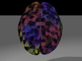
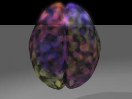
I note that there is an interesting phenomenon going on that some have actually struggled against but that can be used to nice effect for glow/transparency. Note that in the second image above how the glow is greater in the area where no ground plane is. This suggests that if we want to increase the glow in certain parts of our model while decreasing it in other areas we simply need to place (or remove) some geometry directly behind the model. As this could be useful later on... note to self... note to self... note to self.
-
Failed attempt with an ultra simple model... Things that I thought worked: - Using a checker material to try to get the color variation. - Modeling only one half of the brain and then duplicating the other half in the Chor (scale the second instance of the half brain -100% to get the other side of the brain) - Flipping the material in the second model to achieve the reverse effect of color Things that don't work so well: - Doesn't capture electric feel - Surface Roughness doesn't achieve brain folds effectively. - Need more transparency throughout* - No glow* *Note that in these last two cases they can be achieved by adjusting the surface properties. Added a render with glow and transparency tweaked. Note that for the material I just started adding random nodes/colors. I didn't make any attempt to be accurate. As such some nodes could be deleted with minimal effect over all. ColorfulBrain_Failed_Attempt.prj
-
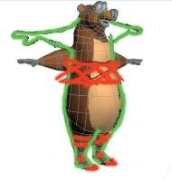
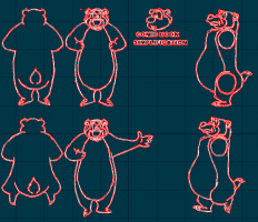
Looking good Paul! The primary area that seems to stand out as 'off model' is the origin of the shoulders/arms which in your model is really low and in most of the imagery/references appears to begin just below the head. Some minor simplification of splines might help in making him more squashable and stretchable which is something I'm confident you'll be wanting. The other option might be to lower the head down to the shoulders. In drawing the rotoscope I had to make a compromise in the angle of the arms going out to the side in that they curved downward more than they remained horizontal (as in your model). I'm tempted to suggest that wherever you have a shape you might strive a bit more for a curved line. By this I mean to say that your model appears to have real bones and anatomy whereas Humphrey's construction only hints at that underlying structure in a minimal style. The example of this might be seen in your model's knees which in most reference aren't nobby knees but two parts connected together in a classic Disney/Warner Bros line. Can you post a render or two from the front and side views? That will help with the analysis. He's definitely a bear right now... and a good looking one... now he just needs to be pushed a little bit more toward the likeness of Humphrey. I'd say the eyes (mischievious), shoulders (hunched) and knees (streamlined) are the primary character identification areas to focus on. Added: I've attached a crude drawing that attempts to raise the shoulders and simplify the mid section. By raising the shoulders/arms you could then remove some of the midsection to achieve easier squash/stretch in animation. I would also make the toes more pointed. In some instances it's almost like he couldn't bare his own weight whereas with your model's wider toes he'd have no problem there. You might be able to achieve that tapering effect simply by scaling the toes down smaller toward the ends. There should be some of that tapering/sharpness in the fingers as well. There aren't too many places on Humphrey that are sharp so you'll want to place some emphasis there. It's a bit hard to see detail in the face of your model and that is a clue in and of itself that suggests you might want to further exaggerate the whites of the eyes and add those largishly dark and expressive eyebrows.
-
These renderings just keep getting better and better.
-
Thanks for posting that Robert. I've been itching to purchase a new computer (a desktop) for quite awhile now. If I could find the right setup I might spend some money.
-
Sure is. He's a busy man these days so go easy on him. He goes by Yoda64 (presumably to distinquish himself from the other 63 yodas that are considerably less active than he is). http://www.hash.com/forums/index.php?showuser=218 Added: What you've got going sounds like a very cool project.
-
Keep in mind that the current trend is to move away from UV mapping entirely (at least in the standard sense of that term). It is interesting to note that while the world in general is moving away from classic UV mapping, some A:M Users are trying to move toward them. It's a fairly awkward situation and my gut feel is that a more perfect solution/workflow should be explored that is more spline/patch-centric. For where Disney/Pixar is trying to push the industry reference: http://ptex.us/overview.html
-
Tore, It's great to see you here again. I expect you want to talk about the items on your list (and that is a good idea because some things might already exist or have effective work arounds/approaches already but ultimately keep in mind that in order to make any wish list a reality you'll want to add those line items into A:M Reports as feature requests. You never know when one of your requests may sync perfectly with something Steffen already has planned to bring to reality. Keep in mind that when posting 'wish lists' to the forum you are not requesting new features so much as saying, " I really want to talk about/explore my thoughts on this". The reason there are not 'wish list' topics is that wish lists are to be filed in A:M Reports so that they can be better understood, considered and prioritized. Those reports help define the future of A:M.
-
That was fun. It's good to see an animation contest running in the forum again.
-
Stefan, If you can get in contact with Steffen Gross, he's got the current (or most current) Software Development Kit (SDK). There should be some good info on how to interface with Actions files there.
-
So very goooood! Love it. Good grief man. If you can do that on your first attempt there is only one thing to do. Model more!
-
I'm arriving late to the party as well. Hope it was a happy one Lloyd and Jason!
-
You are on a roll. Very nice!
-

The Passing of a Titan (Paul Forwood)
Rodney replied to Paul Forwood's topic in General Announcements
Paul would have been 61 today. It seems appropriate to reflect on the man, his talent and generosity even as we are reminded of how much we miss him here in the A:M Community. -
In contemplating the next A:M Extras I've been looking at some of the older models/characters/actors and almost all could use a little refinement. I suppose the real question is... how much refinement and in what direction should the models be pushed? Here is basically the same model as uploaded by John Henderson above but with two groups added to suggest skin and pants. Any thoughts on this character? What would be optimal to bring him forward into the modern age of A:M? The primary area that I would likely focus on in updating this particular character might be the hands. Maybe that and link him with a few default props, actions or poses to suggest a possible personality (a starting point to work from when users download the character). Perhaps folks can even suggest a name. HeavysetMan.mdl RunningPose.act
-
Thanks Paul, I only see the flaws (which are many) but hopefully that will give you a starting point. One of the reasons I wanted to do an animated turnaround is that it reduces those flaws considerably. For instance, in between the front and side views of the head we have something of a problem with the smiling face on the front and the frowning face from the side. The comic book simplification is a quick overtrace of a Humphrey face I saw posted in a comic book. The corners of the mouth really irritate me and even now I want to go back in and resolve that by having him smile (or frown... or both) from all views. There are a few 3D recreations of Humphrey already out there in the wild and those would be great to get up close and personal with. One is a figurine based on one of the old animated short films. One is a teddy bear. And the other is the bottom character on a life sized totem pole in Disney's Wilderness Lodge. As far as reference goes, I haven't looked through all the Humphrey shorts themselves and I'm sure there are some very nice views to choose from in those. Example: kcaQ4P7qn38 Hooked Bear Q7JhGMXvDP4 Donald's Fish Fry Perhap's the classic Humphry the Bear short (with a ton of bears duplicated all over the place) is in the 1956 short 'In the Bag': 4ol28kPTqa4 Of course there are many others to include 'Bongo' which is a great short to study because of it's higher quality. Interestingly, one of the directors went on to create other, almost carbon copy versions of Humphrey for other studios. Those can provide decent reference as well. And there is Yogi bear too which is something of the ultimate oversimplification of Humphrey. In yet other news there is Humphrey B. Bear who only looks like Disney's Humphrey on occasion.
-
What I find particularly nice about this workflow is that these two files, the image/decal (.png) and the model/spline roto (.mdl), are generated from exactly the same file; an adobe illustrator (.ai) file: AI_Import.mdl
-
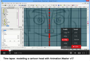
Don't forget that there are several ways to slow down video via youtube. One is to view the video in HTML5 enabled view. Of course then you'd lose Marcos's relaxing music... (I suppose you could play the faster version in the background though) You can watch it even faster too! (Watching someone model fast is a good way to get rapidity going in your own methods)
-
Here's a spline roto that came from the raster to vector test I did with Xara Xtreme (which over here the Tinkering Gnome noted was free until 20 May): Why use a standard roto when you can start from a spline roto instead? Note: The results here are using default settings across the board. Simplifying the results in Xara would reduce the splines coming into A:M considerably. Edit: I removed the model for now because it is entirely too spline heavy. I'll adjust the settings and upload it again later today. Added: Uploaded a simplified roto:


