Rodney
-
Posts
21,649 -
Joined
-
Last visited
-
Days Won
119
Content Type
Profiles
Forums
Events
Everything posted by Rodney
-

I'm losing chor constraints between models when I close...
Rodney replied to rusty's topic in Animation:Master
A new topic right here in the main A:M forum would work well. We can always move it to a more appropriate place later (if necessary). -
You'll get a lot of different ideas on this. I'll offer one... or ten. I like the first phrasing. The head, eyes and mouth all seem to work well. At the word "Wow"... although this seems to be said sarcastically it still has an accented spike to it and that doesn't come across in his eyes/face. At the end I'd delay the initiation of the smile just a little bit more so that there is a revelation of Picard's emotions appearing on his face for the grand finale. As irony seems to be his intention a slight micro expression of anger/superiority might work well just before going into the final expression. (I'm thinking primarily of his brows furrowing slightly here) I would be tempted to have Picards arms go behind his body as well to get some shoulder motion into the scene. Added: The most important part of dialogue isn't lipsync but rather body orientation. Consider how Picard might be rocking back and forth on the heels of his feet while pontificating. My over all suggestion would be to play with the body more (put on your Milt Kahl cap here. Milt was a master of using all available screen real estate). Consider that Picard might be slightly turned or leaning one way at the beginning, then turn slightly away from camera and then finally press in for the final phrase back on camera. Over all that is a nice take!
-
I believe this is one of the reasons the Special Topics were initiated.. Of course, another is to showcase cool stuff. In this way workable ideas quickly spin up into production. In almost every case the initiator of an idea is its greatest champion.
-
Nicely done! You are on to something here.
-
I'm losing chor constraints between models when I close...
Rodney replied to rusty's topic in Animation:Master
I'm not sure if we fully established what Chors save that Projects do not. I know we did establish that Project files were unnecessary as long as the Chor file was saved. -
I'm losing chor constraints between models when I close...
Rodney replied to rusty's topic in Animation:Master
Any external file that is introduced to the project file later can be expected to be unembedded. This is why we can safely have some files embedded while others are not embedded. I think we are chasing tails here. But I don't want to leave this variable dangling. As suggested before it isn't necessary to embed everything. I was simply suggesting that if your desire is to embed everything then you should be sure to 'Embed All' just prior to saving. The process of fully embedding files in a Project is easily tested: Create New Project Create New Model Embed All Import (different) Model Save Note the little disk shaped icon that is on the imported Model that isn't present on the created (embedded) Model. This indicates that the file is saved externally and therefore NOT embedded. Now do the same test but embed just prior to saving: Create New Project Create New Model Import (different) Model Embed All Save Note that no Models are external (there is no disk shaped icon on the Model in the PWS). All files are now embedded This may not resolve your constraint problem but it is a better workflow if you expect all files to be embedded. There aren't more steps in this workflow you simply don't have to Embed All at the beginning (which is an unneccessary step)... do that just prior to saving instead. If you have any external files that are constrained to internal files and the external file is not located where the constraint expects it to be that constraint will fail. In fact, it has to fail because the target is no longer there. Again, I am not suggesting this is the case with your situation and perhaps addressing a different problem while ruling out an important variable for this case. This is especially true if you cannot see any reason to Embed All just prior to saving. If you do not intend to embed everything in your Project then performing an Embed All just prior to saving wouldn't be desireable because it will embed files that you desire to remain external. -
Nice interior shot!
-
Here's to another year of animated creativity! Happy Birthday Gerry!
-
The links: ftp://ftp.hash.com/pub/misc/Data.zip (This is a 158MB file with extra files, characters etc. ) Note to Rusty: You should already have these files on your last A:M CD. ftp://ftp.hash.com/pub/misc/LittleData.zip (This is a 7.5MB Data file that primarily has the file you already get installed with A:M) More recent files contributed to the community are found in the Extra DVD and in the A:M Exchange area in the forum. (I believe you have the Extra DVD already) Extra Data DVD via Hash Inc Store A:M Exchange Resources Center (Forum Area)
-
In all my years of using A:M I have maybe edited the registry once and that was to experiment to see what would happen. Sorry, can't help you here. The equivalent of this for me is to purchase a new computer every couple years or update the operating system (when ideal). That helps to keep all the cobwebs clear. What Robert said. Not all computers/graphics cards have SSE4. If you do have it, installing the drivers should help accelerate computations. Additional Information: http://en.wikipedia.org/wiki/SSE4 Pro: You could use the Timelog to track how long you use A:M (useful for billing client purposes) Cons: You'd still have to track the timelog entries and if not needed it's an unnecessary event that launches with A:M.
-
There may be several good reasons for creating the iris effect with simple geometry but then rendering that out as a image sequence first before applying it for the effect. One reason is that then you have that effect available for use in other projects. Another is that you don't have to keep reanimating that same effect. Yet another (or several) is that you can retime/alter that effect. It can help to think of these camera transitions devices in terms of black and white and/or grayscale. One reason for this is that you can then apply that transition to the original image and have it literally fade the original image as opposed to obscuring it in some way (i.e. the shot could transition to a different scene in the background if the image itself fades) Sweeps and swipes an be accomplished in a similar way. Whatever you want to disappear color as black (transparent) and whatever you want to remain color white (opaque). Apply this as Transparency on a single patch that has the patch image of the sequence you are trying to transition out of then animate the frames of that patch image to adjust the speed of the effect. As I said though the cool part of this is that when rendering you'll get access to the transparency so that you can then place this fading sequence over another background, scene or sequence. I like Robert's approach but the downside is that it is a bit more complicated to make the basic template and then to create other templates whereas with using simple shapes/geometry and patch imagery we can quickly adjust any effect to taste and even layer the effects. What I would do with Robert's technique is use those materials to create really high rez transitions (in grayscale) and then apply those as patch images on a single patch to create the final effect. For more complicated effects simply stack a few more (independent) patches over the top of one another and then render that out. Where geometry often works best for transitions is where something (or some character) is interacting with the effect (i.e. Porky Pig grabbing the closing iris to suggest 'Tha... tha... tha...tha...tha...that's not all Folks!' yet.
-
I'm losing chor constraints between models when I close...
Rodney replied to rusty's topic in Animation:Master
It has a lot to do with the target of those constraints, especially if you are constraining two models to each other. If the model is either not there or has changed then the constraint will fail. This aligns with Mark's ealier observation of the constraint targets not being in your earlier screenshot. Perhaps the targets weren't there because (after setting them) they simply were not saved. Note: This is generally not a problem with constraints because they are within the same model. When constraining external models together it introduces additional variables; specifically that those external relationships must never change. If they do the constraints will fail. Consider: In your video you imported Model and then immediately embedded (I would never bother doing this because it isn't likely to embed everything... some variables may be introduced later that nullify this). But this is okay, you can embed as many times as you want and that'll be okay. *Now here's where I think you might be going wrong* When you import a new Model into the project from an external source (versus creating it new in the Project itself) it isn't automatically embedded. The reason for this is that A:M thinks you want to maintain that link to the external Model so that changes you make to it will be automatically reproduced (in that Model) elsewhere. Now follow me here... If you fail to embed immediately before saving A:M will not embed external links. So why did the Project file that you shared with others fail for you both before and after but not for everyone else? I'm not entirely sure about the before part (perhaps you tested the file before embedding and saving) but the latter was likely due to your current workflow which has you regularly importing the files again. The fact that your resources are on a network in a variable in this in that any external resources will fail if they are not in the same location. A:M however does a pretty good job of telling us if the external resources are missing so I don't think this is particularly relevant to the issue. I watch the video but was a bit confused by the mouse appearing to click other places than where it really did. I'll watch it again after offsetting my spatial calibration by a few inches. Unless I am mistaken, I did not see you 'Embed All' again before saving. When embedding, my suggestion is to *always* embed immediately before saving. I can't think of a good reason not to do that unless there is something you specifically do not want to be embedded. I would be curious to see what difference there is with regard to the constraints (if any) if you embed just before saving. Of course if embedding the Models is counter to the goal of having the modular parts of the master model then I understand why it would not be optimum to e embed them. If expecting all files to be embedded you really MUST 'Embed All' just prior to saving. If nothing else doing this will remove some significant variables in troubleshooting the issue. -
I'm losing chor constraints between models when I close...
Rodney replied to rusty's topic in Animation:Master
Apologies for retyping what you've already typed. I'm going through line by line to see if anything stands out. Workflow Create New Project Import the 'head' and 'body" models Create a Chor Implement constraints Visually review and test constraints to ensure everything works Save Project (unembedded) Exit A:M (Note: This workflow worked/works) Problem: All tests to date with everything embedded in the project did not work. (although sometimes they inexplicably did) Repeating the above steps but embedded everything, set constraints, tested, closed and reopened. Constraints FAILED. Question: I'm curious... did you embed again before saving and closing or only before setting constraints? Two other tests: Embedding one model first then the other (in separate tests) results in the constraints working in both cases. Results: When everything is embedded, the constraint(s) fail. If either model (but not both) is embedded the constraint(s) work. If neither model is embedded the constraint(s) work. Query: Does this indicate that only on my two PCs and only if the (file?) gets too big, the constraints will fail? I don't find that to follow logically. As you say this should be fairly straightforward to test. The only thing that stands out to me at this point is that you may not be fully embedding all the files in your Project *after* you have set the Constraints. If this were the case then when opening the Project again the Constraints would not work, just as they are not working in your specific case. When dealing with pre-saved models that are then embedded into a Project there is a chance (due to many the variables of workflow) that the models are not actually embedded. I would be also curious to see if saving/reusing only the Choreography would maintain the constraints. Rationale: You may not need the whole Project if you only need the Choreography Precedent: Chors were used instead of Projects in Tin Woodman of Oz. -
I'm losing chor constraints between models when I close...
Rodney replied to rusty's topic in Animation:Master
There appears to be something different about your workflow. I have several theories but not enough information to speculate much further. At a wild guess I'd say that you are not using the saved Choreography that maintains the constraints but I don't know why that would be. When animating.... or wherever you are experiencing the problem... are you ever creating a new Choreography? This was not likely to be the problem (not impossible but less than 1% chance) Likewise, it is probably (that is to say a high probability) not due to installation. The problem with pursuing these lesser options first is that if the problem gets fixed you might inadvertently credit the wrong thing for the fix. If someone suggests formatting a harddrive... I swear I'll roll my eyes all the way around my head. It is likely that you are doing something different in each of these cases. If we can find out what that difference is then we'll be in on the fix. As that is workflow/location specific we need more information. Perhaps you can screen capture your attempts? If you don't have a good screen capture program try screencast o' matic. -
A fine looking group! If I may be so bold to say it I think Nora might be a little tall. We'd need to see them side by side for better comparison. At a guess I'd say she needs to be just tall enough to have to stand slightly on her tippy toes in order be able to kiss Latimer.
-
And you are proving that multitasking can be a very effective way to proceed. I'm liking the way you are headed with Cleo. If I may, I would like to suggest you do everything within your power to make her 'pretty'. My rationale for this is several-fold. Firstly, most villainesses aren't particularly pretty. Secondly, Cleo is artificially enhancing her prettiness in the Land of the Dead, much as she did in real life. If you have some time to waste here are a few biography videos on Cleo I learned some things I didn't know about Cleopatra from watching them.
-
Video-Introduction on using Makerbots Replicator 2 with A:M
Rodney replied to Fuchur's topic in A:M Tutorials & Demos
Nice! I really like your other video that shows the creation of a large object too. ...AND... It is very cool that you have been making Makerbot parts with the Makerbot (such as you did to hold the different size plastic wire spool). Very nice! -
If there is interest... We do have a Work For Hire forum than is rather underutilized. One possibility would be to tweak/expand that area to always index A:M's creative talent and provide their Work For Hire status. Basic concept Anyone interested in working for or with others (free/paid/whatever) would post one topic (that'd be their business card). They would be responsible for editing that post to let others know they current status. Where feasible the listing would be automated. Default order of the listing would be posted order (but this could be customized via options on the forum's bottom right). Options might be: Available for Community Project: NO/YES Avialable for Paid Jobs: NO/YES Skill Set/Interest Modeling: NO/YES Animation: NO/YES Rigging: NO/YES etc. The default (if any) would be 'NO' to prevent inadvertent contacts and offers. Note that these areas would probably be better served by customizing and then maintaining forum profiles and the Work For Hire forum could simply link to that. To see a list of those who are available you'd just have to click on a link that would list all of the bio-topics. That's a shot across the bow... for now I won't speculate farther.
-
I was leaning a little toward a young buff Jay Leno with a cleft chin.
-
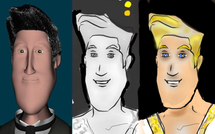
I also see Marc as a Midas-lite in terms of gold/jewelry. He likes to wear the stuff but prefers them as accessories... probably in order to maintain his (stealthy) mobility. (If he has gold plated sai My sketch was taken directly from your previous model (see attached): He's a bit beefy... ala Kronk... he works out. Something I don't know about Marc: I have an impression of Marc as someone who collects weapons as a hobby (gold plated sais, nunchucks and fasimilies of ancient weaponry from the world of the living) but wouldn't actually hurt anybody personally with them. Although... I don't think he'd particularly care if others were to do that for him. This is all a game to him and he's having a great time playing the guy who knows everything. To injure someone personally would be to take the fun out of the game. Now if someone were to perish in a cold and damp dungeon cell while he is away attending to more important matters... Hey! That's just part of the game. The worst thing that can happen to you with Marc is that he grows bored of you because you aren't somehow playing the same game as him. In other words... he might throw you into the dungeon because he can but then... forget he put you there.

-
When reading your script this is the basic character I saw: Lightskinned/fair complexion Orange/Yellow/White hair (unnaturally blond) Tends toward Roman clothing while in presence of Cleopatra (a toga-tunic kind of thing but one that hints that he is a quick change artist as he will change into his 'ninja stealth costume' when spying on others) The attached image isn't too far off with regard to what I saw him wearing in public. He sees himself as royalty but isn't as prone to extravagance/fakery as Cleopatra. Cleo aspires to be all powerful... Marc thinks he already has that power.
-
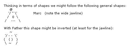
Oooo... I'm liking that. I'd say Father still could use some difference in shape for his jaw to further distinguish him from Marc. I have a feeling that we are going to need to be able to differentiate between the two characters even in the dark. As such the shape of their silhouettes will be even more important.
-
It's a bit hard to see from the three quarter view angle but I'd say that as you have him now Father needs to be further differentiated from Marc (not that we've seen Mark... but I'm assuming we are following the original model you posted in this topic as a general look for Marc. Edit: The forum doesn't maintain text in the way I need it to so... see image attached.
-
I dunno. Looks about the right size to me. (In case this is confusing folks.... it was rather huge before) The following words might need to be avoided in their ALLCAPS form (with spaces included in the words): armband armbands stormbound warmblooded As in, "HELP! SIMCLOTH IS NOT ANIMATING MY CHARACTER'S A AND CORRECTLY!" Luckily the forum ignores whole words that include more than just those three letters. My apologies Douglas. The topic is back to you and Rotoscopes. Nancy was just commenting on your cute character. I heartily agree with her. More please!
-
Robert's life may never be the same: For the present it's impossible to type the letters R M B together in the forum without being um... effected. Test test test If'n you want to type the letters R M B by themselves you'll have to put extra spaces or characters in between the letters. Note: This change is not retroactive over previously posted topics/posts. For the change to go into effect the post with the letters R/M/B would have to be edited/refreshed. In other news... we might need to make the replacement R.M.B. graphic a bit smaller. The red light is also appearing on the left of the mouse... hmmm... thats not very optimal. Now the red light is on the right. In order to stay on topic I will suggest that with regard to Rotoscopes that whenever someone wants to create a Rotoscope from ANY ANGLE, NO MATTER HOW ORIENTED we can use a single patch with the desired image or sequence applied to it. For best results fade the image out a little and lock it to make it non-pickable.