-
Posts
2,728 -
Joined
-
Last visited
-
Days Won
4
Content Type
Profiles
Forums
Events
Everything posted by Zaryin
-
I think there's a free program called GIMP that is very similar to Photoshop -- at least it used to be free. Do a search. I also find your models awesome .
-
Are you still using the shader with the SSS? Because I just use the SSS...?
-
Nice work. How's the speed with multi and no multi rendering?
-
Thanks guys. Yeah, I actually like the placeholder hair as well, but it's going to look a little weird with everyone else having real hair -- I hope everyone will be able to have real hair. I do have a dark blue spec on her hair. I was thinking of adding a subtle gradient, but I figured it's only placeholder hair and I will be adding a background so I let it go. Thanks again guys.
-
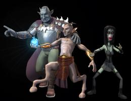
Here's the image with the Sluagh posed. As with all the characters, the pose is subject to change and tweaking. This pose will probably have some tweaking done to it . The hair is a place holder until I start working on hair for the whole image. Legs are looking a little cartoony to me, so I might fix those as well. As you can see, my Sluagh is so thin that her hands are nearly see through with the SSS, haha. That's it for now. I don't know who I will work on next. Here's a list of the characters still to be made: Sidhe, Eshu, Pooka, Nocker, Boggan As you can see there's alot to go still. That doesn't even include the background *sigh*. Thanks for looking.
-
Thanks .
-
Yeah my friend hates it because it reminds him of Tim Burton. For some reason all my friend's have some sort of hangup when it comes to Tim Burton. Thanks .
-
Haha, I love that last face punch. Nice.
-
The darkness is because the color values of the SSS are really too high for realistic skin, but I get the best look with that amount. If you go lower the rendering time will increase dramatically. I try to fix some of it with my color decal. If you look at my image you will notice that darkening on the Satyr's nose and lips. Yves once posted the correct number values for the color of SSS it's like 1, .50, .25 (i just made up those numbers ), but it is really low.
-
Yeah SSS isn't the most ideal for animation right now, but it does look nice . Oh, I updated the info on how I do my skin in my topic. (my last post)
-
Man this looks fanatastic. I'm trying to picture it all textures now, it's going to look awesome.
-
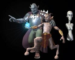
Haha, thanks guys. SSS settings are 6,4,2 for color and the last setting is 100% for the Troll. The others are 5,3,2 and 100%. Hair is the very last things I will be working on for this image. Right now I just threw SSS on all the areas that will have SSS in the final image for the Satyr. Final decaling will be the second to last thing I do . So in the final image the Satyr's legs and hooves will be different colors than the skin. And the legs will also be hairy. Thanks again. EDIT: I should also say with my skin that I set Spec Size to 200%, Spec Intensity to 10-15% and Reflection from 1-5% depending on lighting and textures (got that one from Noah Brewer ).
-
I like the armor so far, but for some reason the chest area feels too wide to me. Are you building with a specific character as guide or without one?
-
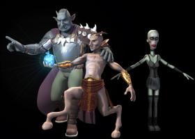
Here's the Sluagh with her finished outfit. The next pic will be her posed with fake hair and a color decal for her goth-clown makeup look. UPDATE: Changed the image to the one with her makeup since it didn't take me that long to do.
-
Looking great. Are you going to model in clothing folds or use textureing to do it or leave it like it is for a more cartoony look? I'm really bad with clothing folds so I'm a little interested in others' proccesses. Haha I don't know why but "Lip Hair" is really funny, haha.
-
Please take this the right way, but you're starting to make me think you're the new Brian Prince with all the awesome landscaping things you've been bringing. I can't believe that's one material.
-
Thanks alot guys! Yeah my friend thinks its all the bends in the right leg that's throwing off the Satyr. I will probably end up tweaking that leg in the final pose (When I get the actual stair in there that he'll have his hoof on.) I actually like the left hoof fine. I think something went weird with the right hoof when I transfered the pose over from the old legs. That'll be something I looking into towards the end -- or in between now and then . Plus the color will not be a skin color when I apply the decals for the Satyr. Right now for ease I just stuck the hooves in the same material as the rest of the skin. Thanks again!
-
He is looking great. Makes me feel better for gaining a little weight after quitting smoking, haha.
-
Those rivets are just making it even more filled with awesomey goodness .
-
Awesome start so far! My first humaniod was HORRIBLE! So you're already ahead of the game.
-
Also for the sky you might try a gradient material with blue on top and a subtle orange at the horizon.
-
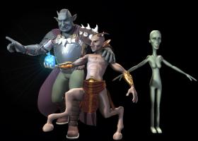
Finished the base body. Excuse the lower legs. I didn't bother to put alot of detail in them since I'll be cutting them up into over the knee stockings and combat boots . I changed her expression and added splines for eyelashes. I will probably add fake hair just to get an idea of what she'll look like with hair. I will probably also add a face decal for her makeup just to see that as well before I make the final decals.
-
Wow, that's looks great. Although the crazy look reminds me of the crazy monorail in Stephen King's Gunslinger series -- which I like .
-
Yeah, that's great!
-
A little update before I go to bed. EDIT: I decided to render a 3-pass in to see what she'll look like in the scene so far.


