DanCBradbury
-
Posts
683 -
Joined
-
Last visited
Content Type
Profiles
Forums
Events
Everything posted by DanCBradbury
-
cool goose eric. it's got lots of character, especialy the face and beak. He looks like an old man kinda. nice modeling
-
your rabit is a bit scary... jk nice model
-
thanks dahr. For the most part the rust is fairly sublte. There's more concentrated areas around the base and the blade ridge.
-
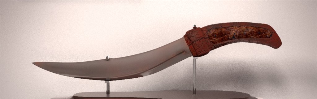
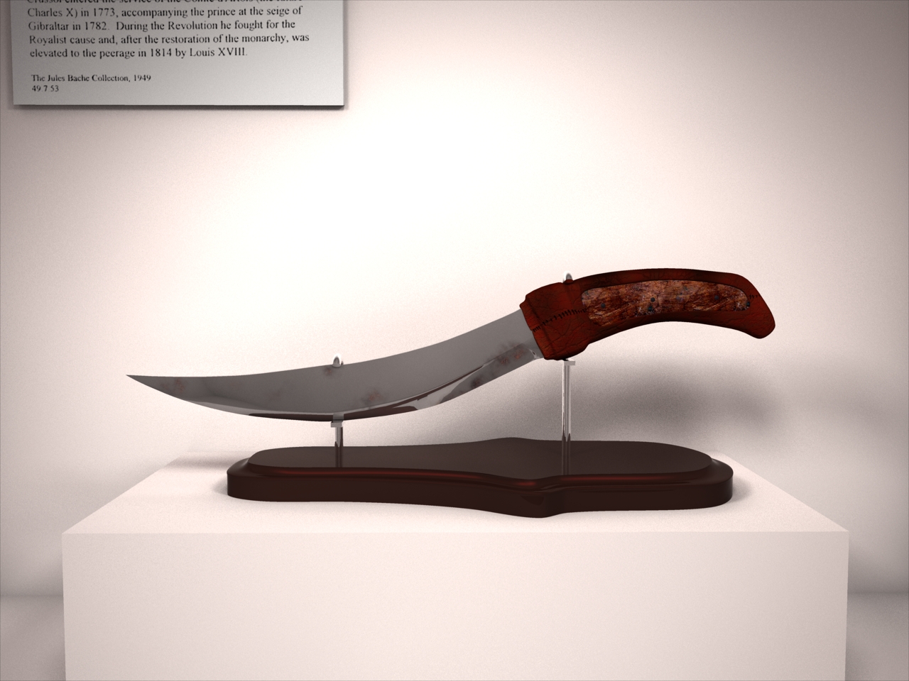
After spending some time with the designers, it seems they didnt want it to be very old after all. lol. What a wonderful "learning experience" it was making the blade old as dirt. lol. Anyhow, this version is more acurrate to what they were after. It is supposed to have a more used look as opposed to old. I took your advice Eric by putting some rust near the base of the blade, where the leather wraps arond it, and i also made it a lot more reflective. I still need to adust the normal map intensities, and change the wood to something much newer. Let me know what you guys think.

-
looks spiffy, however neither the roof nor the right wall have any illumination at all. Hope to see the animation soon.
-
those arent individual shadwos repeating in the volumetric, rather it's noise created in the volumetric itself. to fix it all you have to do is increase the quality of the volumetric... about 2000% quality should be fine. Be sure to also render with multipass, as it dulls out the banding as well.
-
that's just cool! one thing though... your shadows are very akward. At the moment it looks like hes floating above the ground.
-
that's an amazing fish model. are you unraping the fish to do the decaling? looks real good scott.
-
well, if it's old enough it wouldnt have any reflectivity at all, and the metal would be very dark... but i'm trying to get my knife in a middle ground between old and anchient. somewhere above this level of rust and grim but it takes a long time to tinker with my model now, cause all i'm working with are textures at the moment... and they're not very easily changed... especialy normal maps.
-
hm... maybe it cause the knife itself isnt that thick... not sure. thanks so far on the comments guys. But i'm still debating weather the blade is to reflective. after ceveral hundred years metal looses almost all reflectivity and becomes dull. I need to talk to the designer about it. What do you guys think? is the blade too reflective? i've posted a pic of a 10% reflective decal map, as opposed to the 30% reflective decale on the last post. Knife003m.mov
-
that's pretty cool. normaly i've found that the longer a camera scene stays up, and smooth camera movements gives the best look. Awesome lip sinc and character... although he looked like he was glowing a bit... like some light was right in front of his character
-
that's just awesome.
-

animated displacement with red material effector
DanCBradbury replied to johnl3d's topic in Work In Progress / Sweatbox
wow! very interesting. You said you used displacement... how many patches did you use for that render? all the tests i've done with displacement on A:M required a lot of patches. -
looks pretty cool. but you may just want to have the legs flutter realy fast back and forth for a whalk cycle... cause i dont think a creature like that could ever walk properly lol. neat model.
-
Hey guys, thanks for the coments. And YAY! i passed all my finals with a's and b's. anywho, i changed the model up a bit and changed some of the texture and material properties. I made the blade metal a browner color because of the rust, i fixed up the area where the ridge on the blade stops at the handle, and i made the leather a lot "leathery" by using the inverted diffuse map (where i made the leather darker because of the way a hand would have been touching it for all those years) for a reflectivity map, because worn leather turns real dark and get's all shiny shiny. let me know what you guys think.
-
That is looking FANATASTIC!!! lol. You realy have this whole modeling thing down. lol. Is that grill that you can see through the weel well modeled? or did you just make it a map? AWESOMEFULNESS!! Keep up the good work. Hope to see it painted one of these days.
-
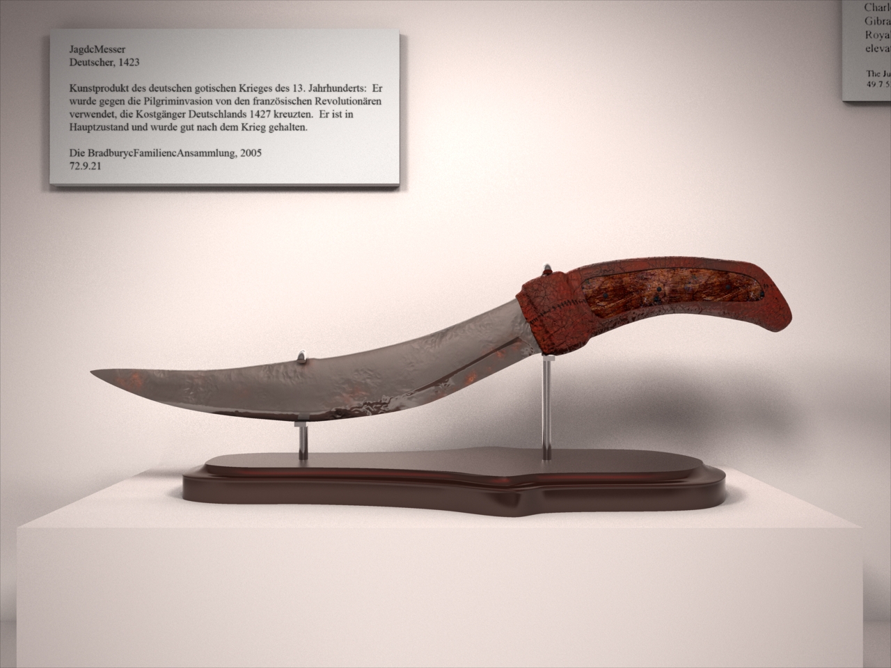
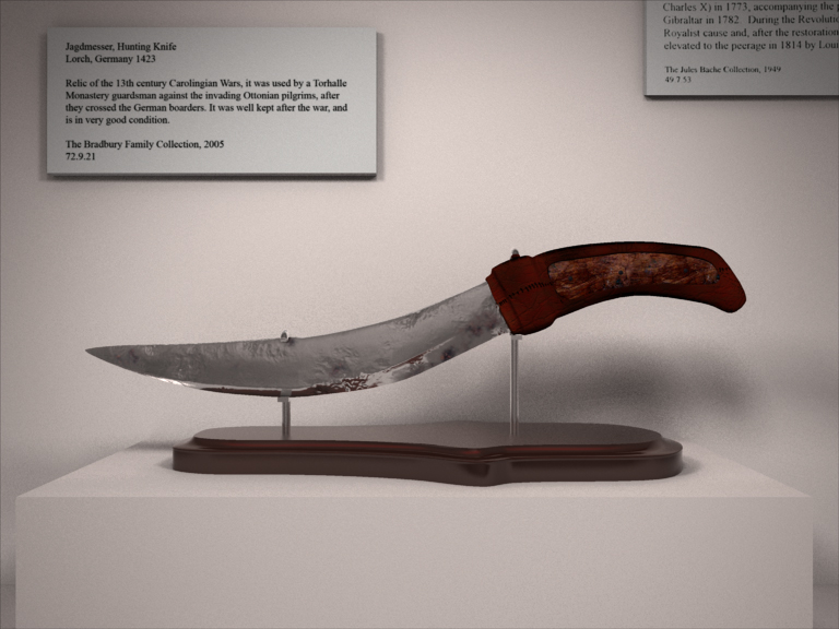
Sorry for the very long belated reply. College got in the way... you know how finals go. yeah... i was thinking that too. I significantly lowered the brightness of all the lights in the shot. normal maps are just a texture like color maps, specular intesity maps... all you have to do is paste them onto a model and away you go. Basically it's just a suped up version of a bump map... but totally different. lol. I'm not real sure on what versions of A:M came with normal map ability, but i do know that my version... 12.0 has normal maps in the texture type list. yeah... probably too sharp. I've dulled it out considerably. Overall, the guys i'm doing this for are looking for a very old, well kept knife, that when it was produced had limited resources for its construction. I hope the bumps and inlets i've put in it make it look older. by the way, nice new icon eric. RARR!!
-
simply amazing. Nice render. but all i got for christmas were internet popups... WHY WONT THE LEAVE ME BEE!!!
-
Animated Fire for Larry b's Character
DanCBradbury replied to NancyGormezano's topic in Work In Progress / Sweatbox
You could have used density in a fully transparent yellow droplet... looks good though. -
??? what do ya mean? i wasnt yelling at you... i just want to destroy my computer cause my photoshop wont let me make the wonderful normal maps any more... something about a programming error... then photoshop turns off. I am sad now. mi nombre es daniel. pero, todos está bueno. llámame daniel, por favor. anything i need to change with the knife? is the setting good enough?
-
nice renders jason. I always like seeing people use radisity.... and it looks like you got it down.
-
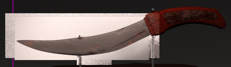
Normal Maping Summary Normal maps are great, and are fairly easy to use. Photoshop has a plugin where you can go directly from a grey scale image to a normal map. Only problem... about 2 days ago it stoped working. and every time i try to use it it locks up photoshop. I feel about ready to throw my computer out the flippin' window. lol. Here's the newest render for the knife.
-
not normaly. Metal oxidization has a more bubling effect rather than a disolving, "pitting," effect. But yes, in most rust there is a certain level of bumps and wavyness... but this knife isnt in that bad of a condition. lol. it will however... give you tetnis. lol. yup... but i'd never do somthing so cheap as to use a desaturated color image to get me a bump map. I hate it when people will take a photo of something like a brick wall, desaturate it and call it a bump map. Plus... normal maps are much better and rarely end in aliesing of slopes. You should realy convert over to the power, of the normal mapping. i do see that now... you bring up a good point sir eric. i will fix this problem emidiatly. darn... that means i have to redo every single one of the blades textures...
-
thats probably because of the lighting set up i have now. I should probably redo the rig i have at the moment. what is pitting? i got cha there. lol. I already have those, the picture show's just how many texutres i'm using for the handle. The render i posted does a bit more justice to the leather... but i do need to redo the wood part. the blade is fairly reflective, and all that is is the shadow made between the wall and the roof. it is radiosity after all. Thanks for the critiques eric.
-
well... i've also got in mind some modern art wall hangings that would also use this effect. I know about the streching method... and it does produce some pretty good stuff... but is there any way to reproduce this?