DanCBradbury
-
Posts
683 -
Joined
-
Last visited
Content Type
Profiles
Forums
Events
Everything posted by DanCBradbury
-
Thanks for the tips guys, i'm gunna get right on that. Maybe a cylinder projection map on the pipes would look good.
-
(Null) Not a user posted message.
-
that's a realy good start to your model, but the only 2004 Saleens that has the mesh near the exaust are the racing ones, and right now it looks like the steet model. Are you gunna model all the creases and everything? That would be awesome. Try to steer away from pinched edges though... the curved areas on your model look razor sharp. Hope to see the finished product. It's a nice start to a Saleen.

-
Wow! that's an amazing model. You may want to take your query to the Hash Materials laboratory forum. There are some pretty smart people over there when it comes to materials... namely ZPiDER. Try talking to him. BTW: that's one of the best architectual models i've ever seen come through A:M. Nice job.
-
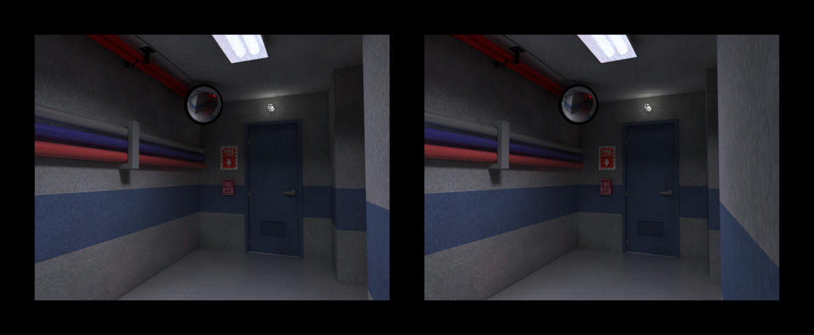
lol. no... i was just wondering if building codes would allow it, so i checked the wonderfuest tool in the world, the internet. Well, there's not been much feedback on my pictures... so maybe it's just that you all need a different angle for a picture. Please give me some feedback on what needs work... or what i should add to make the shot more pr looking. render time: 4:53:12
-
Actually, according to the 1998 California Building Code - the High Level & Low Level Exit Sign Regulation numbers (1003.2.8, 1007.2.7, 1007.2.8, 1007.2.9, 1007.3.12, 1007.5.13, 1007.6.2a, 1007.6.2.1a) allow for the placement of both ground style and ceiling style exit signs... but... other than that... could ya give some feedback... or perhaps some tips to make the picture realer looking? lol i need to show it from the other sides though. there's all sorts of different stuff in this model.
-
Hey all, i just rendered this. Just posting it to see what you guys think, and let me know what should be changed or added to make it more pr.
-
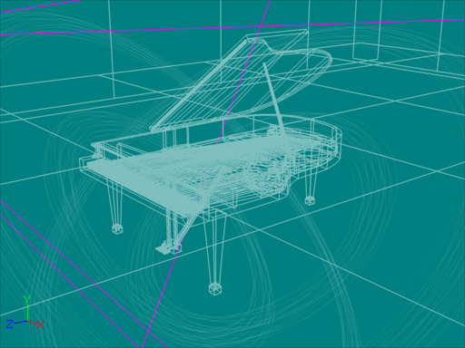
Here's the wireframe... and some sort of a wierd wireframe/color combination 3d stereo. Thanks for all your suggestions and complements guys.
-
Here's another view of the piano, it's from the front... and again, stereo. Hope you guys like it. Let me know if you see room for improvement. Multi-pass: 16x16 Number frames: 2 Render time: 1:14:21
-
Hallo und Willkommen to my first ever render with A:M version 12. It's a grand piano, and it's a very dynamic caustic/radiosity/ratrace picture! and even better... i made it a stereo, bacause... they're just so dang awesome. Let me know what you guys think, and feel free to give any suggestions about the picture. I love modeling objects more than people... i wonder why? lol Does anyone know what happend to the anti-alies control in rendering? My piano stereo is divoide of smooth edges! "WHO WILL MAKE BENDER WAFFELS THE WAY HE LIKES THEM NOW!!!" lol.
-
Big words go in the ear part of the brain... and i... oh-meh-gosh! a lolly pop! mmmmmmm... lol. jk. Nice model. I too learned of the complexities of DNA and they filled my brain with wonderfulmentness. lol. now... zoom out and show all the DNA's to create a massive elephant, or something.
-
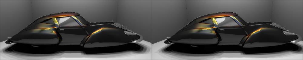
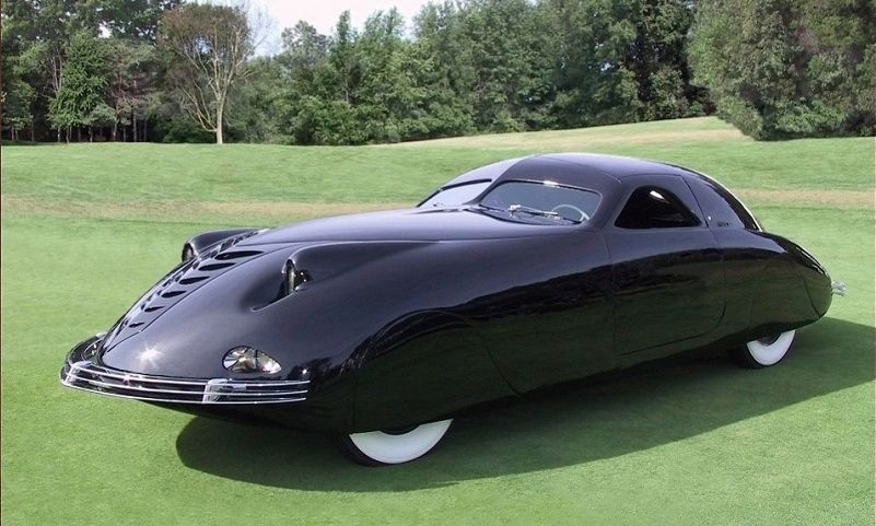
Hey guys! I made another stereo... this time it's black with "real" pearlecent paint that will move and change due to angle changes, well so did the last one... but hey! If you want to know how to do it just let me know, and i'll give you the tutorial. This one gives you a better sence of depth then the last one. ENJOY! BTW: the car was designed to be a cross between a 1963 Corvette, and a most rare car... the 1938 Corsair. Very different styles, but they came togher quite nicely. Let me know what ya think.
-

Herbie the Froggy Boxer in TOON
DanCBradbury replied to dborruso's topic in Work In Progress / Sweatbox
The one on the left looked pretty good, but you may want to increase the spectrality size to full and the spectral intensity to... say 50 or 40 %. In that shot he looks to much like porceline. But good job. Did they make you put their name in the shot, because they gave you advice? lol. jk -
pretty cool. remindes me of my super mario 64 days. lol. Nice action mixing... but... he does a whole lot of breathing... is he haveing a baby? lol jk. Good job. NOW FOR THE TEXTURES!! lol
-
That's awesome! how'd you do all that without creases and beveled edges everywhere! aside from the awesome base... its needs a cool paint job and some rubberized tires... right now they look a little sharp and dangerous. It looks great and keep workin on it.
-
I have the same problem. No pictures. Everyone uses firefox these days... you should really get that checked on. Windows API code using internet browsers are just to unsafe and hazardus to your computer. You should think about switching over.
-
Herbie the Froggy Boxer in TOON
DanCBradbury replied to dborruso's topic in Work In Progress / Sweatbox
You should probably make the background very dark... like he's in an arena, then maybe some volumetric lights, a little radiosity, 32 ray cast shadows, perhaps a refractive and transparent iris and lense for his eyes instead of an eye picture, some spectrality to the frog to make him seem shinny, a bump map instead of a color texture for the floor, and maybe a little creasing in the boxing ring ropes. But other than that... looks pretty good. Good frog modle. -
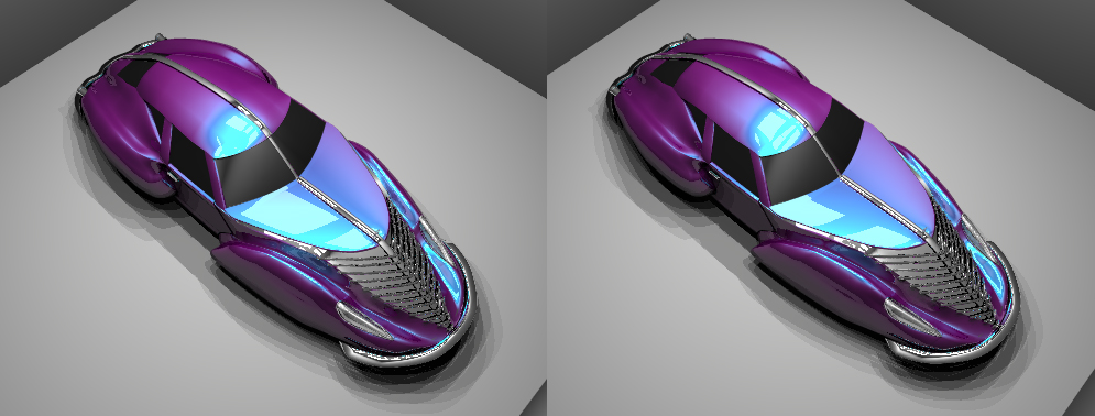
Ya... that motorcycle's pretty sweet. Here's the candy iridecent paint i applyed to the car... and! i made it a stereo. Stereo Instruction: Cross your eyes while looking at the picture until both cars are on top of each other. At this point there should be 3 cars on the screen, you need to focus on the one in the middle. Hold your eyes crossed for a while. After a few seconds or so it should start to focus and the image seems to leap from the screen! isn't 3d and animation master amazing! K enjoy the car, and give me any suggestions for the body and or color. And then... with all my cars... i crashed it. "I swear! He came out of no where! How was i supposed to know it was a red light, hu!?" lol.
-
REALY!? dang... then that means a bunch of people havent got a clue on how to spell it... google shoots out pictues for all of the wierd spellings (chameleon,cameleon,kamillian,camillian) lol either way... do you think that style of paint job would look better? and by the way... i havent got a clue what those are
-
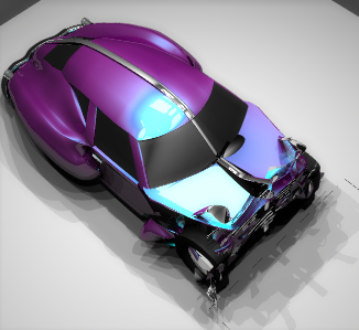
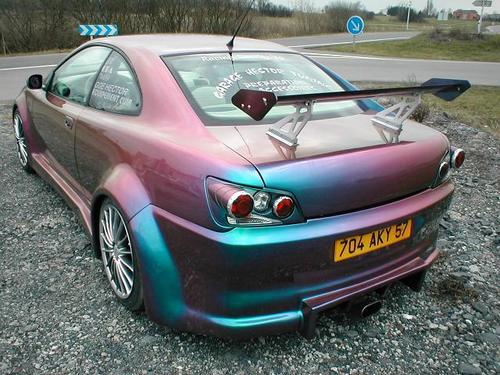
Oh, sorry Luckbat. I spelt it wrong, it's cameleon... and here's an example of a paint job with a cameleon style candy paint.
-
Thanks guys. It's already very reflective... i'll put some lights above the car so you can see the level of reflection. Would a camillian paint job look better? It's currently dark navy blue with mid blue spectrality. Here's a pic to show how reflective the car realy is. And sorry for hijacking your post Mike.
-
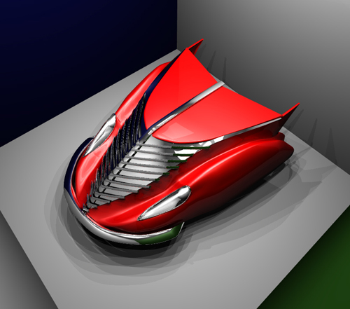
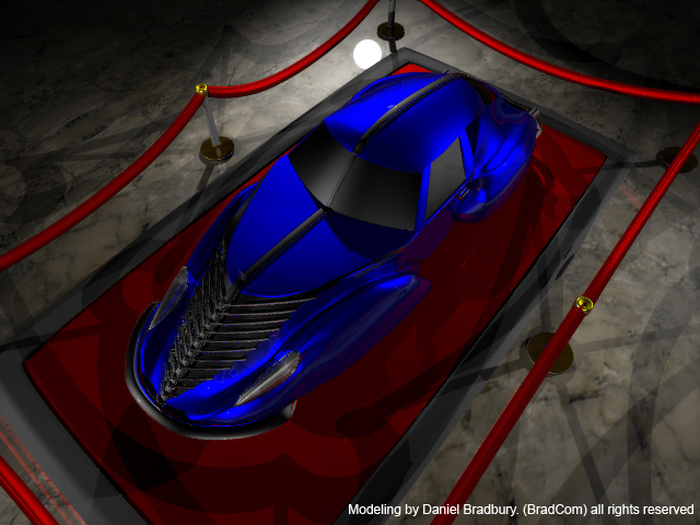
Here's a small project i've been workin on for a few hours. If anyone's got any suggestions for a better paint job, let me know.