DanCBradbury
-
Posts
683 -
Joined
-
Last visited
Content Type
Profiles
Forums
Events
Everything posted by DanCBradbury
-
What version of A:M are you using xtaz? I remember a while back, when you would make a .mov render the image would have bad color, most noticably the brightest areas were never white, they were more of a 75% grey. This could be the problem. If you render out just a simple jpg, and it has correct color, than you may not want to go with a .mov, rather a .avi.
-
it might be this monitor - is at work on works bad laptop monitors - but i think you should make it a bit brighter :3
-
that's awesome! I always love the look unfiltered radiosity looks; gives it a really stylized look to walls and stuff. there's a few bright spots on some of the edges, but still very cool
-
that's an awesome model, and the bcd is freaking awesome. You a scuba diver? One thing that kinda popped out at me, the knife would be really hard to take out cause the strap is holding it to his leg at the grip. Cool character
-
this was such a weird show. I was really little when it was on tv, and that baby dinosaur creeped me out every time x__x

-
Not only is it a single light per room, it's also 2 ray casts per light. I should probably lower that to one ray cast, as it would lower the render times tremendously. But yeah, ambiance maps would definitely be more efficient, and you could even have random objects like desk shadows or figures to make it look realer, but i wanted to try something different. here's the full version if anyone wanted to take a look. There's also AO in it as well
-
In trying to make a better looking lit building, instead of using an abmience map, I made each of the rooms, threw some lights in, and here's what i got.

-

Displaying character with real photo background:
DanCBradbury replied to entity's topic in Work In Progress / Sweatbox
the rotoscope feature would probably be better for what you're trying to do, as things like hair and character edges will be antialiased with the background image instead of the camera color. Also, if you want to make the image more natural looking, you should deffinately look into IBL with AO -
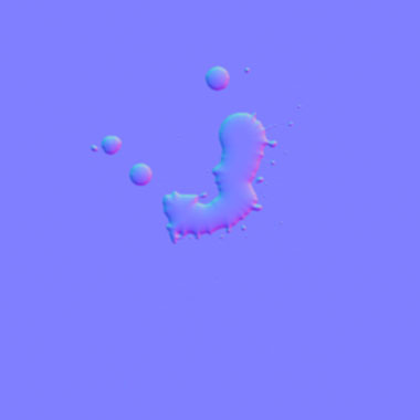
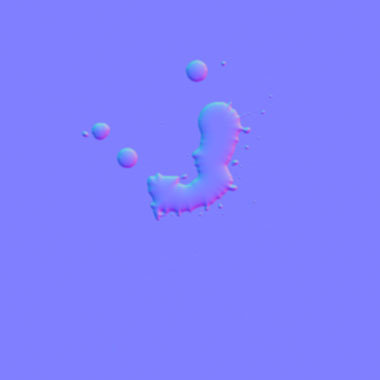
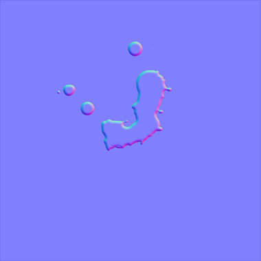
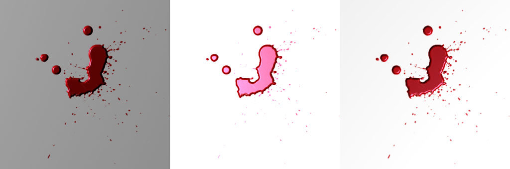
i just figured out that my gradient formula for the surface falloff was backwards... so it looks super sharp for the edge. It's late right now so i'm not going to set up a render, but the difference in just the normal maps clearly shows that the new normal map is more like a liquid. the drops now look like drops instead of bottle caps
-
i was inspired by bioshock to try and figure out how they make blood look so real. After a long time fumbling around with photoshop, to get a good looking liquid surface tension normal map, i think i got a fairly good result. The key though that I found out was blood doesn't have a white or red specular highlight, it's blue. Anyways, here's the results of my testing. BloodStain.zip BloodStain.mov
-
that's looking awesome you should do an a:o render now. ^-^
-
kannst du uns das Projekt, Eric zeigen?
-
if you're going to want that paint look, you're going to have to get a version of A:M that supports hdr
-
did a quick test of radiosity with a flare
DanCBradbury replied to johnl3d's topic in Work In Progress / Sweatbox
I'm not john, but no, the poke-a-dotted look is not what you're looking at; that comes from having to small a sample area. What you're seeing is totally different. There is a very strange anomaly that occurs when rendering radiosity, which is more noticable in closed off scenes. If you have immensely bright lights, you will eventually start to see actual shapes appear in the photon patterns that look like objects in your scene, almost like a mirror. It's easily fixable by turning jitter to full. -
so why did you make Spock look like he's got horns? shouldn't the ears be pointing strait up? the eyebrows are a great caricature, but in some shots they're distracting and sorta makes it look like he's wearing a bowlers cap.
-
did a quick test of radiosity with a flare
DanCBradbury replied to johnl3d's topic in Work In Progress / Sweatbox
Is that the look you were going for? It's definitely not real, but very artistic though -
Xtaz, you should probably pick a complicated car that is going to throw you lots of challenges and have very odd surfaces, so that you can show how to get around pesky patch configurations and how to make it all smooth that just seems like it would be more helpful in the long run for people then picking just a random car, imo
-
cool, can you show the shaded view? i think you may have to rethink the patches around the spokes on the tires.
-
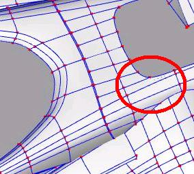
Bias handles allow you to adjust the magnitude and direction of any spline point, making modeling strange surfaces less of a pain. The bias handle itself is a yellow manipulator that appears once you activate the show bias handles button on the main toolbar. They would definitely make the smoothing a lot easier, but use them only after you have the entire shape of the car down and the majority of your smoothing already done by simple modeling. The 5 point patch is at the steep curve on the front end of your car. You can see the subtle black line accross the center of the 5 point patch which shows that it's distorting. It doesnt look like much now, but once you add reflections, this patch will do some crazy things.
-
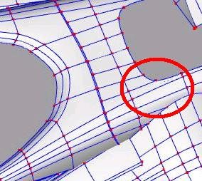
thats an amazing model so far. are you using the bias handles? they're great for getting the right rounded edges you're looking for. Also, there's a 5 point patch on the hood that's been stretched beyond it's limit and has a black line running down it. cool car
-
ZOMG! i love their expressions!! Awesome!
-
A pose slider might be your best bet for the cup.
-
you should definitely use cp weighting for the handle. This will get rid of those weird looking creases in the wood when it bends.
-
you guys realize this person hasn't even been to the forums in about a year >_>
-
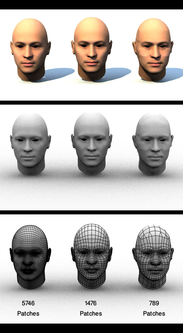
Building a photorealistc face
DanCBradbury replied to Darkwing's topic in Work In Progress / Sweatbox
No, there is only 3 selections for patch density. You have a high, medium, and low resolution patch selection. Here's a zip of just the skin models for each resolution. MultiRes.zip