MattWBradbury
-
Posts
1,410 -
Joined
-
Last visited
Content Type
Profiles
Forums
Events
Everything posted by MattWBradbury
-
I like this guy. He's got a lot of character.
-
If you look at this image, the sternum is pulled out almost as far as the chest plates. Your placement looks like it's pushed into the chest cavity. You also might want to make his talons a bit thinner so they look sharper.
-
You'll defiantly want to use expressions. John (he has the walking egg that's on fire icon) has been doing tons of tests with expressions, so you can contact him to get some good ideas, though I think he'll eventually drop by this thread. You could also create logical operators to control the expressions so you won't have to change them by hand.
-
The spheres are just to make the scene look more CG. What do you think about the blue AO and yellow sun light?
-
I aggree with Luuk: not enough reflective spheres.
-

Captain America from "The Ultimates"
MattWBradbury replied to LeeAnderson's topic in Work In Progress / Sweatbox
I just noticed something, the red strips aren't symmetrical about the y-axis. How hard would would it be to use a decal there? The belt buckle looks a lot better. Did you slim up the torso, or is that a perspective change? If I could get away from looking at technical pieces of A:M and actually start using it as an artistic pallet I could probably make a good character. The scientist inside me wants to explore all the nooks and carnies for some odd reason. My thrird model was probably... a box. Maybe a reflective sphere. Before I had A:M, I was using Punch Super Home Suite, which allowed my brother and I to build houses, and it even had a cad editor. The only thing missing was a good surface properties editor and renderer. When I got A:M, I just started messing around with features, and I haven't really stopped. -
*erase post*
-
That's what I had thought, but probably have a Decal for each room. That way you could easily control the intensity in that room, and not affect the whole floor.
-
it was at 50% when I saw it and it had taken an hour, so two hours for the larger 1280X960 render. This smaller render here would have only taken 40 minutes.
-
While it is true that reflections and transparency together is slow to render, it would not account for that long of a rendering time. I believe that the radiosity had the most impact on the render. I just checked, and IBL was working in v14.0a.
-
In A:M, AO simulates light coming at the subject from all angels. I would suggest using AO with Image Based lighting (remove the room as radiosity doesn't work well with that much scale difference). You can find some really good High Dynamic Range images on this site. Throw in a giant reflecting sphere in the choreography to cast only reflections and then render (by using Projection Materials). Make sure you're using Multipass as it speeds up rendering times when using Ambient Occlusion. This should save you tons of time (probably won't take more than two hours for a 1600X1200 image).
-
Captain America from "The Ultimates"
MattWBradbury replied to LeeAnderson's topic in Work In Progress / Sweatbox
I think I need to go less advanced for my first attempts at modeling people. I don't have a good grasp on anatomy yet either. -
Captain America from "The Ultimates"
MattWBradbury replied to LeeAnderson's topic in Work In Progress / Sweatbox
Very nice work. It even inspired me to try something new: modeling! I really don't know what I'm doing, but I'll try it anyway... I just drew some simple contours that I thought would work with splines on this image: I then just laid out some splines to match the symmetry, and then sorta moved the cps around. I got something that looked like this: I really need a lot more practice (or a first attempt) at modeling the different areas of the body. I just kind of winged this one. Do you have any pointers about the areas like the knee? Right now it just kinda looks like another muscle; probably make it more square in shape.
-
Very nice start. I can't wait to see this character in a full environment with four lightsabers.
-
Very nice texturing. I also purchased the 3D painter with my upgrade, so I'll have to test that one out. Though my only thought on the armor is that it may be a bit too busy. Still, it works all the same.
-
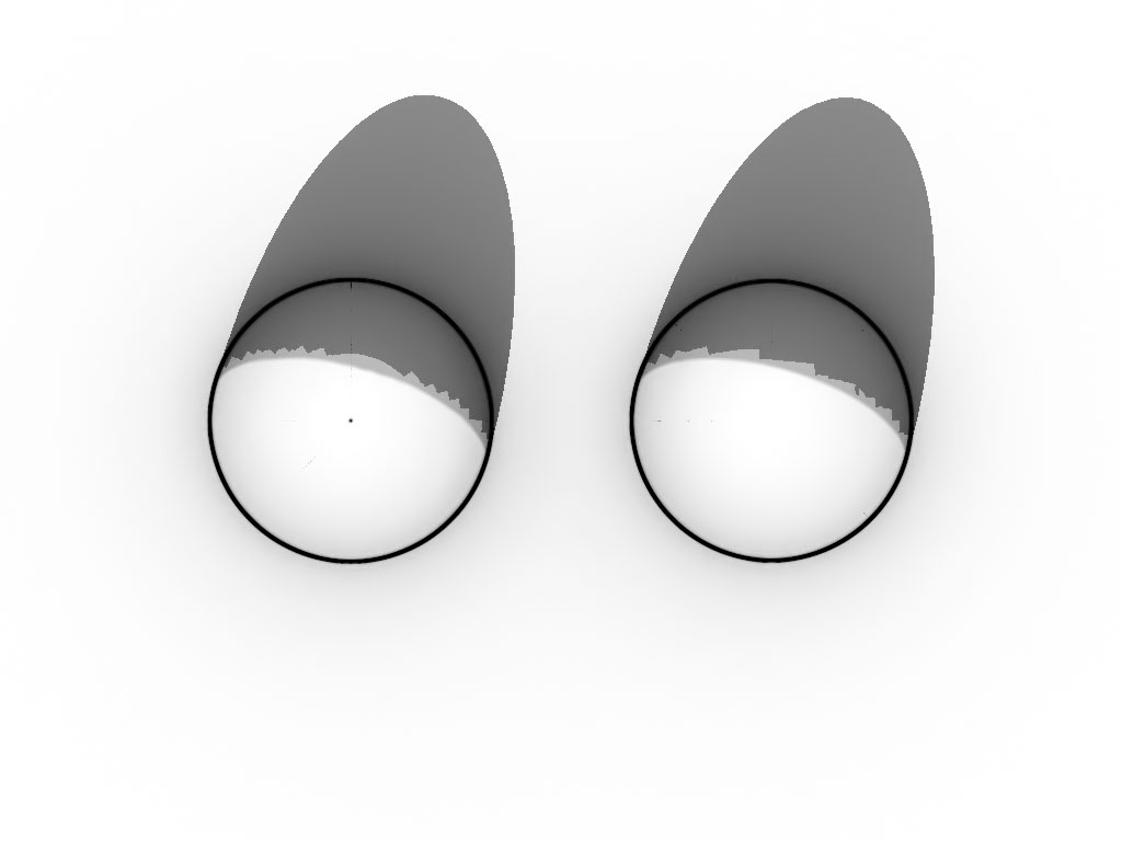
It appears that the toon shader is breaking down each patch into smaller patches and then processing them that way. You can see a noticable difference in these images: Both models have the same shape, but they have completely different construction. The render was with Ambient Occlusion and one Sky light. There are also noticeable anomalies along longitude lines from this vantage point above the domes. Has this problem been reported?
-
Some of his actions look fairly quick. You might want to slow some of them down to make him seem more like an old wise men than a young scoundrel. You might want to lower the saturation on his green skin color. Other than that, everything looked good.
-
Job well done. Any editing from here on out will just be variations of equal quality.
-
It looks quite interesting, though I'm not sure what happened to the shadow on all of the domes (they look like steps instead of curves).
-
He looks washed out in your last one. You've got the haloing going on all around his body, and something is really messed up by his feet.
-
There's defiantly a different feel when the contrast is increased in the image.
-
Nice head model. Did you just use the thread to show it off? He kind of looks like Forest Gump.
-
This one is pretty close to yours, but with a little more back lighting. Though I like the effect you got off of the rocks in front, so more highlights could be added to those specific groups. Legs: Role Model: Oh man... that seems really lame.
-
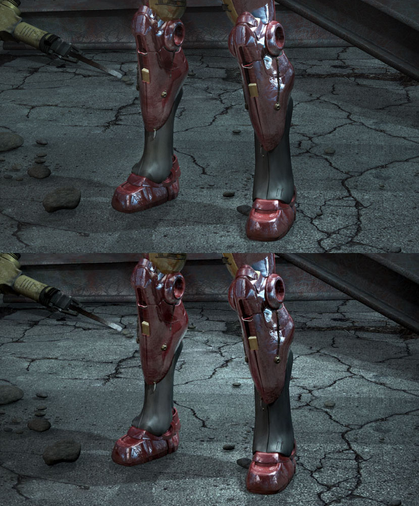
I was actually going to do that. I guess I was being lazy. Everything looks good except for the background behind his shins. When the tone is similar across that area, it makes the background look like a poster, or it looks like it is lacking in depth. Try lighting the area just behind where he's standing and see if that works better. I think the problem may be the slight halo effect I can see around his legs. I'll see if I can bring it out.
-
I had the lights a lot brighter in the version before I posted, but it took too much attention away from the center again, so I dimmed them slightly.