-
Posts
3,827 -
Joined
-
Last visited
-
Days Won
31
Content Type
Profiles
Forums
Events
Everything posted by largento
-
No problem, Bob! That's exactly the same experience I had when I first watched Barry's DVDs and that's why I'm such a big fan of them.
-
I think you're going to have a tough time finding an artist who thinks their work (and for 30 seconds of finished animation, that's a lot of work) is worth nothing.
-
Trying to finish this character up
largento replied to jirard's topic in Work In Progress / Sweatbox
No crits from me, Jirard. I think you've been very consistant with your designs: they all have great style and look like they inhabit the same world. -
I'm not sure who the modeler is, but there's a pretty cool T-Rex model on the Extras DVD... EDIT--Not sure why the old image is still here... realized I had the eye target off in the first one...
-
Thanks, Lee, that's nice of you to say. I was an art major my first year in college, but then switched majors and got my degree in journalism. (And then ended up becoming a graphic designer... meaning if I'd stayed as an art major, I'd probably be a reporter today.) :-) I've always liked to draw, but always thought I would be a writer. I've always known people who were much better at drawing than me. But I do love humor and cartoons. I take the personality compliment as high praise. In the real world, though, I don't get a lot of respect for my illustrations. It's astonishing to me how many people there are who lack any sense of humor and look down on cartoons. Folks can be pretty brutal in their condemnation. You should definitely keep working on it. Even if you end up not doing Project Brimstone, you'll likely come up with stuff you can use in other projects. That way when you come back from your mission trip, you'll have a bunch of stuff you can hit the ground running with.
-
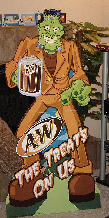
Mark I think just the part that you did a standee for A & W Root Beer is cool enough, but now that's it's relevant to what I'm doing, it's even cooler! Do you still have it? Could you post it here...uh...for reference purposes. I wanna see! As far as the jacket goes...I wish this was the first time I had made this mistake, but it's not. You get into "the zone" and you forget about stuff like that. There's also something seriously messed up with his right arm around the elbow area. But...for my first piece of real character concept art, I'm pretty pleased. I really wish I had time to model it for real. Oh well... Lee Haha, well it's not as cool as it sounds. I never had it fully explained to me, but the client had sent out an order form to their regional people for them to order pieces for the Halloween promotion and for some reason they offered a Frankenstein standee that they didn't actually have. Not sure what they were thinking. :-) Anyway, it was something I literally had to turn around in a day. Which always seems to be the case, unfortunately. I've got plenty of time to work on the dull stuff, but give me something fun to do and I have to hurry with it... Looking at it now, I see a hundred things I'd change, but I think it came out okay. Here's a picture of the actual standee. It stands 5 feet tall: The client was thrilled with it, but I'm sure that was mostly because they were able to get it done at the last minute for cheap. :-) They never noticed the jacket blunder. :-) I usually try to look down at the buttons on my shirt when I do something with buttons, but I still miss it often. Not sure why it's such a hard thing to remember. :-) I think the concept is way more important than the elbows, Lee. :-) You should really take some notebooks with you and fill them up with designs. You could come up with the whole story and designs in 2 years. Then you can come back and make a really cool webcomic out of it!
-
Neat stuff, Eric!
-
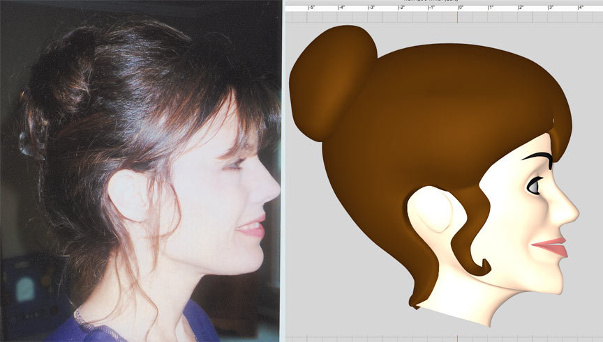
I haven't gotten back to the Henrietta model yet. When I look at joining the head and body, I'll check into it. To be honest, I'm not sure what you're seeing about the neck. The only thing that strikes me is that there could be a sharper angle where it joins under the head. Here's the photo reference of the actual woman compared to the model: The model has hair on the back of her neck that might be making the neck look like it ends sooner than it actually does, but to be honest, I don't see that it is that different from the real thing.
-
Thanks, Jirard! I just bought my plane tickets last week to go to Kentucky next month to get together with my friend and lock down the script. He's got the basic plot of it, but I thought it would be fun for us to get together in the same room and play around with it. I think it's going to be pretty funny. My friend has titled it "The Wannabe Pirates and the Indescribable Treasure of the Coconut King." And it's gonna' have monkeys. Lots and lots of monkeys... who will look exactly the same, 'cause I'm only going to do one monkey model. :-)
-
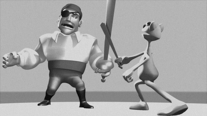
That's a seriously scary looking villain. I think it would be cool to be able to see the two squaring off! One note, though. You've got his jacket buttoned on the side a ladies jacket would button on. I make that mistake a lot! Last year I did a Frankenstein standee for A&W Root Beer and it made it all the way into printing without me noticing it. :-)
-
Whew! I got sidetracked with other projects this week and wasn't able to do much with this until this morning and so I decided I would finally finish out all of the phoneme poses for Flemm and take my first shot at some lip syncing! I had emailed my friend who played Flemm in his live action movie and asked him to record and send me a line like "The rain in Spain falls mainly on the plain" so that I could use that. The jokester did send me the file, but decided to record himself singing the line. :-) So, as I started doing the lip sync, I just kept thinking that I might add a little more and ended up doing a full body thing. I didn't manage to completely finish it out (didn't really do anything with the fingers and I forgot to move the head), but it's the closest to doing any real animation I've done yet! Ladies and Gentlemen, I give you... Captain Errol Flemm! lipsync.mov
-
Well, the first thing to do would be to delete all of those extruded splines, so that you're just working with one sideview spline and one front view spline. A VERY good idea is to save your model incrementally (pooh_001.mdl, pooh_002.mdl, etc.) so that you can go back if something doesn't work out. I'm sure getting Barry's DVDs will be very helpful to you. (They were to me!)
-
One thing to be mindful is the symmetry of your rotoscope. The left side of the face (from the viewer's POV) on your drawing is noticeably wider than the right side. I suffer from this same thing. Something to do with one eye being stronger than the other eye. To get around this, I've been taking one half of the drawing and flipping it to see how the whole face will come out. Helps to see how the whole face will look. I make adjustments based on that.
-
I can at least help with the olive green bit. Make sure you don't have any CPs selected in your model. Look at the Properties palette and check the surface properties. You've most likely set the surface properties for the model rather than for a group. Change the surface properties back to the defaults and your olive green color back to white. Unfortunately, I do the flip/attach manually, so I'm unfamiliar with how the copy/flip/attach works. Just a guess, but it looks like it's pasted the face before you aligned all of the center spline control points.
-
Although I suppose you try scaling each of those splines to match the front view, I don't think you'll get the results you're hoping for. Instead, it's a matter of stitching them together. Luckily your subject matter isn't *too* complex. This is the fun part. :-) You'll need to go back to just having the side-view spline and the front-view spline and stitch them together. To start, find a CP on the front of the face and connect it to a similar spot on the side of the face and then continue that spline to a CP on the back of the head. Sort of like this: As you add more splines, you'll begin to see how to make it work. Of course, you'll need to add more vertical splines in, too. Although the tutorial covers a much more complex face, it wouldn't hurt to spend some time studying Colin's face tutorial in your manual. What helped me immensely when I started was getting Barry Zundel's excellent Training Disks. He sells them here. Barry's DVDs cover modeling a figure, rigging the figure and then animating.
-
Wow, neat stuff! I really love those last two.
-
Way to go, darkwing! I think folks are reacting to the sundown photos. I wouldn't say they were too dark (in that you can't make out the detail), but there's probably a way to color it so that you get the sense that it's sundown without the whole screen dimming like that. Maybe going with an orange sky color and then try some different colored lights on this side of your figure (maybe blue?). Or even go for a full silhouette. I look forward to seeing the finished piece!
-
Count my vote in favor of the two-tiered skirt, too! It's quirky and different. Plus, to me anyway, it makes her seem taller, which supports the fact that this is an older version of the character.
-
Not positive on this one, but I believe it's in your settings. Maybe the modeling tab? There's a place to indicate the offset. If you make both values zero, the extruded CPs are created in the same spot as the originals. At least I think that's the case. I know it does that for copy/paste. I've had mine set up that way for so long that I don't remember how it worked when it wasn't that way. :-) Hope that helps!
-
She looks fantastic! Great work! I was going to say that the fasteners on the shoes were on the wrong sides, but I see that the third figure has them correct, so I guess they've been fixed. Can't wait to see the others!
-
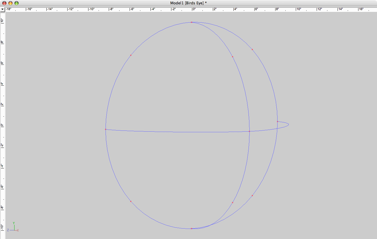
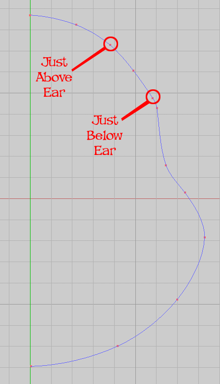
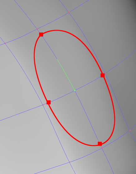
Bob, the best way to do this would be to do only half of the front/back view and the whole side view, so that you end up with one side of the model to build. Then when that side is done, you copy/flip/attach it to make the whole. Having so many control points along your spline is going to make the model very difficult to keep "smooth." Already, I can see some uneven parts in your spline along the bottom of Pooh's face. I would start by making just as many CPs as I need to make the shape: This will give me a nice, smooth surface. The other thing I'd keep in mind is planning for things like the ear. See how I've put a control point above and below where the ear would go and then one in the center? By doing that, when I've got the side of the head built, I can go in and add a ring of splines: Delete the center point & it's splines, and I've got the place to attach Pooh's ear.
-
I think it looks great, Lee! And I like the backstory so much that I've written a theme song! (To the tune of "The Flintstones") Brimstone! Project Brimstone! Got enlisted by Nightrun, Inc. Cam Keene (former Marine) Found out Doc Buchanon was a fink In a suit of armor, watch him fly He's got lots of wires in his thigh When you're Project Brimstone You are nothing like that guy by Stan Lee!
-
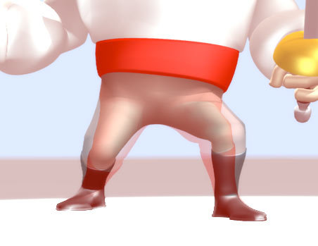
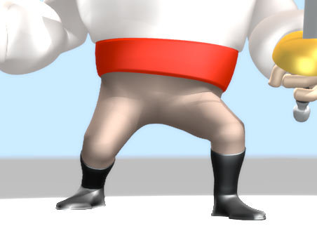
Bless ya', laddie! I've been noticing some awkwardness with the legs for awhile now and was chalking it up to my inferior CP weighting! I went back and turned on my geometry bones and to my surprise found out that the thigh bones' start point had shifted inward. Don't know how that happened, but I must've completely missed it, since it was mirrored on to the other side, too. I fixed those and it seemed to help a little, but was still not right. So, I moved the start point up some and did some editing of the CP weights and I think it's much better! Here's a pick showing just how much shifting happened when I replaced the old model with the adjusted one: And here's the adjusted one: It's still kind of an awkward pose, but I think the leg joints are much improved. Much thanks, Robert!
-
-
Thanks, Yves! I think I know what I did wrong with the rim-light. I lowered the angle of the cone and messed with the distance and softness. Need to learn when not to mess with stuff. :-) I've been setting up a bulb light in front of the characters, then the keylight aiming down from just to the front and left of the character (character's left) and then the rim-light from up and just behind the character's right. I'm pretty sure like you say that the keylight didn't have shadows turned on. Next time I'll do that. Are you meaning the neck should be back as a whole? Or maybe make it thinner and bring the front part of it back? Thanks, Lee! That model you linked to is amazing. The detail in the hair is fantastic. I'm trying to put more "edges" in these models. It does seem to define them more. I'm not quite getting exactly what I want, but I'm feeling like I'm improving with everything I make. I really appreciate the encouragement! Point noted on the background. With the bloom, it gets even lighter than it's set. I should probably make up some sort of generic background to test them against. At least for right now, I kinda' like the really bright lighting on the faces. It's really kind to the modeling, too, since little imperfections are hidden by the brightness.


