largento
-
Posts
3,827 -
Joined
-
Last visited
-
Days Won
31
Content Type
Profiles
Forums
Events
Everything posted by largento
-
I'm currently rigging and weighting my pirate character and have been building a custom rig (part of keeping the character simple.) The plus side, is that I'm able to put in orient-like bones where I have spline rings to cut back on a lot of the guesswork. I've also stumbled into the happy solution of using cosmetic bones at intersections (shoulders, elbows, wrists, etc.) which orient like at 100%, but do not store the roll. I then add another cosmetic bone further down the bone that does the same, but adds a roll like constraint at a percentage (say 50%.) That way I can finally roll the bicep without destroying my shoulder! Watching Will's CP Weighting disc has completely convinced me to do it the way he does. All in an Action window. You can easily switch back and forth between muscle and skeletal mode with no worries of accidentally moving something in the model. I've been selecting a ring of splines and then editing the weights with the control panel like Will describes. Go get his disc! Here's a question, though. Is there an easier way to take all the constraint relationships to the other side once I've mirrored the bones? Easier than going back and redoing all of the constraints?
-
Thanks for the reply and the excellent info!
-
One thing I've noticed is that it doesn't work if you have the "none" radio button under "subdivide edges" checked, nothing will import. I usually set it to "auto." If you're using CS3, they don't have the legacy thing anymore, but if you save it as an illustrator file, you'll get the option to pick which version to save it as and Illustrator 8 is one of them.
-
Hi, Satyajit! You're blog is fascinating and especially interesting to folks who are wanting to do their own films. I wanted to ask you a little bit about your process with using painted backgrounds. I'm wanting to do that with my project and I have a basic idea of how to make it work, but I wonder if you could talk a little about what the challenges are and offer some tips. I watched Hansel & Gretal and the backgrounds were not only beautiful, but the integration with the 3D elements was really good, as well. Mark
-
"Get up, Mr. Bubbles! Please get up!" :-) I just started playing it yesterday morning on the 360. I had the day off and played it for the better part of the day. Nice sense of being in the environment. Nice model! Are you going to decal it?
-
You were one of the lucky ones! I remember staring for hours at the Green Machine ad on the backs of comic books. :-) BTW, the seat looks great. I don't know if you've ever said in any of your posts, but are all of these character designs working towards a project?
-
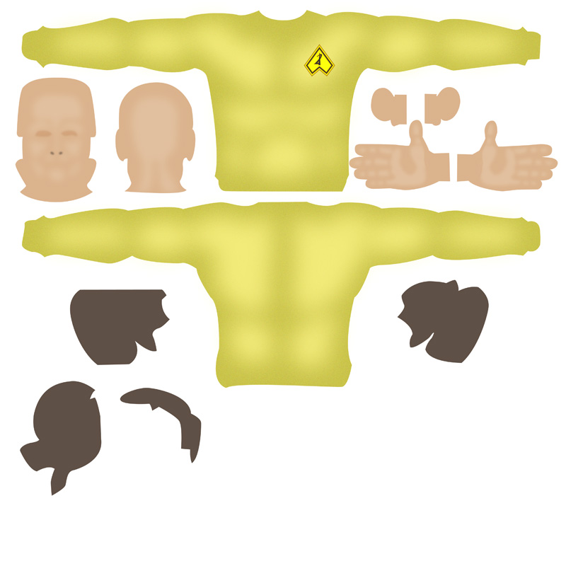
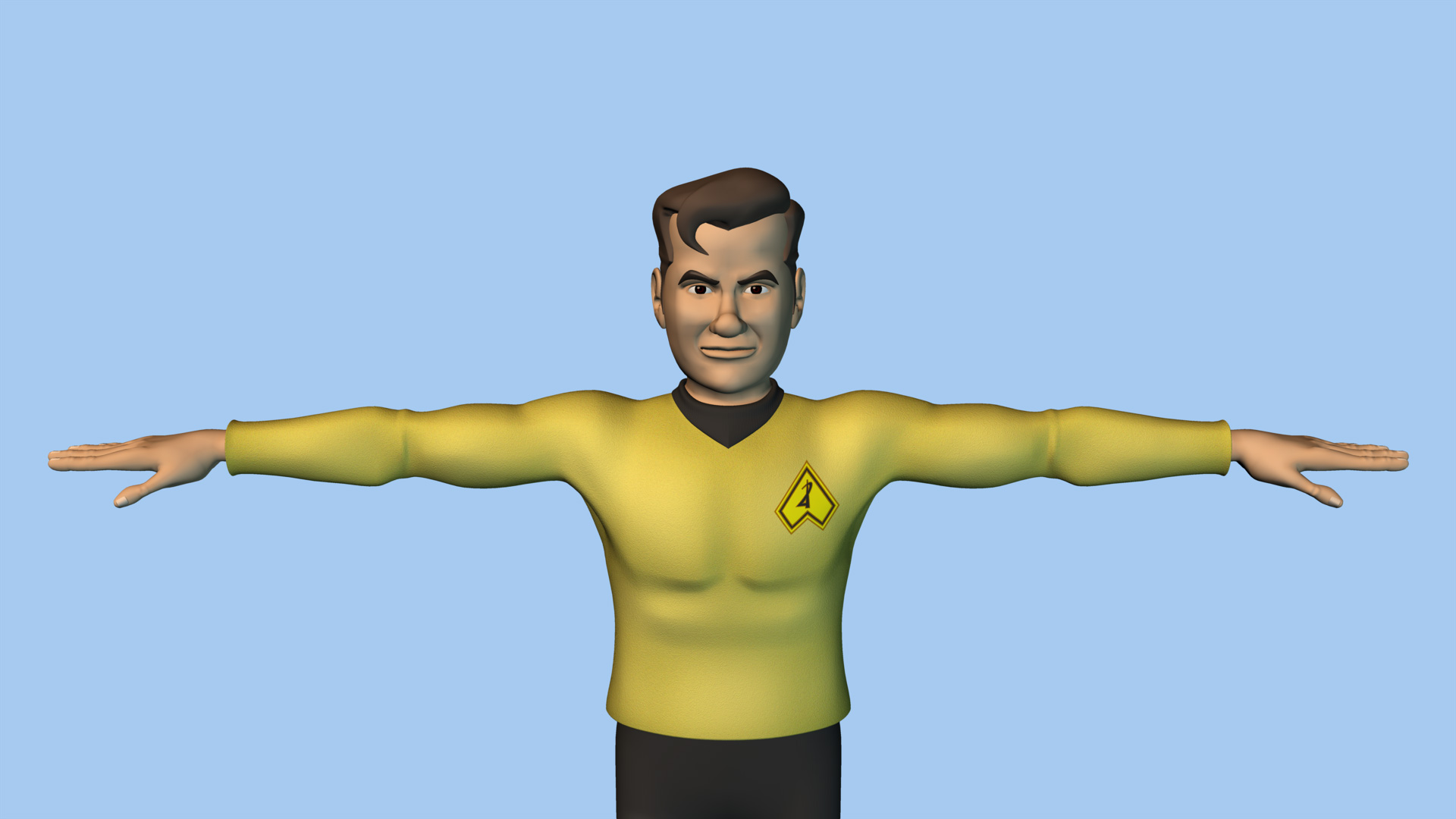
Just in the way of an update... I spent some time this weekend experimenting with doing UV decals. I watched Will's tutorial disk and really wanted to give it a try. It's still a work in progress (I'm working on painting the hair in 3D painter, but haven't figured out exactly how I want it to look yet.) Nothing too dramatic with it. I think the tunic looks pretty good. I gave the color decal some noise and then added a bump decal with white pixels applied with a brush set to dissolve. It doesn't look quite as soft, although, I've found that when you add depth of field, the softer focus areas sell it as being felt. Here's an image of the model and the decal sheets...

-
Keep the thread going, Dhar. It's a nice "case study" for people wanting to create their own characters.
-
I wouldn't dare look for a single fault in it, Lee! You've done a tremendous job with it and should feel really proud!
-
That's really cool, Gary! I just realized looking at your model that Big Wheel design has come along way since I last rode one in the mid 1970s. The way the back end curves up to form a seatback is really great. I remember that if the seat back (which was a separate piece back then) broke (or you lost it), you couldn't pedal the thing. :-)
-
I also have both and second Dhar's recommendation to get both. I bought Barry's first and I'd advise going through that disk first. Barry's disk covers the really basic elements of spline modeling, whereas Will's is more advanced modeling. I would also recommend the other disks from both parties. I've learned tons from them (and still have more to learn!) I don't have any experience with poly-modeling, but when I first came to A:M, I was coming into it thinking that control points and splines were like paths and points in Illustrator. So, I went straight to the bias handles and tried to use them like bezier curves, became frustrated that the add tool didn't work like the pen tool and succeeded only in making a mess. :-) I'm hardly a seasoned A:M modeler, but I'm getting there and I hardly ever touch the bias handles. In my way of thinking, they really are useful for trying to make really low spline-count models. Essentially, you're tweaking the biases to make up for missing splines. For that purpose, it would make sense to go ahead and model with all the splines you need. Then when it's finished, go in and see what you can take out and adjust the bias handles to compensate. The key that unlocked it all for me was learning about continuity. Once you understand that, the rest just seems to fall in place.
-
Thanks, Nancy! Given my inexperience with animating, just the fact that he *has* arms is going to be challenging! :-)
-
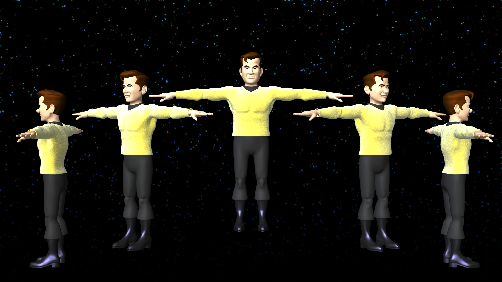
Thanks, Jeff! I've got most of the body finished. I've still got to build the collar (which will join the head and body), the hanging part of the sash and his vest. Then spend some time cleaning it all up. I wish I didn't have to run out today, because I'm sure I could get them done in just a few hours. Probably won't be able to come back to it until late tomorrow. I rendered out a turnaround to show my friend and thought I'd put it up here, too: flemmbody.mov I'm having big time fun with this!
-
Select the CPs and then change the correct axis scale to "0". If you enter the correct pivot measurement, they'll line up to that point. (eg. change the x pivot amount to "0", then change the scale in x to "0" and they'll all line up on zero in the x axis.)
-
Excellent work, Dhar! For being your first model, you're making the rest of us look bad! :-)
-
Thanks, Robert. No toon-render, no. I'm still dazzled and amazed by the 3D-ness.
-
Thanks, Trajce! I've got some cleaning up to do, but all the structures are in place for Flemm's head. (I'll do his 5 o'clock shadow with decals.) Here's a rotation: flemmspin.mov
-
Thanks, guys! I've started working on Flemm's head. (He's missing his ears and I haven't joined the 2 sides of the head yet.) I'm finding that simplifying it is much harder than making it more complex. It's so hard to resist the natural shapes you get when you're modeling in A:M. The body is going to be a lot of fun to do.
-
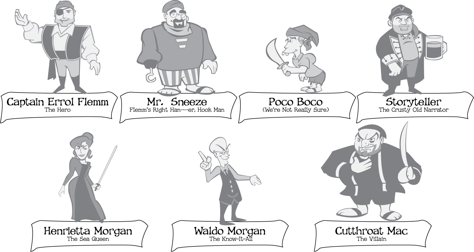
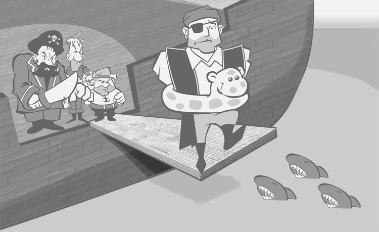
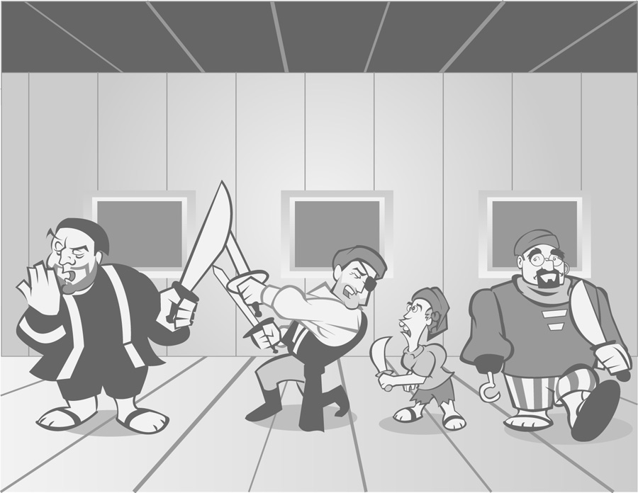
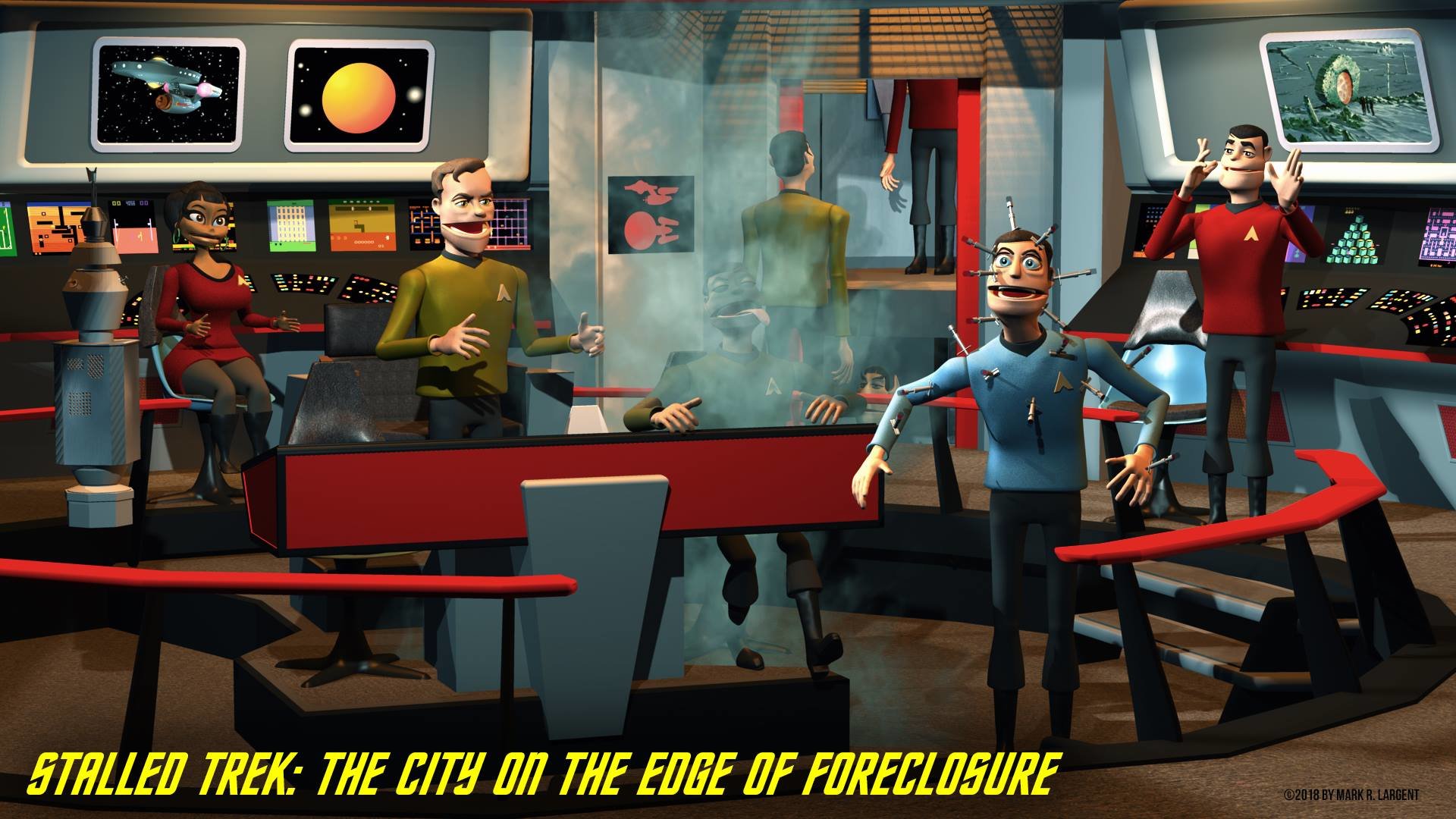
I had to give this one a lot of thought, but I've decided to work on a second project while still working on "Stalled Trek." I realize that this will put some more stall into Stalled Trek, but I think it's the right thing to do. The reality is that Stalled Trek is pretty ambitious and I want to get it right. As such, it's going to be a long time before I can finish it. Also, I'd like to have some more experience with the other aspects of the process (namely animating) so that my skills will (hopefully) match my ambition. I'd rather not have to go back and reanimate everything, like I'm having to go back and re-model the characters right now. So, while I continue to work on the "hard" project, I've decided to work on a simpler side-project, which will hopefully allow me to make more of my mistakes on it... rather than on Stalled Trek. I think this project will be a lot of fun to do, too. Not only because of the source material, but also because I won't be the Lone Ranger on this project. Some history: in 2003, a friend of mine pulled together a bunch of his friends and made a little home movie about pirates. Since we no longer live in the same part of the country, I wasn't going to be able to be involved, but thought I might be able to contribute in other ways. I came up with the notion of doing an animated sequence for the opening titles, using cartoon versions of the cast. Unfortunately, my life was in a bit of upheavel at the time and I finally had to accept that I just wouldn't have the time to pull it off. I had done the character designs, though, so we made some still images that were used behind the opening titles instead. Not nearly as satisfying, but what are you gonna' do? Anyway, fast forward to now and my friend and I were talking and he said that he'd had an idea for a sequel to his movie, but it would require a lot more to turn it into a movie and he wasn't sure if he wanted to take on all of the work of doing another one. I thought about it for awhile and finally asked him what he thought about the idea of doing it as a short animation. After some debating of the logistics, we both thought it would be fun and decided to do it. The great thing about this is that my friend is an artist, too, so there's going to be a tremendous amount of sharing the load. He's going to write the story, storyboard it, design all of the props and paint all of the backgrounds. (The only 3D will be the characters and the props and parts of the sets necessary for them to interact with. This will keep the amount of modeling down to a much more reasonable size.) He'll also record all of the dialogue (using the people who played them in the movie he made.) I'll *just* (ha!) do the modeling and the animating. :-) I'm not pretending it'll be easy, but dividing the tasks like this and having one another to bounce back and forth off of and spur each other on, should make it easier than just doing everything on my own. The look is going to be pretty cartoony and stylized. Like I said, the backgrounds will be flat and we're going to try to keep the story relatively uncomplicated and the number of characters to a minimum. The movie was done in black and white (my friend loves the old Errol Flynn movie "The Seahawks"), so this will be in black and white, too, which helps keep things simple, too. In the end, the cartoon should make a great extra for his first movie and an excellent bit of practice for me on my way to completing Stalled Trek. Since I'm not involved in the story (which my friend won't begin writing until next week or so), I'm not sure exactly what will be involved. I do have the character designs I did of the cast of the first movie and although I don't know if all of them will be used, I'll feel safe starting to model the main ones. Here's the character designs I did all those years ago... Not sure exactly how well they'll translate into 3D. I tried to keep them extremely simple back then and I think that'll help to make for simple 3D character models. Here's a couple of the "stills" I did back then. I think the look of this will be very similar, just with the characters and some elements in 3D.
-
Decide to work on an old character I started
largento replied to johnl3d's topic in Work In Progress / Sweatbox
Would a pig have hands? -
You know what might be fun to add as a bit of detail in the background would be some pieces of armor from one of Iron Man's villains, as if he'd just finished defeating one of them (maybe Titanium Man or the Crimson Dynamo.) Not that many people would recognize them, but it'd be cool to the ones who did.
-
Attached Krok's head to his body today. Needs some work (although I'm fairly proud of his new boots!) :-) Figure I'll spend the week tweaking things and then rig it next weekend. I'm waiting until he's fully rigged before I do the decaling. Here's a turnaround... v3_spin.mov
-
Did you move the model far away from the center axis in the model window?
-
Wow, Jeff! Great work! This is my first time seeing this thread. I'm sure the finished product is going to be amazing!
-
I could be wrong, but it sounds like you may be in mirror mode... try turning mirror mode off.