nf1nk
-
Posts
189 -
Joined
-
Last visited
Content Type
Profiles
Forums
Events
Everything posted by nf1nk
-
wow luuke that one really feels 3d great depth
-
I just used mainly default settings, I used type anaglyph (grey, red/blue), eye spacing of 3" and use the frame distance to my focal plane. I had to turn off toon render (for some reason I couldn't get anaglyph, and toon to work together).
-
For the scifi contest most people re released their contest entry in stereo. I thought that was really cool so, now that the voting is over I feel it is ok for me to repost my entry in Stereo. I would love for other folks to do the same. oh and I would love comments and criticism.

-
I like the look, but I feel like the timing could use help. it would be nice if the space ship sat for 1/2 a second before the elevator happens, then another 1/2 second before the door opens. I like that some the background falls out of focus, it feels more real.
-
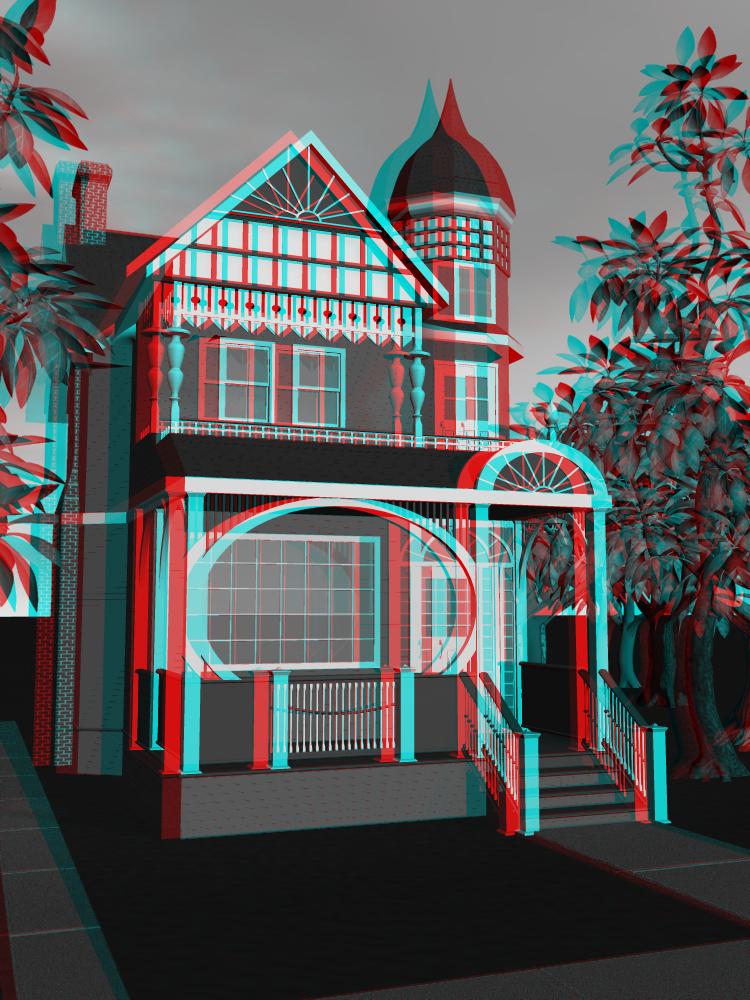
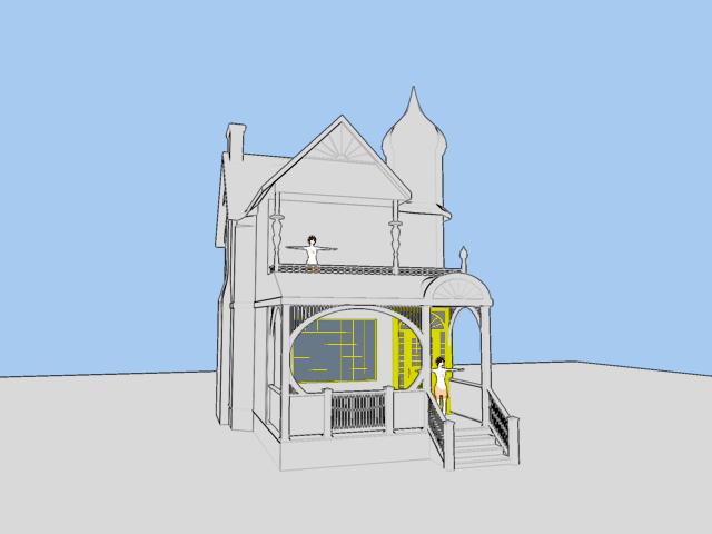
Here is my victorian house. I never would have started this if I knew how much work all the little peices of trim would be. It is still very much a WIP, but of course C&C would be great. The bottom floor is mostly done, but the upper floor and tower are barely begun. I am using a tune render beacuse it shows more of the detail before I texture and color. oh and the colors are just placeholders
-
nice flames
-
its a good looking helmut, but it looks way too small for this fellows head. my experiance with wearing the miserable things is that they sit no closer than 1" from your head in any direction. This gives the apearance that they are too big for your head.
-
Big cats have round irises tiger eyes house cats and snakes have slit irises, but oblong eyes might be a good comprimise
-
Space is black because there is nothing to reflect against, not because it is nessisarily dark. In fact windows on space craft that might turn to a star have to be heavily tinted to avoid blinding the crew. (of course if you are in the shadow of a planet or moon there will be less light) The point of this comment is to let you know that it is ok to brightly light a space scene. Many old sci fi movies didn't do this because the ships are held up with wires and post editing is expensive. your ships look like they might have neat detail. give it more light so we can see it.
-
Figured it out. I needed to add a transparancy decal under the color. that kind of bugged since it messed up my glass material some
-
I am having a bit of trouble getting the decal to look right on this. it is supposed to look like orange paint applied to the glass. right now it looks like orange tint applied to glass.
-
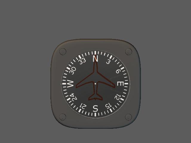
That might work. I might play with that Idea when i build the ammo counter. which will be after the artificial horizon, the mag compass, the airspeed indicator, the Gmeter. climb indicator.... Lot left to do. In the mean time here is a short video of the altimeter working while the plane is rolling. next to it is a clock that is working. it is just hard to tell because there is no light on it Gaugetest02.wmv
-
Well the altimeter turns out to only work if the altimeter stays right side up. looks like I have to recode it to take that into account. I am hoping for inspiration while I sleep
-
if the numbers were like an odometer then the only thing you would have to change is the axis of rotation. that would be easy your distance meter would probibly be more use full if you used insead of the RSS between the root bone and the null, you used the RSS of the difference between two nulls sqrt( (nll1.translate.X - nll2.translate.X)^2 + (nll1.translate.Y - nll2.translate.Y)^2 +(nll1.translate.Z - nll2.translate.Z)^2 * 36 / 30.48 note that I miswrote before you multiply by the number of degrees per notch and divide by the unit conversion the hardest part of that is doing the decalling. it will work but it will look like kie an odometer from a car from the early prewar years. the numbers will never sit nicely on a line. if you want them to sit nicly on a line that will take some tricky math to make it work.
-
not impossible but notably harder it would be much like actualy writing the firmware for a digital display. there would be a ton of if statements. each digit would be a seven segment display each segment would nead its own code each segment is either on or off for any numerical value. so we are looking at around 70 lines of code per digit. there are short cuts in modeling that could seriouly reduce the amount of code, but they won't become aparant until I think about it more
-
Shouldn't be too hard. you could turn the altimeter into a distance meter by chaning the first expression from (ground.transform.Y)*3048/36 to sqrt((ground.transform.X)^2 +(ground.transform.Y)^2 +(ground.transform.Z)^2)*30.48/36 where 30.48 is no of cm per foot and 36 is number of degrees per tick mark edit that will give you straigh line distance. I think I could do curved line distance also but the math would be much harder
-
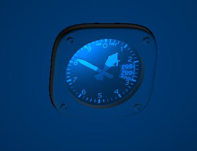
I tried but each time I try to do a shaded w wireframe I get a failure message of InitBoundRenderInfo what ever that means Here is the model file and the image files used to create the model the null labeled ground is actualy what the altimeter is measuring the Y offset from the big hand shows 100 feet and the little hand shows 1000 feet edit: oh and it was done in V13 with the most recent patches installed Altimeter.zip
-
Let me know if anybody wants it critism is strongly encouraged the cool part is that it actualy lets you know how high above the ground it is
-
I think the problem with the girls elbow is that it is pointed at the camera, it is hard to tell what you are looking at when you see the elbow at that angle, it would look better if either the camera moved or the girl moves.
-
http://freesound.iua.upf.edu/samplesViewSingle.php?id=9885 This is the sound of a pile driver, perhaps with some editing it could be the stomping of this huge machine. free sounds is a great resource for the kind of thing
-
http://www.smcars.net/ they are a pretty good source of of car blueprints, but alas no viper srt top view they do have side, front and back views without perspective. registraion required
-
Add some slobber and it should be ready to give little kid nightmares . it looks great
-
its lookin good, I wonder if the capitain would look more birdlike, if you made the feathers stop just below his pant line so we get some more of his cool scaley feet and ankles
-
The detail is increadable (with extra letters in there to show how great the model is), and maybe when the model is done your model will answer a question I have had abou the jedi star fighter. Where is the bottom half of the R2 unit ?(I know that this bird has R4, but in episode IV they refer to them with a generic term R2) The wings look too thin to hold the whole robot. This isn't a complaint about your model, as yours looks very much like the ILM model and it has the same issue.
-
I agree completely, I also feel like the wings should extend at least twice as far. Most flying things have a wingspan of at least twice the body length. of course there are significant exceptons.