nf1nk
-
Posts
189 -
Joined
-
Last visited
Content Type
Profiles
Forums
Events
Everything posted by nf1nk
-
Thats a really great grenade and a neat way to do that, (I have been doing similar technique except I have been twisting splines instead of deleting extra splines, it saves on crashing). For the sake of details. I would like to point out that modern grenades do not have the cool grooves that your WWII/korean war grenade has. Even the frag grenade, has a smooth outside. Also the pin on a modern grenade is like a cotter pin (split in the middle), it still does have the ring.
-
I have to agree with Bill on this one. I am thinking either a light blue or light red, would give both an interesting reflection and provide for a more dramatic light. or even if one of the now blcak bands was instead some glowing color just my $0.02
-
The eyes could really use large black pupils, right now it looks like he has glasses on, but he is a very cute raindrop, or maybe a pudding.
-
As long as we are doing the texturing, it would add realism to have the engine block be rough, like a casting. the engine is boxer style, and most boxers have a cast block. as an aside. high stress members are not cromed, because croming can cause hydrogen embrittlement. The block is a high stress member. the car looks awsome and I am very impressed
-
also consider having a driveshaft instead of a chain. I saw an artice on that in popular mechanics. Consider a strange rear suspnsion set up. color shifting paint, and ....
-
Very nice movement. It has come a very long way
-
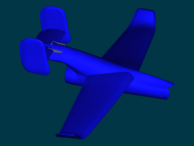
Its pretty and I like it. Here are a few criticisms. Take them for what they are worth. 1. we should be able to see the top of the seat (s) at this angle. 2. the exhaust for the engines appears to dump directly into the elevator. this would be extremely inefficient, and would cause, both discoloration and structural damage to these surfaces 3. The vertical stabilizer seems kind of small, also despite the very nice panel work in the front half of the aircraft, I don't see where the rudder control surface is (although that could be a render artifact. 4. The elevator is thicker than the wing. I have looked at hundreds of aircraft and have never seen this to be the case 5. All of the flight surfaces end in the same way, a kind of boxy flat thing. It would be cool if you used a different tip treatment for the wings than the elevator. 6. Consider wheels instead of skids. even helocopters use wheels now 7. keep up the good work
-
Yeah, you know what this car is..or you better
nf1nk replied to pixelmech's topic in Work In Progress / Sweatbox
one thing you could do is tilt the top of the wheel in 1 or 2 degrees, so you get a little more sky reflection. also many real racers do this although its name escapes me. it provides more traction at the expense of tire life -
Getting close John, but I can't see that blue printing well, or holding up to abuse. the beveling still seems unnessisary. The card has come along way and your hard work is showing
-
Looks awsome, but i agree about the cow hooves being too wide, and it seems the motor cycle is missing the foot posts. but hey awesome work.... oh yeah and I think these are the wrong trousers
-
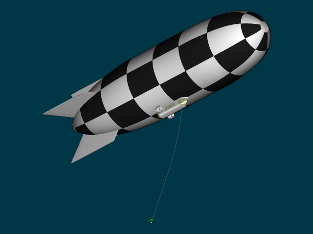
I added the turn flag hanging below the Blimp, it looks small and close but it is 30m below the blimp and the flag is 1.5 m long. that should give the racers some margin to shoot for when they come around the corner at 300+ mph. (how to spot an engineer: look for someone who uses metric and english units in the same sentence)

-
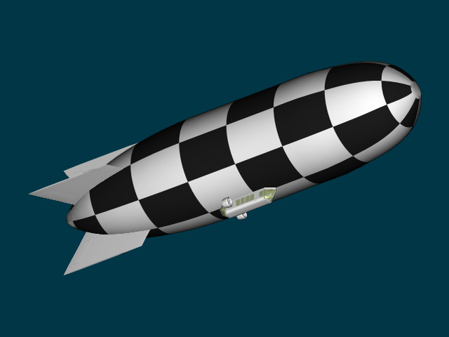
Since I was doing My racing Jets, I looked at some pictures of the Nevada Air races and I saw the birds doing hard turns around checkered pylons, I thought it would be cool to have the Jets screaming around a checkered blimp. In the nose and tail I did some things that I knew would give me puckering, like I saw in the images of real blimps. one Part that disappoints me is that you can hardly see the cool five bladed propeller that I put on the nacelles
-
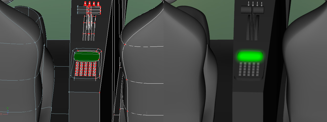
I did a test render of the radio I did for my blimp, obviously it could stand to be beveled, but you can't really see this thing so I am not even gong to decal the buttons, but the main thing you can see in this shot is that my buttons do not affect the number of patches I used for the back plate
-
Recently I did a key pad for a radio in the planes I was doing for a while, and I found that It didn't look much different when I made the backplate one flat patch and then just sort of set my squarish buttons on top, as opposed to setting each button in its own divot (later I noticed there was almost no angle you could see the radio from, but that is another story). I guess my question is does it need all of them, because to me it would look about the same if the blue part had about 1/4 the patches
-
Its not as strange as it looks, The model is acting as though the wires have a great deal of mass, and the spheres are acting as though they have very little mass, it looks odd because we are used to seeing things set up where the spheres have significantly more mass than the wires, also we expect the wires to flex, or if not, the joint between the wire and the weight would stay rigid.
-
what I was wanting to do was run the aircraft real close to cayon walls at insane speeds, including having the planes just missing tree tops speeds may not have to be super high, but my particle systems are set so they look very good at 250 m/s
-
I checked my physics book, and whie the speed of sound can vary based on a large no of variables, for the purposes of determining speed mach 1 = 340.29 m / s. Still my little birds are moving very fast
-
I looked at weggs grand canyon, and while it is pretty the edges don't feel sharp enough, the textures don't feel bold enough and I wold like mine to be more watery with flashes of green. In short it wan't what I wanted. I may slow things down to 200 m/s to get a little further under mach 1 which is closer to 300 m/s, either way I am going to eat up terrain very fast.
-
So I have mostly finished building my fleet of racing jets, and would now like to race them through some large canyons or possibly fjords, with maybe a mountain range thrown in for good measure. The jets should move about 250m/s so the canyon will have to be large indeed. I have my old AM 2000 book, and it mentions rebumpx, but I am not sure how compatable it is with v11. Any thoughts on good relatively recent tutorials on how to build mountains and valleys?
-
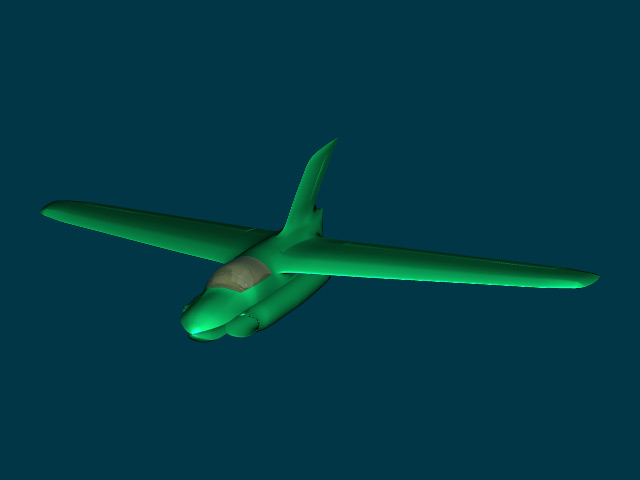
Here is the last plane and so far my favorite, I call it eh electric blue anteater. The cockpit section is far from finished and the engine isn't installed, but I love its funky shape.
-
Strangly I am more interested in how he made the thing wobble, than the metal surface
-
My wife noted that the hair on the eyebrows is a radically different color than the curly mass on top, "it looks dyed". could be the look you are going for though. all around very well done
-
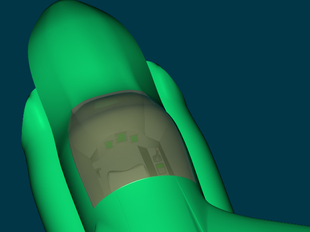
ths should be the view with all the wasted cockpit detail
-
and another one
-
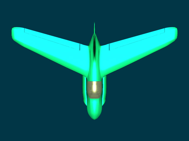
The green one, soon to be no 55. the one with the spline problems. THis model has some ugly internal splines that I can't delete ot AM crashes. but their are only two ugly splines and they are internals so they get to stay. also the ugly patch behind the cockpit is from another problematic spot where the software would not let me put a 5 point patch, period