dborruso
-
Posts
950 -
Joined
-
Last visited
Content Type
Profiles
Forums
Events
Everything posted by dborruso
-
Hey, this is a fantastic character. good job!
-
the city is off to a great start. I am looking forward to seeing more. I think the city deserves it's own thread so more people will see it. Take care.
-
Hey jin, The car turned out beautiful. A work to be proud of. Good to see you make such a splash in the forum. See you in chat.
-

Some of the first stuff I've done with A:M
dborruso replied to darklemur's topic in Work In Progress / Sweatbox
Wow, those are your first works? very impressive indeed. That menger sponge must have pretty heavy spinage. All those holes. That Knex thing is real neat too. Would you consider making some tutorials so we can see how you made such nice symmetrical mechanical shapes. Dont worry about the stuff you did wrong in your fireworks animation. It's got a lot of personality and charm and I think you pulled it off well with style. Very ambitious. I checked out your site. I really like your flash work. I liked your count of monte crisco better than the movie. That song trigger happy was really funny in paintball, I never heard it before. Keep up the great work. You will be a pro in no time. -
Thanks guys here he is textured. Now to rig him.

-
Hi hashers, I started my first model for the boxing game i wanna make today. He is herbie the frog and he will be the main player character. I modeled him in segments because i wanna keep my first game simple and this way i dont have to worry about how my joint rotaions will translate from one program to another. I just slapped those textures on there, there will be much better texture maps with details and variation. I tried to keep this model low poly so the texture maps will finish it off and maybe make the edges where the segments meet look better. I was trying to put a test eye map on his eyeball but spherical mapping isnt working in 11t for some reason, this could be a problem for me. thats why his eyes are just spheres now. I'm gonna texture map the iris and pupil and the lids right on the sphere. You cant use surface properties in gamestudio so it will all be texture maps. Let me know what you think about this character design. I would like some real honest feedback because i wanna make this a good looking game that appeals to people. Thanks folks.
-
Larry, I think you have a nice successful yet simple character. It is a good lesson for me to look at. Thanks. He looks a little dark to me in that pic, but i guess he's transparent and the floor is dark so that will happen. I'd like to see him tested in different enviroments. I am looking forward to see what you do with animating this guy. Looks like a lot of fun. peace
-
hehehe, thats pretty funny. He looks pretty stiff and his arms dont bend but I would imagine you know that already. It's a good start. I Look forward to seeing him finished.
-
You are invited for the CRITIQUE
dborruso replied to trajcedrv's topic in Work In Progress / Sweatbox
I really liked this animation. I think its well done and fun to watch. The teeth have a lot of personality and are cute. Good work. -
Here's and update on the frog bone warrior.
-
Hey Den, I used to be a compusa employee too but i didnt have nearly the fun position you have. I was in inventory, yukk. Congratulations on teaching a:m. very cool. Good luck to you and your students.
-
nice. very original. Keep up the great work!
-
Hi Pengy, I really like this character. Cant wait to see him animated. Even construction workers love A:M. Awesome!
-
Wow jin, I am very impressed with this car model you made and the speed you made it in. very good work. see ya at #hash3d
-
Hey DL I love this image. I would imagine hash coke would have some strange mind altering effects on one Great work. I love your fishies.
-
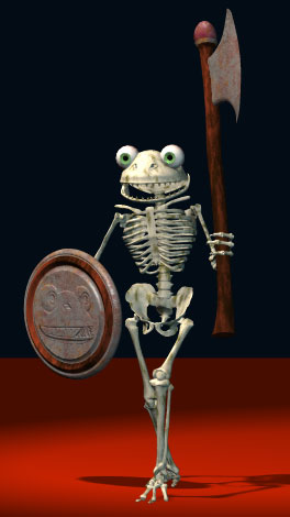
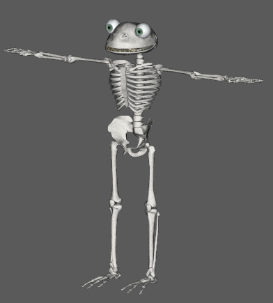
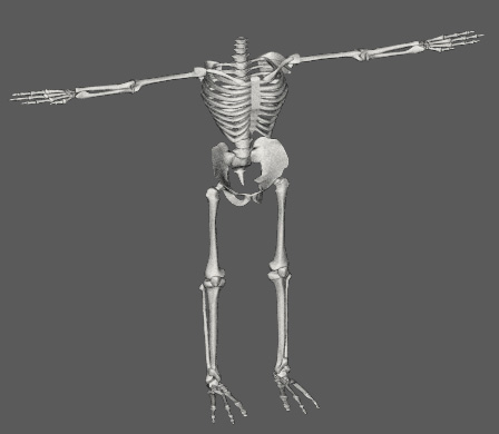
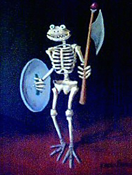
Well my frog bone warrior is just about done. let me know what you think. Thanks for looking.
-
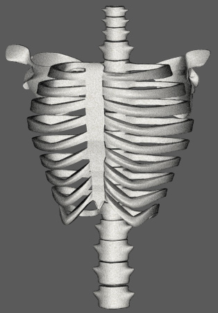
I stole the rest of the parts from the old eugene model. The pelvis I made stunk but eugenes is great. I dont mind cheating a little. Now I can focus on making a bad ass skull for him.
-
Thanks Guys. I'm glad you like my character design. I've started modeling him as you can see. The pelvis and skull will be challenging but the rest is pretty simple. I dont know what jason and the argonauts is but my frog bone warrior will gladly fight all challengers. John, how'd you make that little animation of my guy. It's awesome! so cool to see him move already. You beat me to the punch. I'll keep you updated of progress. Thanks for looking.
-
Hi all, I've been thinking of doing a character of a frog bone warrior for a while now. I have done a painting of him to help visualize him. My painting skills are a little rusty as I just started painting again after like 6 years of not painting. Sorry the pic is low quality, i took it with my web cam. Let me know what you think of this character. Comments, criticisms, suggestions welcome. Thanks
-
Damn! You even make toilets look good!
-
nice markus. smart to keep your first model simple, you can learn a lot with that little guy. Have fun
-
really nice model Rod. Good to see you doing something other than helping others. Dont get me wrong, helping others is great, but you gotta do your own thing too. I see you had a birthday. Happy Birthday!
-
Against The Author Hitting it Big!
dborruso replied to guernseyfreak's topic in Work In Progress / Sweatbox
Your webpage has definitely improved. Better off without all those flashies and stuff. On the trailers page the text cell on the top is too long. Maybe you can set a smaller horizontal dimension. Also, it would be helpful if you had links to the other pages on your site from each page, or at least one to the homepage from each page. I like the logo on your splash page, but don't think you really need a splash page. Maybe if you had like a flash version and an html version to choose from it would make sense. I would go straight to the homepage with the links to other pages on your site. Use that cool logo somewhere else then. Good luck with your ambitious project. -
I get a dead link from that url
-
Hi Pancho, you're site is off to a good start. Here are some suggestions: It looks like there should be a horizontal banner up top but all i get is a little red x in the corner. Your last button after my tools doesn't display either. I am on ie 6 on pc. Align everything properly so the right side doesn't look so chaotic. I would get rid of the border on the table with your artwork in it. Most of the time those borders are distracting, ugly, and amateurish (just my opinion). The black lines around the buttons look fine though. The link to your disco guy animation is a dead link. I like the colors, and your artwork, and the general layout is ok. But I suggest some tightening and tweaking. Keep up the good work. Happy Hashing