-
Posts
21,632 -
Joined
-
Last visited
-
Days Won
114
Content Type
Profiles
Forums
Events
Everything posted by Rodney
-
Zaryin, I think you might be closer to the Steve Ditko Spider-Man than the modern one. Thats a good thing IMO. Those eyes though... gotta go with the white (as in Patricks maquettes). The comic book fans in this forum have yet to be reckoned with! Rodney
-

Mechanic expression use with hypnotic mat
Rodney replied to johnl3d's topic in Work In Progress / Sweatbox
... I will vote for JohnL3D. Which image is by JohnL3D. I will vote for JohnL3D. Which image is by JohnL3D. I will vote for JohnL3D. ... -
Is it time to announce the Tinkering Gnomes Workshop? No. Didn't think so. Move along... nuthin' to see here.
-
Very Cute.
-

GAIL: The City [slight nudity]
Rodney replied to patrick_j_clarke's topic in Work In Progress / Sweatbox
...as they say... another fine feather in your cap. Congratulations! -
..and is a cool idea at that. Thanks John! I can definitely use that.
-
Since library files are just text files it should'nt be to hard for a programmer to generate/manipulate that text in interesting ways. I'm no programmer but as I said: I'd gladly work with anyone that wants to work on Library improvements. For Hash Inc involvement definitely follow Ken's suggestion and submit to A:M Reports at a New Feature request.
-
One way would be to make the 4 CPs all of one continuous spline. It takes 2 or more splines to create a patch so... that would leave the area open.
-
I most certainly do. Its great to have you back!
-
Not that they have revealed. I'd guess that Library improvements may be in the realm of plugin/uitility programmers to build for now. I'd gladly work with anyone that wants to work on improvements. There is one aspect of Libraries in future versions that might force an update to how A:M handles libraries. The ability to read into compressed files would seemingly force A:M to require the ability to 'see' into compressed files or only view shortcuts to resources outside of compressed files. I'm hoping for the first option but no news is good news for now. Libraries will improve in direct porportion to the attention span of those that champion them.
-
Nice detail!
-
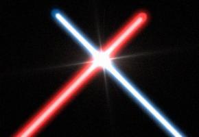
Looks more like a painting of a lightsaber to me. Clone, While I won't ever claim this is a decent saber look I think you could realize what you are after by using several dome capped cylinders with varying transparency and specular color. You could then modify the splines of that cylinder as you need. The most important factor to remember I think however would be that the effect is usually done in post production where the artists control the elements completely. That way the backgrounds and other objects in the scene only effect the saber blades if the artist wants them to. In still imagery (such as Dark Jedi posted) additional effects have been added such as lens flare too. You can do this all within A:M.
-
Yep. Information on the Knight and his knee injuries can be found there. That and a link to a knight without the problem.
-
I like that much better. Nice bright lighting. Feels like desert.
-

AM can convert and compress output formats
Rodney replied to johnl3d's topic in A:M Tutorials & Demos
Very nice John. Clear and concise. -
It's pretty basic but Irfanview (freeware at www.irfanview.com) will create a screensaver/slideshow of images in .exe/.scr format. Nothing fancy but if you created several similar images it would almost look like animation... um... maybe... (actually the refresh rate probably wouldn't work for that now that I think about it). Perhaps best just to use WinXP's built in slideshow... Desktop / Screensaver Contest. Great Idea! That should be the next Hash Inc still image contest. Great imagery Colin.
-
I think WIP would work but since its not a WIP I think maybe Showcase would be better. I like it. I'd like to see the transition be even more of a snap/instant transition but... nice. If I had my druthers (what ever those are) I would suggest repositioning/resizing the text a bit for maximum effect (you know... to really draw people into the center of the effect) but perhaps you got it right after all. Well done!
-
Outstanding explanation Paula! We'll try to get more specific information out about this. Here is the suggested trajectory for successfully learning Animation:Master: - Complete The Art of Animation:Master (TAoAM). Get TAoAM certified. - Graduate Animation BootCamp (ABC). Create a Demo Reel demonstrating your mastery of the principles of animation. - Enter the Mentorship Program. The premier mentorship program in the A:M community is the Tin Woodman of Oz (TWO) movie. When you join TWO you'll work under an Art/Animation Director in a full production movie. TWO is a Martin Hash production and officially sanctioned by Hash Inc. The Mentorship Program is headed by David (he wrote the book) Rogers. At any given time there may be other mentoring opportunities made available through other production houses or individual mentors. Official mentoring opportunities will be announced as they are become available in the forum. Added for Bob: If you are officially enrolled in this process for the purpose of participating in TWO (and you are!) you are qualified as 'involved in TWO'. Make sure you are on Martin's list and hope to see you at Hash Bash 2006!
-
Shootin'! Or will there be a horse race.
-
Michael, Let me say this... You are joining the Animation:Master Community at an opportune time. Not only is Animation:Master at its peak in terms of performance, features, price and support but the A:M Community is involved in a host of projects that provide a rewarding and accelerated learning opportunity for everyone with an interest. Everyone is busy these days. The fact that you've searched out and selected A:M tells me a lot about you. It sounds like you have plenty to keep you busy but I hope you'll find time to get involved here in the forum. You can gain insight into A:M from community projects like 'The Tin Woodsman of Oz' movie. Closely related to your current work you'll find the community has recently launched a TWO related game to complement the movie. With your background and experience I know you'd be a welcome addition to either team in any capacity. You said: You definitely should get involved in TWO. Even though you are sure to see a lot of TWO related projects in the future that isn't all there is to do in the forum. To get new users up to speed quickly there is the manual; The Art of Animation:Master (TAoAM). The exercises coupled with free online video and live assistance from others in the forum is a great way to learn the basics while meeting other up and coming animators, modelers and technical directors. Looking beyond the manual you can expand into the Animation BootCamp (ABC) which provides a thorough path toward mastery of 3D animation and technique. ABC walks animators through the creation of a Demo Reel demonstrating the 12 Principles of Animation and beyond! Its hard work but really rewarding. I highly recommend it. As Hash Inc has often stated; people are Animation:Master's greatest asset. The community is a great place to collaborate with others. For those apt to teach there are opportunities to take what you learn to the next level through teaching. There is a Mentoring program (now operating within the TWO project) and the Tutorials forum is relatively new but is finally starting to take shape. With new technology like Wikis and A:M's collaboration features the time has never been better to get involved with other artists. What you learn working with others can help make your own projects a reality. Not enough you say? There are contests to enter (both still imagery and animation) or you start a Work in Progress (WIP) and get critique and commentary on your work. There is the Extra CD project, the Hash Fellows, Software development and programming and more. Even if you just want to sit back and enjoy... there is always something fun going on in the forum. Welcome to the A:M Community. It's great to have you with us. Rodney
-
Go Dennis! (and go Herbie!)
-
New versions automatically install in their own directory. You should be aware of the file format difference between v12 and v13. Projects saved in v13 will NOT be backward compatible to v12. Keep your v12 project files separated/in duplicate and it won't be a problem. We'll try to get you linked to some of the tutorials. A really nice Sweeper tutorial (several actually) can be found on its creators site. Check out Mosca Films (Emilio here in the forum). Anyone have the link handy? Newton Physics has some outstanding tutorials by it's creator (Stefen Gross). He goes by Yoda64 (or some number like that). Outstanding programming by both of these talented guys.
-
Wow. Great Mom! Welcome to the Animation:Master Community.
-
Your second question requires a more technical answer so I'll punt that on down the field for someone else to catch. To change the spline color you need to go into TOOLS/CUSTOMIZE and on the last tab change to splines in the drop down menu. Then change the color. You can change other things like background color, CP size and more there.


