CreativeAustinYankee
-
Posts
362 -
Joined
-
Last visited
Content Type
Profiles
Forums
Events
Everything posted by CreativeAustinYankee
-
Hi, Just wanted to recommend to any and all to consider using the G13 if you're still using the keyboard. I bought it from Amazon and have now set it up for modeling. Later on, I'll set up separate profiles for rigging and animating. Right now, I'm going to get used to the layout by building a bunch of nurnies. Steve P.
-
I LOVED the Neverhood. Doug TenNapel has teamed up with a few old friends and is creating another similar game. Terry Taylor is onboard for the soundtrack! They're looking for support, I thought I'd help spread the word. http://www.kickstarter.com/projects/194953...=home_spotlight
-
This may be nothing, bu have you cleared your Hash registry file? Sometimes that gets a little messed. Also, try updating your video driver files. Just a thought. Steve P.
-
Steve, Great work! I did notice a few small things that, if changed, would add to the project. First, I noticed the front tires of the bus don't really turn into the curve. It kinda looks like the bus is gliding along. Rigging the front tires seperately and getting them to turn along the path would help add a little realism. Also, the bags of chips on the hot dog cart, there's a point of realism that your striving for, but these decals might be too real to fit within that context. You might consider creating fake chip decals that are a bit less realsitic. Just one guy's opinion. Steve P.
-
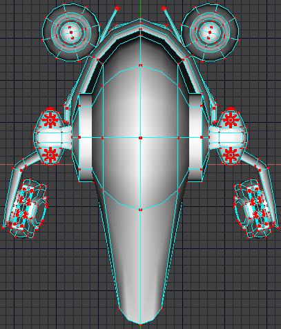
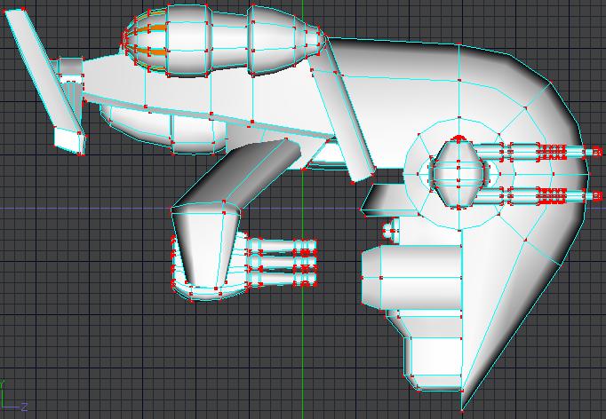
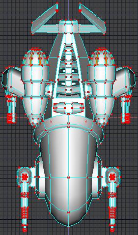
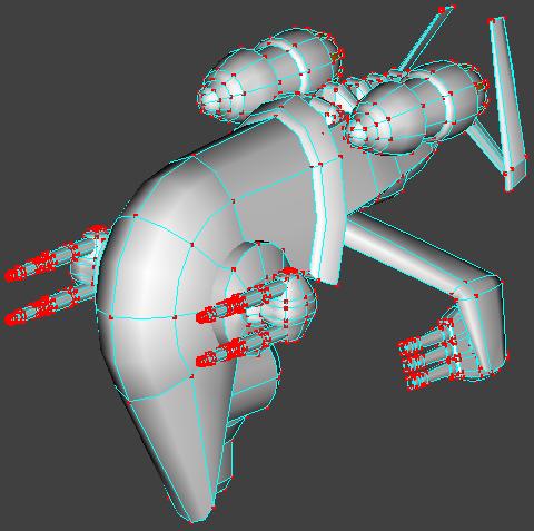
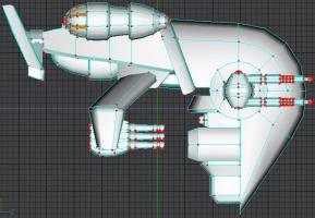
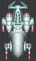
Hi, I haven't posted anything in forever and thought I'd share what I'm working on. This is one of a few types of spacecraft I'm modeling for a live action greenscreen comp. Basically, I'm pushing the envelope with what I'm capable of doing. This is going to eventually end up on a showreel. I've still got some nurnies to add and some textures and cockpit interiors and so on. I created a small avi turn around that I wasn't able to upload for some reason. Anyway, crits welcome. I'll create some better wireframe pics. Steve P.


-
A drawing Contest
CreativeAustinYankee replied to animation man hi's topic in Work In Progress / Sweatbox
You may find this site really helpful. Steve P. http://www.ugo.com/channels/comics/heromachine/classic.asp -
Actually, if you trimmed a little of the black, you could use it for your avatar. Just a thought. Steve P.
-
This is very good. There are a few areas that might be tweaked a bit, if you're still working with it. It has to do with motion arcs, follow-through, and secondary motion. Overall, he moves a little stiff. And.... he appears to be running with his knees bent. My two cents. Steve P.
-
Overall, the image still seems a little crowded, but that just may be my personal taste. Much better than the previous version. My advice, let this rest for a bit. Come back to it when you have fresh eyes, and I'm sure you'll see things you can improve on. In the meantime, take a look around some of the 3D galleries on the net for inspiration. Check this out: http://www.eve-online.com/screenshots/coll...5122007&n=8 http://www.eve-online.com/screenshots/archive/ Best of luck, Steve P.
-
Okay, a few guidelines about creating interesting images. Your image is very static. The best images tell a story. Perspective: Right now, the ships are all of apparently the same size and approximate distance away from the viewer. Two of them are shown top/bottom. There's nothing there to really catch the eye and bring the viewer into the scene. Show us the viewpoint from one of the ship pilots or perhaps what it would look like standing on one of the asteroids. Play around with perspective, find an interesting viewpoint. Composition: The rule of thirds - this is a basic guideline used for all types of visual media. If you're not familiar with this rule, the short version is this: Divide your image with grid lines into thirds horizontally and diagonally. Where these lines intersect is where you want your object of interest in the image. Contrast - vary the size of the asteroids a bit more. Perhaps, show us a planet, moon, or space station to help us establish a size reference. Space is huge, everything in this image is kind of clustered together. Spread things out a bit. Vary the distance. You have a lightsource from the bottom right, yet everything is evenly lit and flat. The contrast of shadow and light would really add some depth to this scene. Color composition: The space rocks are grey/white and the ships are grey. Uninteresting. Storytelling: There's not really a story here. The ships don't really look like they're ore miners, they look more like single-pilot fighters. There's no implied action here. We can't tell what's going on. Give the ships a purpose for being here. Take some time and really rethink this scene and you'll be suprised with the results you can achieve. Good luck, Steve P.
-
You might want to reconsider the brown of the dog, the horse, and the ground. Too simular. Steve P.
-
Hi, Welcome to one of the most helpful forums on-line. You'll want to read the following post, it will give you alot of info: http://www.hash.com/forums/index.php?showtopic=31791&hl= The biggest difference between some of the Machinema programs and Animation Master is CONTROL. From creating your own props, clothing, and characters to textures to actions, Animation Master gives you extensive control over everything. There are quite a few things that AM can do that can't be done in other programs and all of that choice can be a little overwhelming and confusing to someone new to 3D. When you have a question or problem, definitely ask the forum. Many problems have been dealt with by others and a forum search is usually a good start. Again, welcome aboard. Steve P.
-
Eyebrows, it all depends on how much detail you want, how close the camera is going to be, etc.. Depending on how the face is modeled, you could get by simply by changing the color on some of the patches. If that's not going to work, for most work you should be pleased with the results of the image maps. I recommend only using hair if you're going to be doing some up-close shots of the face. Image maps (color map, bump map, transparency, etc..) are created with an image editor such as Adobe Photoshop, Corel Photopaint, etc... There's a free one available. http://www.gimp.org/ OR If you want some incredible flexibility with your maps, try 3DPainter for A:M. Check out the web site. http://www.3dpainter.com/index.php?page=main Well worth the price: $99 Steve P.
-
Cloverfield monster
CreativeAustinYankee replied to Teh_Demon's topic in Work In Progress / Sweatbox
This video may help. IGN Cloverfield Creating The Monster http://www.youtube.com/watch?v=xBZIvaMcXmo Steve P. -
Not bad, I've got a robot character that looks alot like that. The one thing I noticed was the arms, for readability in animation, these need to be much thicker. And the hands need to be larger overall. Just my two cents, Steve P.
-
Not bad, but you still need a few more bounces at the end before it rolls away. The height of the bounce is directly related to the "springiness" of the ball material. For most of this, the ball looks pretty springy. My suggestion is to work out a simple formula. If the ball bounces this high at Point A, the percentage of that needs to be ? at Point B, and ? at Point C and so on. Do this with distance (movement across the screen) as well. Nice start, Steve P.
-
To be able to make her talk, you need to model her mouth entirely different. Study the splineage on some of the free models. The mouth area starts out with a ring, and spreads out from there. More like what you did with the eyes. Steve P.
-
Did an image search, came up with some decent pics. http://images.google.com/images?q=Gears+of...rt=126&sa=N Just follow the link. Steve P.
-
Another approach for some of this would be in modifying existing models. I've taken what was orginally a t-shirt and turned it into a long overcoat simular to the one you have here. You're going to want to decide how much detail that you want to model and how much you can get by with using image maps. The amount of detail of the shoulder pieces of the coat would be approximately about the level you would want for the armor shoulder pieces. Make sure to save frequently and save in versions when you model this. Steve P.
-
You should be able to find some reference pics online, Google image search is usually pretty reliable. Find as many pics as you can. Once you've got the pics, you need to look at the armor, equipment, etc.. and decide where to break it up and what to model first. A project like this is going to require some intermediate to advanced level modeling knowledge. If you're still new to modeling in splines, you might get frustrated with this, just so you know. Also, keep in mind, alot of the detail is created with image maps. If I were to tackle something like this, I'd start with the chest plate and then the shoulders. Then maybe the arms. Or the gaunlets. Save the gun for last. Study the splines of the knight model, alot of how it's put together would help you here. And, again, keep in mind that alot of the detail is from the image maps. You''ll need a decent image editor/creator. Good luck and let us know how it goes. Steve P.
-
The start of Wonderful from Everclear? Looks like a good start. Steve P.
-
From my experience, you can get away with alot more alpha and gamma tweaking when the final result is intended for 2D. Interesting work, thanks for sharing. Steve P.
-
One of my old posts in the Off Topic forum had a link to all of them, I'll see if I can dig it up. Found it: http://www.wackypackages.org/
-
Pretty cool phoenix design. (okay, maybe you didn't intend it to be a phoenix, but...) What do you plan on doing with it? Right now it looks bas relief. It would also look cool as a tattoo for a character or insignia on a shield or aircraft. Keep at it, Steve P.
-
animation master dog
CreativeAustinYankee replied to adam&oliver's topic in Work In Progress / Sweatbox
Since you intend to enter this into the Mascot contest, I'm going to focus on giving you constructive criticism. You're gonna be up against some tough competition. What you have right now looks more like a guy in a suit than it does an anthropomorphic dog. I really think that you need to step back and get a clear picture of the character in your head. It's not that the modeling is all that bad, but the proportions are really out of sync. Take a look at Kee Kat (on the CD) to give you a good reference guide to proportions. Character's like this tend to be "child-size". Roughly 3 heads tall. The feet, hands, and head are extremely large in comparison. I also recommend making the ears much longer and droopy and giving his snout a more conical shape, but those areas are subject to preferences. Really study some of the other characters you find. My two cents. Good luck. Steve P.