-
Posts
3,827 -
Joined
-
Last visited
-
Days Won
31
Content Type
Profiles
Forums
Events
Everything posted by largento
-
Really nice! Great camera work, too!
-
Thanks, Robert! Really glad you liked it! It's been so long ago that I don't really remember much about the writing of it, but I think I liked the idea of using the voice-overs as transitions to cut between scenes without having to do the usual "Meanwhile on planet such and such" captions. The book being formatted landscape has been a stumbling block for getting it reprinted at one of the print-on-demand sites. I do hope to set up a way to sell some of the originals online, though.
-
I think the likelihood of a production company/studio buying the rights to The Wannabe Pirates is pretty close to zero, but I'm doing the graphic novel anyway, so why not give it a shot? I watched a documentary on screenwriting awhile back and someone in it wisely pointed out that no one's ever been fired for turning down a script. If they say "yes," then all kinds of money is on the line and if it's a flop, that person can get fired. If they say "no," their work is done and they can go to lunch. Still, you never know...
-
I'll have to try Steffen's way, but if you do it the drag/copy way, you have to drag/copy the *whole folder,* not just the app. I usually drag/copy them to the desktop, renaming the folders A, B, C, D, etc. They only seem to work during the first session, so I think of them as temporary and always throw them away when I'm finished.
-
Thanks, guys. Robert if you run across that $50M, let me know. :-) One of my goals with the final story (the graphic novel) is to create a story that would make a great standalone movie. That's partly why I'm doing it independent of the gag-a-day format. I'm imagining it as a feature film in graphic novel format. By doing it offline, it's also something I could take to studios to pitch as a movie. I think The Wannabe Pirates could even work as a live action movie. Jim, I think I'll feel satisfied by the end of the process whether it generates a dime or doesn't. I do think that I'll have to take a hard long look at it when I reach that point, though. I'll likely be 45 years old at that point. I'll want to consider other options. Although I see the potential for many more Wannabe Pirates stories, I might want to do something (or anything) else by then. :-)
-
It's wild looking back at the beginning of this thread ...this was supposed to be a quick and easy project. :-) Some of you may have seen that I've put the strip on hold until the start of February. I have to let the real world interfere for awhile. But I've also started to circle around an idea for an endgame. What I'm thinking of is finishing out the current storyline and then doing the final storyline as a graphic novel only. This won't be online as daily strips, but rather done offline designed from the start as a graphic novel. As far as the daily strip would go, it would convert to a gag-a-day format (not tied to stories) ...or maybe just updates on the graphic novel. I'm thinking then that I'll take a look at where I am and make the decision whether or not to go forward from there. At that point, I'll have three 200+ page graphic novels (plus a book of the 2D strips). Not too shabby. If things change and the strip starts to generate income, I can always just keep it going, but I think I'd like to be able to move on to other projects. It will be cool to have this thread as a journal of the entire journey.
-

New Childrens Video Finally Completed
largento replied to detbear's topic in Work In Progress / Sweatbox
Looks great! Congrats to you and all those who worked on it! -
Spectacular, Nancy!
-
Thanks, Ken. What does it look like? (I mean besides a watch or a ring?)
-
Well, multi-million-dollar-litigation or not, it was nice to revisit this thread again! Wonderfully lyrical and magical stuff, John!
-
Nothing too amazing, but I realized I haven't posted on this thread in awhile! Here's the namesake for the current storyline. This will be the Amulet of the Apes:
-
Very Very Cool!
-
Wow! Great job, Kamome! How long did it take you to make it?
-
Yes. The top ring will hold the shape of the lower leg. The bottom ring will hold the shape of the foot. The center ring does the bending. Think of a drinking straw. If you bend it, the straw pinches around the bend. The bendable straws have those rings which hold the shape of the two parts of the straw so that they don't pinch.
-
Remember to keep in mind that you need three spline rings at joints.
-
Nice model as always, Paul! Not sure about the hair, but I haven't really messed with hair much. I hate to hear about your hard drive. I hope you didn't lose too much stuff.
-
Have a great birthday, Steffen!
-
Great job! I've started a re-watch of ST:TNG. I'm just now starting the 2nd season. Many of these I haven't seen since they were originally broadcast. Anyway, they were discussing some of the visual effects in the extras for the first season and mentioned that the shield effect was done optically by turning the camera sideways and dropping salt onto a black sphere on a black background. :-)
-
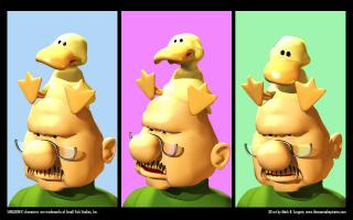
#6 in the series! This definitely was the toughest one yet! Sheldon by Dave Kellett is bar-none my favorite webcomic. It's also very much a line-art comic, so imagining the characters in 3D was difficult. That said, I'm really happy with how it came out. Arthur the duck just seemed to come alive when I put in rigging, so I ended up doing this one as multiple images, so that I could put him in different poses.
-
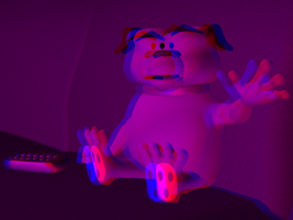
#5 in the series! This is Gus the dog from David Wilborn's Urban Jungle webcomic. I shared a table with David at the Webcomics Expo I went to in August. He's a really good guy and does a great webcomic! And the stereo version:
-

New work I've been crying over...
largento replied to new guy's topic in Work In Progress / Sweatbox
Impressive! Very cool! -
That looks great, Matt! Great movement and character!
-
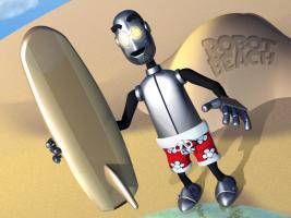
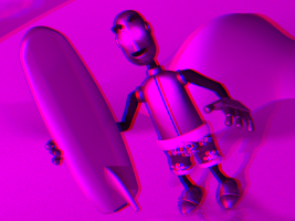
#4 in the series! This is "Robot" from the great webcomic, Robot Beach by Matt Forcum! I was supposed to wait until Friday to work on this, but I started fooling around with his foot last night and just couldn't bring myself to stop working on it until I had it finished. And here's the stereo version!
-
Cool snake, Gene! The snakey-tongue movements work well!


