-
Posts
3,827 -
Joined
-
Last visited
-
Days Won
31
Content Type
Profiles
Forums
Events
Everything posted by largento
-
Thanks, Matt. If I do, I'll come up with a credit like "Weed Supplier" :-) That was kind of thrown together. I once again used my "only tree." That is the only tree I used in the Wobbling Dead. Drop it down where you can't see the trunk and it becomes bushes. :-) A beauty thing about doing it in black and white is that ground texture could literally be anything. Robert, there's some mystery surrounding the show's quality. I came across a story that was published a few days before production started on the show and it was touting that the show was going to be filmed on 35mm even if they had to provide 16mm versions of it to the television stations. ABC's "Telemen" were going to watch the dailies via a connection to a television, so they could see how the show looked and offer their "expert advice." :-) Unfortunately, only the 16mm films that were part of syndication have been used for video release and they were chopped versions of the originals. Given how poorly the property has been treated over the last few decades, I don't know if there's any chance that the original negatives exist and if they are even salvageable. If they did shoot the show on 35mm and the negatives were preserved, they could release a great looking version of the episodes, but there's no will or profit margin to make that happen. The only ray of hope is that it's currently owned by Universal Pictures, so they'd at least have the means to keep those reels if they are still around.
-
I thought about that when I did Amutt Time and decided to go with widescreen. It's a little weird seeing it that way, but not as annoying as having to watch 4:3, which would mean many people would stretch it out on their widescreen TVs, completely distorting everything. :-)
-
Thanks, Dan! I think the Sin City suggestion answered my question, because my immediate thought was that it would be neat to do a Sin City parody, but that would be the only time to do that look, because I'd want the look to match. I do want the look to match, so I think black and white is the way to go. BUT... I could always do the poster in color. :-)
-
Matt—By AO, I mean regular AO (not SSAO). Didn't bake the dynamics (which I think is going to be my mistake). The video shows with multipass on and multipass off. With multipass off, the tail's movement works as expected. I am using the latest version and there are three bones in the chain that makes up the tail. Robert—I just baked the dynamic systems and rendering again ...and it's working! Baking was the missing piece. Thanks, guys! I've long been gun shy about using dynamics, but like you say Matt, it's easy and fun. I've even added it to the rim of the Ranger's hat so that it will bounce when he rides. :-)
-
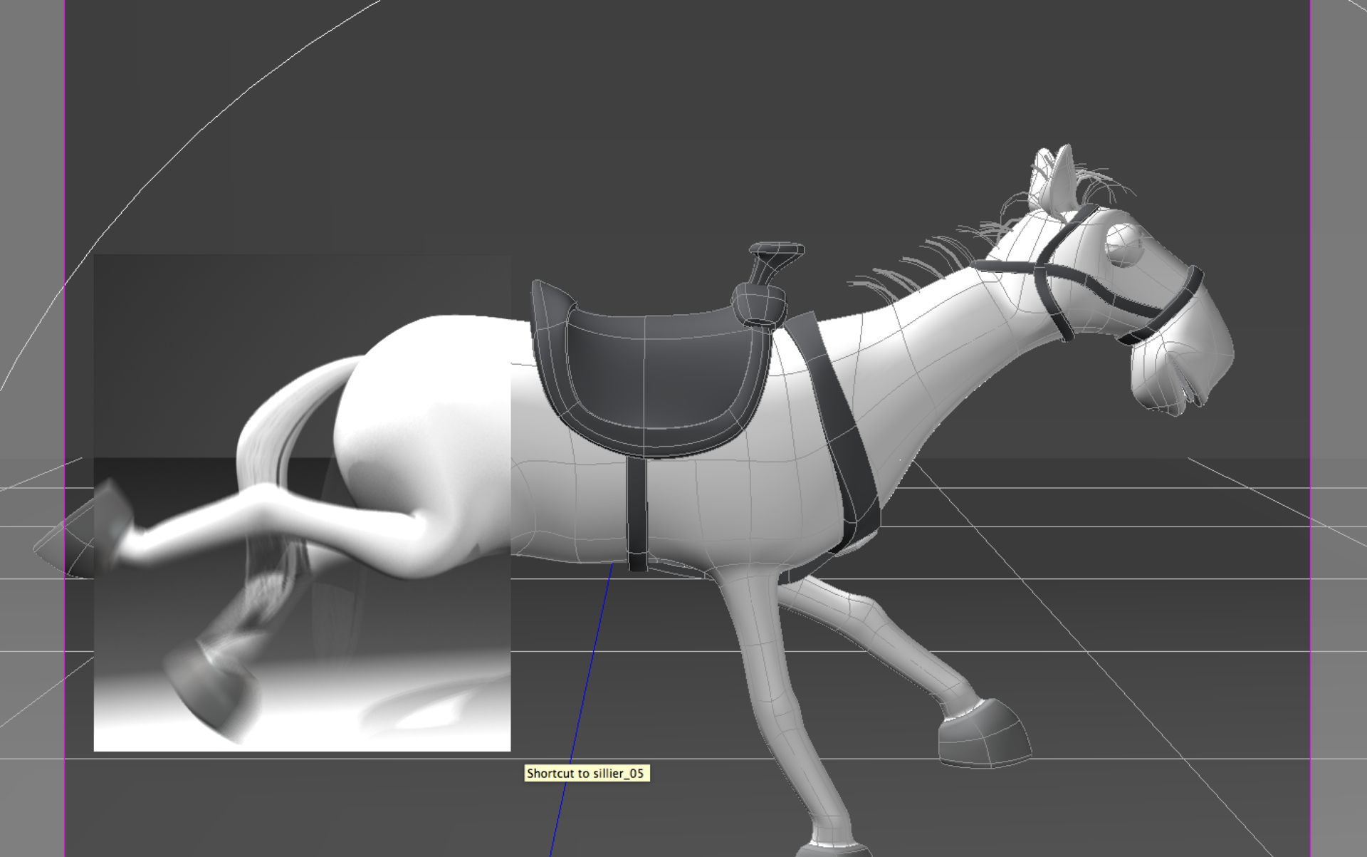
Okay, here's a weird one. I've been messing around with getting my puppet horses set up and decided to add dynamic constraints to the tail. It shows movement in the real time preview, but then when I go to render, it renders the first pass correctly, but all the other passes render the tail in its original position and the result is the tail stays in place. Here's a quick render, showing what I'm talking about. See the ghost tail that's in a lower position? I'm not sure if this is the fault of motion blur or multi-pass. To make things even more bizarre. Doing a quick render in the model window shows no tail at all. So I rendered it again with single pass and no motion blur or ao and the tale moves as expected. tails.mp4 Anybody know what's causing this?
-
I believe that you can redeem them and they cumulatively add up to how much credit you have at the store. So, then you could use them to purchase one item. Scroll down on the front page of the store. There’s a Gift Certificate FAQ.
-
Nice, Rodney! I could see some variation of that being used in a space battle to show something breaking apart on a ship's shields.
-
I don't think this really lends itself to switching colors, unless there was some sort of framing device and I'm not really sold on that. I do think there's a good reason to do it in b&w if it's going to be seen that way. A big issue with b&w is contrast and just converting color to b&w doesn't always get you the results you expected. That said, color is far more appealing and my movies have seemed to have great appeal to young kids who respond much better to color. I can see a value in going either way. It's just a thought, though and I have some time before I have to commit.
-
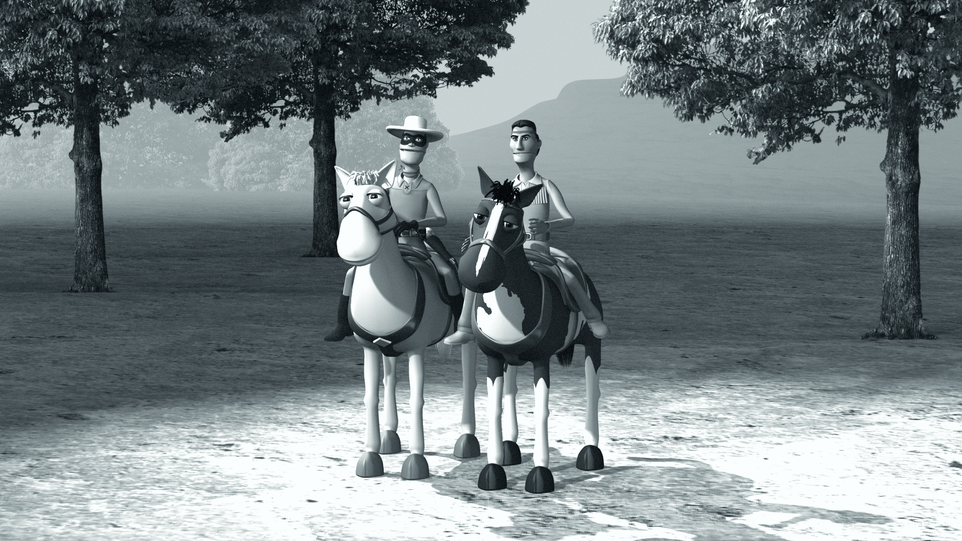
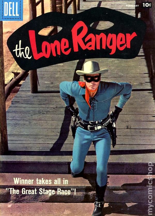
Augh! Had a freelance job that beat me up for a few weeks, but I'm back in the saddle! Just throwing this out there to see if anyone had a good argument either way. My original plan was to do this in black and white. The Lone Ranger television program was black and white and even though the final season was shot in color, it only aired in black and white. It's kind of weird, but though there were 221 total episodes shot, only 104 were put into syndication after the show ended. As best I can tell they didn't include the 39 color episodes, the 52 episodes with John Hart as the Lone Ranger and the first 26 episodes. The color episodes wouldn't resurface until 1973, when they were edited together as "Lone Ranger Movies" and syndicated separately. It wasn't until the 1980s that the rest of the episodes were made part of syndication. But I can't help but think color would be more vibrant, more enticing. Currently, I can't render in color to show a comparison, but does anyone have a strong opinion? Should it be in Black & White? There are shortcuts that come with doing it in b&w and it would more look like the show. Or should I do it in Color? Nobody wants to see b&w anymore and it would make it more appealing to kids. Thoughts?
-
I cropped it short, but yeah, a few of the bullets land on their head and rotate around in a gravity defying way. :-)
-
Bullet Physics No-Go on Mac Version? [FIXED]
largento replied to largento's topic in Animation:Master
Latest update of A:M fixes this problem. -
It works! bullets.mp4
-
Awesome! Thanks!
-
I just gotta say how impressed I am that youve stuck with this, David! I think most people wouldnt have the patience to keep chipping away at the mountain like you have. Kudos to you!
-
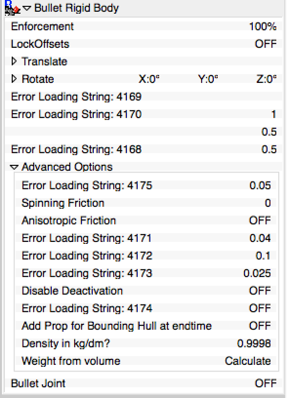
We were discussing bullet physics in the Hangout today and I thought I'd see how it works on the Mac. Seems to be a problem with it. The properties box has a number of string errors and just trying to run the simulation with the default settings crashes the application every time. Here's what the properties box looks like: To be honest, I'm not sure this a feature I would ever make use of, but I'll do up a bug report when I get some free time.
-
Okay, I get it now. So, there might not even have been a murder at all. The corpse could represent the love between them that he "killed" when he found out she cheated on him ...and it's been there, rotting away and growing larger and larger over the years until he takes hold of the knife and kills himself. Her talk about him being forgiven for the act IF he had dealt with it right away, is saying that because he has tried to avoid it and not deal with it, it can't be fixed.
-
Really fantastic, Tore! Wonderfully creepy atmosphere and mood. I think I understood the metaphor up until the end. :-) Great job!
-
There are higher resolution icons built into the icon sets, but for some reason, it doesn't make use of them... Obviously, it's not something I've considered a problem.
-
I'd love to see the file icons updated. I've got a 5K monitor and the icons for A:M files appear as blurry messes.
-
Thanks, Rodney! I posted about it on the Official Lone Ranger Fan Club Facebook page and got a "wow" reaction from Dawn Moore, Clayton Moore's daughter.
-
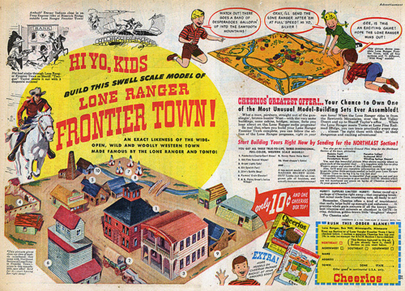
Thanks, Dan. That was definitely the initial idea. The idea being to show them using the map to make their plans and having a bunch of parody Cheerio boxes around, like the badguy sent off for it and put it together himself. I think for the actual movie, I'll have to make a sort of condensed comic version of it, because the actual Frontier Town map is crazy complicated and spread out. :-) I'm still going to finish the real one, though, because I think it's cool to have a 3D version of it. It'll be fun to do a kind of flyaround/turnstile of it when it's completed. I'm assuming there aren't very many "complete" real ones that people can look at.
-
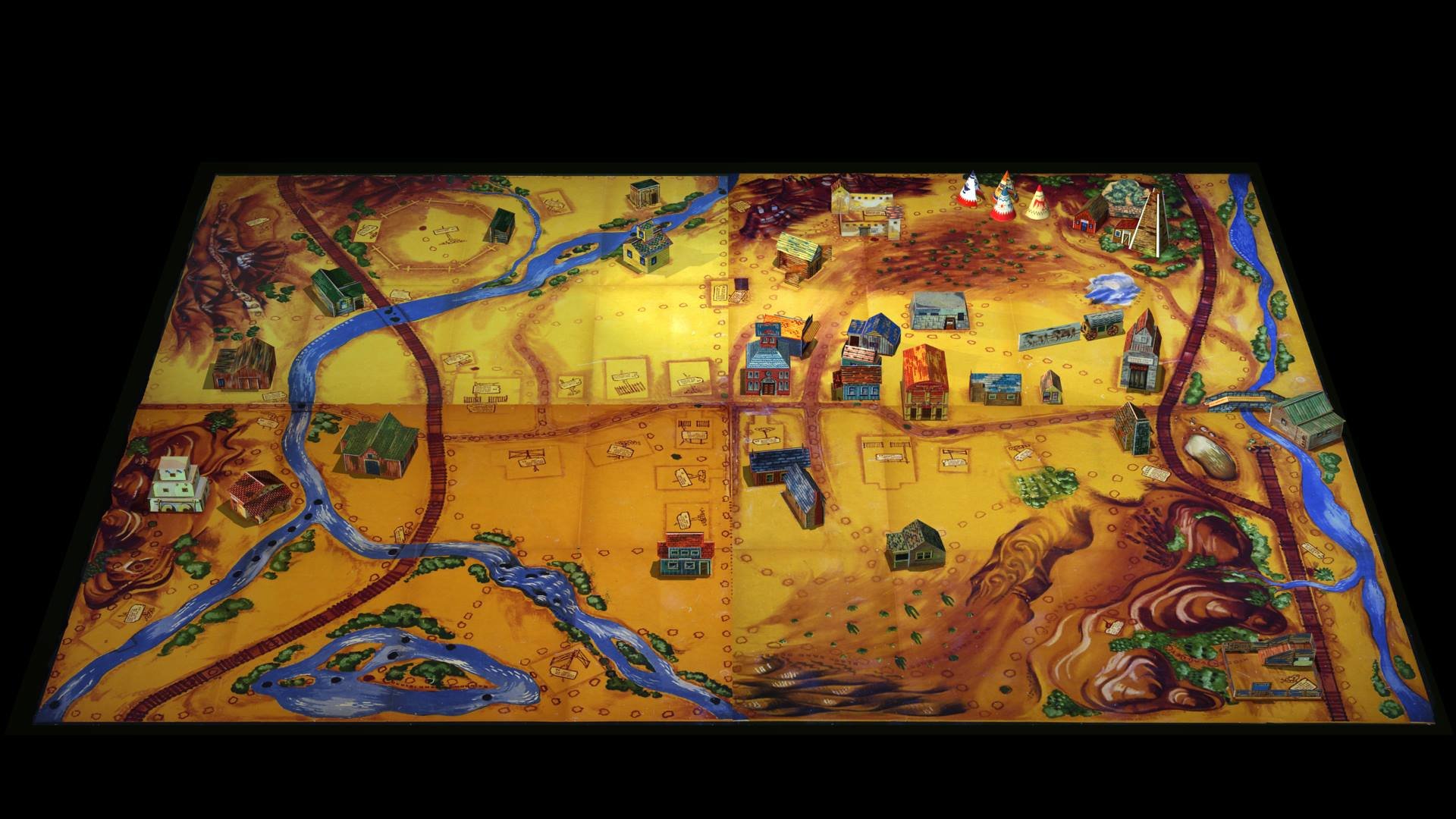
I've gone down a bit of a rabbit hole, but I'm having fun immersing myself in Lone Ranger stuff. I found some interesting stuff about the transition from radio to TV. The worry was that the TV show would come off seeming small and limited because the radio show could do virtually anything they wanted to do. Herds of buffalos, trains, calvary, etc. just required some clever sound effects and narration. As an attempt of limiting the radio program, the 1948 storylines found the Lone Ranger and Tonto sticking around one town. This went in tow with a marketing promotion called "The Lone Ranger Frontier Town." The four individual sections of the map could be purchased for a Cheerios box top and a dime. They came with pop-out buildings and landmarks that could be assembled and placed on the map. Additional buildings were available from the backs of 9 special boxes of Cheerios. The completed town was 52"x40" (each section being 26"x20") and kids could use it to visually see the locations on the radio program. This extended to the TV show, whose first three episodes (shot together as an origin story, that could have been released as a movie if the pilot wasn't picked up) retold the Frontier Town storyline and featured many of the same names and locations. I thought it would be fun to try to recreate the model in 3D and use it as an inside joke in my parody. It's turned into an enormous amount of work. :-) In the real world, it would have been much easier to put together the pop-out models that came with the maps. The kid didn't have to cut them out. Doing it digitally, it's a pain, because they required bleed on the print (to account for shifts on the press) and the trimlines and fold lines are in most cases invisible. Not to mention, the images I've found of the sheets are fairly small. The Cheerio box images were a good bit easier, since cut lines and fold lines were clearly marked on them. I think I started on Friday, but even after working on it all weekend and yesterday, I've barely made a dent in it! I've placed all of the models from the Cheerios boxes (28 of them) and completed the pop-out models from the northeast section (another 11 models), but I still have the pop-out models for the other three sections. I can only imagine how cool something like this would have been for a kid in 1948 ...assuming they had someplace they could put it. :-) Anyway, here's my progress so far...
-

"Paint fall" Image Contest WIPs
largento replied to robcat2075's topic in Work In Progress / Sweatbox
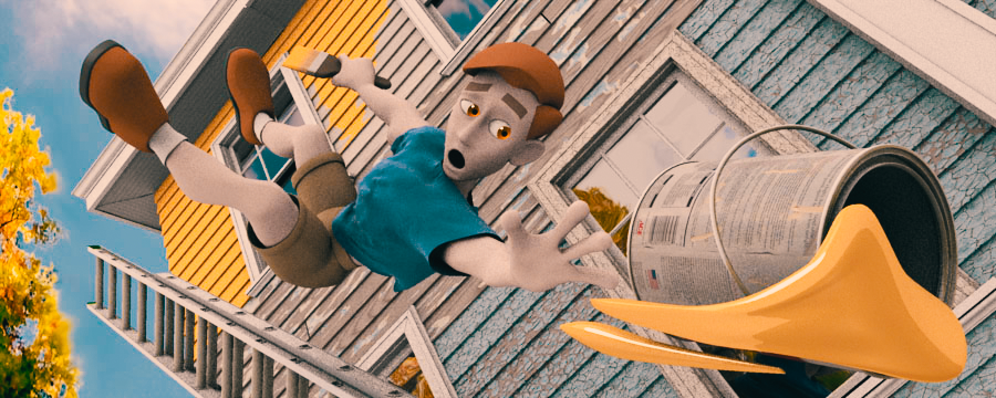
You know, now that it no longer has to be a summer memory, it seems kind of appropriate to make it autumn ...the Fall. :-) -
I've had it happen on my renders, too, but only with z-buffered shadows.


