-
Posts
3,827 -
Joined
-
Last visited
-
Days Won
31
Content Type
Profiles
Forums
Events
Everything posted by largento
-
I believe so. I hadn't realized that Photoshop now natively can create bump and normal maps from images. In the not-too-distant past, it wasn't an easy thing to generate a normal map on a mac. Yes, you could create a seamless image the traditional way, but it's pretty neat that you can do it with by pressing just one button. I think this PixPlant plug-in would be great for people who like a lot of fine-tuning control, which really isn't me. :-)
-
I gave it a try today and have mixed opinions on it. There seems to be a whole lot of sliders that do things I don't understand, meaning that I'm sure you could accomplish great things with it if you knew what it was you were doing. It does a pretty good job of automatically making a seamless tile, but it's hard for there not to be a visible pattern. I played with an image of tree bark. I was able to select an area that didn't include the sides where the texture was compressed and with one click, I got a seamless tile. Original: Seamless: It also lets you make normal, displacement, specular and ao maps. I don't know if I'd use it enough to justify purchasing it, but it's a neat option.
-
Unfortunately, that's Windows-only, too. I'm thinking about giving this PixPlant app a try. You find an image and work with it to create a seamless tile and it can generate normal maps. From the website: PixPlant Features Quickly generates seamless textures from images assisted by smart tools like the Seed Wizard. 3D preview area with displacement and parallax rendering. Fully editable maps at pixel and whole-surface level with shading and sculpting tools. Ambient Occlusion rendering from a displacement map. Project files simplify continued work with multiple 3D maps. Available for Windows and Mac OS X. DRM-free and no activations or online connections needed. It says it can run on its own or as a plug-in inside Photoshop and it appears to give real time views of the results. It's $49 for the "freelancer" license (one-person biz).
-
I've been playing around lately with a 2D app and it has bones, constraints and "influence," etc. It is much more like 3D animation than traditional 2D. It even has reusable "actions." I remember seeing a break-out image of all the parts and pieces of the Archer character. It struck me as being similar to paper dolls with joints. They create new wardrobe and find ways to re-use items as much as possible. (ie an outfit designed for one of the main characters would be put on a background character in another episode.) They create their sets in 3D and then paint over the single render image to make it look like painted backgrounds, which seems like a smart solution to me. A lot of those Hanna-Barbera backgrounds made heavy use of sponges. Applying a similar texture to a simple, flat-shaded render could go a long way towards copying the look.
-
Was this one done in A:M? I may be misremembering, but I thought he had done one that had the flat-shaded look... https://vimeo.com/173327634
-
Didn't Sebastian "thefreshestever" do some flat-shaded stuff? I want to say he did a couple of things with A:M before moving on.
-
Good job, guys and thanks. I realized @ 2:30am, that when I'd dragged the original back from my secondary monitor that the blueishness I was seeing was from the monitor. :-) I don't doubt that the original may have spent some time in Photoshop. I think most things we see have been color-graded or enhanced that way.
-
I played with this for awhile tonight. This uses four lights (a key, two spots and a fill) as well as global lighting. The thing I was noticing looking at the original is that it has a kind of blue-ish feel to the light. I used Porcelain and an environmental map on the skin, as well as some speculation. I set the fill to a negative number to darken the right side of the face and gave the key light a light blue color. Not quite the same...
-
Coolness.
-
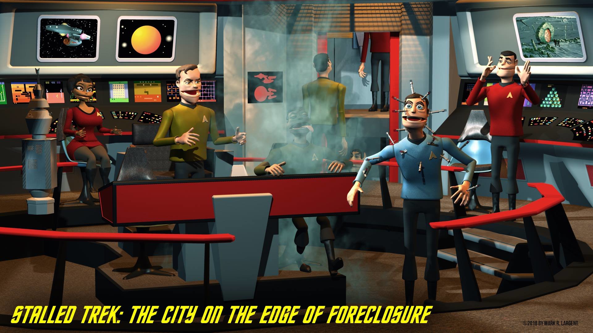
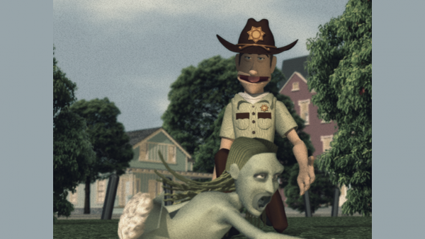
I'm thinking there might be an avenue with some of the smaller streaming services that are popping up. Back in 2012, I really thought that selling DVDs at conventions would be the way to go for me, but the convention culture has changed. They are more focused on celebrity guests and the "geek culture" has been offered up more as a fashion choice. The fact that the two biggest conventions I went to last year with the film festival had "Tattoo Alleys" speaks to the change. It's a boon for the convention owners because it's getting a lot more people in, but those people aren't really fans. I've talked with people wearing Star Trek cosplay who volunteer that they've never watched the show. They are there to enjoy all the attention their costumes bring, not to share in the fandom. Vendor tables (even in Artist Alley) have become cost prohibitive, too. The first Stalled Trek did well, but I'd overspent on producing it and didn't have the capital to set up at cons outside my local area. By the time I was out with The Wobbling Dead, I got lots of people looking at it, but nobody wanted to pay for the content and they didn't want a physical DVD they would have to carry around. I gotta' say, doing the last Stalled Trek free and getting to be a guest at the conventions rather than having to manage a table and try to sell product all day, was much more fun. :-) The real trick, of course, is just making more content. Doing one film every other year doesn't do much for developing an audience.
-
That reminds of the stories about DC Comics noticing in the 50s or 60s that issues with gorillas on the cover sold better, which led to tons and tons of gorilla covers. :-) 40K is a large number, so I'd agree that at some point it must have gone "mini-viral." I got excited about my view numbers last year (significantly less than 40K) until I noticed that a cat video that had only been up for an hour was in the 100Ks. It makes it frustrating when you realize that the effort-to-views ratio is greatly skewed against animation. But really, it's cool to know that you've made something that even a few people have enjoyed. Now, if you'll excuse me, I'm going to start working on a project with a gorilla in it. :-)
-
Welcome back, Martin! (Quick, guys, tidy up the place!) :-)
-
It really does. Like stepping back in time.
-
I could be wrong about this, but I seem to recall that if you change Open GL, you need to quit AM and then relaunch first. That might explain the crash after changing your settings.
-
Success?
-
My entire reason for buying a Mac Pro back in 2008 was after one too many hard drive crashes and I wanted to have some flexibility. The 2013 Mac Pro seems to go against this. Like you say, you can do external stuff, but I kept hoping that they would eventually go back to something like the older design. It was so well-designed. Easy to swap out stuff and worked great. Granted, my room is now several degrees cooler since I've stopped running it. :-)
-
I might have to double-check, but I'm fairly sure it's the Radeon HD 5870. Which means it's an ATI (not an AMD). I bought it cheap off of eBay from a guy who took a PC version and flashed it so it would work on a Mac. It was a step-up from the 2600 that came with my Mac, but I don't think I ever felt like I gained very much from doing it. It might feel like a big step down from your Quadro 4800. The iMac has an AMD Radeon R9 M390.
-
I finally upgraded from my early 2008 Mac Pro about 18 months ago and I went the iMac route this time and it's actually been great for what I've been doing. It's a 5K, 27-inch Late 2015 model with a 4GHz Intel Core i7 processor. I use the Adobe apps mostly and have had no issue. And it was somewhat cheaper. :-) When I made that short film last year, I used my Mac Pro as my renderer and did the main work on my iMac. Was a great thing to be able to keep working while I was rendering. No other way I could have finished it in 33 days! Both of my Macs have AMD graphics cards, though. I upgraded the one in my Mac Pro years ago, but my options were limited and I don't recall there being any improvement using AM.
-
There was a very cool iOS app called TreeSketch that made it easy to create trees, but alas, it seems to have been discontinued. I found the rendering times for trees too high and so I ended up going with 2D trees. As long as you make sure they point at the camera, it worked well for me and I realized early on, that people rarely see the trees for the forest, so I got away with using only one tree over and over again. :-)
-
Glad to hear that. I'm one of the very angry customers who thought the move to kill Disney: Infinity was the wrong one.
-
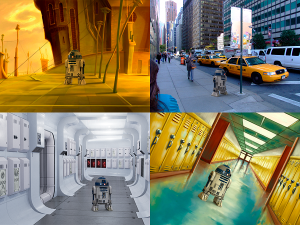
The goal is to help designers, their primary market. It's being advertised as a way to do photo-realistic 3D product renders. I've played a little with it and for the most part, it's a very simple way to get those results without having to know very much about 3D applications. It comes with a small sample of 3D models, materials and lighting setups (all image based lighting.) More can be found on the Adobe Stock marketplace, many for free. You can only import OBJ files right now, but it's still in Beta and they keep saying "for now" in response to questions about importing other file types. The real beauty is that you can import an image as a background and with a few button clicks, you've got something that would have taken a lot more effort and knowledge to do traditionally. The content-aware stuff that Adobe has been implementing comes into play with this. It analyzes the image and looks for a horizon line and tries to set the grid up to match the image. For really complicated images, it doesn't do a very good job, but when it does work, it's great. That's one button clicked. Then you can click a button that matches the lighting to the image and an IBL is created using the background image and applied to whatever model you drop into the scene. I had this little R2 unit and dropped him into some examples. It was fun to see the whole plane tilt immediately when I set the view to match the dutch angle shot. The renderer is very slow, but does a good job. I'm no compositor, but the matching the lighting seems to work very well and the image that is generated is a layered Photoshop document with the model and shadows on one layer (with alpha), the background on another and a color layer, so you can switch off the background and just have it on a solid.
-
http://www.adobe.com/products/project-felix.html http://www.3dartistonline.com/news/2017/01/adobe-project-felix-partners-with-chaos-group-to-bring-v-ray-to-graphic-designers/ This may be of interest to folks. I'm playing with it now. Exported an OBJ file of my Pop! model and applied a texture and am rendering.
-
Thanks, Ken. Why d'ya think I put the model up here for free for? Get started, everybody! :-)
-
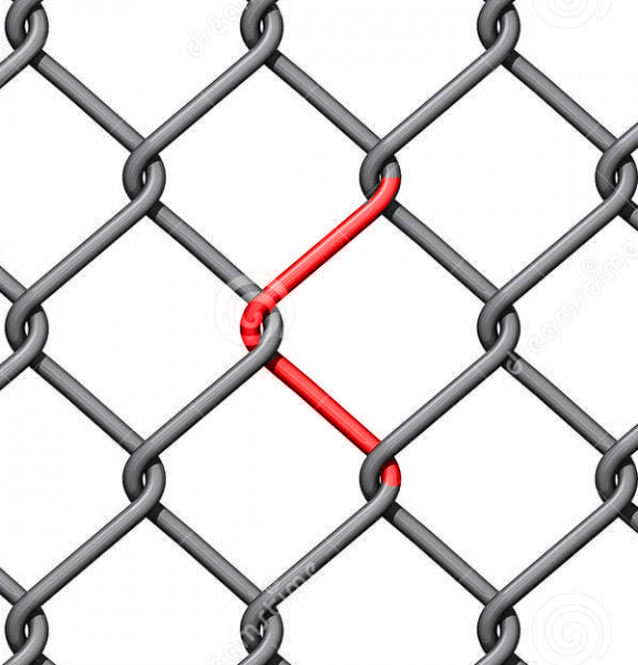
Cool! The easiest way to do the chainlink fence would probably be to use a decal. I'm thinking a quick way to model it might be to model a segment like this and copy/flip/attach to get one of the vertical wires. Then duplicate that and rotate it 180 along the y-axis to make the interlinking wire. Then duplicate that over and over again to make the fence. It would be a ton of patches, though.
-
I think the heads swivel. To be honest, I've never touched one and I haven't taken the ones I just got out of their boxes yet. They appear to be solid and I'm guessing there's a mix of methods in their production. They aren't recommended for very small children and are meant more for collectors.


