-
Posts
3,827 -
Joined
-
Last visited
-
Days Won
31
Content Type
Profiles
Forums
Events
Everything posted by largento
-
I'm not aware of a shortcut key that will do that. Would be cool if you could. Maybe one of the older folks know something. [EDIT] There are shortcut keys for moving the camera around while in camera view. I'll have to look for them, since I don't use them myself. [EDIT] Here are the key commands to move the camera around:
-
Hey Douglas, You can create your own very simple rig. All you have to do is create bones and then assign CPs to them. The existing rigs offer many more things, but back when I was in your position, David S. gave me the advice of trying to build my own rig first. Just so that I'd gain an understanding of how things work. Mechadelphia has a great intro to rigging on his site you should check out.
-
v18.0 mascot Contest - It's that time again!
largento replied to Jason Simonds's topic in Contests/Challenges
Not me. Maybe Jason can post a list here so we can be sure our submissions made it there? -

v18.0 mascot Contest - It's that time again!
largento replied to Jason Simonds's topic in Contests/Challenges
whew! Mailing mine right this second. Looking forward to seeing everyone's work. -
Nice!
-

v18.0 mascot Contest - It's that time again!
largento replied to Jason Simonds's topic in Contests/Challenges
I'm still at the point of modeling/rigging/texturing the pieces. :-) I'm fairly settled on the framing, though. That was basically settled before I started, so I'd know just what I needed and not have to spend time on stuff that wouldn't be seen. I'm having fun, though. BTW: I've set up my shot so that it works either way, but the final file should be A ) 1440 wide x 1920 tall? or B ) 1920 wide x 1440 tall? The past years' seem to be more tall than wide. -

v18.0 mascot Contest - It's that time again!
largento replied to Jason Simonds's topic in Contests/Challenges
So looking forward to seeing what everybody has done. It seems like I'm always busy when this comes up, but I decided to take time out and do one this year (first time in six years!) I've been working on it since Monday and hopefully will have it finished within the next couple of days. I thought it was going to be easier than it's turned out to be. :-) -
I agree with everybody here, this looks fantastic! Especially the highlights on the hair.
-
Thanks, Nancy! Regular hair. This is a case where no grooming was necessary, so I just worked on length and width. There's a slight jitter, too.
-
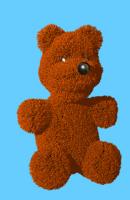
Nothing big, but I needed a teddy bear for The Wobbling Dead and put together a very quick one. I thought it came out pretty cool, though.
-
I did a comic book style tutorial on how to make a sphere here.
-
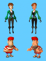
That's disappointing to hear, Jake, but like you said, that's personal taste. I look at the original skin color on Henrietta compared to the new one, and the original looks kind of like a corpse. I wasn't aware of just how yellowish the skin color was until I compared one of the characters to a character from the new cg animated Batman series. It was startling. And these are supposed to be pirates who wouldn't be pale-skinned at all. Both times the strip has been critiqued on a webcomics forum I'm part of, the issue of color has come up. Generally with the coloring of the characters and the backgrounds and how they interfere with "reading" the images. I've tried in the past to compensate with colored lighting, but it makes sense (to me, anyway) to go back to the colors on the characters. Taking Henrietta for example, look at how much better her costume "reads." There's much better contrast between the black and green parts. In the end, though, this is just about freshening stuff up. It's hard to work with models that are so old and from a time when I was just learning to model. I keep seeing all the things I'd do differently now. With a handdrawn strip, the characters get to evolve over time as the artist develops them. With cg, the characters don't. It's still a big IF as to whether or not I'll do another Wannabe Pirates story after I finish up this one, but if I do, I'll be redesigning and remodeling the characters.
-
-
-
Not really short, just small legs. Many cartoon characters are that way: Mighty Mouse, Fred Flintstone, Popeye ...even Mr. Incredible in The Incredibles, has proportionately smaller legs to the rest of the body. In the case of a character like Flemm, it helps to give them a heroic look. Like his upper body is stronger and more powerful, tapering down to small legs and feet. With a character like Sneeze, it gives him the appearance of being bulky and strong. It doesn't work so well for female characters, though, so that's why you notice that Wilma Flintstone, Olive Oyl, Elastigirl and such have longer legs.
-
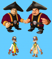
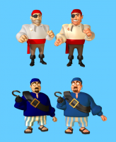
I've started giving the models a facelift for the relaunch. I can't really commit the time to remodeling, but I can at least take a new look at the coloring. You can see the originals on the left an the updated ones on the right. Funny that I never noticed how yellowish the skin color I was using was. I worked up a rosier version and worked with ambience and specularity to get a better look. Man, I'd love to just start over from scratch, though. These were among the very first models I made and I've just learned so much more since then.
-
Did a search for this because someone had asked on another forum. It creates a global map that you could wrap around a sphere to make planets. Fractal World Generator
-
That's a home run by any standards, Gene! Well done!
-
That was great, Sebastian!
-
I remember having an application that was given to me by a guy who worked for NASA, but that was back in the System 6/7 days of the Macintosh. It was just a tiny little app that allowed you to plug in info and run a simulation. Surely there are much more advanced ones available now. I think it was just called "gravity" or something like that. The only real "hard" sci-fi idea I ever had was for a story called "The Infinity Orbit." It was essentially about what would happen to a planet in a binary star system if it reached a point where its orbit swapped to the second star, making a figure eight orbit. This guy's kids had actually come up with a simulation where that would happen, but I was more curious about what would happen to the planet itself. Could it survive such a transition or would it break up? Or would the conflict cause it to just shoot out of both orbits? I never felt like I knew enough to say for sure what would happen and I hated the idea of ending the story with it never being decided.
-
Thanks for the feedback, guys! You're right, Sebastian. I had been working with a background image (blurred tropical photo) and had matched the background to the blue in the sky in attempt to have the background image disappear into the background. I just kind of kept it when I abandoned it. Changed it to a more muted blue. I also added in some more shadows. You are correct, Rodney, that I was considering how the site looked on mobile devices. They tend to be more portrait mode and the wider you go, the smaller your content gets. I've been very pleased with how well the site works on my iPhone and iPad. It even loads pretty fast over 4G. This Adobe Muse app is a godsend. I would never have been able to achieve this with my own coding abilities. It was also fast, too. I did the majority of the work on Wednesday and Thursday. Not bad for a 50+ page site.
-
Wanna' see a sneak peek of the new website for The Wannabe Pirates? It's a pretty big change. I've abandoned the Wordpress/Comicpress combo simply because that seems to be designed to work for gag-a-day comics rather than story comics. Some changes: 1) The latest comic is no longer on the front page. Why risk having a story spoiled? There's a page now for the latest comic that regular readers can bookmark. 2) Added a "Catch-Up" page. If you're just a spotty visitor, you can read the last five strips in the correct order on their own page. 3) New Archives. Now all of the stories are archived so that you can read through them ten strips at a time. This makes it much easier and I hope, more enjoyable for the reader. I'm going to do a re-think on advertising and probably just have a couple or three small ads a the bottom of the page. A big part of this redesign is removing clutter. I realize that most of these ideas are "wrong" from the point of trying to make the most money, but let's face it, it never really was making any money, so why not make the experience for the reader better? Yes, with the old site, I got a page view for every strip, but isn't it a pain to have to click a next button after every single strip? Anyway, you can check it out here. My plan is to launch it in the next few days.
-
I was an art major my first year of college. I vividly remember the first day of my Freehand Drawing 100 class. The instructor took us outside and said, "Draw that tree." I soon realized the instructor wasn't actually giving us any tips or insight into the process. He was just telling us to do it. My exact thought was, "I could tell myself to draw a tree for free. Why am I paying for this?" :-) I was going to school there with an academic scholarship that covered a little, but a sizable student loan needed to cover the rest of it. After that first year, I left the school and went to another one that offered me a bigger academic scholarship and an art director scholarship for the school newspaper, which almost covered my tuition. I had to work full time, but the only debt I incurred was for that first year and I ended up paying it off before I left school. I switched my major to Broadcast Journalism and finished in that. It's always been a conflict between me to write or do art, which I guess is why I like comics so much. It mixes both. Plus, with my new major, I got to play with the radio station and tv studio, which gave me a kind of mini-film school. The outpouring of information about art and everything else that has been spilling out of the internet for the last ten years or so has been amazing. It definitely re-energized me several years ago when I started finding these cool art and comics blogs with so much practical information. Made me want to do comics again. In the old days, a college degree was supposed to guarantee you a high-paying job. There's no such guarantee anymore. Students today face a tough choice.
-
Nothing of relevance to say, other than I've started scripting The Wannabe Pirates again today and boy, am I having fun. Turns out taking a break was probably the best thing I could have done. I'm enjoying getting back to the story and bringing new ideas to add to the old ones.
-
Thanks, Steve! @Robcat I'm in a holding place right now with the color. I'm hoping to discover something "official" in that regard, but in the end, I'll probably just have to guess. Without some way to decipher their paint codes, it's useless to look at animation cels, because they've aged 60 years and the colors have changed. A Google image search will come up with a crazy range of oranges for Jane's hair. George's hair color jumps all over the place, too. I'm also trying to avoid the tainted 1980s relaunch and focus on the 1962 original. I'm away from home right now and away from my DVD set of the show. I think I'll probably grab some screens from that and see how it goes.


