largento
-
Posts
3,827 -
Joined
-
Last visited
-
Days Won
31
Content Type
Profiles
Forums
Events
Everything posted by largento
-
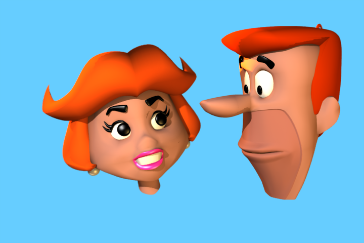
Thanks, guys! Matt, I'm not at all surprised by that. :-) Here's the part of Mrs. J. you're not as excited about seeing ...from the neck up. :-)

-
The other option would be to go back to the original InDesign file and export it to html. Does Will still have it?
-
Here's how Acrobat dealt with the Technical Reference PDF: html.zip
-
PDFs do terrible things to type. Do you have a sample PDF (or can point me to one.) I'll give it a try through Acrobat and InDesign.
-
Thanks! Something like "Adventure Time" or "Regular Show" wouldn't be first choices for me since I don't watch them ...and in the former case, I don't even understand it. :-) The only newish show that I watch and like is Phineas & Ferb, which could be fun, although I think I'd concentrate on Agent P and Dr. Doofenshmirtz. The character designs are extremely flat, though, which would make 3D tricky. I think there are a lot of classic cartoons that the general public of most ages is aware. Things like Ricochet Rabbit and Atom Ant, probably not, but the Jetsons, Flintstones, Scooby-Doo, etc. stay pretty high profile. And heck, sometimes retro is "hipper" than current stuff. Especially if it's something obscure. I've saved some images over the years that I always thought would be fun to recreate, so I'll probably look for those. The goal would be to have about 4 images that I could put in with the other stuff I've done to try to get an agent. Get that person to make the rounds and see if they could get me some illustration work. I'm even considering making my 3D illustrations portfolio a View-Master reel. :-)
-
Thanks, guys! Robert's on the right track, Sebastian. The idea is to present it to ad agencies as an alternative to a 2D illustration. My thinking is that if they can see something familiar, they'll "get it" more than if they see something that's already in 3D (like The Wannabe Pirates, for example.) This could also show that I could turn a 2D mascot into a 3D mascot. I have been debating what to do for a newer cartoon, Robert. So many of them are terribly designed, that it's not easy.
-
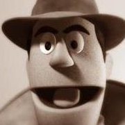
I've been thinking for awhile about doing some sample 3D illustrations for my portfolio and realized that doing existing characters would probably have more impact, since they would be more familiar to clients. For my first one, I've decided to do a 3D illustration of The Jetsons (complete with flying car and backgrounds.) I have no idea how long it will take, since it's going to be a back-back burner project, but I worked on George's head today:
-
I wonder if you could cause the fog or depth image to band by lowering the color depth? If you could get the image to band, it would seem to me you could select layers with the wand tool in Photoshop and create individual layers.
-
Thanks, Sebastian. That's a good call. I originally had it coming up from the bottom of the screen, but when I redid it, I just had it sort of fade in. Probably better just to pop into place at the point the singing starts.
-
Thanks, Douglas! The hope is that this will be an entertaining intro to people when they discover the webcomic.
-
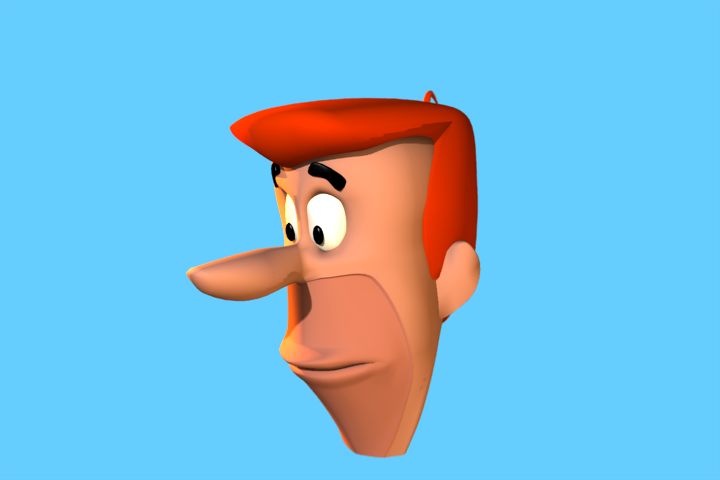
It does take a little while for it to load and you'll see the beach ball. If you wait, it should work. I tried both versions myself. Difference was that v16 didn't ask for maps. The prop came in as a white tree with rectangular leaves. I'm going to go with the png files. They render much faster and don't have the uv mapping problem.
-
Thanks, Rodney! I need to fix the ending (I'll confess to having given in to exhaustion), but for the most part I'm satisfied with it. In the end, I rendered the ball by itself out of A:M and added the lyrics in Premiere Pro. If I'd known I'd be able to get so much of it done with animation I did for the book trailer, I would have done this back in 2011! :-)
-
Okay, so I tried a different route. I used the OBJ importer to bring another tree I made into a model file. It seems to work: I did have to go into the decals and change the leaf images to be cookie cutter, but other than that, it seems to work fairly well.
-
Has anyone else tested the file?
-
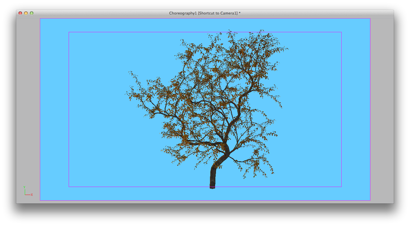
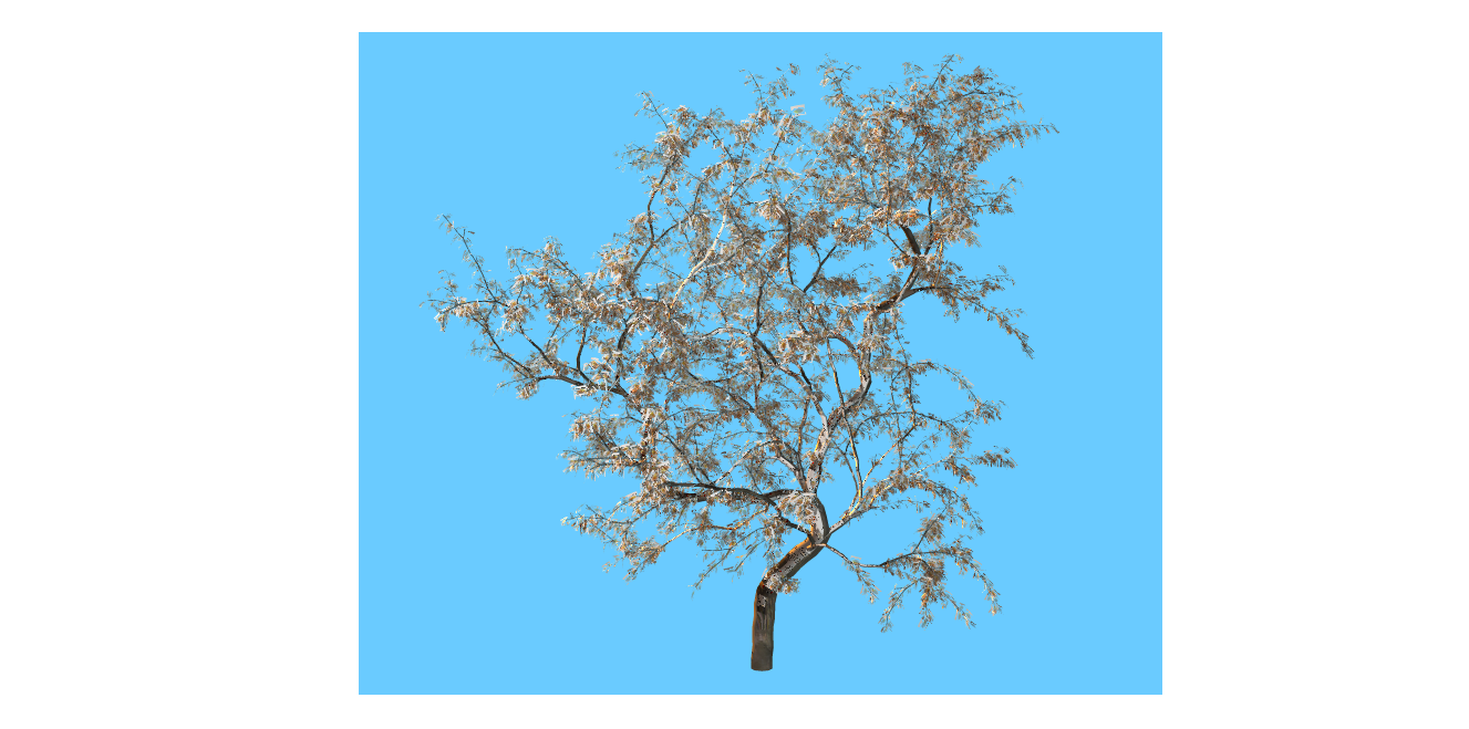
Here's an example: Here's how the tree prop looks when placed into the Cho: Here's a Quick Render: Here's the zip file: Tree6_12_13_9_51_AM.zip
-
Well, spoke too soon. The tree prop comes in looking right, but doesn't render anywhere close to the same. Still, the export saves a hi-rez png file with transparency, which is how I've been doing my trees lately anyway, so it's still a win. Making trees in seconds is just amazing.
-
WOW! Getting it now! [EDIT] Just made a tree, exported it to my Dropbox, brought it into a cho as a prop and it worked perfectly! This is a godsend!
-
Finally held a gun to my head yesterday and made myself finish up the Ballad of Errol Flemm video. It'll probably change some before it goes up on the website, but this is pretty much it. I was able to use a fair amount of existing animation in addition to some stills. A couple of stills I had to create and there's a tiny bit of animation with a Gorilla trio that's new. The bouncing ball/lyrics was such a time suck, but I didn't want to do it without them, so it was worth all the messing around in multiple apps. balladflemm_s.mov
-
I was in the position of thinking that the pirates theme would make folks think I had an unfair advantage.
-
I still get a kick out of seeing the ol' Spaceknight, but to critique, I would point to two things: 1) Camera motion I see a pattern of establishing a shot and then doing a quickjerk camera movement to find an object. This is very disconcerting. Better I think to have the object break some part of the establishing shot and then then have the camera move to focus on it. Even a lense flare that orginates off camera but then breaks into the shot, to give the camera a reason to look up to where the object is. Also, once we start following an object, we like to stay with it. Jump cutting away can be confusing. 2) Contrast You want the focus to be Rom, but he's having to compete with textured rocks and background plates that are all in focus and competing against this. Rom is basically smooth chrome and the environment textures are drawing the eye away from him. Rom would stand off of the rocks much more if the rocks were darker in color and the textures more muted. Some depth of field would help with contrast, too and make the shots feel less flat. There are lots of ways to achieve contrast, but the important part is that you don't want the viewer to struggle to "read" Rom in a shot. It's kind of tricky, but you want the camera moves to feel to the viewer like they are looking where they would want to look, while at the same time, getting them to look at what you want them to look at.
-
Nice!
-
I've struggled with this many times, myself. For years, I would hop from new shiny project to new shiny project, leaving behind a ton of unfinished projects. Yet, I also worked almost exclusively on The Wannabe Pirates for four years ...and burned out. Having pondered all this, I realize that I need to have something to work on as a re-charger a diversion. The stages of a project are such that you start out very excited by an idea and then eventually move into a stage where it just becomes work and then usually there's a renewed energy as you near completion. When you are in that long work period, it's helpful to be able to steal some energy and excitement from beginning a new project. The danger is spending too much time in that new project and ending up in the work stage on more than one project. Now, you've got nothing to draw energy from and you're in danger of abandoning both of these projects. The other option is trying to capture some of that energy from the accomplishment stage. Break the project into a bunch of smaller projects, so that you are continually finishing parts of it. It's a weaker energy, though. Having abandoned ship so many times before, I wasn't prepared for what happened after I finished Stalled Trek. The vacuum that was left sent me into an almost year-long depression. To keep from having that happen again, I decided to go back and finish the unfinished Wannabe Pirates story. It's not something where I'm starting up a new project, but it is something that I can use as a buffer so that when The Wobbling Dead is finished, I've got this continuing on. I have another project that's germinating, too. I remember this interview with comic book writer Cary Bates. He said that he'd spent some time watching soap operas and realized there was a structure to them. As one storyline was reaching it's peak, another storyline was just starting and a third storyline was "just getting to the good part." This meant that by the time that third storyline got to it's peak, the second storyline would be getting to the good part and so on and so on. It kept the viewer hooked. I think this plan of mine is very similar. Just as The Wobbling Dead finishes, The Wannabe Pirates will be getting good and I'll start on that third project. If I keep adding to the pile, there's no reason I can't stay hooked on doing them for years to come.
-
Here's the mock-up I'm working on for the front page. It's too large at this point, but it's the basic idea. The image in the box is just something I tossed in. It's where the Ballad of movie will go. And yes, I did make the tavern sign in A:M. :-)
-
Well, convincing a little kid is a lower bar. :-) I'm not going to attempt such skullduggery. In fact, like I said, the lack of animation is an attempt at honesty. Don't want to trick them into thinking they are going to see animated cartoons rather than comic strips. I gave in and animated the bouncing ball. I ended up doing it in A:M, since AE is a little sketchier with letting you scrub through audio. Here's a shaded render. The type will obviously be sharper in the final render. karaoke_balltest_small.mov