NancyGormezano
-
Posts
7,863 -
Joined
-
Last visited
-
Days Won
15
Content Type
Profiles
Forums
Events
Everything posted by NancyGormezano
-
3rd Thursday November - Book Cover - Edgar Allan Poe
NancyGormezano replied to NancyGormezano's topic in Showcase
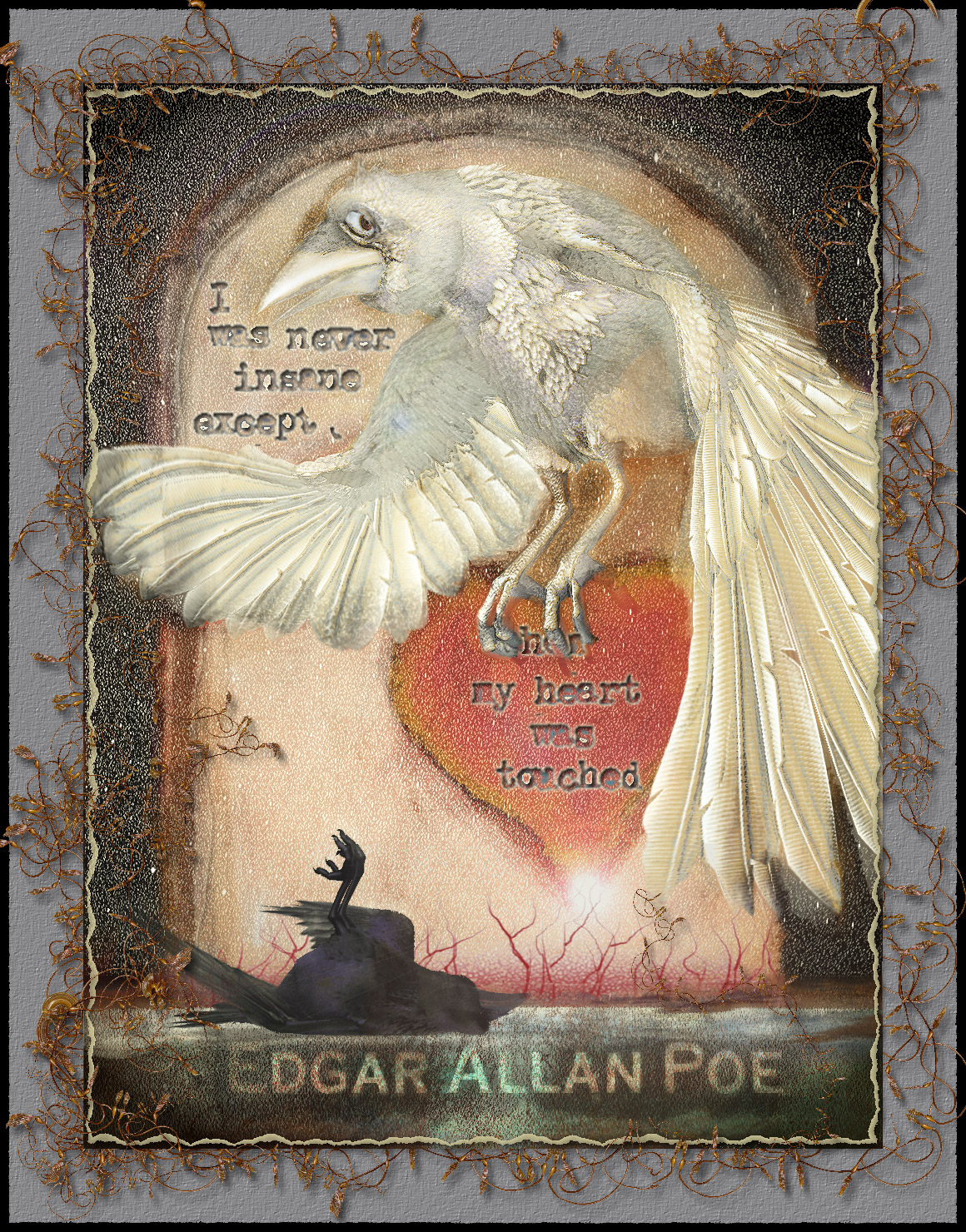
Tweaks - changed border, made heart occult wing. and the text. I hope it's more readable now. I've also included the image/render of the Raven from A:M that I used.
-
3rd Thursday November - Book Cover - Edgar Allan Poe
NancyGormezano replied to NancyGormezano's topic in Showcase
Thanks for the feedback Rodney. I did debate with myself if it was ok to hide the "when". I have more of a fine art leaning rather than illustration, so mostly I tend to not want to be so "readable". But illustration is a different game. But I thought it had enough letters showing so that most could fill it in. I made the raven white, hoping that it would suggest a ghostly spirit of the dead raven. Hmmm..I'll have to think about the eye...not sure what emotion I was trying to get from this...at first I thought I wanted "worry", then sadness or "here we go again" ...Now I realize I'm not sure what I was trying to say with white raven expression.. "crazy" might be better...or... -
This months prompt: Make a book jacket (cover) that will be used for a volume of Edgar Allan Poe Stories. So I started with rendering from A:M an image or 2 of the crow model (from Scarecrow of Oz) - and then I proceeded to work up a variety of concepts (in photoshop) - the last image is probably what I will go with. But I might try doing at least one more concept - different altogether, more childlike, and probably including a cat.
-
Hmmmm...methinks I should go look at my innards as well
-
Huh? I am not aware of how to create a pose (relationship slider?) that controls visibility of multiple models (in chor I presume? in an action?) but is contained only in one model Where/how are you creating this pose? Enlighten me please! However, If your intention is to easily turn on/off different models in the chor: 1) In the chor I would make a folder (rename to ONE) that contained all the models (1-9). 2) right click on the ONE folder, choose "select children" 3) While all are selected, turn active property of one of the models to OFF. All will be set to OFF 4) deselect all the children in folder, select just the model that you want to be active, turn it's active property to ON can do above with any of the properties for the models contained in the folder/group.
-
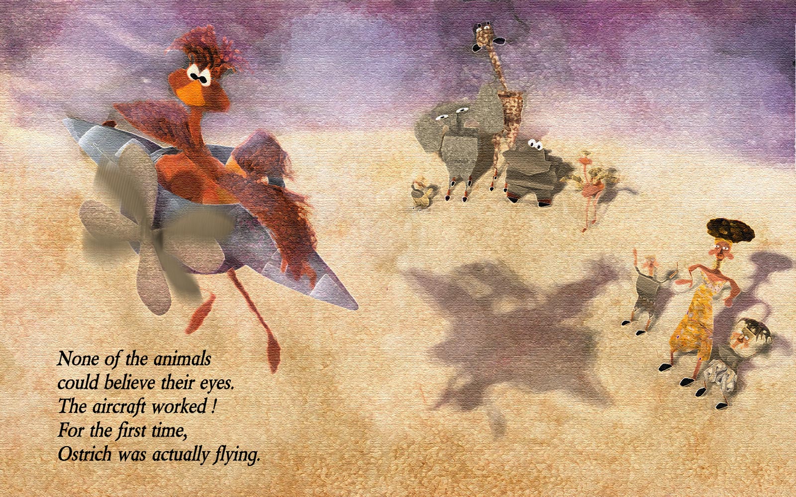
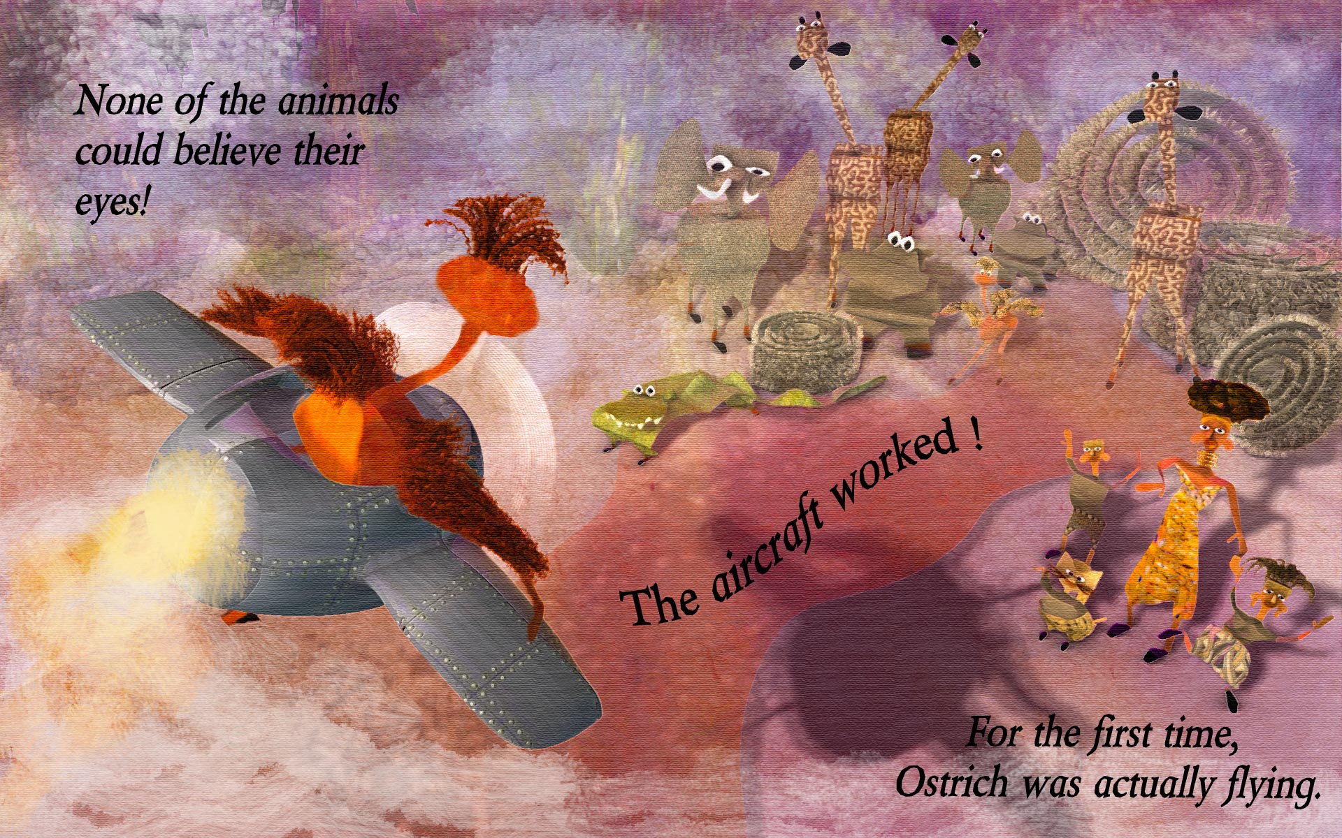
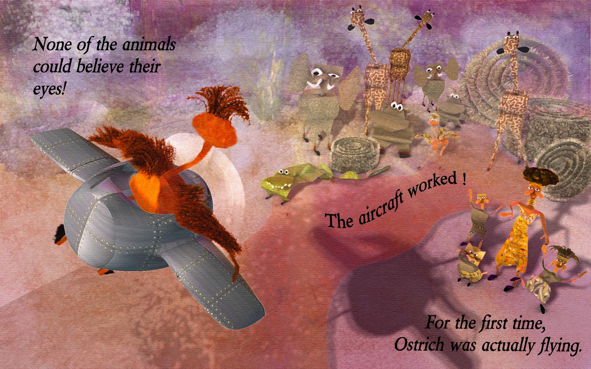
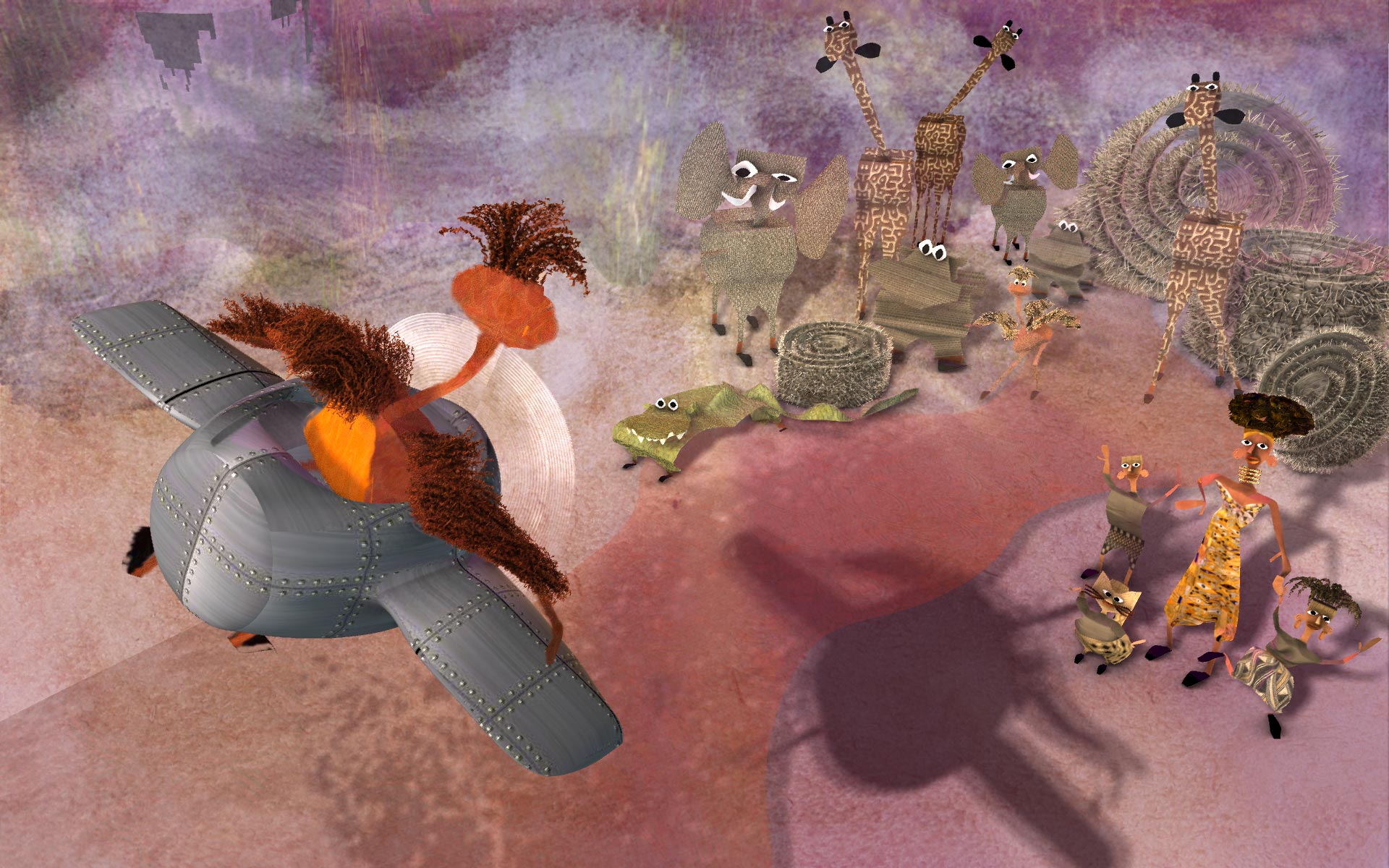
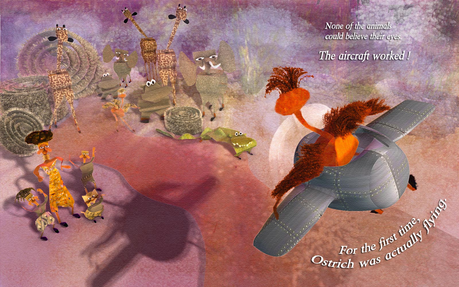
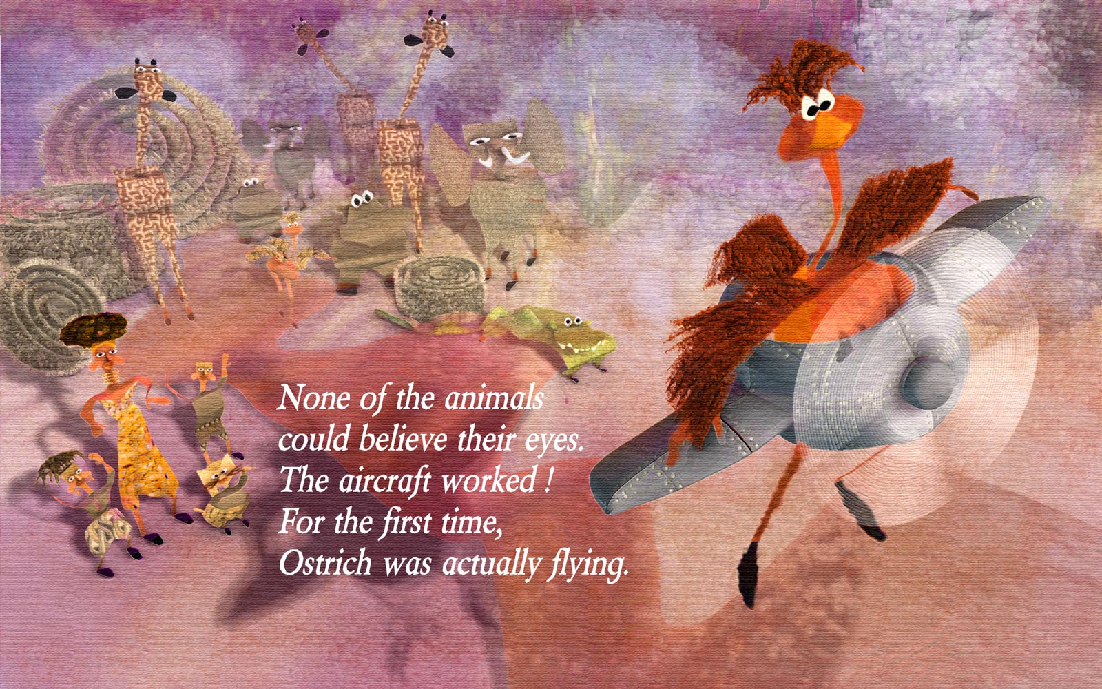
Thanks again all for your feedback! Ah yes. heh heh. Yeah, that's why I prefer the version with "back to reader". For more interesting story reasons, only. However, have to admit, I wasn't thinking strafing (but good idea!) ...was thinking more that she was an inexperienced pilot, not yet able to control direction of aircraft, and causing some worry among her antagonists!. Should probably make the plane/pilot have some more wobbly feel, or show more posture @Rodney, Robcat - But I have to agree, I do prefer the "facing viewer" version more as a stand alone image, because I prefer to see the face of Ostrich. Like I said before, I am going on the assumption that Ostrich's face has been shown in prior pages. One of the comments made, in terms of developing portfolio, is to show the same text, illustrated 3 different ways, even 3 different styles. @Robcat - thanks for the feedback - From what I understand, I don't think it is that important to have the text be so literally synced. Nor is it necessary that the text be aligned so perfectly to the action shown. As long as the image illustrates the entirety of the text, and contains blank space for text to be added later by "textologist". The layout of page could even include white space for text, not necessarily as an overlay on image. Most of the images submitted didn't even have the text included. However since I was thinking this could be a 2 page spread that spanned the crease, I am more concerned that the crocodile, currently, gets cut in the crease (directly in middle). That's a no-no for sure, unless I elongate him some. As for text, that would be something I should find out (as to who adds text). They do have a course on "Illustrating Children's books" - over 20 hours - chock full of great info, on my queue, which will probably answer my question, or else I can ask on their forum. From what I understand, and have observed, childrens books illustrators often add elements and back story activities in the image, that aren't explicitly stated in the text. If anything, I would say this imagery (either version) does not have enough details, and auxiliary activity going on, eg, exhaust on plane, more detailed controls on plane, perhaps a sidekick (mouse) who accidentally hitched a ride at the wrong moment, birds flying around, etc I hesitate to add here what I had started with (1st image, and unfortunately had submitted for contest) - UGH - but good for giggles and maybe interesting to show comparison. If I had started earlier, I would have obviously been better off getting feedback all along! 2nd image: Added some exhaust, put text at bottom, then top left. And yes, in case anyone was wondering, those "hay bale thingies" that were added, were stolen from Rodney's/Serg's spiral, and then hairified! Edited again...put curvy letters back
-
Thanks John! Thanks for the feedback Rodney, Simon, Robert. Thanks Rodney - yes I totally agree -so I flipped it back. I like Ostrich facing away, and changing the point of view to be that of the animals rather than Ostrich. Less expected! I don't think this is a real story (it's a made-up prompt only for the contest), and I am assuming we have met and seen Ostrich on previous pages. In one of the courses on Storytelling (for book illustration, not animation) - it was suggested that one can choose to show the action before, during or after. And one of the winning entries for this go-around chose to not show Ostrich at all, just the reaction of all the animals. It was fabulously done, in the style of "far side comics" - where the animals were almost mocking Ostrich. All interpretations of what the story was, leading up to this prompt were totally up to illustrator. Obviously would be different if the whole story had been presented. And yes, I've changed the text to black. Better! thanks. In case you're interested: Here's the video critique of the winners for this contest As I understand it, these contests are designed to help people get pieces for their portfolio, so the prize of the contest is to get a critique, and once someone wins, they are not eligible to win again for 1 year I believe (to give everyone a chance to improve). So the winners are not necessarily the best entry, but more the best for "critiqueabilityness" as well as good entry. This is so that everyone can learn. @Robcat - I've changed the text to flow across the pages - I like it better Yes I feel they were too similar in tonal value to stand out. I had used fog to blend them in A:M, but I changed it for the back animals to ignore fog. I could have also tweaked tone in photoshop. Thanks for the feedback Simon. Here's this revision, the first image being the tweaked version in PS - In PS, I added some dabs to background, upped the saturation, added text. The 2nd image is how it came straight out of A:M
-
Thanks Robert. The text was the "given" - everyone did an illustration using those sentences, so no changing that...But I am going to work on changing the postures of the animals slightly to communicate more "worry" about Ostrich crashing into them ...and will also work on rearranging text again (going to zumba now)
-
Yup...And since I hadn't taken any art classes when going to school, I'm finally learning (new concepts to me) that it is better to start with small concept composition thumbnails, tone sketches before rushing into playing like I typically do - saves time, less likely to get attached to results, and less likely to be resistant to changing in the early stages, when a lot of work hasn't been done. But for this contest, I just barged ahead spontaneously, in my typical workstyle..next one, I will "attempt to attempt" a new approach to the problem from a more planning, staged approach method, and...gulp...may even do a work in progress. (Shivers) I changed image again to see if I could introduce some more story. I am very awkward at text, font choices, as have never studied them. Also not sure about white text.
-
I've signed up for a monthly subscription for the Society of Visual Storytelling - excellent instructors, with the most amazing excellent, creative students, & interesting courses! (I am such a noob). Every month (third Thursday) they have a contest. This month (October), the prompt was "None of the animals could believe their eyes. The aircraft worked! For the first time, Ostrich was actually flying." I entered at the last moment (first time), and my entry was not finished. So I've continued to work on it .Still not done, as I don't feel like the illustration tells a good enough story. But I'm tired of it, so I probably won't go any further. Here is what I have (not what I submitted) I used A:M of course and tweaked it further in Photoshop. My goal was to be able to get a handcrafted look, that doesn't look CGish. And to develop a more automatic pipeline. However, this time, I spent way too much time on technique and rendering style, rather than more importantly on content (which this desperately needs). Next month's contest is to design a book cover, for a volume of Edgar Allen Poe short stories. EDIT: flipped image so that it reads left to right - I like it better! - was suggested to me by someone on SVS forum
-
I took Serg's project, and added bones as Laoxiang did to the model. But I "automatically assigned bones", and then I went into an action and dragged last bone in the chain all the way to the left, so that scroll laid flat (preparing it for decalling). I could have also have done it in a pose. An unexpected consequence was that with the moving of only one bone, the other bones followed and created an automatic very pleasing animation for unrolling of the scroll. Neat. (this was my first attempt at using Active Presenter screen capture software - free software suggested by Rodney, I believe awhile ago? was a little awkward because I'm a newbie to it, but works very well) scroll.mp4 SCROLL.prj
-
What I would do: 1) save all the chor(s) that are contained in the project to separate files (*.cho) 2) start a new project 3) import all the saved chors into this new project only those images that are used will be imported.
-
Holy Flying Floppies, Batman!
-
wow - great to hear you are ok!
-
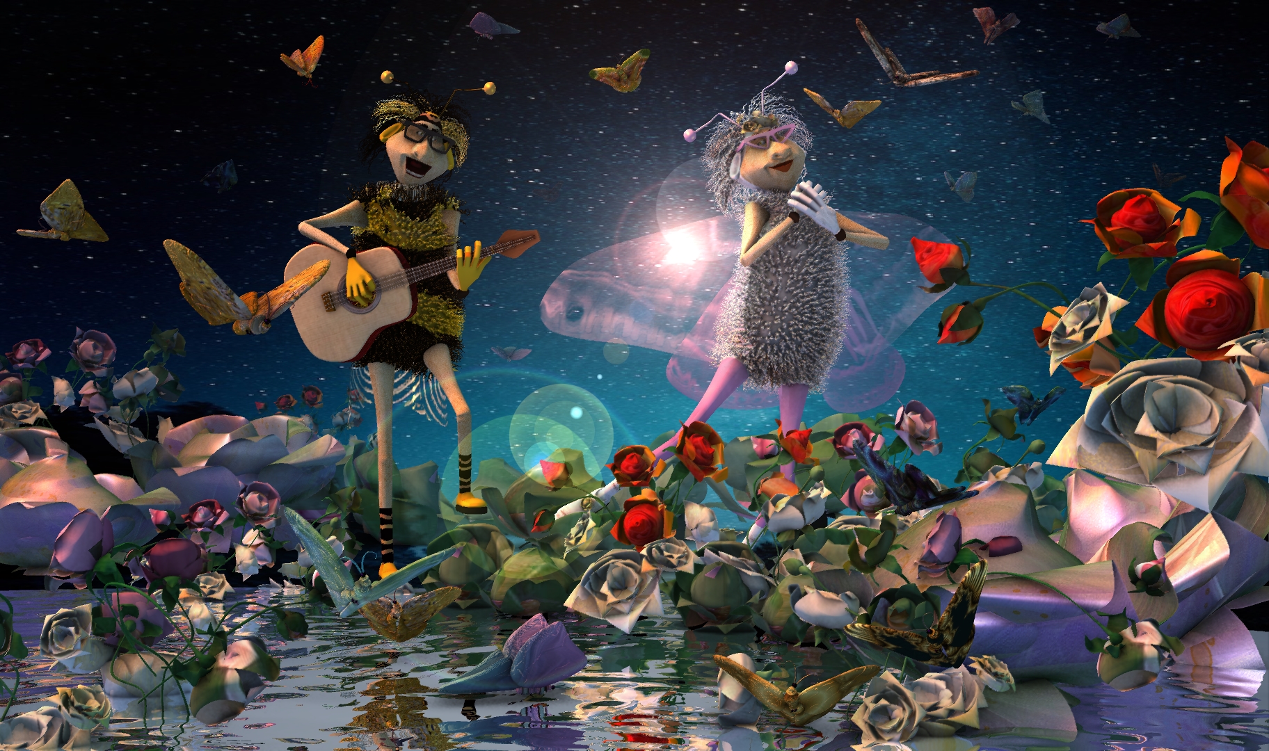
My absolute all time favorite rendering from A:M. Gorgeous artistry.
-
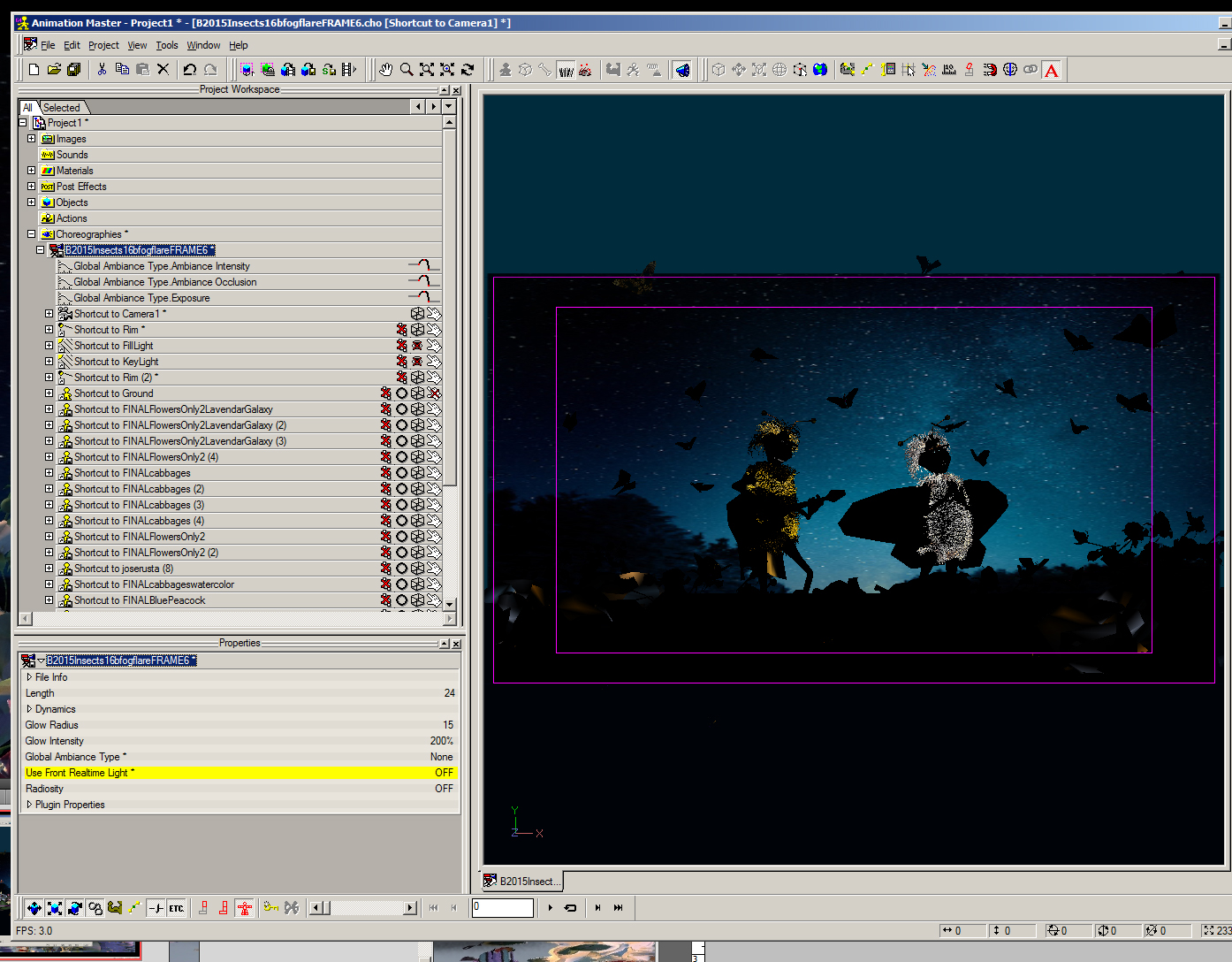
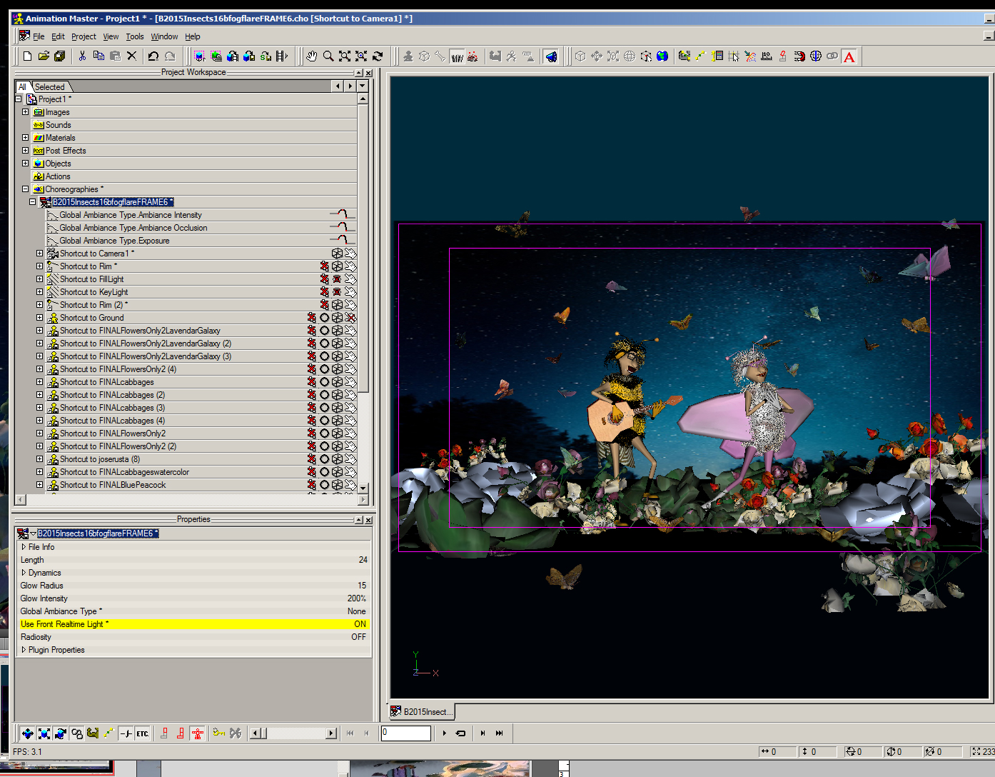
Perhaps you are looking for the "Use Front Real time light" - it only applies to realtime view and you do not have to turn on/off any lights in your scene. It is a property of the chor. You might have to toggle it sometimes, after doing an onscreen render.
-
yes - excellent idea! That would have worked better. I guess since I had done some bugs with 2 pairs of arms early on, I found those models ugly, awkward,not cute. I didn't want to uglify the bee character. But in this case, it would have worked wonderfully. This was actually a last minute image that I did. Had almost not entered, even though I had done a lot of the models way back in June. I had lost interest in the subject - the perils of starting too early and having too much time to work on an entry!
-
ah- ha! yes sorta...except I'm much shorter of course. Thanks Matt, Steve!
-
Bug report makes sense...
-
since it seems to be the thing to do...I too shall post my final image for this event..alas...no moolah for me...
-
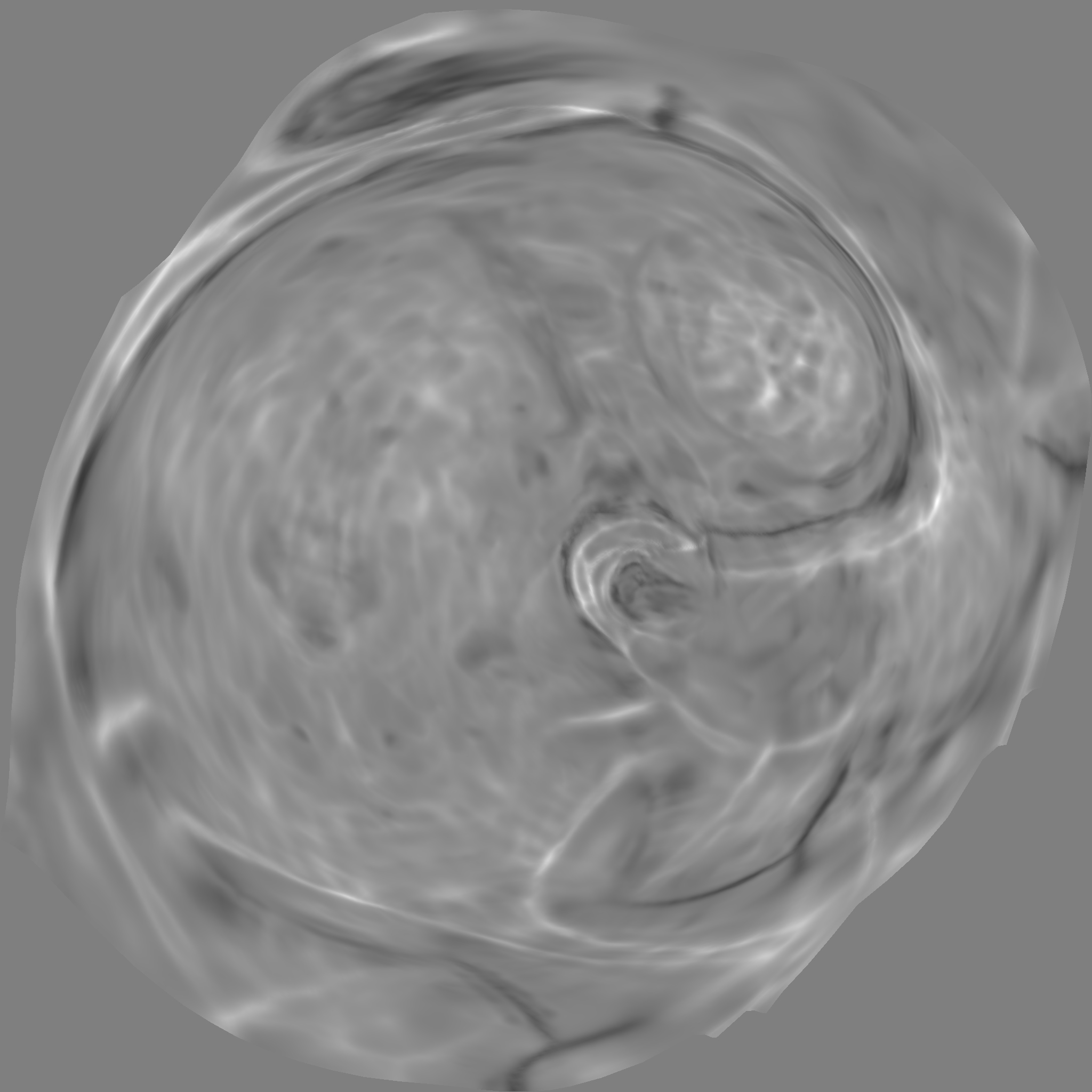
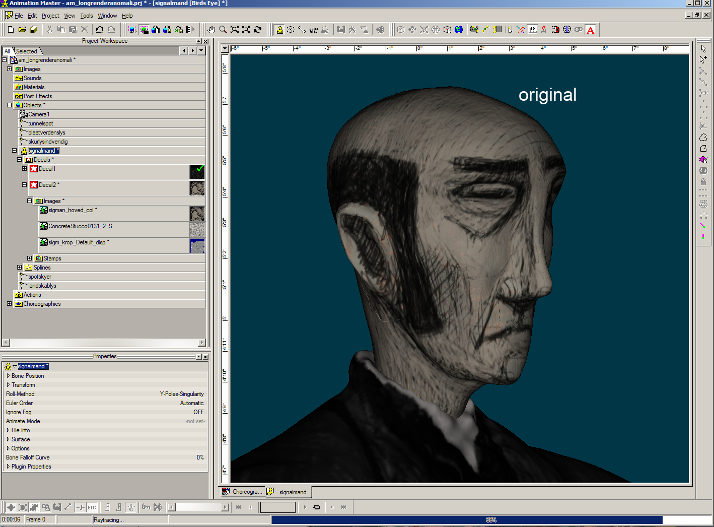
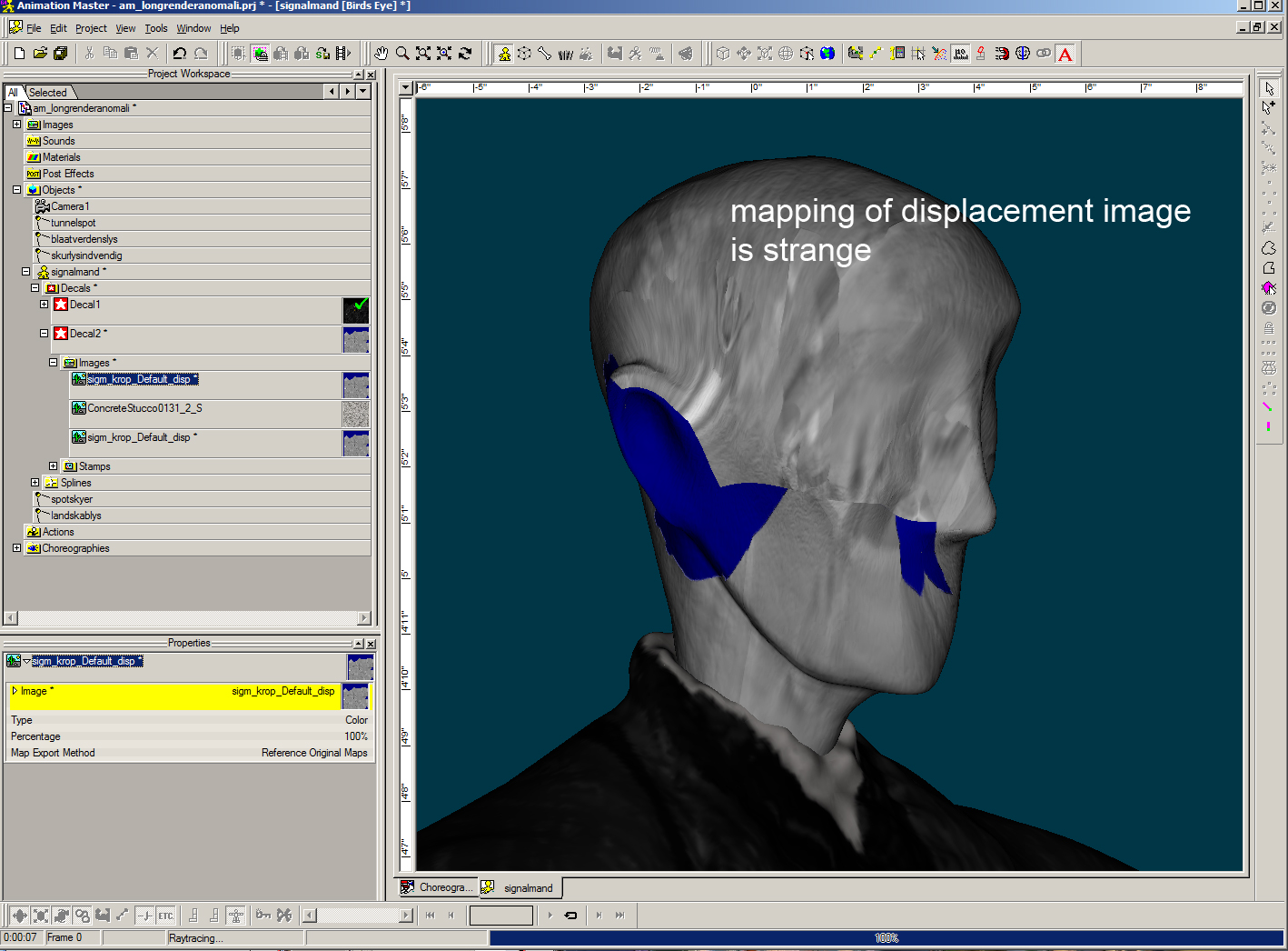
What I did was change the image Mode to grayscale using GIMP...I don't think just changing the blue color to gray would fix it. Hope that helps, Tore. It may help the computational error - but I've always used RGB mode images for displacement without problems. I think A:M uses the luminosity value for the computation of displacement, regardless of color. However - In Tore's model, it really looks to me that the displacement image (sigm_krop_Default.png) should be part of Decal1 container (body patches) and NOT the Decal2 container (head patches). If you look at the image, it shows the body, not the head. I also think what he meant to do was have nytestangular_Default_disp.bmp be the displacement image for Decal2 container (head). I've converted the .bmp to a jpg in order to upload it here (2nd image).
-
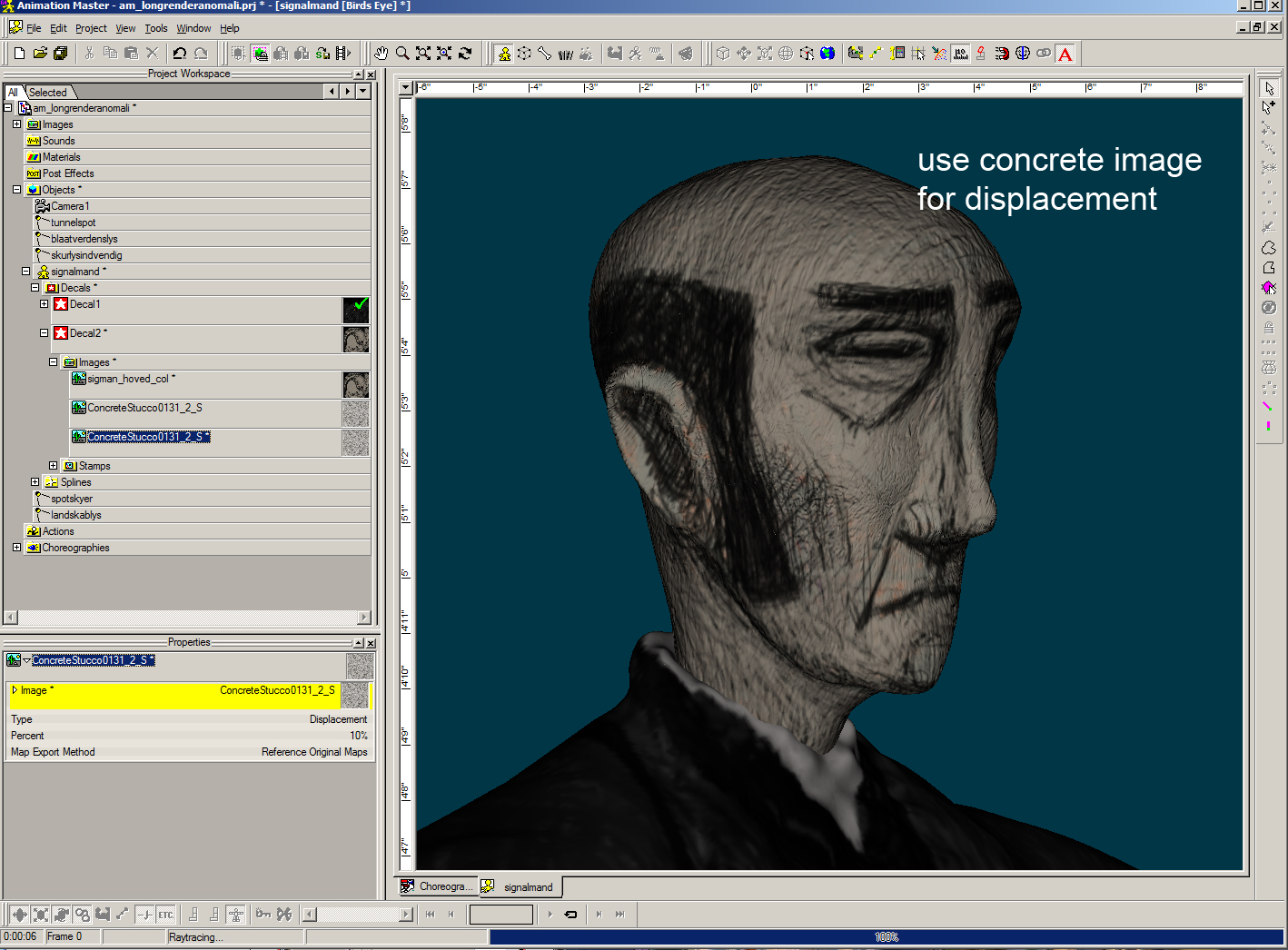
I think the mapping for your displacement image is strange and wonder why you are using it? I substituted it for the color map just for illustration purposes to show how it is being mapped. (see 2nd image) Perhaps you might want to use the ConcreteStucco image for both displacement and bump? I think it looks better, more texture. (3rd image) Or even use the sigman hoved col image for displacement (50%) - see 4th image? Looks better to me. As for why A:M takes so long using your original assignments? who knows? I suspect it's just a quirk in math related to camera angle and weird displacement calculations, on an extremely dense mesh. (also not sure why it has to be so dense, other than it came from another program)
-
Insect Image Contest Results Announced!
NancyGormezano replied to robcat2075's topic in Contests/Challenges
FUN video! Congrats to winners! -
Need advice on good schools for game design...
NancyGormezano replied to entity's topic in Open Forum
Just noticed this free Lynda.com video (Insights with a Game designer Brenda Romero), which might be interesting for your daughter to watch. I have not watched it, so it may or may not be relevant. An excerpt from their blurb -
nice!