luckbat
-
Posts
2,750 -
Joined
-
Last visited
Content Type
Profiles
Forums
Events
Everything posted by luckbat
-
Yup, that's pretty extraordinary, all right. People sometimes forget the power of post. What would happen if you rendered toon lines and used them as a mask in Photoshop? You might be able to get the bevels to follow the edges of the object more accurately this way...
-
Only you can decide whether the mouth is good or bad. Are you satisfied with it? It's true that you'd need to rework some of the lipsync poses if you follow Justin's advice, but I don't see why you'd need to remake the mesh. Try it the easy way--go into your lip poses, select all the upper-teeth CPs, and hit delete. This will delete any keyframe movement for these CPs. Close the pose window and have a look at the results. Everything will be the same, only now the upper teeth will remain stationary relative to the head when the mouth opens. You may be pleasantly surprised...
-
In principle, that should actually work. I'd suggest double-checking with the Anzovins, of course, but as long as you A) don't overlook any of the Rigger bones/relationships, and make sure all the pre-rig bones have their original names, you should be okay. There is a silver lining. If you pull this off, your end result will be the same as if you had done everything properly to begin with. From that point onward: 1. Make all changes to the pre-rigged model, then run the Rigger again. Make no alterations to the Rigged model. 2. Never overwrite your pre-rigged model with the rigged version. Think of the pre-rigged model as your template. It sounds like you've got a long day ahead of you if you go this route, but from that point on you'll be cruising. Good luck! Edit: Okay, I'm gonna stop "helping" now. If anyone needs me, I'll be taking a speed-typing course...
-
You're meant to add fan-bones, CP weights and Smartskins to your model after you insert the TSM skeleton but before you run the rigger. (You read the manual, right?) You don't absolutely have to start over, Andrew--all the bones from the original skeleton are still in your model, so you could theoretically make them visible, Smartskin them and hide them again. But it would really be in your best interest to build the Smartskins into the original model. The issues you're encountering now are only going to multiply as you keep going, I'm afraid... Edit: Apparently, John Artbox and I were engaged in a competition to give you the exact same advice at the same time. You win this round, Artbox!
-
If I'm reading him right, Justin is simply suggesting that your character's mouth should open in a downwards direction only. Right now his mouth opens in both the up and down directions, like Pac-man. Try making his upper teeth stationary relative to the head. His lips are allowed move up a little, just not the teeth. Step one in setting this up would just be to lock down the upper teeth and leave all the mouth shapes the same. If you're satisfied with this look, then you're done. If you think it makes him look bucktoothed, then you'll need to adjust the lip movements so that the upper lip only travels a short distance upwards, while the lower lip does most of the mouth-opening movement.
-
Roger that. It may not be possible to overhype "Stop Staring." It's just that good. If you're thinking about getting it... Get it. You won't be sorry.
-
This page helped me get me started on CP weighting: http://www.hash.com/am2004/Modeling/CP%20Weights/
-
The new shading style is SOOOO sweet. I'll be first in line for the tutorial on that one. My feelings on the blue stripe haven't changed, but I just remembered that Captain America's got the same thing! The difference is that his stripe doesn't follow the bottom edge of his pecs--it's a bit lower. Plus, he has that tasteful black belt. If you can, try tossing in a placeholder or something for your chest insignia--it'll make it easier to judge the overall balance of colors and lines in your design. I understand Nimblepix's reasoning on the calf muscles--even though your model is true to the original illustrations, the giant quadriceps, anatomically accurate though they may be, create a top-heavy feel. I always liked the solution of compensating using jackboots, like the Flash wears. These make the legs seem more balanced visually. Admittedly, you seem pretty committed to the spandex, but I thought I'd throw that out there.
-
Ah, that makes more sense, then. Perhaps a utility belt of some sort could help visually reinforce the pants thing.
-
Okay, you asked for it. Keep in mind that it's a little intimidating critiquing a guy whose avatar is the Incredible Hulk. I don't wanna make you angry. The top costume is okay--a little minimalist, but what's wrong with that? It shows a tasteful Tron influence which should play well with the over-30 demographic. What has to go, though, is the pointless stripe across the midsection. Not only does it sit there, slapped-on, like the stripe down the middle of a highway, it doesn't match the elegant circuitry gradients on the hands and feet. Personally, I'd prefer no stripe at all, which would draw the eye to the extremities and imply that the hero's powers are energy bolts from his hands, plus perhaps the ability to fly. Still, if you can't bear to leave the midsection un-designed, perhaps a hero's icon on his chest would break up the area graphically. In this case, I'd vote for a small, tasteful off-center one over his heart, rather than the traditional Superman/Batman chest logo. You could accent it with a pale circular gradient. As for the bottom one, well... Those krazy Photoshop curves are fine for adding pizzazz to your wireframes, but... how can I put this... on a finished design they look amateurish, like the work of someone who just bought Photoshop a month ago and is dying to play with the filters (See: lens flares). If you want to add shininess to the costume, consider Kricket's toon materials, especially the chrome one. I do like the colors in the second one, though. The higher contrast and darker blues make him look more intimidating. But it still looks like a terminally cheesy Photoshop effect. Brutal enough for ya? At least now you know why I voted "yes..."
-
Well okay, then. As a background model, it seems fine to me, and I wouldn't slave over it much longer. The colors might need to be tweaked depending on the "look" you're going for. If it's a lush, retro feel, could could get a lot of mileage with a nice banker's lamp: If it's more of an 80's-cop-movie bank, I'd desaturate the green blotter so it's not so eye-catching. Aside from that, it looks excellent, although if you've got multiple desks you might want to randomize the pencils a bit.
-
But... How could a person sit at that desk? Where would their legs go?
-
short animation of someone sneaking....
luckbat replied to Ernesto Esteso's topic in Work In Progress / Sweatbox
How long did it take you to design and animate it? -
Hang on--are you saying you're going to base your ambitions on the making of a film whose name you don't actually know? Seriously, though, I support indie filmmaking 100%, but Raimi did a lot more than just send out mail. First of all, he and his friends actually filmed a short version of The Evil Dead to show to prospective investors, with whom they met personally. Second, they were pitching a low-budget horror movie in 1980. At that time, with the proliferation of VCRs and video rental stores, low-budget horror movies were like a license to print money. That's why there were so many of them back then. A guy with a spare million dollars lying around is only going to invest in "movie X" once you convince him that: "Movie X" can be made for a million dollars. "Movie X" will generate more than a million dollars in revenue. "Movie X" can be made by you. It's as simple as that. It helps if you're friends with a bunch of millionaires, but that's a whole other topic.
-
My first lipsync & character animation
luckbat replied to Atomike's topic in Work In Progress / Sweatbox
Also, I agree he can do just fine without hands and feet, but I'd urge you to allow him to lift himself off the ground just enough to cast a shadow from time to time. His bottom edge is his "feet." One of the classic animation challenges they'd give to new animators was to make them animate a sack of flour as though it was alive. No eyes, no eyebrows, no mouth, no arms, no feet. Just four corners and the ability to tilt, hop and bend. If you're good, that's all you need. Seriously, you'd be amazed. Mr. Pellet already bends sideways. You're off to a good start... -
My first lipsync & character animation
luckbat replied to Atomike's topic in Work In Progress / Sweatbox
Oops. Didn't see this thread the first time around. I know how you feel, though. My first lipsync test was greeted by a lot of chirping crickets. Eventually, you'll want to get JBarrett to jump in here, as he's the dude whose name's on the CD. In the meantime, aside from noting that it's a little odd that Mr. U-238 has a 2D mouth but 3D eyebrows, I have to give an overall thumbs up on this one. It's nice to see such a simple, appealing design. Since you asked for criticism, here's what I have to say: His mouth is moving a bit too quickly. If you look in the mirror and say "welcome" and "station," you'll notice that your mouth doesn't open and close with each syllable. For "welcome," it should open on "wel-", hold, then open a bit wider on "-come." For "station" it should just open and close once for the whole word. Really. Check the mirror. Number two comment would be about symmetry. While I doubt your pellet is going to be sneering or chewing tobacco, he could stand to use some asymmetry in his mouth movement. You'll have to experiment, but I'd try skewing the mouth a bit on "Hi" and "Cooper." No need to make fun of the voice work. After four years of Dubyah, just hearing someone pronounce "nuclear" correctly is good enough for me. My only other comment would be regarding the model itself. At the moment, you've got a cylinder with edges so sharp you could cut yourself, combined with shiny spherical eyes, pointy flat black eyebrows and a soft rounded mouth. Without changing the basic design, I'd urge you to tweak a bit for the sake of unity. You might consider reshaping the eyebrows into curves, to echo the crescent shapes of his eyelids. And/or sharpening the corners of his mouth, or rounding the edges of his body. Some specular highlights on his gray skin could help him look more metallic and less rubbery. Oh, and don't forget to add a pair of gargantuan breasts. You can't go wrong there. All right, seriously, just work on the mouth flappiness and add a couple more pose sliders to shift the mouth left & right and tilt it clockwise/counterclockwise and you'll be amazed at what a difference it makes. -
Can't get rid of volumetric banding
luckbat replied to luckbat's topic in Work In Progress / Sweatbox
I tried turning on the advanced properties, which revealed every advanced light setting except "Fall-Off Softness," the one I wanted. Honest! Check out my screengrab. One more day of this, and I'm going back to posting everything in the New Users forum, where I obviously belong.
-
Can't get rid of volumetric banding
luckbat replied to luckbat's topic in Work In Progress / Sweatbox
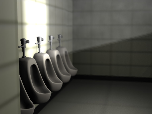
Man, oh man! I think this bathroom is haunted. How else to explain the bizarre "ghost doors" that show up in the multipass render? The doors are, of course, present in the geometry, and they show up fine in the preview renders, but when I do a render-to-file using the same settings, they disappear! Watching the 16-pass render, I observed even further strangeness. In the first few passes, the doors were absent. But by the halfway point, they started showing up, yielding the transparent doors you see before you. Needless to say, the doors are not set to transparent, and as I mentioned they show up normally in the preview renders. Has this ever happened to anyone else? I'm using the MacOSX 11.1 beta, but the same thing happened when I rendered using 10.5r. Meanwhile, I was quite disappointed to see that even with raytracing set to 8 rays, the sunlit areas (I've added a second window since the previous screenshot) have no softness whatsoever! I thought that was the whole point of having multiple rays...? Help me, Yves Kenobi! You're my only hope! Needless to say, I'm still getting hard lines on the volumetrics, no matter what softness settings I use. Even 8-ray raytracing had no effect. What must I do? At this point, I'm just going to have to throw in the towel and fake everything like Vern suggested. Heck, I might even burn the shadows into the wall texture or something. This is getting ridiculous.
-
Don't forget about soft reflections: http://www.hash.com/forums/index.php?showtopic=5050 They might be of use to you...
-
Can't get rid of volumetric banding
luckbat replied to luckbat's topic in Work In Progress / Sweatbox
Hey, wait a minute... This excerpt from the lighting properties page in Hash's HTML Help sounds like exactly what I want: http://www.hash.com/htmlHelp/v11.0/GeneratedHtml/LightP.htm Fall-Off Softness Visible: Sometimes, Default: 80%, Min: 0%, Max: 100%, Percentage This setting is only used when a object is set to be volumetric. Changes how smoothly a light falls off to the background color. A value of 0 causes an abrupt edge where the object falls off to the background color. Higher values soften the edge caused by the falloff. There's just one problem: My light objects don't have a "Fall-Off Softness" property! Do yours? How can I access this setting? -
Can't get rid of volumetric banding
luckbat replied to luckbat's topic in Work In Progress / Sweatbox
Whoops. I tried setting the percentage higher to try to get rid of the banding (it had no effect), but I never thought of setting it lower to get the shadows back. Well what do you know? There they are! Unfortunately... Setting the softness to zero makes all the shadows hard, including the edge of the sunlit square on the wall. I guess this is just a limitation of Z-buffered shadows. Obviously, the sunlit square should have soft edges, while the pipes, mere centimeters from the wall, should have hard shadows. Switching the klieg to raytraced shadows with multiple rays would, of course, render all this stuff properly, but I was really hoping to avoid the resulting render slowdown. Especially since the volumetrics project listed below doesn't seem to need them. The banding... it taunts me... -
Hello, all. I'm in the early stages of modeling a set for a short piece I'm working on, but I'm getting some strange artifacts that I can't seem to shake. I based my volumetric settings on this thread ( http://www.hash.com/forums/index.php?showtopic=3994 ), but I don't seem to be getting the same quality of render. Number one issue is the sharp diagonal banding on the light shaft. I've set my klieg width to zero, as instructed, but no dice. It's not the "quality" setting in the volumetrics, either--even at 99999%, the banding is as sharp as ever. Number two is the missing shadows behind the urinal pipes. What happened to them? Is it because of the Z-buffer? They show up properly when I switch to Raytraced, but then the edges of the sunlit square on the wall turn hard instead of soft like they should be. I gotta say, I'm confused. I downloaded the project in the thread listed above, and it's got nice soft shafts of light, even though all the lighting settings are the same as in mine. Are there any volumetrics experts out there? I've been toggling the lighting properties for three straight days and I just can't get this ray any softer. Even with multipass-16 and depth of field! Can anyone spot something I've missed?
-
I'm guessing he relied heavily on these tutorials: http://www.colins-loft.net/tutorials.html
-
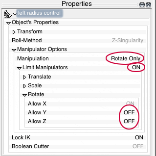
You're welcome, William! Now that you have the Euler Limits set, you can optionally configure the manipulator properties of the corresponding bones in your choreography's model shortcut to display the X-rotation manipulator whenever you select the bone. Depending on how you like to work, it could make posing those bones easier, or at least more visual. Check out the image below and give it a shot...
-
You want Euler Limits.