luckbat
-
Posts
2,750 -
Joined
-
Last visited
Content Type
Profiles
Forums
Events
Everything posted by luckbat
-
I'm flattered, Paul, but to tell you the truth, I'd never used any other 3D software before I started playing with Hash A:M about five months ago. Maybe that's why this 11-second clip took me over four weeks to do... I definitely agree. Unfortunately, the v.10.5 toon renderer doesn't give me as much control over the shadows and highlights as I'd like, so I'll probably need to use some sort of compositing software like After Effects or Motion once I head down this road. Still, your suggestion made me curious, so I used Photoshop to composite some still renders to better simulate the appropriate lighting. Here's the result: The above image is simply a combination of two different lighting setups--one for shadows, and one for highlights, plus a levels adjustment and a couple of gradient overlays. It shouldn't be hard to reproduce using motion graphics software. (Strictly speaking, since I'm rendering out to targa anyway, I could just use a massive Photoshop action to do it all, but it think it would choke after the first few thousand...) Yeah, like I said, I'll be doing facial expressions in the next version. I haven't even built the pose sliders yet...
-
Oh, the emotional highs and lows of 3D animation. It took me about 12 days to create my first one, and the feeling it gave me was nothing short of elation. To singlehandedly create an animated character out of nothingness, well... it's extremely empowering. And then came the changes. All I wanted to do was fix a few arm movements, smooth the lip sync, maybe sharpen the facial expressions a bit. But the new arm movements revealed places where the arms and hands weren't proportioned right, so I felt I had to redo them. Which helped, but that screwed up the shoulder fan-bones, so they needed to be rebuilt. Which is when I realized that the neck wasn't toon-rendering properly, because I'd just used a simple tube instead of a more anatomically accurate shape. So I fixed that, too. Once the neck was finished, I could see that my character's cheekbones and jawline weren't quite right, either, and neither was the hair, which really needed more spikyness and some bones with dynamic constraints... Which is why, in the end, it took me 12 more days to make an animation that only looks about 10% different from the old one. And I still haven't fixed the facial expressions. That's not such a good feeling. Anyway, here's the new version, which ought to be twice as good as the old one, but isn't. It looks like I still need to make one more pass, this time focusing on facial animation, but if anyone has any feedback on this version, please pass it along. Ebon_lipsync_test_v1_1.mov
-
An animatic, for all practical purposes, is an animated storyboard.
-
Ah, the younger generation. How they've missed out on the classics.
-
Thanks! Maybe that's the reason I've gotten so few responses to my request for feedback. (I'd like to think so, anyway.) Yeah, tough call. In the final version of this scene, her outfit, the background, and even her voice are all going to be different, and her animated performance will be a lot moodier. Right now the voice track is pleasant and calm, so that's how I'm animating it. It'll be a shame to throw all of it away for the full scene, but that's why it's a test, I guess. I am learning a lot about the process, which is the important thing. Well, you get two free download credits when you sign up for an account with istockphoto.com, so technically I didn't pay anything. But even so, their pictures only cost 50 cents, so... meh. I needed a men's bathroom interior, I got a men's bathroom interior.
-
Well, here's my two cents: There's something weird about his arms. The guy's pencil body curves like rubber, but his arms have hard shoulders and elbows. Also, in proportion to his body they seem really thick--half the width of his body, basically. Based on his floppy eyebrows and lips, I'd recommend going the same route with his arms. Make them more like rubber hoses, less like human arms. You could go with the standard white cartoon gloves, or try pink ones, to match his eraser hair. That might look interesting. Good luck!
-
Yay! Daleks! Conquering everything that stands in their way, except stairs.
-
Just a quick note-- I'm looking to spend the weekend working on version 1.1 of this clip, so if anyone has any specific advice/suggestions, please let me know. So far, here's what I'm planning to tackle: Fix the lipsync poppyness around "all the," and the closed-mouth poses around "about"/"my" Rework the beginning to be less floaty Incorporate more full-body movement towards the end That's all I have, aside from Bigboote's request for more 'O'-mouth action. Any other areas you guys think I should focus on?
-
Oh, and trust me, fellas... You do not want to see this woman's "O" face.

-
Drat! They do come together, when the clip is rendered at 30 fps. But you're right, this 15-fps upload is missing those crucial frames. Hmm. I'm not sure how to fix that. I can't hold the closed-mouth pose for longer, since that's unnatural. I suppose I could drop the lipsync action's framerate to 15 and shift some of the keyframes, since this test is geared more towards uploading than broadcasting.... Still feels like a hack, though.
-
That is so weird--he looks like he's stop-motion! I have no idea why. TROLL SMASH!
-
Thanks so much. I'm shy. Actually, if you spend much time in the New Users forum, you may have seen a couple of the masters helping me out with some tricky modeling problems: When pose sliders collide: http://www.hash.com/forums/index.php?showtopic=8387&hl= How to create mummy bandages, toon-style: http://www.hash.com/forums/index.php?showtopic=8177&hl= Well, I was planning to use the dopesheet, but most of the Hash old-schoolers recommend ignoring it in favor of manual lipsync, so that's what I did. (In a nutshell, the argument is that you'll spend more time tweaking the dopesheet's output than you'd spend just building lipsync by hand.) If you're serious about lipsync, do what everyone does and buy Jason Osipa's book Stop Staring. Trust me, it lives up to the hype. There's no real secret to lipsync, the trick is just to be lazy. Seriously! The mouth is lazy; it moves as little as it has to between sounds. (Of course, it also helps to have a tiny anime-style mouth like my character does.) Thanks again. You know, it's words of encouragement like yours that-- --uh... never mind.
-
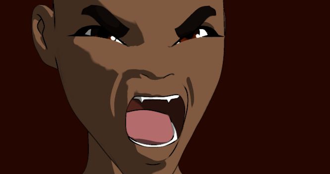
Well, here goes... Below is an 11-second lipsync test I did for a personal project I'm working on, called "Ebon." The dialog in this clip is from a 2-3 minute scene I'll start work on once I build the rest of the characters and the set. This is both my first model ever as well as my first animation ever, so it's not all it could be, but that's okay--this isn't a portfolio piece, just an excuse to teach myself the Hash interface and to suggest what the final animation might look like. [Addendum 7:40am - preview image:] About this clip: The dialog comes from my own script, with voices provided by friends. The background was Photoshopped from a stock photo [ http://www.istockphoto.com/file_closeup.php?id=130157 ]. Questions, comments & criticisms welcome. [Addendum 10/31/2004:] Note: This is the old version--there's a newer one at the bottom of the page... Ebon_lipsync_test_v1_0.mov
-
I certainly agree that there are many different ways to offer criticism--some helpful, some not. But it also depends on who your audience is. Is your animation for the public? If so, then the advice of "unqualified" people is exactly what you want. There are times when you need insightful, constructive criticism. It's best to go directly to your coworkers and mentors for this, since they can evaluate your work with a professional eye and (hopefully) a sense of what level of guidance you require. On the other hand, when you upload something to the Internet, well... Expect a flood of blunt, simplistic, contradictory responses. And that can be useful, too. Because this is, ultimately, your audience. And if they're giving your latest masterpiece a lukewarm response, that's important to know, even if they can't give you a good, articulate reason for why. If only George Lucas had spent a little more time listening to "unqualified" critics when he was working on Episode I...
-
It's a tough call. Personally, I like the idea; it has potential. Some masters need a little help, and some newbies need a little direction. But let's face it--as currently defined, the program skews heavily in favor of the masters. Speaking as a newbie, I have two choices: I can learn the ropes by charting my own path through this crazy software, working on my own animation projects. Or I can learn the ropes by working in a semi-guided fashion on someone else's magnum opus. There are advantages and disadvantages of each method, of course. But at the end of the day, either way, I've spent a day working in Hash--it's just that, under the apprentice program, I've got little of my own to show for it. You see what I'm getting at? The newbie gains a bit of guidance and organization (and probably a bit of remote tutoring), but loses the time to work on their pet projects. The master loses some time spent corresponding with the apprentice and organizing a two-person workflow, but gains a free intern. Since working on their pet projects is probably what motivated the newbies to buy Hash A:M in the first place, it's difficult to imagine them giving those up. Once again, I really do like and support this apprenticeship idea. But the masters are going to have to offer something more than just exposure to their masterfulness. I submit the following: For this apprenticeship program to be viable, it must offer something that is available to neither the master nor the apprentice. What form could that take? Perhaps a collaborative, Boids of a Feather-type project. Or a freeform creative ping-pong match, like Photoshop Tennis, but for Hashers. Or a jointly produced, in-depth tutorial on a complex animation technique. The field of possibilities is vast. But if the offer on the table is simply "Whatever the master is already working on," well...
-
I think you can pretty much solve all your remaining walk cycle problems by adding the song "Staying Alive" by the Bee Gees. ...Please?
-
He has plenty of forward/back sway, which suggests a heavy beast throwing his weight around. So I'd suggest complementing it with some more side-to-side sway. What may be bothering you about the arms is an insufficient tilting of the shoulders--they mostly shift back and forth, but not up and down... As mentioned above, the sway of his arms is too linear, almost like they're hitting a wall and bouncing off. Changing the ease to make them more pendulum-like will work wonders. Love the head movement, by the way...
-
Truth be told, I haven't seen the Hamill mockumentary you're referring to, but I've heard great things. You're very welcome. Man. Someday I hope I can learn to handle criticism as well as you can.
-
When you're done, be sure to post a "before and after" wireframe, so we can all marvel at the hard work you've put into this!
-
I think most of the trouble you're going to run into with this model will stem from the conflict between "realistic/plausible" and "looks cool." Right now your model has the proportions of an average guy. This is fine, but when you're building a cyborg warrior, viewer expect much more heroic proportions. Please don't take this the wrong way, but right now he looks like a costumed guy at a comic-book convention. (Forgive me!) Here's a link to a page about human measurements: http://www2.evansville.edu/drawinglab/body.html If you look at your model from the back, you can see where the proportions are going awry. His hamstring muscle is shorter than his chest muscle! You could get away with a 50% increase in leg length without sacrificing plausibility. If he were an anime character, you could double the length. In the same vein, making the head a bit smaller will help lend the character more powerful look. Another area that will help sell the idea of strength is giving Space Marine a more Y-shaped upper body. Right now he has... well, love handles. If you tighten up his waist and move his shoulders farther apart, he'll look a lot tougher. Finally, the reason Ken asked about the T-pose might have been those shoulder pads. Unless they're made of cloth or something, your marine won't be able to raise his arms at all! I hope I'm not sounding discouraging. I wouldn't spend my time writing this if I didn't think the model had potential. I personally would like to see you push your influences a bit more. His collar, kneepads and gloves give him a medieval knight feel, while the helmet is more samurai-esque. The black joints have a Robocop vibe, etc. So keep going! Do some more research into Eastern/Western armor, for example, for more ideas on how to "clothe" your marine. Best of luck!
-
Hee hee! The pilot's chair looks like a robot pilot!
-
Agreed. The right one. Note that the engines are very organic in shape like the original Osprey, but the fuselage is quite flat and mechanical. Could you play with the curves on the fuselage to bring it more into line with the potato-shaped engines? Make it more... bulbous, somehow?
-
It's because of the shadow on the end. It makes it look like the gun butt is pointing towards the viewer.
-
Celebrities own the rights to their "likeness." Courts grant a certain leeway for satire and caricature, but you can't, for example, draw the Three Stooges and sell T-shirts of your drawing. http://www.rcfp.org/news/2001/0502stooge.html The decision ultimately rests on how "transformative" your work is. A photorealistic doll of Diana Rigg might not be legal to sell, while a cartooney version of her might be okay. Witness a comic that featured a thinly veiled version of albino blues singers The Winters Brothers. In the comic, two albino cowboys named The Autumn Brothers are revealed to be half-worm tentacled creatures. The Winter brothers sued, but the courts rejected the lawsuit in favor of DC Comics. http://www.tcj.com/254/n_winters.html On the other hand, Arnold Schwarzenegger was recently able to stop production of a "bobblehead" doll of himself, though he later granted permission in exchange for certain changes to the doll. Yves is clearly in no danger here, but yes, celebrities do in fact own the legal rights to their image.
-
Reminds me of that Sprite commercial with the "Sun Fizz" drink mascot who comes to life and terrorizes the children. It was directed by Spike Jonze. Have you seen it? http://sickjokes.about.com/library/blmedia_sunfizz.htm