Nosferatu
-
Posts
415 -
Joined
-
Last visited
Content Type
Profiles
Forums
Events
Everything posted by Nosferatu
-
Great job, Ken. Looks very convincing. Nos
-
AM can convert and compress output formats
Nosferatu replied to johnl3d's topic in A:M Tutorials & Demos
Excellent, John. Very useful. Thanks for sharing. Nos -
Mechanic expression use with hypnotic mat
Nosferatu replied to johnl3d's topic in Work In Progress / Sweatbox
What is thy bidding, Master? Nos -
Wow...What software did you use to make that capture? Nos
-
Try setting the magnitude property on the force. Even if you want the default of 100%, click in the box to highlight it and then hit "Enter" on your keyboard. I find it sometimes has to be reset like that. Nos
-
"Platelets: Lepidopteraphage" - the film is finished!
Nosferatu replied to Dascurf's topic in Work In Progress / Sweatbox
Excellent work. Worth the price of admission. Very reminiscent of Lynch and the Brothers Quay, not to mention Svankmajer. Sound-wise, I would almost think that you had gotten Splett to come back from the grave for one more go-round. Very inspiring work because all your elements and pacing are very congruous. There is WAY more sophistication here than meets the eye. Nos -
1. Put a null in the center of focus. 2. Scale it large for easy access. 3. Constrain the camera to "translate-to" and "aim at" the null. Turn ON "compensate mode" while setting each constraint. Now you can rotate the null around it's "y" axis and the camera will spin around the null at a fixed distance. (if you convert the nulls rotation type to "euler" you can just type in 360 in the "y" rotation property to set a keyframe for a complete turn. Be sure to key the "0" location first.) Sounds more complex then it is. Phil Phil, Just wondering...is compensating the "aim at" null necessary? I can't see the reason for needing a compensation on that. THanks, Nos
-
8 oz. glass Coke bottle and cap
Nosferatu replied to R Reynolds's topic in Work In Progress / Sweatbox
Yes, I think the new cap would look more realistic in the scene. I wish I had a bottle to open so I could test. Nos -
8 oz. glass Coke bottle and cap
Nosferatu replied to R Reynolds's topic in Work In Progress / Sweatbox
Rodger, Regarding the cap, I can't help but think that a real cap would have a sharper bend angle because of the way an opener leverages itself against the middle of the cap. Yours tends to curve up at a gradual slope. The bottle looks absolutely awesome. Just wondering, how many passes? Nos -
Looks really great so far, Kevin. This has the potential to be a great piece. Good old Boneless Thom is getting to be a regular Alfred Hitchcock with his cameo appearances! It seems to me that the overall ambience may be a bit high. If you had the fireplace and candle as the main light sources, thereby making the back of the tree and presents much darker, the tree lights might look a lot more convincing. The picture has an overall great composition, as I can tell you already know. I'll bet if you play with the lighting and eliminate the ambience it will really come alive. Nos
-
Need to brighten up this guy's eyes
Nosferatu replied to Nosferatu's topic in Work In Progress / Sweatbox
Darklimit, You win the grand prize! Your idea about adjusting the falloff properties worked perfectly, though I'm not sure exactly why that serves to brighten the center of the sphere. Thanks for the great idea. And thanks to all for your great suggestions! Nos -
Need to brighten up this guy's eyes
Nosferatu replied to Nosferatu's topic in Work In Progress / Sweatbox
Thanks, Stian. I appreciate the encouragement! Nos Thanks, David. I'll let you know how it turns out with the light list method. Nos Why add more lights than neccessary? I suggest the Oren-Nayer diffuse render shader, and just adjust the brightness. Light lists, in my not-so-humble-opinion, are a pain in the ***. I agree, it's going to be a pain. I don't know anything about this Oren-Nayer shader where can I find/learn about it? Nos -
Need to brighten up this guy's eyes
Nosferatu replied to Nosferatu's topic in Work In Progress / Sweatbox
Thanks, guys, I'll try a light list. I haven't played with that yet, but I assume by using a light list I can have the lights affect the pupils only and not the glasses. Nos -
The lenses are clear, but they do block a lot of light to his eyes. I tried bumping up the ambience on the eyeballs, but that has the effect of washing out his irises (simple color decals). Is there a way I can brighten up his eyes without washing out the pupils? I'd rather not use geometry for the irises unless I absolutely have to. Thanks! Nos

-
Rodney, Would you please put me into the contest? Thanks! Nos
-
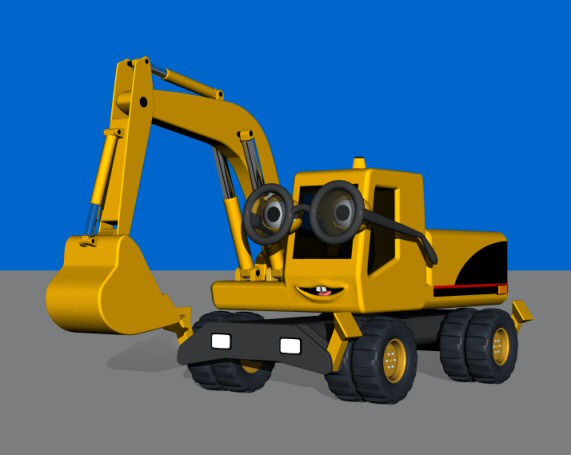
David, I have good results with vehicles when I sink the tires below the surface by a virtual inch or inch and a half. It makes it look like the weight of the vehicle is flattening the bottom of the tires. If your tires aren't rotating, you can bulge them at the bottom, too. I would assume that you have to have the sunlight corresponding with the actual time of day you are depicting, is that right? All I can suggest is giving the sunlight a bluish cast. This makes it look a little more realistic in my scenes. Now how on earth are you accomplishing those great road surfaces? I'm really struggling with this. My textures invariably go bonkers at render time, no matter what I do. Your work gets better and better with every project. I'm genuinely impressed. Nos
-
"You're right Mr. Thatcher..."
Nosferatu replied to robcat2075's topic in Work In Progress / Sweatbox
Looks pretty good. You might consider having him look back at Mister Thatcher after he says "60 years" to see Mr. T's reaction. This would add a feeling of resolution to the scene. Nos -
Fantasy Scene - "Faith Of Evil"
Nosferatu replied to DarkLimit's topic in Work In Progress / Sweatbox
Beautiful work, DarkLimit. Would you please explain how you did the terrain? I'm going to need something similar for a project i'm working on. Inspiring stuff there! Nos -
Critique my Flash website, please...
Nosferatu replied to John Bigboote's topic in Work In Progress / Sweatbox
Looks good overall, Matt. I have a horizontal scroll bar on every page at 1024 X 768, though. You might want to trim it down to eliminate that since as far as I know 1024 is still the most common visitors' resolution. Curious...What are you favorite improvements to Flash? Nos -
Sorry - get in line with bad puns - I believe Ken & myself were the first to discredit ourselves. Ahh...I'm in good company then. Nos Here's the gist of what I wrote. I like your attitude of wanting to hear others' perceptions. >>>>>>>>> One thing that I noticed right away was that his entire body reacts to the 1st egg before he has a chance to process that there is something to recoil from. It might look cool to have his head move first to see the egg and then a split second after that his body would recoil. Sound-wise, the sound of his footsteps sounds like shoes on a linoleum floor. A more muffled sound would fit the scenery better, and maybe a few "scratchy" sounds as his feet slide on the ground. And a loud thump for the last egg would add weight to it, but I suspect you did it without the sound on purpose.. <<<<<<<<<< Thanks for showing us this inspiring piece of work. Nos
-
Good job, David. In fact, eggsquisite. Your moving holds are extremely well done. I initially threw in a few critiques but I edited them out since you didn't ask for that (thought I was in WIP forum). Great work overall. Eggcelent work, in fact. Sorry, but you knew one of us would stoop to punning. Nos
-
I agree with everything Alonso said, but it has a lot of potential. Now that you've laid the groundwork, you can start tweaking and you'll have a nice piece. You might want to consider moving his eyes in a more deliberate and quick way, as if he's quickly locking on to different characters' eyes. A warning about profanity is always appreciated (children, wives, personal convictions, etc.) Keep at it. As I said above, this (and you) have a lot of potential. Nos
-
David, How about trying a lag constraint on the camera? I find it simulates head motion very well when the impact occurs. Nos
-
Very nice and cozy environment. I would very definitely love to hang out there to do my reading! I like the organic feel. It seems the book cases are a little high in ambience, unless there are light sources there that I can't see. It's definitely a tough one to light. Overall an excellent piece. The tree trunk looks great. How much of that is geometry and how much is texturing? Nos
-
Looks great, Mark. It has a nice, organic feel to it. Nos