-
Posts
821 -
Joined
-
Last visited
-
Days Won
2
Content Type
Profiles
Forums
Events
Everything posted by thefreshestever
-
hmm, steffen told me just 2 days ago that i COULD run a:m on windows on a mac with the same license.
-

punch babies in the face
thefreshestever replied to thefreshestever's topic in Work In Progress / Sweatbox
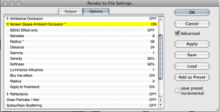
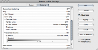
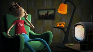
see the 2 screenshots regarding toon and SSAO settings.. the distance value in the SSAO settings vary, depending on if i´m doing a close up or wide angle shot. the rest is lighting and texturing. for those shots i used one very distant klieg light casting shadows, softness set to 0.01%. i also used two kickers that are sunlights, mostly backlighting the characters, no shadows. also a very small amount of global illumination of 2-20%, depending on the shot. the livingroom-scene also contains a bulb light. for the textures i made mainly bitmap plus materials where i use a picture similar to this: http://kindertapeten.de/kindertapeten-shop...49504-b_big.jpg wait, i think it´s exactly that picture -

punch babies in the face
thefreshestever replied to thefreshestever's topic in Work In Progress / Sweatbox
-

punch babies in the face
thefreshestever replied to thefreshestever's topic in Work In Progress / Sweatbox
thanks. still building the other sets. no, you´re right nancy, punchin cats would go a little bit too far. i´d never do that!!! -
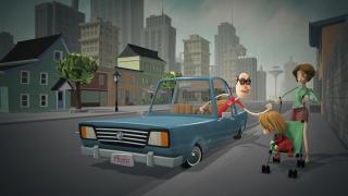
greetings my friends after a long period of thinking about it, i´ve decided to dismiss my short movie project "the lunch encounter" (the one with the guy and the cat). for several reasons: 1. the story wasn´t strong enough. 2. my animation skills are not good enough to compensate the rather weak story. 3. it´s too long. 4. i wasn´t 100% happy with the look anymore. also i realized i suck at story writing. i really do. i´m always starting to make a movie because i just want to do a short, not because i want to tell a story. maybe some of you can relate to that. i just have fun creating characters and props and sets and doing the lighting and stuff, and i always need a "frame" where all this can happen. and this frame is usually not my strong suit. but then i realized i possibly should just focus on what i´m good at: advertising. with that in mind last week i had an idea under the shower for a short which made me laugh really hard... it is really more of a satiric commercial for a imaginary "product": "PUNCH BABIES IN THE FACE" it´s only going to be about 30 seconds, fast cuts combined with slow-mo sequences of babies getting punched in the face while the off-voice is selling the "product" in 50s commercial narration style with a lot of sarcasm. i hope it turns out as funny as it is in my head. but it´s not just meant to be funny, it is also meant as critique to the present form of capitalism, which has gotten clearly out of hand (at least in my opinion). animation will be a lot of fun i guess, i will try to get as much dynamic into the animation as i can, using a lot of squash & stretch. luckily i will be able to use some characters and props from the other short, so all the work wasn´t for nothing. i tinkered around for days regarding the look, and i think i´m happy with it now. it uses toon render in combination with the newly implemented SSAO feature. the ability to combine toon render with ambiance occlusion is new for me as a mac user, because real AO doesn´t work with toon render. this pretty much comes out of a:m as it is, just a little color correction and fog added in post. here are the first two set tests and the title screen....
-
this was fun! amazing what people could already do with a:m back then... i especially enjoyed the hammer animation.
-
example another example you´re right about the facial expressions, but for me the squetch rig is mainly about the squash and stretch and bow and bend capabilities. i don´t know about other folks here, but i´m in need of those features from time to time...
-
it´s installation process is as easy as any other rig installation. with any other rig you´ll have to translate and scale bones in place, and there are not more bones to move using the squetch-rig. there´s also a detailed instruction in form of a text-document coming with it, so everyone should be able to follow the steps. the weighting process is a little bit more complex, because there are more bones to choose from in the end, but other than that it´s the same. this rig gives absolute animation freedom and flexibility, everything can be squashed and stretched, almost every thinkable pose can be realized. poses are organized in folders and i think it´s quite well arranged. i think most people are afraid of it, because the first versions of this rig were very laborious to install with resetting all the compensates and stuff. but david made it just as easy as installing any other rig. the only downside to it is that it´s a little bit heavy, so loading a squetch-rigged model takes a few seconds more, undo´s in the animation process too... you can´t have it all i use it all the time, in my opinion it´s the most advanced rig available for a:m.
-
that´s some serious detailism
-
that did it! dank dir!
-
something weird happened. i was working in after effects cs6 while a:m v16 ran in the background. somehow my graphics card did some weird stuff, my desktop-image was gone for a few seconds for instance, and the computer got slow... i forced quit on after effects, then regularly shut down a:m and restarted the computer. after that the project workspace in a:m was gone. and i can´t get it to show up any more. but only in v16. in v15, v17, v18, everything was still there like it should be. i deleted my v16 version and reinstalled it, but STILL no project workspace. how can that be???? i´m on a mac, OS 10.68 btw. i´d very much like to get v16 running again, it´s the most stable version ever on a mac. any ideas?
-
looks nice... the videos must have hurt a lot, though
-
congrats marcos! i bet the race was tight, there were so many beautiful entries!
-

Laurel & Hardy Illustration Breakdown
thefreshestever replied to largento's topic in The Wannabe Way
i´d like to, but there´s not much to show. i don´t draw my characters first or make any concept, i just start modeling and see where it goes. -

Laurel & Hardy Illustration Breakdown
thefreshestever replied to largento's topic in The Wannabe Way
superb modeling as always! i love that it´s got a story to it. wouldn´t hurt a bit to see this one win instead of mine. -

Captain Crazy Pants works out
thefreshestever replied to NancyGormezano's topic in Work In Progress / Sweatbox
haha, great character! i would like to see him animated!!! -
thanks rodney... i think that could mean a slight disadvantage for me
-
jason, my entry STILL isn´t there!
-
jason... my entry is not there, even though you replied to my mail...
-
thanks! we need a like-button at the forums!
-
i can´t really see it in the screenshot, but you´ll want to make sure no bone of the chain collides with the mesh of his body. if there´s already happening collision at keyframe zero, kinematic chains tend to go haywire.
-
thanks david.
-
wow. that looks awesome!!! Especially the hair.


