Rodney
-
Posts
21,649 -
Joined
-
Last visited
-
Days Won
119
Content Type
Profiles
Forums
Events
Everything posted by Rodney
-
Saw it. Enjoyed it. Need to see it again.
-
Whoops... a few minutes later... already funded. Now moving on to the stretch goals of After Effects and Nuke plugins (I'm confident those goals will be met because of those deeply invested in those products). Too bad I'm not in a position to suggest an A:M Plugin.
-
Funding is now at 93% due (primarily) to a recent buy in from Red Giant. MOX will most certainly see it's primary funding level reached but it is uncertain how much farther it may go with other (smaller) corporate heads buying into the idea. In my estimation it's important that MOX reach it's stretch goal of adding an Adobe After Effects plugin (for that Adobe itself should be able to spare a few $). Getting a format into the mainstream so that it can actually be used is that important.
-
I've always thought of you as an early adopter.
-
Have any early adopters had a chance to play with A:M on OS X 10.10 Yosemite? Unlike with Mavericks... which threw a lot of folks off a cliff for a brief moment... it would seem most incompatibilities with Yosemite are related to hardware drivers. That sounds like good news for A:M users as keeping hardware drivers up to date is generally a good practice anyway. As Yosemite is a free upgrade for Mac Users it likely to be adopted by many: http://www.apple.com/pr/library/2014/10/16OS-X-Yosemite-Available-Today-as-a-Free-Upgrade.html
-
It is interesting to note that the MOX format is going to take a large part of its approach from Open EXR becoming, in essence, an EXR movie format. How Brendan plans to get this done is to effectively mirror Open EXR's architecture as a wrapper for other formats. This is a little bit like what the new programming language Julia professes to do in that it provides a intelligent and web enabled wrapper (of sorts) to access other programming languages. What makes Open EXR the ideal 'subformat' to work with is it's access to multiple images (within a single container image) and depth information via channels. As those channels can be user defined this opens up the format for consider (local) programming. The desire is to take a very complex array of image formats and expose the strengths of each wherever they are needed most. Theoretically, at least at the user level, image formats themselves would be largely interchangeable all within the scope of this new file format. While Brendan's immediate goal is more down to earth the potential is there to solve some of image formats more pesky problems: - Image formats that don't display well in a browser - Image sequences that can't leverage transparency - 1D images trying to fit into a 4D world While there have been and continue to be open image formats, MOX is the billed as the first open movie format. 'Tis a lofty goal to be sure. Here's a PDF of the basic MOX proposal: http://www.fnordware.com/downloads/MOX_Proposal.pdf
-
me = jealous Not that I have anything to render that would require such a renderfarm. Maybe someday! Thanks for sharing Steve. You are an inspiration.
-
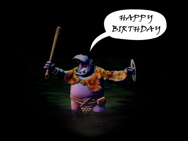
More Birthday wishes for Will!* (All but some minor final texturing created in A:M... and using Will's Tar .stl model from the other topic) *Who wants a great party to end. Although, the next panel in this sequence would be Tar saying, "Bah!" and storming off because nobody is left (conscious) to celebrate with him.

-
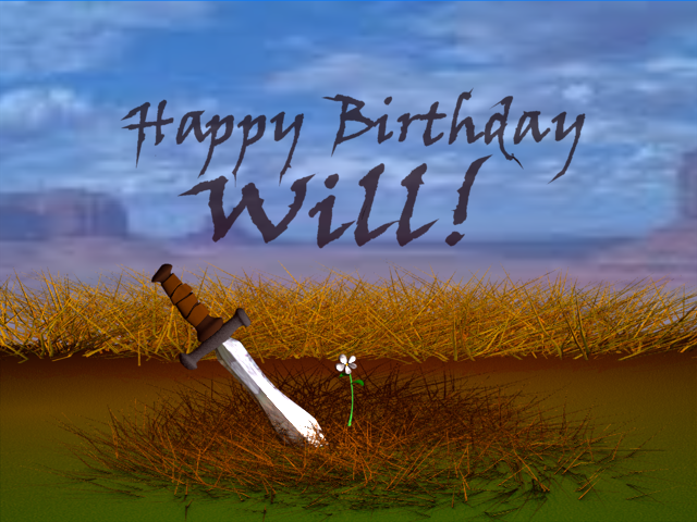
Birthday greetings are a great place to quickly put an idea together (and... hopefully it'll work!). I figure Tar dispatched someone long ago at this exact location and that poor soul became fertilizer for an oasis of life in the desert to grow. During these brief forays into image making I do try to make note of things that I didn't have time to incorporate in a timely manner (sometimes that provides a clue as to an area I need to research). One such thing would be to add some rust to the sword to further indicate the passage of time. And although I do allow myself some room for maneuvering the goal of these doodles is to complete them entirely in A:M (or alternatively to draw them on paper). Now... how does this all relate to Will and his Birthday... well, that's all part of the challenge. I figure in a dozen or so more years I'll finally be able to do his birthday justice.
-
Brendan Bolles, creator of the ProEXR plugin for After Effects etc. has launched an effort to cull together various open source image and audio formats into a new (more universal) media format for image sequences. It looks like he'll easily make his initial funding goal. This is of interest primarily because having a -simple-, -universal- and -patent free- image format that allows for still and moving imagery has long been of interest. Will MOX just be another file format to contend with or can it achieve it's lofty goal? If anyone can do it it might be Brendan Bolles. This video outlines some of the problems and the support behind the idea:
-
Yes, what Robert said. Anything that makes A:M crash should be avoided and since Steffen is the creator of the plugin he is the one would will know best how to proceed. I'm not sure how the plugin would test for internal patches but Steffen surely does. I'm not sure if there is a option to select Plugins in A:M Reports but it would be nice to differentiate between crashes internal to A:M and those occurring in plugins.
-
Mentioning other software isn't the problem*... feature orgies, baseless comparison and promotion of competing products... those will surely run afoul of forum rules and common sense. As long as common sense prevails we can explore A:M in ways few ever imagine. Here's a tip: The key to a discussion that 'mentions' another program is to keep the focus on A:M. If the focus is on the other program then it should probably be posted in a forum dedicated to that program. *I do have to chuckle a little every time someone goes to extraordinary lengths to circumvent forum rules that have never existed. Then I sigh as I realize that folks do take that silliness seriously. (We now return you to your forum topic already in progress)
-
Here's a modified version of the chair that successfully went through the Correct Normals plugin. Just prior to running the plugin I had removed all internal patches by using the Split Patch plugin. I did have a similar issue with the Split Patch plugin that is possibly related to the same issue with internal patches. Note that the resulting chair (attached) is a little more dense as I didn't take the time to go back in and delete all the unnecessary splines. kitchen chair (no internal patches) after successful correct normals.mdl
-
The plugin crashes on the kitchen chair here as well. At a guess I'd say this may have something to do with internal patches... (?) That model has a lot of them.
-
Happy Birthday Will! (my first renderings from v18g)
-
Big Hero Six character studies:
-
It would be very hard to get consistent results from a vast number of settings versus only a few or 'none'. One of the ways that Lumion can be optimized so well is that it limits the options available to the user... thereby increasing throughput. A major issue with time-based rendering would be the difference you get say when you use Global Illumination (or all the fancy bells and whistles on) vs when you render with all options off. One minute render of one wouldn't get you near to the other... in fact the first might not even be fully calculated in that timeframe. But here I assume that the 'rendering time' is mostly that from the moment calculations are already performed but now must be executed. The trick to such a thing would likely be to 'entertain' the user while the calculations are being done in the background. In other words, there is a large part of 'rendering' that is perceptual. Current efforts to gradually reveal an image and then refine that image the longer you wait are an example of that approach. The answer to the question of 'How much quality do you want?' then depends on how long you are willing to wait for it. In essence this is almost 'time-set rendering' except for the setting part. In that scheme of rendering the setting is obviously set high and the renderer will keep chugging away until either that level is reached or the user gives up but I'm not sure most of those renderers allow you to change that upper limit (although they should if they don't).
-
Nuke itself is complicated to use so it's probably a good thing that there is some resistance to be faced getting into it. Otherwise a lot of folks would download only to find they couldn't use it anyway. As for 64bit only... that's a given considering the amount of memory the program needs to use. I'm certainly not trying to defend their license but they know folks will be abusing their license so they want to make sure the rules are known from the get-go that the program is not for usage by those that would otherwise be required to purchase. It's not unlike speeding... we know we aren't suppose to drive faster than the speed limit... we know we are in violation if we do it. And yet we still tend to drive above the speed limit because it's too inconvenient for us not to.
-
For those of you working on personal projects of the non-commercial variety this might be of interest. Nuke is a high end compositor used in the production of many feature films. And of course Nuke does offer more than just compositing. Some of the features: http://www.thefoundry.co.uk/products/nuke/features/?product=nukestudio The PLE release is designed for learning the software with the obvious hope that you'll want to eventually purchase the commericial release because it is that useful to you. There is a long considerably long list of things you cannot do with the noncommericial release: These constraints may limit usage but they do allow access to some expensive compositing tools. The one question I have would be whether the license allows for a level of collaboration while learning Nuke. The line item "Not available for use in the provision of a service to 3rd parties, whether paid or not' could preclude this. Other restrictions (of the hobble-ware variety) are said to be minimal: The release isn't planned until 2015 so that gives plenty of time to consider the compositing requirements you'll be needing in the future and better determine if the non-commercial usage is appropriate for your personal project. With Nuke Studio The Foundry is trying to get a piece out of the rapidly growing independent film world; an increasingly competitive arena especially in the light of VFX studios seeking to diversify their sources of revenue. Note that there are three different versions of Nuke (Nuke, NukeX and NukeStudio). As near as can be assertained only NukeStudio will be available for the free extended non-commercial usage. The price for commercial use of Nuke Studio is expected to be £5,600.
-
More you say? Meet the characters: https://www.youtube.com/watch?v=Oe2fqoy0L_s ...and don't forget Fred: https://www.youtube.com/watch?v=q396a9CPJvA
-
Here is another article that goes into some additional detail on Hyperion, dPix, etc.: http://electronicdesign.com/blog/disney-supercomputer-renders-big-hero-6
-
Rendered on a 55,000 core supercomputer... There are several names of computer systems/software dropped in this video that haven't been mentioned a lot before, mostly because they've only recently been created in service of Disney's latest movie 'Big Hero Six'. It's well worth a look for the look at technology which interestingly enough isn't related to Renderman.
-
This is fairly self explanatory. Folks have long desired to be able to make sense of audio waveforms...
-
- 1
-

-
There are two things previewed in Lumion that I'd like to see implemented in A:M. Note that only one actually exists in Lumion... the other is just hinted at in the preview. Mass Placement With mass placement you draw a line and along that line a set of objects are placed. The most common usage for this type of thing to date has been to place trees into a scene. Other programs such as Unity follow more of a paint-it-into-the-scene approach. What success might look like in A:M is drawing a path that has a set of sequential models applied to it. The keyframe numbers and the ease of those keyframes for objects on that path could then be adjusted. While it would not be as elegant as a feature programmed specifically for that purpose we can creating this feature ourselves by setting up an Action that references a group of models (sequentially or otherwise) which then could be applied to an empty model dropped into the Chor. The path would then be adjusted as required. This approach would lack dynamic adjustment of keyframes and quantities but would otherwise work quite well. Time-set rendering This is the one that isn't quite a feature in Lumion but is a good approach to rendering in my estimation. (In Lumion the quality of rendering is apparently set with 'stars'. IOW if you want a really high quality rendering you would set the render to '5 stars'.) The idea here being to 'set' the quality of a render based on the user's time desired. If you desire a 30 minute render per frame you get exactly that. If you desire 1 minute per frame... same same. The trick here of course would be to ensure the quality of render for objects in a scene remains consistent across n number of frames. For still frames some variation might be okay but for animation changes in quality might produce strobing effects or worse. Again, I am not suggesting that Lumion has this feature... the preview only hints at that. Can you define 'supersonic'. (I must assume you don't mean that Lumion literally renders at 768 miles per hour here) I assume the end goal of rendering is 'immediate' or 'real time' but 'supersonic' doesn't provide a clear point of reference. I will say though that '50% of supersonic' does sound fast. This does play into my thought above about Time-set rendering. This 'could' be a way to more accurately measure rendering in that 1000 fps would be a useful measurement (within the same renderer). This could be used as a means of comparison from renderer to renderer as well as long as the final quality of the rendered images (primarily for animation... not only still frames) were specifically accounted for. In other words if a VERY low quality was desired 1000 fps could be set and the renderer would render for exactly 1 second**. Likewise, if the renderer was set to 24 fph (24 frames per hour) in one hour you would have 24 frames (quality of each frame averaged... or otherwise set... over all frames). Hope that makes sense. *Time-set rendering is a term I am using. I don't know what such a thing would actually be called. ** The number of frames rendered in 1 second being what I consider a high watermark.
-
This is a SIGGRAPH presentation on how the body deforms during breathing as applied to animated characters/avatars. Perhaps a bit more technical than routinely necessary... still, it contains some information especially useful for those striving to create 'realistic' performances. I wonder what qualifications one must have in order to be a 'breath actor'...