-
Posts
21,630 -
Joined
-
Last visited
-
Days Won
114
Content Type
Profiles
Forums
Events
Everything posted by Rodney
-
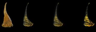
I had to play too! In my case I decided to pursue a geometry/mesh based follicle and while not up to the examples posted thus far I think it has potential. The main idea is to spend a little time with the base ring of the follicle and then use the Duplicator Wizard to copy 25 or so times with the model slightly rotated, scaled and translated as the plugins goes to work. Some additional deformation/distortion and a decal can contribute a lot to the effect too. If persuing a geometry-based solution use of either the Duplicator or Sweeper plugins may be worth pursuing. Note: The right-most images are the same as the second ran through the Denoise and Exposure Post Effects.
-
Have you completed the exercise on particles in TaoA:M? (The one named Smoke, Wind and Fire) If you have then you are already set. You may just want to review it to recall how to set things up. The Sprite Emitter is contained in a Model which can be Constrained to any other Object and the settings of the Emitter itself can direct the emission. You can also Constrain the Emitter to a Path for a moving/directional effect (think lasers or floating fairy dust). If you can let us know more about the specific effect you are after that will help.
-
Hey, I remember that topic! That .sinfo file could be quite useful beyond just knowing it exists for the purpose of syncing the sounds files (in terms of xsheet/bar sheet reference). Especially as the file in XML and could be edited externally from A:M via a utility or plugin (yeah, I know... not recommended). Very interesting. Thanks Robert.
-
I've been meaning to test it but never got around to it. Is the .sinfo file a text file?
-
Doesn't surprise me a bit to hear it but... Victor Navone will be teaching at the Animation Collaborative: For those of you that live out in that area perhaps you'll be able to attend one of his workshops. Interested in pricing? Description of one of the workshop (not necessarily the one by Victor): It seems even the Pros like to do that Bouncing Ball thing.
-
We've got to get you to put some paragraph space in there so we can read you. [Deciferin' Mode on] As has been mentioned... with v16 you can use both the 32bit and 64 bits simultaneously so... if you have v16, conversion of an image sequence is as easy as a three step process; Right Click/Save As Animation. Although there are other ways to convert your images to other formats in A:M such as via Camera rotoscope... the old v11 way. I'm not an expert on Netrender but the short answer = Yes. If I am not mistaken currently you could run 64bit A:M (and/or Netrender) to render all your sequential images while having 32bit A:M (and/or Netrender) convert them all to .MOV (but not vice versa until Quicktime with 64bit gets resolved)
-
Great progress Jirard. Looking very good!
-
It's hard to beat QT pro and anyone who plans to use .MOV format should have it in their toolset. Can you do without it? Sure. I wouldn't want to however. As you were looking for info on plugins more than utilities like QT Pro here's an added point of interest: Almost all of the plugins that were making the rounds back in the v12 days are now installed with A:M by default. That's a useful guarantee that they'll be there when you need them. This is particularly useful when it comes to working with other people as plugins will only be available if the user has installed them. More specific information and usage for Steffen Gross's plugins can be found where Phil linked to: http://www.sgross.com/plugins/index.html Note that there are also some discontinued plugins that are not installed by default but may be of use in a pinch. Plugins are context sensitive so depending on where you are in A:M different plugins may appear. In addition to the Import/Export plugins here are the standard wizards that show up via Right Clicking in a Modeling window (there are a lot of other powerful plugins installed such as Steffen's Newton Physics which has an entire forum area dedicated to it):
-
I know there is a lot of tweaking yet to go but... Can we get access to the basic set as it is right now? (Has it been posted somewhere already?) I seem to miss out on these projects and contribute only little bits and pieces (if at all). I'd like to be involved in the next project and having some of the basic assets will help me start planning for it. In other words... I've got a basic idea I want to work with now I need to start planning and budgeting for it.
-

A:M Community Chat, Video Tutorials and other Resources
Rodney replied to Rodney's topic in Animation:Master
Thanks Rich! Now... all we have to do is find another person that wants to chat too. -
I'm a bit confused here. (rather common so don't sweat that) I haven't been keeping up on everything posted about Distortion Boxes but I did see a few hints that folks might be starting to confuse things a little. It may just be me that is confused but I'll offer this: I've always considered A:M to have two Distortion features... one for modeling and one for animating. Have I been looking at that wrong here? As far as I know, Distortion Boxes (the temporary ones you use to mold your Model and/or the permanent ones assigned to Bones for animation) do not appear in a modeling window unless you are in Distortion Mode (in Modeling Mode or Bone Modes I believe they should not appear).
-

EggBot walking through Distortion Box
Rodney replied to robcat2075's topic in Work In Progress / Sweatbox
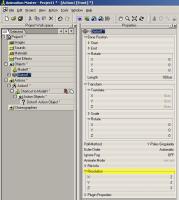
In the original Distortion Box's properties (under Objects in the PWS) look for the Resolution setting. You can then change the number of CPs in the box in the X, Y and Z settings. -

EggBot walking through Distortion Box
Rodney replied to robcat2075's topic in Work In Progress / Sweatbox
A very cool and subtle effect. I'm not sure if anyone looking at that without prior knowledge would have any idea that a distortion box was used to get that effect. They'd be guessing how you did it. IMO that generally is the absolute best kind of effect. -

A:M Community Chat, Video Tutorials and other Resources
Rodney replied to Rodney's topic in Animation:Master
In a perfect world... to accommodate everyone I was thinking along the lines of running a 24 hour event. (think beyond chat here... an A:M TV channel... live... with commentary) In theory, a 24 hour event would allow international Users/Users Groups to take charge of a specific time slot and push areas of interest to them specifically. No one has to stay through the entire event and should there be enough interest, portions of the event (i.e. demos) might be recorded for posterity. As an incentive to those working behind the scenes they would have access to the schedule and any resources well in advance of the event. I'm thinking long term here. The 24 hour event might um... best be scheduled bi-monthly or quarterly at the beginning. The bare-bones'd Wednesday night chat would still be weekly. Note: We would likely ask A:M Users to make their officially public announcements and releases of their films on Wednesdays to hype up the event and really make it worth while to attend. -

A:M Community Chat, Video Tutorials and other Resources
Rodney replied to Rodney's topic in Animation:Master
As we move toward the new ToaA:M we may be looking to promote a weekly chat. If A:M Community itself can't handle the volume we'll look for other options and hang outs. What preferences in days and times does everyone have for chatting? Way back when we use to have a Wednesday chat. BTW: Liveimpact posted the following via chat a few months ago and it seems like a neat tip so I thought I'd post it here: Thanks Liveimpact! -
Something to consider as well is that the term "3D" applies more to images popping out of a screen at us these days than it does 'computer animation' so the term 3D doesn't work too well. Not that his is the model to follow but Scott Christian Sava still seems to be doing pretty good with his CG comic effort. Apparently he raised some $11K+ for the fifth book in his series (133% funded on Kickstarter with 6 days left to invest) Granted, Dreamland Chronicles is not a one-man production.
-
Well since you paint such a gloomy picture of comics future there is only one thing to do... damn those torpedos... full speed ahead! Yes, (unfortunately) you do. Heroes are born of great causes they can't escape even if they wanted to. There was a time that comic books were special. Now they are mostly private and personal. They certainly aren't very profitable. But... neither is independent animation! If you want to be rich become a doctor. If you want to be an artist... you really really really should be a doctor. As far as CG comic books go... perhaps the stars just haven't aligned right yet for it. Comics have always been kicked in the dirt, devalued and poo-poo upon. But if folks think you are a corporation perhaps you could make that work for you. If you've got an animated story worth chasing perhaps you should pursue that. But even then, don't even think about quitting your day (Wannabe) job. Keep it going in one capacity or another (License it for a community project or something). The only real question worth pursuing is: "Given a perfect world... with no obstacles... what do you want to do?" - Rodney (a member of the "Be Largento" club)
-
I greatly appreciate this topic being bumped this up to the top of the forum again. These shorts are great for viewing again from time to time. Wonderful job everyone and great editing Robert. Please take another bow. As Robert suggested, there is another community project in the works so get ready!
-
Mark! I just returned home from traveling to find my copies of Wannabe Pirates #1 waiting for me. To put it mildly, it was a great read. You've got skills my friend. I am impressed with the cover price given the full color and level of quality. Thanks for keeping that price low for the fans. Do you have any plans for a Wannabe Pirates CG Primer or Sketchbook in the far flung future? You've already got the makings of a 'making of' Wannabe Pirates series that'd I'd love to collect. P.S. Second issue ordered!
-

EggBot walking through Distortion Box
Rodney replied to robcat2075's topic in Work In Progress / Sweatbox
...and here is another oldy but goody that expands upon the Tech Ref write up! http://www.hash.com/daily_dose/feature_foc...istortionboxes/ -

EggBot walking through Distortion Box
Rodney replied to robcat2075's topic in Work In Progress / Sweatbox
Hey, I remember that cartoon spin out. What was the main character's name... Bombob? Now those were some fun characters! In my wanderings I stumbled across this image where David Walker was experimenting with Distortion Boxes for use in "Tin Woodsman of Oz". I don't recall them being used in the final facial rigs but the tests sure produced some nice extremes: -

EggBot walking through Distortion Box
Rodney replied to robcat2075's topic in Work In Progress / Sweatbox
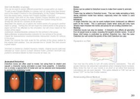
One at a time though right? Not one exported model for each frame of animation automatically? Here I was interested in only the final distorted mesh with the original bones. Think of Bruce Banner morphing into the Hulk... with A:M spitting out a model for each frame in the transformation. As the export was all or nothing, usually what I'd do is pick every sixth model created in the sequence and delete the rest. My thought at the time was to use these key poses/models to move into and out of. Sorry... we are straying off topic. Back to Distortion Boxes. There use to be an online tutorial for basic Distortion but it went away with the move to the new server. I think the content from that is distilled in Holme's tutorial on Animated Distortion Cages however. Page 209 of the Technical Reference has a short write up which hints at the power of Nested Distortion Cages: -

EggBot walking through Distortion Box
Rodney replied to robcat2075's topic in Work In Progress / Sweatbox
You are getting very good at this... and perfectly demonstrated. I like how you've got the wireframe showing to demonstrate where the Distortion Cage is positioned. When I was experimenting with Distortion Cages my immediate goal (before I got distracted by something else shinier) was to have a super car peel out from a dead stop and take off like a bat out of hell. I was looking for Tex Avery style squash and stretch but realized I'd have to rig the wheels separately with a different set of Distortion cages to gain the full effect (distorting the body and tires separately). At that point I just set the experimentation with distortion cages aside for sometime later when it was actually needed. Added Off Topic: Something that I don't think we can do anymore in A:M but could before was to export sequential models (one for each frame) out of an Action. If you think about the results for a moment given Robert's current demo, this would create a distorted robot at it's current location for each frame in the action. I think we can still do this with .PLY format and perhaps a few others but not .MDL format. The beauty of having the .MDL format was that the rigs were still part of the exported/distorted/sequential models and could still be used with reusable actions. -

EggBot walking through Distortion Box
Rodney replied to robcat2075's topic in Work In Progress / Sweatbox
Gives a whole new meaning to the term "Squash and Stretch" does it not? Very nicely done Robert. -
I'm pretty sure Giulio Porta's tutorials have been linked here in the forum before but it's very possible that some have not seen them. They are especially useful to those who are new to A:M. For instance, here is a tutorial on modeling (and texturing) a very basic Eye: Glass Eye Tutorial Guilio provides extensive information on Modeling, Rigging, Texturing and Animating with a focus on Fish, Birds and Humans. The tutorials have been used at Northern Virginia Community College's Annandale Campus. Check it out: Spring 2011 Syllabus, Tutorials and Resources


