Rodney
-
Posts
21,597 -
Joined
-
Last visited
-
Days Won
110
Content Type
Profiles
Forums
Events
Everything posted by Rodney
-
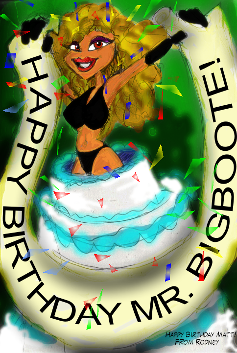
It's almost Matt (John Bigboote) Campbell's birthday. He has no idea we are throwing this party for him. Shhh... (It's his birthday already here in Japan)

-
For some reason your last update on the father makes me think of Gravedigger. That may be because of my first impression of him (see attached image) I ran across these thumbnail sketches yesterday. They are from when you first pitched the story here on the forum (at least I think that's when I drew them). It is an attempt to capture the mood from where Latimer chokes on the cherry... transitioning to the gravesite with Latimer's parents say their farewells... to where Gravedigger greets Latimer but before he sends him on his way. I don't think I doodled anything beyond this but will check. Not a lot of detail here to see. The height of the Gravedigger thumbnail on the left is about 1 to 1 1/2 inch and it was altered little in the cut and paste. I'd say the Gravedigger figure on the right is closer to 1 inch. I post these pitiful scratches mostly to encourage the use of pencil and paper as an effective means of getting all those ideas out of the brain and into reality rapidly. The simpler the sketch the better as that will more likely captures the essence of the idea. At any rate, your work on the revised father reminded me of this thumbnail.
-
I'm not sure which image is which format* (blind tests are good!) but it seems to me that the one on the right with the blue lighting is considerably superior to the other in almost all areas. It may just be that lighting but it seems to occupy space whereas the other, not so much. I'm generally a fan of JPG but because of it's transparency (and a very small hint of promise in the realm of animated sequences) I've been moving toward PNG. I hope you are sketching these ideas out on paper and taking good notes. That way you can always refer back to them. While I haven't done extensive tests I've noted that that PNG images can be problematic in compositing. PNG seems ideal for posting on the internet and since EXR isn't up to that task I say you'll be using both. My gut tells me that if you want softer images you might just convert all of your images to JPG later. With some of the programs now available that should only take a few minutes for even really large sequences. *The transparency in the window appears to give the format of the image on the right away as PNG. Although why the ground should be transparent while the sky opaque is not entirely clear to me. Edit: Tis odd that in the original image the ground is white but in the thumbnail it's converted to black. That is usually reversed from what I've seen here in the forum. Hmmmm....
-
You've given us a lot to ponder here. I stared at that element of your critique for awhile and admit that I didn't follow it fully. I caught the important point of it in that you correctly identified the disparity in acceleration throughout. I think you've mostly got it right on the deceleration after contact as well but, as you state, we have to consider what the ball is made of in order to know more. I confess that you've got me thinking about the likelyhood of stored energy being able to accelerate an object. It certainly can happen but I think it would be due to the stored energy in the object the ball is making contact with? I like how you talk about the compression of atoms as that helps to keep the idea of the object maintaining the ball's mass throughout. Some of the energy is transferred to the object the ball hits and the remainder is retained by the ball. In the case where the ball is made of fragile material it can lose part of it's mass but then we'd see those chunks of the ball separating from the ball and dispersing. The whole idea of Energy Transfer is ever present even where there is no obvious effect on the compression/extension of the ball.
-
Hey John, Back in those days I think the serial number was stamped (in red ink) inside your user manual. I'm not sure where you purchased so not sure if Hash Inc will be able to assist you on this one. Nowdays, Hash Inc maintains a copy of all the web activation codes. v12 was well before the days of webactivation. Did you actually register your copy of A:M with Hash Inc?
-
Outstanding! That's a really great project you've got there. Excellent use of panorama technology Your setup reminds me of the old classic animation pan shots.
-
Excellent analysis Robert. Very nice.
-
With regard to using Latimer as a basis for his parents I think that should work well. Keep in mind that a lot of kids seem to pick up a few traits from each of their parents. So Latimer might have his Dads nose but his Mom's eyes or similar hair color or jaw line. While there is a lot of variation carried through in the genes, in my experience Boys tend to favor their Mother while Girls tend to pick up traits from the Father (call it natures way of keeping things in balance). Hardly universal but I'd say enough to be noticed. There is also the matter of dark eyes and hair being predominant. The Dad might have brown hair while the Mom's hair might be black. This would increase Latimer's chances of having hair black in color. I'm really liking the Mom and Dad. I think you are onto something!
-
Definitely moving in the right direction Dan. Very good for a first attempt. I would do something different with her eyebrows however. The thickness of the individual hairs overall is working against you, especially in the eyebrows. As you find time, investigate getting the hair to taper off and adding an image to it to further blend it in. I admit that as a community we haven't done particularly well (pun intended) in the area of collecting and sharing particle hair settings. This is not to suggest that a lot of folks haven't shared their settings and the information isn't out there, but rather that we haven't been very effective in collecting the various hair settings as materials and putting them all in one place so that everyone can get up to speed quickly with just a drag and drop of a material. Ah, another thing to add to my To Do list.
-
He's looking good. It looks to me like you've got a very economical spline layout. Expressive eyes too! It's not clear at this point if you already have it... I think you do... but make allowance for the mouth and jaw to really open wide and move from side to side. You may never need to go to the full extent of those extremes but then you'll have it if you ever need to push the pose to it.
-
One thing to consider is that of placing a decal on the skin underneath the hair. The classic example of this was demonstrated by the folks at Anzovin who rendered out a top few of a patch with short particle hair and then used the resulting image as a decal to make sure hair showed through fully from every rendering angle. Without a decal (even one that is the same color throughout) the underlying surface of the head can show through the particle hair. Another thing this lets you do is reduce the number of particle hairs you generate. And... at a far distance from the camera... you may even be able to get away when rendering with no particle hair.
-
Way to transform an obstacle into a strength!
-
Keep layering in those great ideas Mark. This keeps getting better and better!
-
I think you may be getting your birthday girls mixed up? Either that or I am. Unfortunately, Caroline doesn't drop in like she use to. She did respond to a birthday message I send to her awhile back and is well and keeping busy. If she shows up... put her to work! I think Kat (our birthday girl!) is too busy telling epic tales of fantasy and adventure to be writing plugins.
-
Happy Birthday Kat!
-
Thanks Nancy, I'm pretty sure it's the same file but want to rule out that variable. My test indicates that this file (the one Nancy uploaded for me) is not working in v17 (either 32 or 64bit).
-
Yes, generally you want to change the setting in the Object for those settings you want to stay the same always and adjust those settings in the Chor to get variations on the original or to animate the property over time. I looked at your Project and did not see anything readily amiss. I did note that you had 'Recieve Shadows' on is the properties of the Ground Grid and I suggest turning that off. One reason is that you might change the setting to Off in the Chor but not realize that you've done it somewhere down the timeline and not on frame zero. I'm not suggesting you've done that... but it's something you might want to avoid.
-
David! Hope you have the happiest of birthdays!
-
Double check to make sure your Ground has Shadows and Reflections set properly in the Properties. I believe you'll want to turn 'Recieve Shadows' to Off.
-
Nice WIP! There are a few obstacles that keep me from enjoying the image as much as believe I could: - Need a label on the bottle even if a made up brand (especially if you are selling something..... gotta have name recognition with that something) - Need a bit more contrast in the depth. The bottle appears to on a table but there is no clear indication of where that table ends. It can be assumed that it ends where the girls legs are cut off. - Symmetry. There is a lot of (too much?) symmetry in this image. While this could be transformed into an artistic strength it's got a little ways to go. If the theme is 'symmetry' then a lot of this will not apply but consider; symmetrical bottle, symmetrical room (slightly turned which is good!), symmetrical girl (her features are mirror images of each other), symmetrical pose. - Parallel lines should be avoided where possible. Unless you are going for 'tranquil' which is quite possible but the colors work against that somewhat. Parallel lines in man made things is the exception that is the rule but you want to avoid camera angles that accentuate those. - Constrast I. This equates to the idea of not knowing where the table ends. When all areas of an image present the same general contrast its hard to get any depth cues. There needs to be more contrast in order to understand what is in the front, middle and back of the image too. You do gain some of this through overlapping but this is a trick on the eye in a 2D image. We assume that with overlapping objects the one not obstructed is the one closer to you. Overlap is one of your strengths in this image. Nice work! - Contrast II. If everything is shiny its works against us in the audience and we lose focus. This appears to be an artistic choice so that's your choice to make so I won't speculate further. - Focus. I assume that the primary focus of the image is the bottle. As such all other parts of the image should be complementary to it. You are close here... so very close. Perhaps if everything wasn't equally shiny? Other thoughts: - The girls breasts seem to defy gravity. (look, I don't know the girl, you talk to her) - Crotch shot is not a recommended pose. (unless you are specifically going for that) - It would be nice to see (at least a little) through the bottle (not too much though or we lose a depth cue). All in all. Very nice image and my comments should not in any way detract from the enjoyment of it. I love the over all colors... they -almost- give us a sense of looking -through- a bottle. Added: In looking again something does occur to me. In a scene with so many reflective surfaces there is a distinct lack of reflections on those surfaces. For instance, shouldn't we be able to see the girl at least in a reflection on the table and in the bottle? I think I see some a reflection of the couch she is sitting on in the table but it can't be the couch because then we'd also see her.
-
Yes, thanks for the clarification Nancy. AFAIK, the makenormal plugin should work fine in the 32bit version. It's with 64bit A:M that it won't work. I think we've got to remove the makenormal plugin from the equation because it doesn't have a 64bit version. That is a separate issue (especially if Aaver is the only one that has the plugin code). So, that's a 3rd party problem. Besides the Makenormal plugin (which I believe would work in 64bit A:M if there was a 64bit version) what plugins aren't working? Can you upload your version of the MakeNormal.atx for testing?
-
Disclaimer: The following does not relate to Netrender because I haven't tested with Netrender. It *may not* related to v16 because I'm testing on v17Alpha 6. For that I'll have to check. Note that I have had both versions in the same file in v16 without any issues for the better part of a year. The area I have bolded in the quote above shouldn't be an issue with Texture and Turbulence files because both 32bit and 64bit versions of the files can be in the same folder at the same time. 32bit A:M see the 32bit versions and 64bit looks for the 64 added in the file name (this was according to a note Steffen posted in a v16 release which prompted me to keep them in the same folder) Note also that I have had both versions in the same file in v16 without any issues for the better part of a year. That the 'Make Normal' plugin does not work in current versions has been confirmed and unless we all just have an older version it is likely it has not been updated. So don't test with that because it don't work, okay. If there is one particular plugin that someone would like to test, please identify that and we can put a focus there. Testing all plugins at the same time is a bit more difficult.
-
Congratulations! Enjoy them while they are so little... they seem to grow up too fast! (Glad to hear you got the Window/A:M thing in order too)
-
You've convinced me. Tech looks really great with particle hair! I'm glad you didn't follow my advice. But feel free to follow this new recommendation: Stick with the hair!
-
And people rejected the idea to name this the 2012 project. While it could just be self fulfilling prophesy it also could be a bit of Murphy's Law mixed in with Parkinson's law to create a new MurphyParkinson law; "All tasks that can go wrong will go wrong as they expand to fill the time allotted." Perhaps the most dangerous thing to say to someone concerning a project is, "There is no deadline."