nyahkitty
-
Posts
524 -
Joined
-
Last visited
Content Type
Profiles
Forums
Events
Everything posted by nyahkitty
-
POPBOT: Cornell Room and Kitty
nyahkitty replied to patrick_j_clarke's topic in Work In Progress / Sweatbox
There has got to be a faster way to pump out an image like that. Excellent work. The robot looks familiar. Like a design I've seen in a comic book. Something about the robot being a disposable assassin. Yes? -
What material are you using for the table? I've been looking for a decent brushed metal look.
-
One way to compensate for slow renders is to render out seperate passes and then composite them in post production. That's what they did in I-Robot and yet they still had to do a great deal of manual tweaking to get it to look right = All that translucent plasticish look which changes depending on what angle you look at the surface.
-
I do believe The Setup Machine 2 by Anzovin Studios has some settings in the control rigs it sets up that can control stretching of bones and the cp's assigned to them. For animated surface deformations, either try modeling them using muscle mode in a percentage pose or try the nifty new bone weights (the option in the properties of a bone marke "Bones Have Falloff") if you have version 10.5 or higher.... I think. Really powerful stuff those new bone weights. :-)
-
The tutorial forum sounds like a good idea. I would say that the ARM site is pretty good for actually containing and sorting tutorials while the Hash Inc. Forum is good for discussing those tutorials. Reduces redundancy while getting things accomplished in an orderly fashion. What I would like to see is an online video that introduces the Hash Inc. online community, in depth. This means having a big bold link on the main page of www.hash.com to a video gives a tour of that website, this forum, A:M films, A:M stills, the contests sponsored by Hash Inc. and the ARM. Perhaps the video tour could also point out that there are tens of thousands of Hash A:M users, some of who have websites with more cool video's and useful info to look at. I do wonder if that might serve to side-step what seems to happen to a lot of newbies, myself included when I first started out, which is the feeling of being overwhelmed by the scope of what's available to them. Hopefully this would help them to avoid asking questions that have obvious answers but are not obvious to a newbie because all of this is... well... new, to them. This might serve to alleviate some of the stress induced by someone settling into the online community. I know, a flyer could be sent with each new purchase of Hash A:M. This flyer would be on orange florescent paper and marked with the title, "Please Read Me First"..... or something. The info on the flyer could, among other things, direct the new user to the Tour Video. Perhaps the video could even be included on the installation CD. Then, the first time Hash A:M is started, the user could be invited to watch the tour video. I am aware that there's a demo video of the software. That one is good. It's simply that it might help to also have one that introduces the newbie in a friendly manner to what is available to them besides just the program itself.
-
Brainmuffin: do you know if Ulead MediaStudio Pro can screen capture also? How does video studio do this?
-
I'd recommend experimentation. One thing I do is just try to personally perform the action and pay attention to how it feels. I then try to invest that bodily awareness into the animation I'm producing. This is because I don't have a decent full length mirror to watch myself perform an action. I usually shoot for one or two seconds for a walk or run cycle. Since I assign a character to a motion path, it's a bit easier to adjust the pace of the cycle later on. There's already been research done on the subject, which is evident in the many animation howto books. Plain old experience born of much practice serves as a nice complement to such book learning. Of course, then there's always the Animation Mentor online learning course, if you've got about $8,000 to spare. ;-)
-
This might be stating the obvious, but that mention of using a model as a sort of distortion lense for the camera just opened up a lot more versatility for my use of Hash A:M. This ought to be interesting. Keep up the good work with experimentation guys!
-
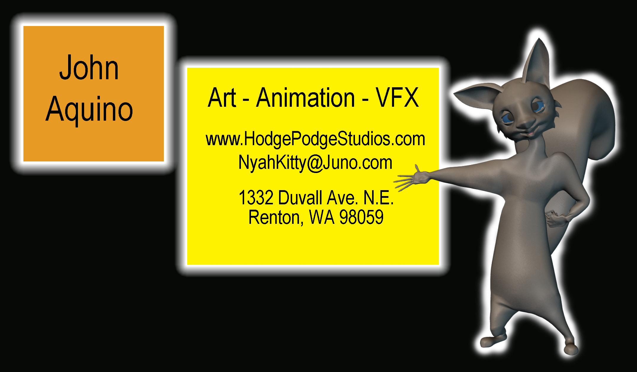
New update: Card Designs Enjoy!
-
Thank you Mr. Morrison.
-
KenH's ear model seems remeniscent of the style found in The Incredibles.
-
Yes, the back will likely be blank. I find that I write most notes on the back of them. There are business card print companies that offer to print additional graphics on the back, but that seems like overkill. Now I have used colored paper for one or two of my designs in the past. This is fine for me as I can see color. However, not everyone can and likely it is frustrating to them when they can't read a card because it is all the same value on a grayscale (if it were converted) in spite of being different colors. This can happen especially with mid to dark colored cards and black text. Anyone who's visited my website in the last two days will see that some of the latest designs divert from the "boxes and blocks" motif. That occurred after I finally looked at other designs found on the net. None of the cards really used defined graphical elements as objects to contain information. If seperation did happen it was to divide the card into two sections, not as objects. Actual graphical objects served as decorations. A lot of the designs were minimalist (basic geometric-ish divisions and/or a photo for the background.... then just slap the information on there and done!). I will preface that statement by saying that those were not without evident skill, as the size of this thread on the subject can attest to the fact of how much effort can be involved in this seemingly simple procedure. For the record, I stuck with the squarish mentality for as long as I did because ( A ) that's what I started with and ( B ) I wanted to see how much I could work with that, in case I could develope a solution from it, instead of jumping from one style to another at whim. I'm kind of thorough like that. What tipped me off that the current style wasn't working was when it seemed like a lot of the critiques were linked to the existance of those boxes, one way or another. But I still think they work in theory, hang it all! Someone told me recently that there are as many opinions on what works as there are people. However, if one pays attention long enough, they'll notice patterns emerge. So it's the pattern of what works that is key, thus from there the basic elements of design were born (again: line, shape, form, space, texture, value, color and others like proximity, scale, perspective, implied depth, etc.) And finally, it was pointed out that the squirrel character, Dodger, could benefit from more polished rim lighting (highlighting the edges of a character from the side or behind), although he is quite bright right now. I intend to consult the first three chapters of Jeremy Birn's book, [digital] Lighting & Rendering, and then do the excercises provided there. What was it someone said about everybody having about 500,000 bad drawings in them, they just need to draw enough to get those out of their system?
-
Thanks for the input. Sounds like the observations from this thread about what looks good covers the full spectrum. Interesting. Final links: Latest Designs Additionally, the Portfolio page has been improved. Feel free to take a look. A helpful notice regarding codecs is posted there: Portfolio
-
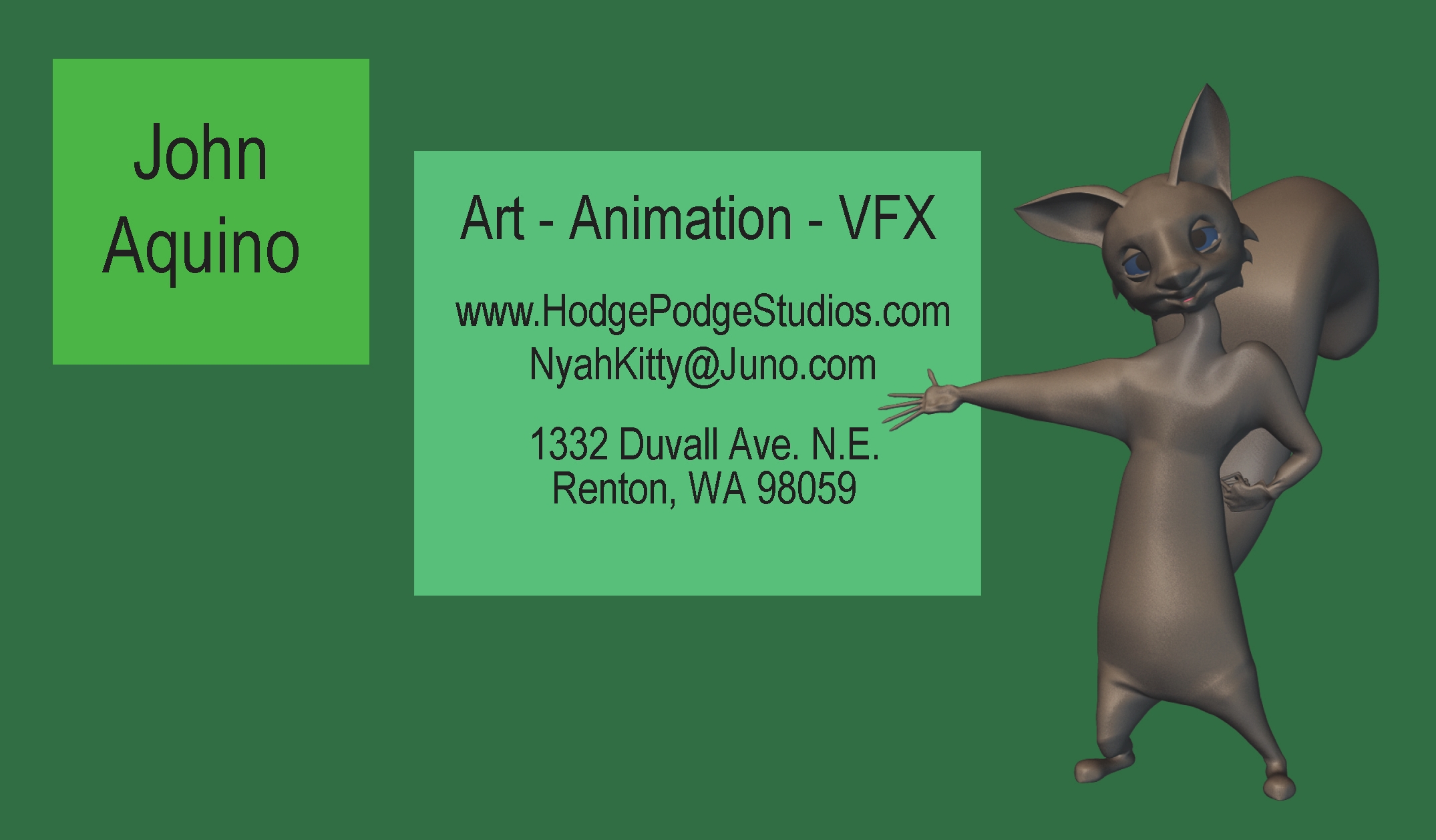
I just stumbled upon a variation that I like a great deal and says what I want it to say. I don't figure on changing the design anymore, so same questions as before: -Does it seem professional? -What sort of personality does this card imply? -At a glance, what sort of services would you guess this business supplies?

-
Ok.... here it is. Now I'm looking for what impression you get from this, rather than critiques: -Does it seem professional? -What feeling do you get from it, what sort of personality of the business is being implied? -What would you guess would be the services that this business provides?
-
Thank you, Jo Bub. It does seem like compositing is figuring into 3D more and more. Interesting.... and a helpful time-saver.
-
Good job. I've often been at a loss for how to turn a character in one spot in order to transition to moving in a different direction. If this was the first pass on this animation then I'd say it will look even better when the limbs don't pop. Nice model, by the way. I like the dangly buckles. Finally, a G rated use for bone Dynamics.
-
I liked the mannerisms of the fellow holding the brochure. He expressed a gentle nature. The hand gestures of the fellow to the left of him were also interesting. Twice now we've seen large crowds in your work. Do you composite them in on seperate layers, or do you plant them all in one chor at the same time? If it's all in one Chor, what manner of machine could handle one of that magnitude? What is your strategy for crowds? Did you use just one or a few clapping and waving actions to drive the crowd? Did it not take very long to model the crowd since they're only in a long shot? What did you do to figure out how the camera moves? What did you use for the flashing and scratching to imply old film? How long did it take to produce this ad? Congratulations on the start of the second Unit. We shall now expect great things from the Soulcage Department.
-
Found a nifty article: Pop Shield vs. Wind Shield and one here also: Furry Mic
-
The pre-made popshields are nifty, but I made one for about five dollars: -stretch and fit a nylon pantyhose within an embroidery frame. The nylon should be reasonably tight so that it is flat. -cut off the excess. -attach a handle to the frame. This way you can hold the shield in one hand and the mic in the other. Being incredibly cheap, I used a wire clothes hanger and a sturdy pair plyers. Since I've started to use this thing, recorded dialogue now sounds more clear and NO POPS. Yay! So... the thing may not win any beauty contests, but it does work.
-
*Homer Simpson voice* mmmmmmm.... Helvetica. I'm suddenly sensing yet another inspiration coming on.... .... no wait, it's gone now. Hopefully tomorrow, Tuesday, the Portfolio page will be better organized.
-
Good grief! Alright, let me go fix it. So, out of the four links on the page right now, you're saying: 1 - the link to the "Dodger" video file is broken? 2 - the video file "YMNie IDENT" is asking for a special software? 3 - the two "Bevels" video files play fine?
-
These fellows are correct. That marine needs to catch some air. Not an altitude that implies a cartoon, but enough so that it reads correctly from the camera's point of view. Also, the bit about just the front part of the foot being the only part that makes contact with the ground is true, especially when going up hill. Knowing that the foot of a space marine armor is basically one piece, he'd probably be leaving divits where his toes gouged the ground. But wait! It looks like you built the foot into two pieces. Good, that will help.
-
Of course, that little gem was only intended as humor for a thread as full of posts as this one. Again, thank you to everyone for their critiques. The final design(s) will be posted soon for audience response, rather than critiques. Stay tuned! I've added a few video's to the Portfolio section of my website. www.HodgePodgeStudios.com Please let me know if you find any broken links or misbehaving codecs.
-
Mr. Robinson: Having reviewed your sage counsel, after spending the better part of a week designing this card, I was inspired to produce this animation. My Response