entity
-
Posts
895 -
Joined
-
Last visited
Content Type
Profiles
Forums
Events
Everything posted by entity
-
Yes, and this model doesn't require it because I won't be showing this much skin. It is a starting point so I can model the clothing over it later. I plan to actually make his clothing as a seperate piece but use the same bones... then, deleting the "under" body and using only the clothing and any part of him that is exposed. I plan to do this for each costume change for the character, so I end up with several copies of the character in different clothing- or even states of decay or transition... depending on what the story requires. And as for detail... my story isn't exactly serious drama or something... so I like this stylized look you get with a low patch count, also I tend to lean toward comicbook art influences in the way I draw and visualize things. This style suits me--(Semi-realistic). I'm aware of your test... Load time and rendertime are not as much of a concern as getting the rigging and poses done efficently and not having to spend so much time on tweaking mesh and bone. I just want to create a nice neat character that is flexible and has that semi-realistic look. I'm not trying for realist--- I tried and the mesh/bones are just a headache for me--
-
Ken, That's great! I love it. How big is he in height? I saw your other posts about modeling him. Does he have a lot of displacement or are you just using bump maps? He's well textured, I might add!
-
MY GAWD!!! It's FULL OF STARS!! Edit: Sometimes I just shouldn't post. That's the most rediculous post I've ever made... sorry guys.
-
You mean the arm? Where? The targets or the elbow bone?
-
Well... Still working on this generic man model. I've given him the 2001 rig. Also, I put in many fan bones w/constraints to smooth joint bends at the shoulder, leg/pelvis, and knees. I smartskinned his Back/ Back2 bones also, so far. This time around it was a lot easier to rig him, because of the low patch count. I plan to donate this model (when complete) to the content CD project. I seem to keep running into an arm twisting the wrong way problem if the hand target is too far away from the hand position... anybody know how to fix that- I just moved the hand target closer to the hand, trying to maintain the poses. In the animation I included here, I tried the actions supplied on the A:M 2004 CD. There were a few things I had to edit, because his scale is different from the scale in the actions in more than one branch of bones. I doubled the time from 2 sec. to 4 sec. because it looked better for the proportions of a realistic human. ShamelessCCMed.mov
-
WOW!! I like that, John. How is it you got it to move more smoothly? Did you keyframe the materials or use a camera trick? How would you create starstreaks this way?
-
This guy had me thinking about this model... and then it hit me... This guy looks like prehistoric man right now... like a cave man or barbarian warrior or something. That's neat! I think the low forehead/ thick jaw gives him the cromagnum look. I won't comment on the body until I see you un-flatten it.
-
I'm in AWE! Lovely! Now you went and made me feel lazy. You did a lot of work there.
-
Vern the V is there in black overlapped by the Z--- wich is a sorta backwards S.
-
ddavis Posted on Sep 27 2004, 11:47 AM Hey Rich, Whenwas I at the top... I must have missed that... Ask Yves. It takes a LOT less time! Never said anything increased just seems like I'm using the 3 and 5 points to escape dead end splines more often since I did this with less splines. Yeeeeeeeeeaaaaaaaaaaaas! That's a definite YES! This time I'm going to wait til I'm done completely-- then I'll texture him. Yeah It's wierd... that's why you like it. I just want to say that your quote in your signature says it all. Thanks Don... I may have to yell at you for this- I'll PM you!
-
I give you this advice because I see you are a sculpter and sculpting works best if I do it like this... First... save a copy of it and rename it so you can try a few different approaches at making him have even more personality. Pick out a few of his features and exaggerate the HELL out of them. If you like the changes keep on. If you don't like, trash it and start from a fresh copy of your starting model.
-
She's coming a long just fine... wondering what you plan to do with her.
-
Hey... looks better now!
-
all2c00l Posted on Sep 26 2004, 07:48 PM That really depends on how long you been modeling with splines. I been splining since v6. It took me 5 days, 6 hours a day. This is my third attempt at this model. The earlier one that I did was started in version 8.5L. I brought him into version 11 and edited what I had from 8,xxx patches to 7,xxx patches (don't remember the actual patch counts). I've never really constructed the splines the way they were ment to be. And I certainly didn't take into account that the way I was modeling might cause problems for rigging. But-- I learned the hard way and wasted 9 months on the old model. Not that the model isn't functional or modeled well, it just didn't have what I needed for my animation project. 3DArtZ Posted on Sep 26 2004, 07:58 PM Well, I had him in two halves. I hadn't CFA'd him yet, and I didn't know how to import a path in a chor, and time was running out. One half was just dragged in and the other... dragged in and changed; x-scale to -100%. Yes- and now that I have time to think about this I realised that I could have given one of them a constraint so it would orient like the other half and they would have moved together-- DUH! Next time I'll try that instead... but now I have him CFA'd... so I can drop the path--delete!!!
-

Some Modeling WIPs (no rigging yet)
entity replied to gordonm's topic in Work In Progress / Sweatbox
Tuck the corners of the mouth in a little (from front toward back) so the lip arc goes inward at the corners. Your character looks GREAT!! GOOD SPLINE'ing. -
Ken, I'm using a rotoscope, dude!
-
You are in for a lot of work... you should find info on toon shading, for hair- visit the hash.com site:: http://www.hash.com/am2004/Modeling/Hair/index.htm and for toon render, check out this thread (links there):: http://www.hash.com/forums/index.php?showtopic=8522 I would use very basic shapes for these characters... keep it simple and stylized and you should keep the look you are looking for. And a piece of advice about modeling; make yourself a front and side view drawing oof the charcters to see in the modeling window ( right click on model-->new-->rotoscope...in the properties you can change things) in A:M to guide you through modeling. okay? The colors look fine to me. Don't worry about the hair system... it shouldn't slow you down too much. Try what you want first... then modify for the render if it eats too much time.
-
The face is kind of "flat" , it looks like from the view you are showing. Are the lips and cheeks and nose very close from the side view? If so I think you should exagerate the distance between them to get that look you are looking for. Did you see the Buz character in the toy's project yet? Maybe you could start with a look at that model. Edit: Too many neck rings in my opinion. you only need three.
-
Great so far! Your on your way! How about the movement of the hair (dynamics)-- is that one of the million things? It has some movement, but I can't tell if it's dynamics or just part of the rig?
-
JTalbotski, Thanks- Do I ever do anything the "easy way"? I'm going to give it a try. If I need more splinage then I'll add more... but not a lot. I'm doing a lighter model because I want it to render fast and I will have to rig this, so I made it easy for me to rig. After looking at other people's way of modeling I was struck by how much less detail in splines you need to construct the shapes that you need. I tried to use a few splines as possible and get a different look going (stylistic-realistic). gaetan, YOU inspired me to give this a try. Your model (dominique) is quite light also, and has that poser look, too, even though she is anime... she has a stylistic- realistic look. So I'll LEARN from you, too. I'm posting the "flyaround" animation below. My camera path got weird and I ended up with a weird wobble on the camera:(386kb) NuBuildFNLg.mov
-
More wires: 3/4 view back Front view Side view Back view Top view Bottom view I'll post an animation (turn table) so you can see it fully rendered with both sides together (unattached). I'm pleased with the new model, even though it breaks my heart to go with less patches... it will be better in the long run, on rigging for animation.
-
You must be Dr.Suess's demented brother... I CRACKED UP!!! THE WHOLE TIME while watching! Keep 'em coming!
-
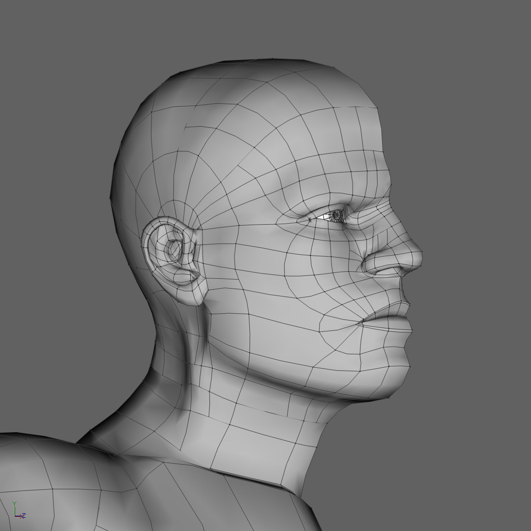
Hello, Have to make a new model... I like the model I made before, but I need to cut down on the amount of patches... so I redesigned the male model. Cutting down on patch count- I didn't find out this until I was mostly done- means you HAVE to use a multitude of hooks and 5- and 3-point patches. I went from more than 6000 patches (my first model) to nearly 3000 (this model)... I only have half done... havn't CFA'd, yet. I still have to do the inside mouth... then I'll be done... one more day! wireframes :

-
OMG!!!! Great work... animation has LOTS of character! And the timing is also great. Great character design+ great animation= PIXAR!
-
WOW!!! Great... I see what you mean now... it's clearer to me what you were talking about. I guess I take aerial perspective for granted... After looking at the aerial perspective palette page you refereded me to, I think I will add layers (with an alpha to near the ground so I dont get that hard clipping where the layer meets the ground) and manually "force" the perspective between the mountains. I will use a different color for my base sky color and shift the color as they go back in perspective. I truly want the sky to be like there is a storm about to happen. So my palette will change... I'll be using that brownish color. Thanks again.