KNBits
-
Posts
218 -
Joined
-
Last visited
Content Type
Profiles
Forums
Events
Everything posted by KNBits
-
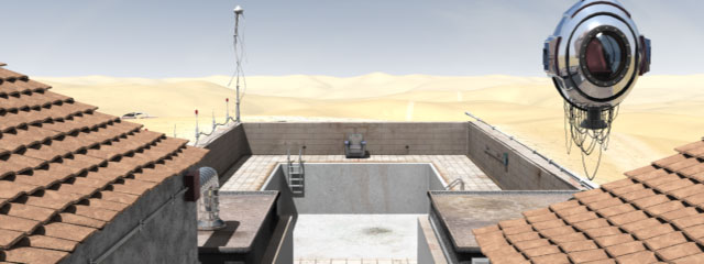
No it didn''t move. The pool is in the ground. The walls around the pool are one feet and a half above the ground surface. The pool is at the top of a small hill, so it probably doesn't help for the eye to figure it out. But now that you point it out, yes it may be a concern. We'll see how it look with the cam movement. Thxs
-
It's start out as a very fast travelling out of the guy's stomach to the first picture (the entire move done in 4 sec), then the cam move in again, so the guy can have his speech up to the final. The "we" is the visual production team for this project, which involve 4 creators right now, but 2 on this particular part. It definitely must be something wrong with the design because this isn't even a camera, but a one-person escape ship or something . Seriously you're right on, I didn't put a lot of work in it, because we didn't decide yet what final position it will end up in the set, and how much details I should put in. Thxs for the feedbacks, it's appreciated.
-
Another render, later in the camera movement. We hope to finish the scene by tomorrow so we can start the render and begin the Live action mixing process. That'll be fun. Take care

-
Thxs. Those images are for a theater show opening next month. The final version willl be heavily post-process. I see what you mean for the sky saturation being a bit washed out. This is because the render show the horizon, and we've put a gradiant on the sky dome to fake distance (like the Fog effect). When the cam pan up, the blue is more saturated. I'll adjust that.
-
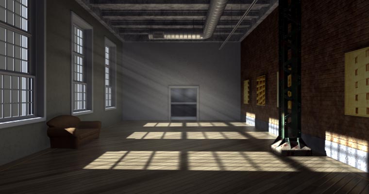
This is a scene we working on right now. We plan to mix live footage of a man sitting in the chair, with the camera moving in his direction. For now we still are at modeling, texturing & lighting stage, so any suggestion would be welcome.
-
Hi Jake, I suggest you save your project with different name each time you render new version, like Castle_001, Castle_002, etc. Each render should be named that way too, so you can later associate them to the right project (Castle_001@000.tga, Castle_002@000.tga, ...). It will help you a lot in your learning process. My last lighting project took me 55 versions to look the way I want. I think you doing good here. The scene is not easy at all. I'm no expert, but what help me is when I get to a point when I'm not sure what to do, I turn all the light to 0 intensity, and start all over again, one light at a time. You have 3 main light source so far :chimney, lamp, and that blue to the left. I suggest you start with the chimney, which for me is in the drive seat here. You can get a very nice mood with just that, meaning the old man will be in silhouette (it will look a bit mysterious). Set the right intensity, and then have some low intensity big width bounce lights the give ambiance. I'm not sure what the blue is exactly. As Triath said, it look problematic. It doesn't seem to come from outside, when we look at the window, but it doesn't look like ambient night light either (too strong, too directional). Keep it up!
-
As said before, it totally lack the 3d feel, which is nice. I read your post but cannot figure out how it is done. Part of it is because I didn't experiment with photon mapping yet. Anymay feel free to explain more about it...
-
I never done something like this so I'll try to figure how it could work. Even if it never actually happen, I think it is an interesting topic that might be useful down the road. I'll search the Forum, and for online applications that offer a structure for that kind of project. My first thought would be to find images, and references, and create some kind of "official G5 blue print", so everybody involved would have the same guide. I say 4 persons would make this a pleasant and not so demanding task. Three on modeling and one on texturing and lighting. I'll check this out, and maybe I'll start a topic in the WIP section.
-
Only what appear on screen is a decal, the rest is material. I like the way the "line" materal around the screen turn out. Now, anyone wants to take a shot to a Powermac G5? Maybe we could do this as a team. It would be great to see how modelers can communicate and build a single object by working together.
-
Nice spin! Maybe I could participate to this mac hardware gathering... it is not finish yet as the stand is missing and the glass need adjustment, but it wouldn't be too long to do. Same address Igeek?
-
Hey it is looking great, but I think you should put it in a cho with proper lighting and minimum environment to do justice to your modeling and texturing. Then we'll see how it really turn. Also I suggest a render with at least 16 passes, 25 is even better, and with shadows turn on.
-
It look very nice so far. It seem like a very solid project. Definitely will enjoy to follow you through your progress. Good luck!
-
You're right. This is due to a change of design, but it kept some characteristic of the previous windows. The bottom panel is the only one that suppose to slide up. Thxs to point it out to me. Thxs DL! I would like to go as low as 2 hours / frame and eventually render a little 5 sec animation of it. 24 fps X 5 X 2 = 240h = 10 days (ouch!). But I guess I will have to set a smaller frame size. I want to give a try to Yves radiosity tutorial with it too. I don't know about Half Life 2 but thxs a lot. Dunno how this would turn up in a real-time engine though.
-
I think this curvy and bold modeling style is very efficient, and you got a pretty nice feeling going on in that scene. The new lighting help a lot. I like the floor design that separate the kitchen and the living room area. The details are great and the images are colorful. Inspiring.
-
Here is the latest version of my scene. Some models and textures will be add later, but the mood is pretty done. Fortunately, I manage to drop the rendering time under 6 hours barrier with a 2600+ by dropping the number of rays per light. I think this is not bad for a 28 lights set and DarkTree texture. Now I will go around the clock with the scene, try to set different lighting according to the time of the day and the weather outside. Thxs to everyone who helped me with this!
-
yeah gorgeous! For suggestion, you might try increase specular a bit, I remember those canes a bit more shiny. Good job
-
Coming along nicely!
-
Whoa strong stuff there! Good job!
-
Hey Matrickz I think it look good so far! Those small details should pay off down the road. Is this scene is for animation or still rendering? Are you using any reference pict to built the scene? Nice lamp!
-
Modeling is pretty much the same, since I try to fix the lighting first. I will add spot on the lighting track soon to add "artificial" light eventually. More modeling and texturing soon. Any suggestion to improve light and color would be appreciate. 12h 08m 15sec AMD 2600+, 512meg RAM PS. The grid and numbers on the brick wall are for future references for texturing map. They will be replaced in final render.
-
Nice! You made good use of people suggestions. This picture tell a piece of a story by itself, and that is good. You might want to add some clues to it (or maybe not). What is this place exactly? To me, it is a modest hotel room now. I could add a phone on the table, a bag on the bed, some cheap painting reproduction on the wall. And I would replace this expensive solar powered lamp by another one that plug in the wall . The light coming from outside is great and create a nice mood with volumetric. The rays of light could be more parallel to fake a sun effect, but the way it is right now add to the enigma (it looks like a strong police light or helicopter light to me right now). I'm not sure what the other light suggest though (the one coming from the left side of camera). It cast hard shadows like a spot (like the one under his right arm, and the one that the lamp cast on the wall), but also feel like the bouncing light of the main source coming from the window. If it's that the case, you might try to increase the width of the light, . This will blur the shadows. Check to decrease the shadow darkness for this light too. Great work!
-
Thxs I appreciate! I will soon have an updated render. It takes about 5 hour to render at 25 passes, because of the lighting setup and the Simbiont I guess (2600+). There is significant change to lighting in the new version, after I got great advices from John ArtBox and DarkLimit, and go through Yves Poissant web site (amazing references there!). For this render, I did a lot of trial and error, especially on the location and width of the light. For the light coming out of window, I have use 2 Klieg constrained together, and located very very far from the room model: -One take care of the light and shadows in the room (3' width, 290' fall-off, 150 intensity, raytraced shadows with 8 rays and 100% darkness). -The other klieg take care of the volumetric effect (1' width, 400' fall-off, 2% intensity, volumetric 2000 quality 25 brightness 50 contrast, raytraced shadows with 2 rays and 100% darkness). I find it easier to adjust everything that way. No lightmap used in this render, but I will use some to blur a bit due to the stains in windows (that you can't see yet in this one). The indoor lighting is also done by low intensity kliegs (7 in this render, but 17 in the next one) to fake light rebound. I will post a schematic of lighting rig with the next render.
-
forgot the attach...
-
Nice arena! Here's another option... I had similar difficulties to adjust volumetric light in my theater setup. My problem was to get balance between volumetric effect and effective lighting. I finally decide to split in two, and get one klieg for the light and shadow, and another one fully constrained to the first one, just to create the volumetric effect. For volumetric, I prefer the one with very low brightness (under 10), and very low intensity. Fall-off is also a major factor to adjust like MTPeak suggest. Due to render time consideration, I didn't add any turbulence, but you might consider this option. (render with 8.5h)
-
Hi, here it is, half finish I would say. There still a lot of modeling and texturing to do, but it gives an idea. I seek advices and comments especially on lightning. Thxs