littleandy
-
Posts
227 -
Joined
-
Last visited
Content Type
Profiles
Forums
Events
Everything posted by littleandy
-
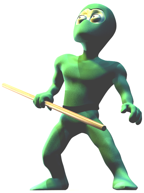
Huh, weird, I've never heard of the gradient material thing. I'll have to look at that. Well, in the meantime, here's a new picture of the ninja- he's straightened up a little and I tested out my new "small pupils" pose so tell me how that looks too. Anyway, his shape should be easier to see now. The weird lines are from shadows-not screwy geometry. I tried to soften them, but I couldn't figure out what lights were causing what shadows... Also, if anyone has any suggestions on how to rig him with the staff, (if I decide to use it,) I could use the advice. I am still a newbie with rigging. mtpeak, could you maybe draw a quick picture for me to illustrate your idea? -Andrew

-
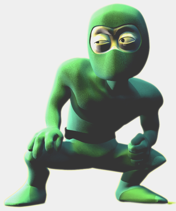
Yeah, I think I'll at least do a little more work on the smartskinning of his left shoulder before I animate him. I actually like the lighting in this picture, but I see what you mean. when I put the staff in his hands I'll put another light source in front of him. Thanks for the feedback! -Andrew
-
ooh, that's an interesting idea. I really like ninja fights with staffs. I'll try modelling one and see how he looks with it. -andrew
-
Here's the latest guy I've been modeling off and on for the past month or so... I'm planning to have him fight another ninja (a duplicate- just orange or blue or something) in a big room. Any suggestions? I'm still not completely decided on the music, or how it's all going to work out, but I want to have all the animation done by the end of August. But if anyone has any ideas for anything at all, they'd be much appreciated. thanks in advance! -Andrew
-
I liked it, although it took me once or twice to figure out what was going on. Maybe adding something to help explain the plot more would have... um, helped? The music did a lot in that regard, but maybe if he had like a health bar in the corner of the screen like in mortal combat games, your approach would have come across better. Of course, take that with a grain of salt, because I am kind of dense when it comes to this sort of thing. Very good though, very funny once I figured it out. -Andrew ("Whoever laughs last thinks slowest")
-
I think 1.5 minutes isn't too bad... depends on how many lights you have in the scene and how many splines. What does the wireframe look like? And nice idea with the clay. Very resourceful! Maybe that stuff in the cranium game is actually good for something. -Andrew
-
Wow, I've always been impressed with mechanical stuff that people model with splines. Very good work, and yes, I'd also like to see you do the crazy particle effect to go along with the portal. -Andrew
-
Wow, the logs are cool. Maybe the scene would do well to have another faint light coming from somewhere in front or to the side of the sneaking guy? Just an idea... -Andrew
-
Crud, Rodney beat me to it, I thought it was Geri too! Nice job, especially for just eyeing it. And it looks like you've set your splines right to do some good facial animation. Looking great. Keep it up! -Andrew
-
Wow. I hate you. That's really awesome. It inspires one to go design a city of their own. Nice work -Andrew
-
That's awesome, man! I'm looking forward to more of this character. I agree, the classical music really gives it a lot of humor. And timing is great. Nice work! -Andrew
-
Wow. I think you have crossed the line that separates the innocently curious from the categorically insane. I mean that in a good way though. Cool stuff! That is a very interesting idea. Now I'm going to be up all night trying to figure out how to use it... -Andrew
-
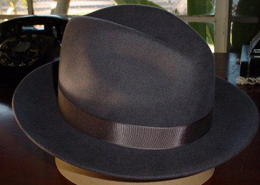
Nice work on the syringe! I didn't really notice a lot of difference in the specularity on the hat though... Here's a photo of one- might be useful. I know it's brown, but the specularity is basically the same for brown and black hats. And it gets more intense on the band that runs around the brim. or whatever that part of the hat is called that the band runs around. plus the fuzziness gives it a kind of soft look. it seems at the moment that the hat in the render is just absorbing all the light... And this is going to seem odd but I really like the feather. Can you show a wireframe of that? -Andrew
-
I think you might end up spending the next year just pruning down your geometry! I really like the model though. I agree with ragtag. It'd probably just be easier to lock the cp's and use this head as a basis for your low(er) patch version. -Andrew
-
Ok. I've got trouble now. I'm going to need to use alphas to fade my other decals into this one and each other. But I'm using a limited edition of photoshop that doesn't have alpha channels. Thanks to heyvern, I learned about the gimp, but how does it work? Can I create a grayscale image on photoshop to correspond to the new decal I have created, and then... make it an alpha channel on the gimp? and how do I apply an alpha channel? Gah! I've never done this before... Help! I need somebody! -Andrew
-
Haha! Looks like some kind of missing evolutionary link. Imaginative design, I like it. Can't wait to see it texured and how you move it around. Nice job! -Andrew
-
I really like your setup! Can't wait for more updates I do think messing with the specularity might do more to make the syringe stand out than reflections... Same thing with the bowler/fedora hat. Maybe some light specularity with a fairly large spec size? (Just IMHO) Awesome work though. -Andrew
-
A few more details... -Andrew
-
Thanks for the replies! Ok, I tried to give the rest of the face more intestest, if that's what you meant...? And yeah Doug, I decided to take his teeth down in size. They were too cumbersome and he had trouble brushing them. I'm planning on entering this into the mad contest, and the goal is to just have him glare and snarl and growl and roar at the camera. Yeah, I'm not really going for originality on this one... Anyway, tell me if this new rendering is an improvement! -Andrew
-
Haha! AP tests are done and I can get back to my orc. I modelled the arms (minus the hands) but I don't think that's worth posting because for the animation I'm planning, they won't really be shown. Anyway, now I'm on to texturing, and I need some criticism. I don't think that I'm really going for REALISM realism, but if anyone has any ideas on how to make it MORE realistic, that'd be awesome. Of course, if you just want to give me encouragement, I suppose that's ok too... But if anyone tells me that he should be green or purple or something, I will personally track them down and hurt them. -Andrew P.S. Ok, yeah, the image contrast has been touched up a little bit with photoshop- I hope that's alright. I'm just kind of anal about my posts...
-
That's freakin awesome! Soo... how much of that can I do with my Photoshop V. 5.5? -Andrew
-
Hmm... I don't get it... Do you just keep the eyeball stationary and move the iris piece on top of it? What's the textured part? So confused... -Andrew
-
Wow! Thanks a lot! I'll try this out right now! -Andrew
-
I know that at the level I'm at with animation I really don't have any right to talk at all... But is there a way you could make the little glasses shift around a TINY bit when she's talking? When I watch it they just seem kind of superglued to her beak. Which I suppose may help to keep the focus on her expressions, but I think with some of her quicker movements, it wouldn't hurt to have the glasses come off a little bit or slide to one side or the other. I mean, that's what would happen to me if I was trying to talk and keep those glasses on at the same time. Just an idea... -Andrew
-
Agh! What happened to his mustache and hair? That was funny! I liked it. But nice job fixing the stomach... -Andrew