


jason1025
-
Posts
1,855 -
Joined
-
Last visited
-
Days Won
4
Content Type
Profiles
Forums
Events
Posts posted by jason1025
-
-
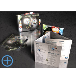
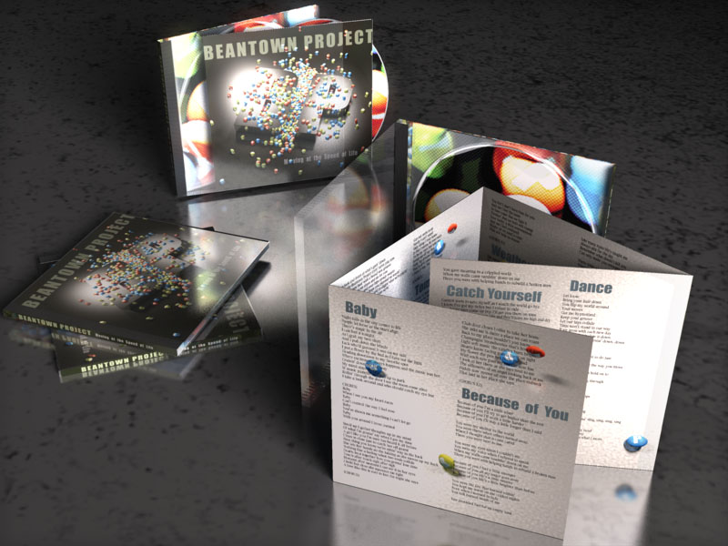
I've mostly been busy building the frontend on FoodFiltr.com, but this was a project I did last year. Beantown Project is an awesome local group from Boston. I designed their album art for the "Moving at the Speed of Life" album. The rest of the pics are here.

Was that a skycast rig to help get the quality of light you achieved?
-
Can some one kindly point me in the direction or provide a link to a rainbow material? Or color wheel material? something like that will do.
-
Did you ever see the tv show "Birds of Prey"?
The cg city looked a lot like what you have made.
-
-
Thanks guys
-
In Barry's training
He says that your patches need to be facing the correct way all the same. I just realized that some of my patches are not all facing the same direction. The correct normals plugin does not really work.
WHat are the negative effects of this?
Can I just ignore it?
-
I inquired with Anzovin about such a thing. They seem to be actively not interested. Perhaps part of the problem is they still sell a TSM for Maya and they don't want the marketplace confusion.what is it about TSM2 that needs work or needs to be implemented?
mac version
I got the same feeling from them. I asked them why they did not continue to support it for AM. They replied with something like after all the hours they spent on creating the product they only sold less than 40 units or so.
-
Hi Nino,
Anything new from you?
Is that Santa model from you?
Hi jakerupert, thanks for ask, I´m spending almost all my time in my job, I´m a vinil sign maker and sign painter by hand as well, so I got a project that keep me very busy...excuse me what santa are you talking about...by the way this post is waiting to be finish (a new character one), maybe 2 months more I´m going to continuous it...the only thing about 3d I´m doing for now, is a model for a motion mx animation, it´s a child character, it isn´t finished yet...here are some captures...greetings
That is incredible organic splining!
-
This is a Dynamics and render test. I wanted to see how the dynamic constraints were naterualy effecting the compressor icon. I also wanted to see the quality of the depth of feild in the render. 16 passes did not seem to give enough passes for DOF. I am hoping the next amount of higher passes will.
Does anyone know how the step option works in AM? I dont understand it.
By the way the compressor guy will have his color changed.
-
Please vote here
http://www.hash.com/forums/index.php?showt...35&hl='
You can pick as many answers as you wish
-
Thanks
-
Looks sleek. I love the character style.
What are you going to do for the A:M guy? Have it as Thom?
Photoman
I am not sure, Having the AM icon on top of another similar simple humanoid model seems kind of redundant.
I could use this
this

or this

JUST KIDDING !! nobody get their panties in a bunch.
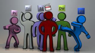
But seriously Is it just me Or do we need an updated icon and logo for AM? I know we all love the yellow Thom guy but don't all children need to grow up? I gather the AM logo and icon were intended to give an inviting user friendly disneyesk feel. but if you ask me and I no you didn't, I think its time for a more grown up sophisticated look. I know we can do better than Lightwave and cinema 4d, talk about ugly. On my Mac I have all of these beautiful 3D glossy icons. And yet my 3d program has a 2d flat, 2 color icon that no offense looks "DATED" back to 1998. Thom does not represent the power of AM 15.G

-
I'm wondering about the idea of the sign over their heads. Wouldn't an icon on their face or chest do better?
You bring up a good point Robert. Part of the reason I chose the icon above their heads, was to give me a device to demonstrate Dynamic constraints. Basically I wanted to get additional high quality free animation.You can see from my earlier tests it came out well. I was debating if I should have the icon on their face and a department name above their head. For example "web design" or "Editor".
I am pretty much settled on this design but I have additional skills and tallents I have to illustrate. For example I am an HD Tape operator so I wanted to illustrate that in a similar fashion but not sure just how yet. I am a professional camera op and Steadicam op, I have shot for shows such as Numbers, Bridezillas, Big Brother exc. So do I have the camera floating above his head like the others or more realistic over the shoulder in hand? Do I have the Panasonic D% Tape over the head? The Hole Tape Machine? Just a Phrase like Tape Op?
The script is
Starts off with
The FCP guy editing my actual demo he turns his head to see other similar guys with different icons walking by the door. FCP guy gets up to peek his head outside the door. The camera fallows different departments FX, Production, Web, IO, Blu-ray authoring and so on All gathering at a location like an auditorium.
The Narrator
" Wouldn't it be nice if you could get all this skill and experience in just one hire?"
At this point I am foggy as to what to do.
I am open to suggestions.
I am thinking of a reveal of some sort to Me in some form or another, whether it be my name , another cg character with my name, a live action me comped in. Or I was thinking that all the characters get sucked together as one and that becomes me. or my name or both.
I also wanted to show my cloth skils so Maybe curtens or a cloth draped over me or my name?
Let me know what you all think?
-
very slick, i like! what's the middle red guy though, is it final cut?
Yes Final cut. I will be adding other apple applications, this is just what I have modeled so far.
-
No compositing, strait out of AM. AO30 49 passes.
The ultimate goal is a group of about 30 characters such as these will be animated in a type of commercial representing my combined experience, skills and talents.
-
Great splinage
-
That looked great
-
Very nice, now you just need some ibl and hdri.
-
My new computer has Microsoft VISTA. When I open the giraffe file, I either get the giraffe without the graph stage or just a white box without the giraffe. How can this be fixed?
Ca you post screen grabs?
-
so i haven't added anything to the model, but this is a test using that ambient occlusion:
looking good. I recommend adding bevels where ever possible. at least on the wings. You can use the zevel plugin.
-
That looks good.
I think the graphic shape of the character helps us not be bothered by the usual mo-cap flaws.
I am curious about that myself. I agree the more unrealistic your humanoid is, lends it self to the humanoid biped bvh system. I did reduce keys on the bvh to smooth out the animation. That may also be what you are referring to. I have a more realistic model I plan to Take Caroline's written Ultimate guide to TSM2 and extrapolate a video tutorial.
-
Awesome!
What rig did you use?
I installed the TSM2 rig then constrained BVH pose to it. Thanks for the compliment
-
-
Shelton
I was wondering. Do you know how to keep from the hair looking too cartoony? I cant seem to get AO to effect it. Thats my biggest Allie when making something Photoreal.


Rainbow material?
in New Users
Posted
Thank you very much