


robcat2075
-
Posts
28,268 -
Joined
-
Last visited
-
Days Won
406
Content Type
Profiles
Forums
Events
Posts posted by robcat2075
-
-
Great news! And maybe you could even pass some of that knowledge on to some going-to-be lighters.
-
Are you saying you've never saved this model in versions? You've been resaving over the same file since the begining?
Or are you saying it won't open in 11.1i? Then just go back to 11.1b
-
Should I report it, move to a later version of 11, or move to v12 s?
!
run, don't move, to v11.1i or 12s.
if you still have the problem and can duplicate it in 12s, report it.
-
I don't know what the standards are for accident reconstruction but it's a good looking shot.
the truck seems to slip sideways several times
Why did you speed it up in AE rather than animate it at that speed?
the sharp shadows are uncharacteristic for such an overcast day. real objects in the scene have no distinct shadows. This is a job for... V13 Ambient Occlusion! Or maybe just a fuzzy kleig light.
-
hmmm... when I try the force Key with Compensate thing I find it only resets the translate if the bone has also been rotated. (the translate filter is ON)
a bone that has only been translated will not get reset... until I nudge the rotation of it and then it jumps to the zero translate position, but then the rotation still needs to be reset.
-
wait a min... Ctrl-X is already supposed to be "cut keyframe", right?
-
MAN HOW DO YOU LEARN THIS STUFF?
There's a small book that came with your CD called "The Art of Animation:Master". Do the tutorials in it. The questions you've asked so far have answers in those tuts. Like-wise with the questions you are about to ask.
-
I right clicked then click new>pose on/off ...
... when i tried it, it didn't work...what am i doing wrong....oh and you know how i'm a noob??? What's rigging?
 ...yeah
the new pose you created needs to be turned ON in the properties for the model. It's under "User properties"
-
But it's a comfy looking throne! I hope his rough metal edges don't snag the upholstery.
-
Before you kick people out, perhaps you could include a link to the instructions on how to do it.
I'm told there's a pinned thread on it, but I haven't found it.
I found something in the Wiki, but it took a lot of pawing thru stuff before i got there.

-
You have bone 17 as a child of Bone 15, even tho it's a different leg.
In fact, 17-24 are all children/grandchildren... of Bone 15, so if you move 15 they will all move too, where ever they are in the character.
In the PWS, Click and drag Bone 17 onto whatever is the parent of Bone 15. that will make it a sibling, not a child of BOne 15.
Make thing easier.... rename you r bones to somethig meaningfulful like
leg Left 1 innner
leg left 1 outer
leg left 2 inner
leg left 2 outer...
-
And how am i supposed to undo it?
In the ProjectWorkSpace the bones folder for your model has the whole bone tree. you can see what bones are children of other bones. You can drag them under or over other bones. You can also rename the bones to something useful there.
Not sure I understand, but remember, after you apply these constraints, close the window and test it out in an action or in chor. don't move things around in the constraint (AKA pose) window or you'll mess things up. and how am i suppoed to do the "aim at" thing cause when i did it it worked but then i wanted to add more bones so i minumised it and went to the bones and when i did and tested it, the eyes didn't work.
Also, I've found that if I've just applieda new constraint, I need to close the action or chor I'm testing it in and reopen it before the new constraint takes effect.
-
i put bones in all the spots i wanted to and auto assined them and when i tested it and moved right claw, the mouth would like jerk out and then when i would move the left claw the claw would move but then all the left legs would move with it!!!!!!!
My first guess is that the heirarchy of the bones is not right.... some bones are children of bones that they shouldn't be children of. So when you move one bone it takes a bone with it that you didn't want to go with it.
-
Welcome to A:M!
i am trying to add bones to the pupil of the eye to make it look around and stuff like that but i can't and i looked at the provided models with A:M like shaggy and it had a null thing and i don't know what a "null" is how to apply it to my pupil
You mean the eye target?
you can add a null with rightclick>new>Null while in bones mode
Presuming your eye bone is pointing out of the middle of the eye already you can make it point to the null with
New>Pose>ON/OFF
select the eye bone
rightclick>new constraint>aim at
click on the null
make sure this pose is ON when you use the character in a chor or action.
But read colin's tuts anyway, they're good.
-
Tried in A:M with TSM2 and it's not right yet.
When you say "it's not right yet", what do you mean?
-
The land in the back needs something to establish how far away it is. Like a fence or signs or something.
Far away land would have a much flatter horizon line. And have less saturated colors due to "aerial perspective." try "fog" for that.
I think the poses in general might be rethought. I don't have a solution right here and now, but I think the silhouettes are overlapping too much
-
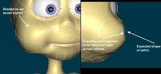
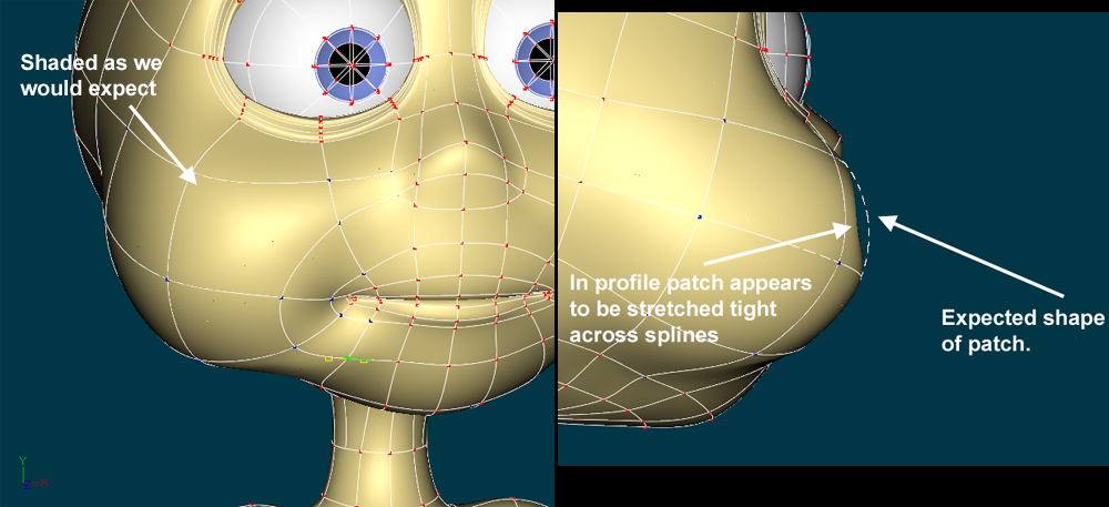
OK, i tried the gigantor patch and it has trouble rendering my "hi" decal. I bet Vern is rightI don't think you have enough splinage for the decals to "stick" to. You only have one gigantor patch for ALL those decals. This... well... theroetically this should work... in a perfect world...
... but in reality you may want to increase the patch count so all those decals aren't trying to live on just one patch.
.
Stil consider submitting an AMReport, the zip is certainly within the 5 meg limit.
-
nice model.
I just added a quick sloppy decal inthe lower left. It seemed to stick, I can't see that any thing else has been dropped because of it but I'm sure you'll notice if I missed something small.
??
-
Don't know anything about Vaughn Bode, but I like the look!
Not sure I understand the lighting in the two set shots, the shadows are confusing.
-
Welcome to A:M!
Here's a thread in which joining actions (or not) was run thru the mill a few times.
http://www.hash.com/forums/index.php?showt...hl=choreography
A more specific answer
http://www.hash.com/forums/index.php?s=&sh...indpost&p=45032
and a picture

-
Thanks for the Mesh, Ken!
Dagoos, I've been doing some tests myself and found much of the same.
I'm also comparing the performance of the Woot's mom model with different rigs.
I'll post some numbers.
I'd really like us to have a proxy for each character that runs at 24fps.
-
Will it load in V11.1?
How big is big?
How big is it zipped?
-
www.hash.com/reports
zip up prj with needed decals. Include screen shots to show differences. Explain situation.
Explain/show the circumstances in which decals show and the circumstances in which they do not.
draw on screen cap to show exact
example of screen cap I submitted, to show exact area of a problem:
-
I can't identify any specific text on the renders since they are resized down, but if you have a case where two renders of the same thing are getting different results, make an AMReport of it. Include the project and the steps to repeat.
As I look at the model, I imagine quite a few of the decals could be combined, but I don't know how they are apportioned now, so it's difficult to make definite suggestions.
Any difference if you don't run Photoshop at the same time?


I'M A NOOBIE AND I NEED HELP!!!
in New Users
Posted
First... indoors voice, please.
ok sample project:
image placed as rotoscope on camera.
angled camera to match perspective of image
ground set to be front projection target.
cube appears to be on beach.
beach.zip