Eric2575
-
Posts
2,615 -
Joined
-
Last visited
Content Type
Profiles
Forums
Events
Everything posted by Eric2575
-
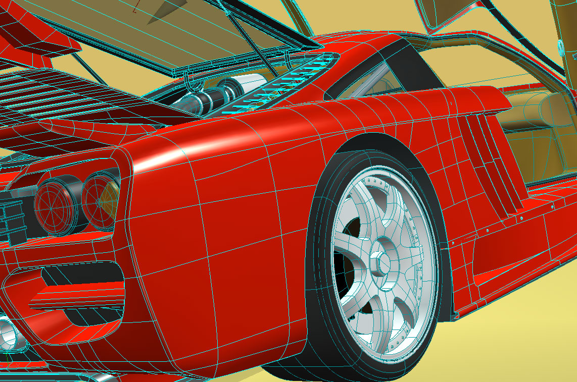
Al: are you using porcelan on your model? Would you post a wireframe? Thanks.
-
Ok now, you can talk up a storm about how you did it, but a wireframe is worth a thousand words.
-
The original NCC 1701 Enterprise
Eric2575 replied to Eric2575's topic in Work In Progress / Sweatbox
I haven't seen the designs for the new movie. Do you have a link? The lights on the saucer are produced by a simple high resolution ambiance decal. See an example of such a decal in the second post of this thread: http://www.hash.com/forums/index.php?showt...=ambiance+decal If you want specific details, send me a private message - or if more people are interested, then I may post a tutorial here. -
The original NCC 1701 Enterprise
Eric2575 replied to Eric2575's topic in Work In Progress / Sweatbox
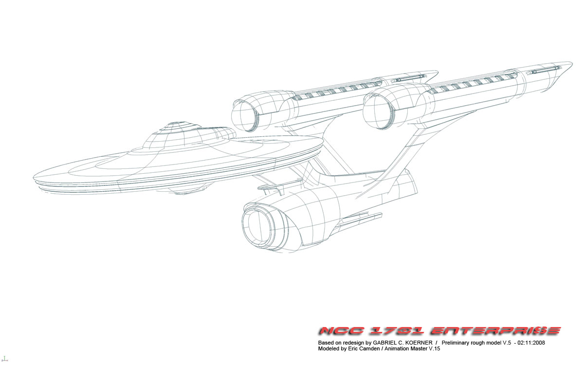
Thank you Mark. Nice job on your project, I've been following it along with everyone else. Can't wait for some animation from you. I've been working on the main body and have actually redone it twice due to spline layout and such, but am still not happy with it. I'm also not sold on the radar dish up front. I may divert from the Koerner design and improvise a bit. Anyways, here is a test of the engines.
-
Super!
-
Beautiful, nicely done!
-
Al: that's looking really good so far. In my limited experience, there is no way you can avoid 5 pointers around the wheel wells - Xtaz has tons of experience and may know different. Don't let 5'ers discourage you though - with bias tweaking and looking at the mesh from all sorts of different directions, you can get them to lay down very smooth. Couple of pointers - keep the 5's as small and flat as possible, one of the main reasons they tweak is because the 5th vertex throws off the balance of the other four balanced points. If you can keep all 5 in a relatively smooth flow, it'll work out fine.
-
The original NCC 1701 Enterprise
Eric2575 replied to Eric2575's topic in Work In Progress / Sweatbox
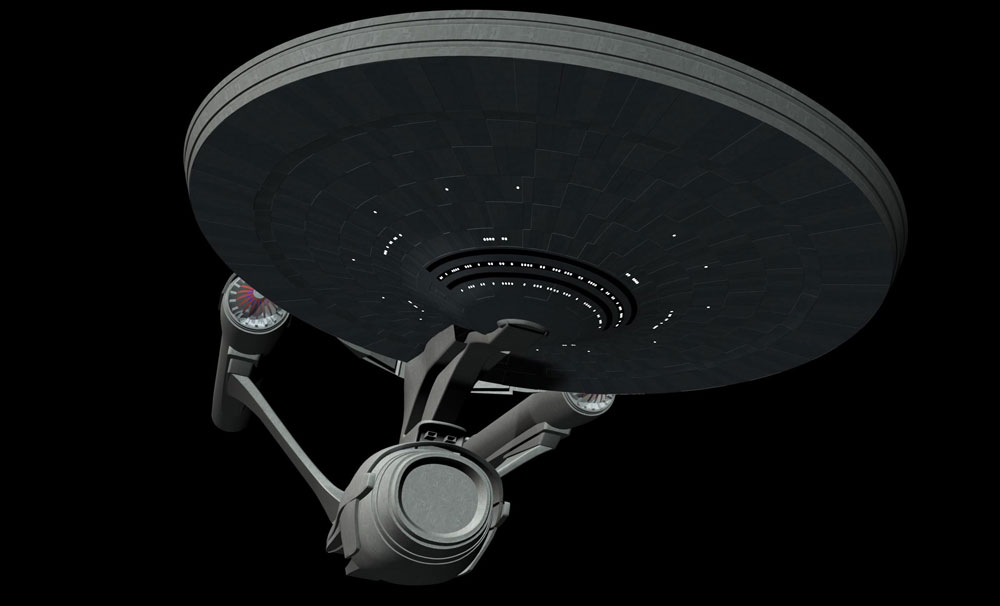
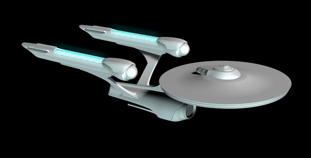
Thanks Ken Been working on the aft part of the main hull and it's giving me a bit of a fit. No worries, just about got it licked. For an interlude, I started working on the decals of the ship. So far, I'm very pleased with the results. Don't mind the unfinished parts of the model, I'll get to them tomorrow. Me thinks it's shaping up nicely.
-
The original NCC 1701 Enterprise
Eric2575 replied to Eric2575's topic in Work In Progress / Sweatbox
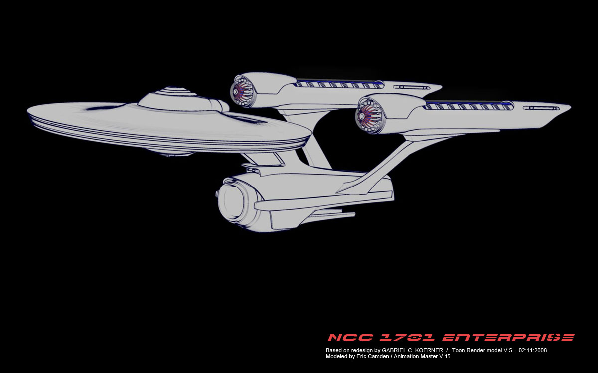
Just for fun.
-
The original NCC 1701 Enterprise
Eric2575 replied to Eric2575's topic in Work In Progress / Sweatbox
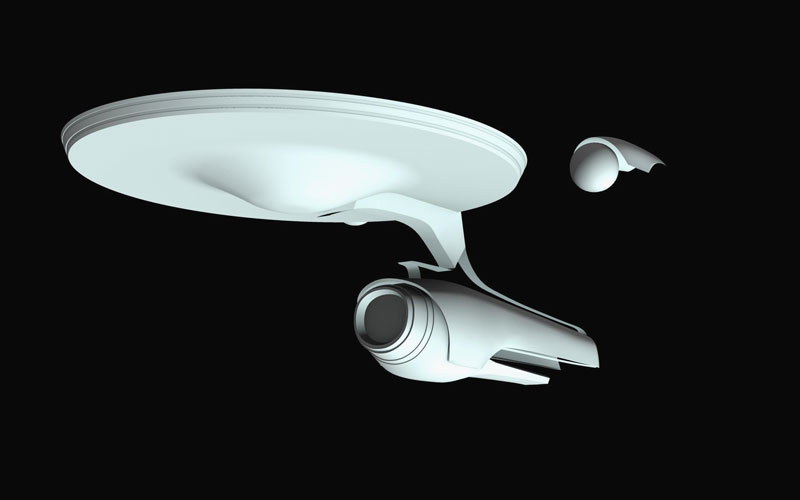
Sure thing, here ya go.
-
The original NCC 1701 Enterprise
Eric2575 replied to Eric2575's topic in Work In Progress / Sweatbox
Yes, that's the design I saw, but your link has pics I've never seen before. What a treasure of references. This will make the modeling a bit easier, thanks. Also a big thanks to Gabe for the inspiration. -
The original NCC 1701 Enterprise
Eric2575 replied to Eric2575's topic in Work In Progress / Sweatbox
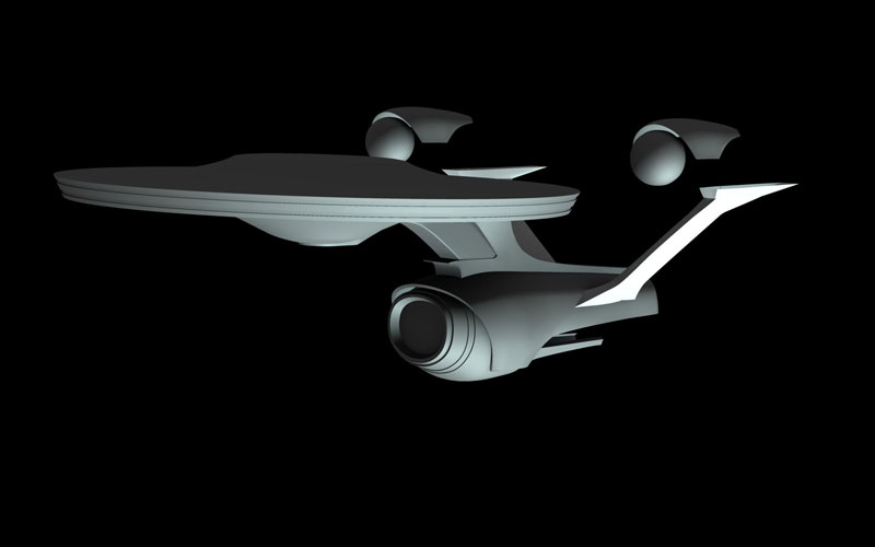
Getting the big stuff done.
-
The original NCC 1701 Enterprise
Eric2575 replied to Eric2575's topic in Work In Progress / Sweatbox
Thanks T-Dogg, I'm gonna put a lot of detail into this one. -
The original NCC 1701 Enterprise
Eric2575 replied to Eric2575's topic in Work In Progress / Sweatbox
A little update.
-
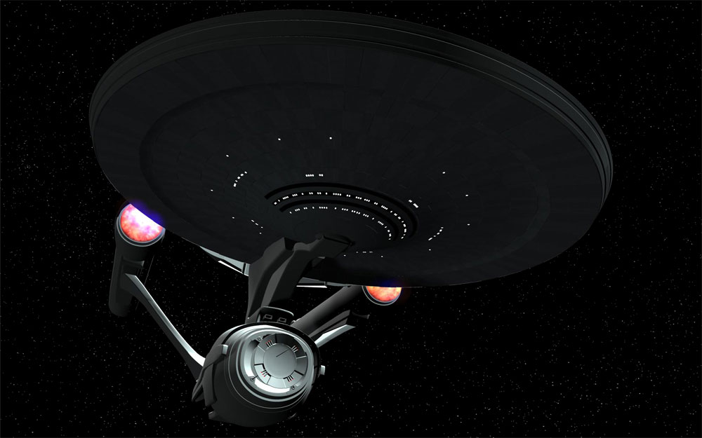
I saw a redesigned 1701 on the web created by a very talented Star Trek fan and wanted to recreate it in Animation Master. I'll have to find the original web site in order to credit the author, but for now I'm just gonna post my progress. I know it's been done upteen times, but I'm a space junkie and always wanted to try my hand at the old girl. Enjoy.
-
Try placing the volumetric light just slightly ahead of the geometry.
-
Final Submission for Heroes contest (Starfall)
Eric2575 replied to Cross's topic in Work In Progress / Sweatbox
Usually entrants into the monthly contests do not show their work before the vote for several reasons. One good reason is the element of surprise. It's always fun to find out at the end who did what, and not knowing beforehand. Another reason is that you are showing your hand (as in a game of poker) - now others who are entering know what they are up against in order to try and beat your entry. Anyways, it's your call. What are the small rectangular shapes in the background, spacecraft wrecks? All in all, nice work. -
Very cool effect. How long does that take to render?
-
Sorry I didn't get back to you earlier, I was in the Mohave desert over the weekend. There was actually snow in the Tehachapi mountains. The snow on the roof and ground effect was achieved in two similar yet different ways. For the roof, I modeled the basic shape and then created a tilable jpeg of snow that I used to make a bitmap plus material. The jpeg below is what I used. You may use it if you like. The attached image was the large version. You might want to reduce it in size. The snow on the ground was a bit trickier. Since I wanted the path to look like the snow had recently been shoveled, I thought I'd use a displacement map for that and then the bitmap for the flat areas. The problem was that the displacement decal and the bitmap did not like each other and came out all messed up. So, I rendered the ground with a different tileable snow pattern decal set to color. This gave me the main snow field which I could then use as a displacement decal. Now I had to incorporate the path displacement. So I opened up photoshop and created the path exactly where I needed it to be for the scene. Once I had the path in the snow field, keeping in mind that it had to be created with shades of black and white in order for the displacement to do it's work, I came up with the displacement map below. You may also use it in any way to suit your needs. Hope that helps. Can't wait to see what you are going to come up with. Btw, thanks for the kind words about my Christmas pic. Cheers Eric
-
Are you sure you don't live in Tokyo? You've got that Japanese style down pretty good. How about some bright colors for the armour? Shouldn't he have some kind of face or at least eyes? Make them glow. Background - Tokyo skyshot. Are those appendages on his hips holsters?
-
Check out my Christmas contest entry, that was done with sprites. If I had used three or more different pics for the sprites it would look even better. Did not take much to render either. http://www.hash.com/imagecontest/Dec07/03.jpg
-
Wow, I think I need a dictionary for that one. Anyways. I just browsed flickr and yahoo images and have found a few background shots that would be a great start. Could someone post a link to some pics of Klu Klips workshop? That sorta looked like a mad scientists lab and would also be a good start for you. Could you give us a little more background info on your requirements for this project?
-
The lack of critique is definitely because your model of Grievous is awesome. You should know by now that we would really say something if we thought it needs improvement. Get to the decaling and don't worry about the model
-
A couple of pointers from someone who is NOT an expert. To get you started, you can get away with desaturating your color decal and make that your bump map. This will already give your texture a bit of a 3-D look. You can use multiple maps for your color, bump and or displacement, and grime maps. The maps do not need to be in order - this is per Martin. Do you have photoshop or some app that will let you make pics with an alpha channel? Do you know how to make an alpha channel and what it's used for? An alpha channel will hide everything in that channel and show everything else. This is perfect for grunge and scratch maps as well as a ton of other things. Here is a link on a quick way to do it: http://www.hash.com/forums/index.php?showt...l=alpha+channel Since Grievous is composed of so many different parts, you'll have to decal each piece by itself in a on/off pose. Are you familiar with creating a pose to decal a part of your model? Do you have good reference material for the model's decals? Matt's pics of the plastic model are a good start, but a full shot would be even better. There is lots to learn, but just about anything you need to know about basic decaling and texturing will have already been discussed on this forum, just do a search for specifics. I will be out of town tomorrow and Sunday with no internet connection, but I can get back to you on Monday if you get stuck on something. Good luck Eric
-
Quick and dirty: The stars look like snow flakes and the depth of field is out of sync - look at the sharpness of the ships vs the planet.