modernhorse
-
Posts
930 -
Joined
-
Last visited
Content Type
Profiles
Forums
Events
Everything posted by modernhorse
-
Thanks for your comments guys. Today's update is to the first scene of the short. I've decided this is final, with the exception of the ground plane. Next week I'll upload some animation. Cheers for now. Doug

-
Matt - That is a very expressive character. His eyes! I have no crits, except that I'd love to see him in a brighter scene. Are you submitting this for the mini-movie contest perchance? Doug
-
Not too blahh for me - nice lighting! I dig your character too. Doug
-
Marshmallow Safety Film
modernhorse replied to williamgaylord's topic in Work In Progress / Sweatbox
Bill - Great to see you still at it on this project. It's been around a while, and if you're anything like me it requires much force of will to stay at it on a larger project. I really like the short scene with the Lechter speak. Maybe you could add a couple of eye twitches and a pursing of the lips here and there. People sometimes do funny things with their lips when talking. Great job on this. Doug -
Short Film in Production: Ballet Pour Ma Fille
modernhorse replied to Dearmad's topic in Work In Progress / Sweatbox
Wow, can't wait to see it with music. Very nice work with the arms follow through. Doug -
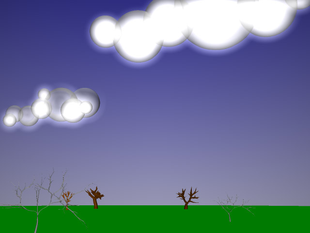
Thanks Zaryin! Easy as pie. Spheres (primitives at that) that are just plunked on top of one another. A little transparency, add some glow and voila! I actually studied Artbox's clouds for his short for the look. I had another idear for the trees. I dig this look. Same concept as clouds. I think it's coming together. It has to, I'm low on time. Attached is yet another set test. The tree in the foreground is what I'm talking about. Doug
-
Hi again - Now that I've mostly settled on the character, i'm moving on to finishing up the set. Attached is my wip. After finally finding the time for Marcel's Treez plugin I'm having a blast. However, I think the trees i've come up with are too 'realistic' looking for this toon-like setting. I'd like to hear your thoughts on this. If anyone has a slew of toony trees they'd like to donate I'd owe you a cup of coffee. Thanks again for your opinions. Doug
-
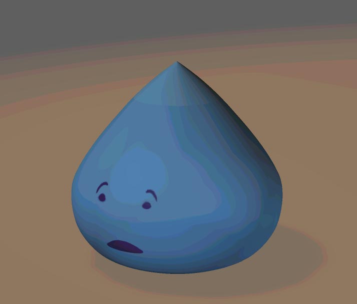
Thanks again guys. I forgot that I had wanted to post the one with the black pupils yesterday. Anyway, here it is. Good thoughts y'all. Doug
-
Okay here's an update. I'm stealing way too much time on this fella ... shhhh ... How do they eyes read now Rodney? Doug
-
Thanks for the positive feedback guys. I'm glad the character is coming through(at least somewhat). I will definitely spend some time with the eyes and get back to you. Cheers! Doug
-
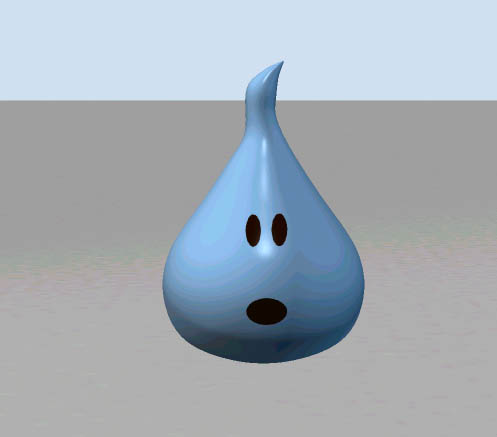
Hello - After trying to use decals for facial expressions I decided to go the modeling route. So.... Attached is the star of a short I'm working on. Posting for your comments as to: 1) How does this character's personality read? 2) What is this character? 3) I'm wondering how this simple environment plays? 4) I need to fix his pointy pupils, I know. I'm trying for simplicity and fun. My goal is to animate this fella. Thanks for any thoughts. Doug
-
Short Film in Production: Ballet Pour Ma Fille
modernhorse replied to Dearmad's topic in Work In Progress / Sweatbox
Alas an update ! My only comment (besides the fan boy type) are regarding the dress. The material doesn't look like a dance dress so therefore I'm wanting it to not be so stiff. If it were a more light material I guess it would be more "believable" to me that it could stand up as it does. Other than that, splendide. Doug -
Here I am again with a minor question. How does one paint a nice sharp decal without all the aliasing? As Will suggested I've used a pencil tool and it still looks like crap. Is my resolution on my .tga too low when I paint it? See attached. As always I'm open to suggestions. Note - there will be closer scrutiny than we see with the attached. Thanks, DopeDoug
-
Hi again, Since it's Friday I thought I'd post an update for the halibut. Can't seem to get the depth I want from the bump map yet but still working on that. I'll get it now that I'm armed with more knowledge of where to look. Anyhow, here's where my character is for now. Doug
-
Serg - I'll third that ! Great job. Perhaps you could provide a translation? Love the character design and again the animation is spot on. How did you do the spilling paint and then the wiping off? Douf
-
Will - Head hurts, reading, re-reading .... oh man ...don't tell me ................DOPE ! Maybe this one will stick with me, I learn much more by making these kind of mistakes. Thanks. Doug
-
Steve ! Man, you just made my day. Here's what I did - I made the model about 40% transparent so my original color decal would show up. Then I changed the properties of my bump map to color, positioned it so it matched the original color decal. Applied it, changed it back to bump and VOILA ! Thanks man that did the trick. I guess if you hang around here long enough you just might learn something. *edit* added the fixed up image. Doug
-
Gee, I can't seem to leave this thread alone. Continuing along with the bump map : I cannot get it to line up properly with the color map. I have copied the color decal, renamed it, added it to the model, changed it's property to "bump" in the decal. It is working as it should though i'm doing something wrong in lining it up. I have checked the scale and position settings and they are exact. Incidentally, I started on a new copy of the model and added both maps without altering their position at all and the bump map was still significantly larger. So I edited the scale and position settings to match that of the color map. And if someone can point me to more information on this predicament I'd be happy to read it for myself. Thanks again. Doug
-
Yves - is this due to jpeg compression settings? With this image I just took a screenshot, pasted it into Adobe PhotoDeluxe (bundled software that I use on occasion) and when it asks me for quality I just hit "standard". I just checked and my monitor settings are at High Color - 16bit. Maybe I'll boost it up to 24bit and see if that solves the banding. Thanks. *edit* I just changed my monitor settings and rerendered the image. Wow, major difference(see attached). Thank you Yves for the heads up!! Doug
-
Hey all, Making some headway. Still not done but getting there. Attached is my progress. Now to figure out how to match up my bump map with the color decal. I also found out that Project Dogwaffle has Alpha channel support. I just need to figure out how to use the program now. Thanks for all of your support fellas. Doug
-
Will - Thanks very much for the explanation. I'll put it to use and be back with an update. Doug
-
Okay I'm back with more questions. I've been trial and error-ing for a bit and I'm quite baffled by this whole Alpha channel thing. Partially I'm sure because I don't have a full version of Photoshop, i'm using Photoshop Elements. This doesn't have an channel pallette. There is very sketchy info with the online documentation on it as well. One sentence to be exact. Anyhow my question from reading the above posts from Gerry,Bruce and Josh are as follows: 1) When you create an image and save it as a 32bit file is this "automatically" an alpha channel image? 2) Once I have created this 32bit file, when I bring it into A:M, should I be leaving it as a "color" decal or as a "transparency" decal? 3) If I just want to create a decal that has eyes and a mouth and I want to apply this to a non-transparent model (still unsure about whether I will go the transparent route), should the image I create in my paint prog have a black background and white eyes and mouth ? And then this decal should be a color or transparency decal? What I end up with now is the eyes and mouth come through okay but the rest of the decal overrides the color of the model's surface. I'm missing something here. As you can see I've been playing quite a bit with this and so far am not getting very far. Sorry if I'm seeming a bit thick here but I think I'm missing some vital info. Thanks again. *edit* I just read a post by Vern in which he says that Photoshop Elements has no alpha channels which would explain why I can't find any docu on it. Guess I'm SOL. Doug
-
Thanks for the replies fellows. I'll try and post my results here later. Doug
-
Hi Bruce - Thanks for the reply. Uh no, don't know anything about that. How does one do that?
-
Hi all - Here is a noob decaling question. The attached model has transparency of 40%. I have applied a decal which clearly is darker than the rest of the model(look at the top of the model - here is more transparent than the face which is the decal). I have matched the colors in my paint program to the model's RGB values. I presume because the model is semi-transparent this accounts for the color differences. Am I correct? How do I get around this? Thanks for any thoughts. Doug