-
Posts
3,827 -
Joined
-
Last visited
-
Days Won
31
Content Type
Profiles
Forums
Events
Everything posted by largento
-
Thanks, guys! It would be fun to completely animate it, Steve, but I think that might give them the wrong impression (ie make them think it's an animated cartoon instead of a comic strip.) Also, as Rodney said, it will make it easier. I think the animated parts will just be kind of bonus bits. Rodney, It's strange, but the music's initial inspiration was "Yankee Doodle Dandy." I wanted to do animated opening titles a bit like the ones for The Pink Panther and as an example for music, sent a version of Yankee Doodle Dandy that played it at various different tempos and styles, which I felt gave it a very cartoon feel. The composer then went and created something with a "pirate" feel. As to the lyrics and singing, my inspiration was definitely theme songs like "Swamp Fox" and "Davy Crockett." One of those boastful, sea chanty-type songs.
-
This is something I've wanted to do for many years now. When McCrary and I first started working on The Wannabe Pirates, it was meant to be an animated short sequel to the live action home movie he'd made. A friend of McCrary's (who also played Waldo Morgan in the movie) wrote a small piece of music to use for the opening titles. I had wanted to animate it even back then in 2002-2003, but just didn't have the resources and time. (This was pre me being aware of A:M). When we started the animation project, I pulled that music out and wrote lyrics to it and recorded a sort of temp track. I always thought that McCrary's friend might be able to take what I'd done and do a more polished version, but they had fallen out of touch, so that never worked out. Still, I had always wanted to do something with it and now that I'm redesigning the website, I'm allowing for a landing page and a video of this is perfect as a sort of mini-primer of what The Wannabe Pirates is about. I think it's mostly going to be moving still shots (Ken Burns-like), but I'll probably put in a tiny bit of animation, too. The start was to subtitle it so that folks can sing along. I'd wanted to do a bouncing ball, but the song is so fast, that may not be possible. We'll see. Anyway, I don't think I've ever shared it with you guys, so here's: "The Ballad of Errol Flemm" as sung by the Three Golden Tonsils (aka Largent, Largent & Largent.) :-) karaoke_file_s.mov
-
One thing I always wanted to have was a way to be able to incorporate animation into the stie. Having animated clips embedded into the "About" page would be one way. I'll be limited by my webcoding abilities, but I'm going to to try to make it a better experience all around.
-
Thanks, Rodney. I think a complete re-design of the website for The Wannabe Pirates is going to be a project in the near future. As cool as the Wordpress/Comicpress setup is, I want to rethink it all and do something that I think is easier for people to read in the manner than they would normally read it (which experience tells me is in long sections.) You can't read a linear story comic backwards and make sense of it. I want to have it so that you have the option of seeing the current strip, say the last 5 or 10 strips, or be able to go to storylines where you can read them 5 or 10 at a time in order. I also want a way to have a better introduction to new visitors and not have to work around the complex architecture that the ComicPress theme forces me to work around ('cause I don't understand it enough to customize it the way I'd like.) There are aspects of it that I like, obviously, but there are also complicated things that were easy for me to break and give me fits. WordPress is also of prime interest to hackers and so, I constantly have to upgrade the inner workings of the site, hoping each time that this isn't the one that breaks everything.
-
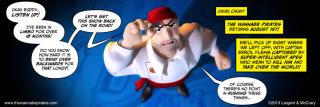
And with this image, I officially announce the return of The Wannabe Pirates! I should never have said never...
-
Just an FYI, if you've been putting off picking up the digital copy of Stalled Trek: Amutt time, you can save money by doing it soon. On June 1st, I'm going to raise the price from $3.99 to $5. I'm looking into getting cards printed so that I can sell digital copies at conventions, so I'm going to have to up the price to cover the cost of the cards. This is still half-price when compared to the DVD and you don't have to pay for shipping. Just click on my banner in my signature and it will take you to my store.
-
That's a good idea, Robert. Thanks, Nancy! I did play with that a little, Nancy, but the rigging is really basic. I cheated by pulling the leg bone up into the body, but I didn't have the ability to tilt the hips to allow for it. Afterwards, I took a look at a Huckleberry Hound cartoon, and he pretty much walked on the toes, so, his feet never tilted back.
-
Thanks, Steve! I hadn't intended to do any of this, but it was a great exercise for thinking about how to make an odd-shaped character move.
-
Thanks, Rodney! You know how much I love the old viewmaster stuff. Years ago, I looked into creating custom viewmaster reels of The Wannabe Pirates to sell, but the cost at the time was prohibitive. I just checked today and there are now options for ordering a single reel. They're still too high to make for sale (unless you knew you could sell lots of them), but as a novelty, it's not too bad. You can get a single custom reel with a viewmaster in a white box for $30. I'm totally going to do it! :-) The images have to be 1112x955 pixels. I can't find any specific info about 3D settings, but obviously a viewmaster just does plain old stereo images. The fun would be to make the shots as dimensional as possible. I once read an interview with the woman who did a lot of the sculpting work for those old viewmaster reels and she said they would use a single camera and take two shots from different angles. They would even move some of the elements between shots to exaggerate the 3D. Might be fun to experiment with that sort of thing.
-
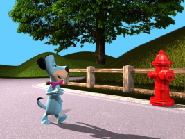
Hadn't planned on doing this, but thought it would be fun to Walk the Dog, as it were. :-) Here's a 90 frame shot of Huckleberry walking down the road. I modeled Huck with no knees, so I had to figure out some way to reload the foot without scraping it on the ground. I used a sort of clown like waddle and turned out the feet at that point like you would do if your shoes were too big. huckwalkin_s.mov
-
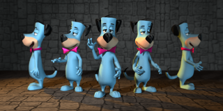
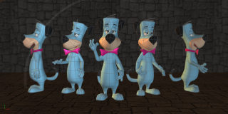
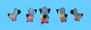
Thanks, Robert! Well, I got back to him today and finished him up. I'm thinking I may do up a bunch of old HB characters and put them into some kind of poster I can put in my portfolio. Here's Huckleberry Hound in full. And for comparison, here's the wireframe:
-
I would bet Pixar and the lot composite all of their shots, Kat! This is all looking great and kudos again for sticking with it and seeing it through.
-
Way to go, Paul!
-
The plan would be to finish the one I was 2/3rds of the way through when I stopped ("The Amulet of the Apes.") That will give me the material for a second graphic novel. Unless something were to change, this would be followed by a complete re-haul. All of the characters would get updated designs and be remodeled. Flemm was modeled by me waaay back in 2007 and was one of the first characters I ever modeled. I like to think that I've gotten better since those early days. :-) These updated versions would be used for the grand finale, "The Sword of the Rightwise King," which starts with Flemm as a youngster and goes all the way to the epic event of 1692. This will give me a nice trilogy of graphic novels, which could even be combined into a single, massive 600+ page tome.
-
Do I do it? Do I bring The Wannabe Pirates back from hiatus? Is the world safe with more Flemm? Giving readers a say here.
-
Thanks, everyone! Those old character designs are deceptively simple, but they were really made for 2D and getting things like the front view and side view to co-exist is a challenge. Took me awhile to realize that part of the trick is that Huck looks slightly down when he's facing the camera, so you can see his eyes over his nose. :-) I don't think anything could have saved HB after the networks assassinated Saturday Morning Cartoons, Rodney. Besides, we're seeing how Warner Animation handles the HB properties after Bill & Joe died and it's not pretty. Thanks, Sebastian. It's just way easier to tweak the model when you don't have a bunch of control points. Same with doing weighting when you're rigging. It's less about efficiency and more about me wanting to take the easy way out. :-)
-
I often see cartoon characters and am seized by the urge to model them in A:M, but never seem to have the time (or a good reason.) I've thrown out reason and decided I'll make the time every once in awhile. :-) One of the ones that I've always wanted to do was Huckleberry Hound...
-
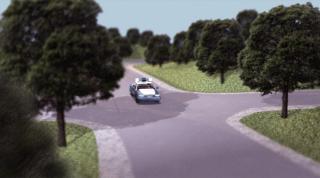
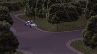
Having a little fun with post production. Added a lense flare to draw the eye to the approaching car. Did this in Photoshop. os_shot_001a.mov Not going to turn into JJ and start adding them to every shot, but it not only works to draw attention to the car, but it keeps the car alive while it's behind the tree. This shot cuts to a close-up of the side of the car making a rolling stop (revealing the "SHER'FF" gag) and serving as a cover for the character getting out of the car. A sound effect tand then pan up to him already out of the car and walking forward.
-
Bravo! I was thinking it was a wall with notches around a small rectangular building. :-)
-
Thanks, Sebastian! I'm guessing there must be something new with the setting for the lights that the new choreography places, but I can't find anything in the settings that tells me what it is. Now I get to go render the whole shot *again*. :-)
-
It's frustrating, because the expectation is that you can delete everything from a choreography and not have any issues. I finally went back to an old choreography file from before the change and set it up and made it my new default. I had to set up the whole shot again, but this time I just manually placed trees rather than messing with flocking. I get the shadows and the lights seem to work like expected. This is out of v17, too. It's strangeness. I think the slight tinge of halo around the trees comes from the depth of field. There aren't visible white pixels around the clipped art. It doesn't bother me, though. This is all of a seven second shot and more times than not, the background isn't going to be in sharp focus.
-
I went back and forth, but prefer the 2D trees. I'm not sure what's happening with the shadows, which clearly aren't there. I checked all of the settings and am baffled about that. I've been having shadow problems ever since the default choreography was changed. The 2D trees are set to cast shadows, too, but aren't. I've tried removing all of the default lights and putting in new lights, but the render then comes out really dark (progressively darker as each pass of the multi-pass is rendered.) I ended up having to go back to v16 to do these renders, because v17 doesn't seem to be able to handle large memory setups anymore. I can't even preview the Sea Anemone (Flemm's ship) in v17 without A:M immediately crashing.
-
Happy belated birthday, guys!
-
Rendered out the opening shot last night! Decided to go with 2D tree photo instead of models. I think they actually start to look like the miniature trees you see on elaborate model trainsets. I also abandoned using hair for the grass. Too much render time for too little effect. I might use it in some closer shots if needed, but I'm satisfied with this.


