-
Posts
3,827 -
Joined
-
Last visited
-
Days Won
31
Content Type
Profiles
Forums
Events
Everything posted by largento
-
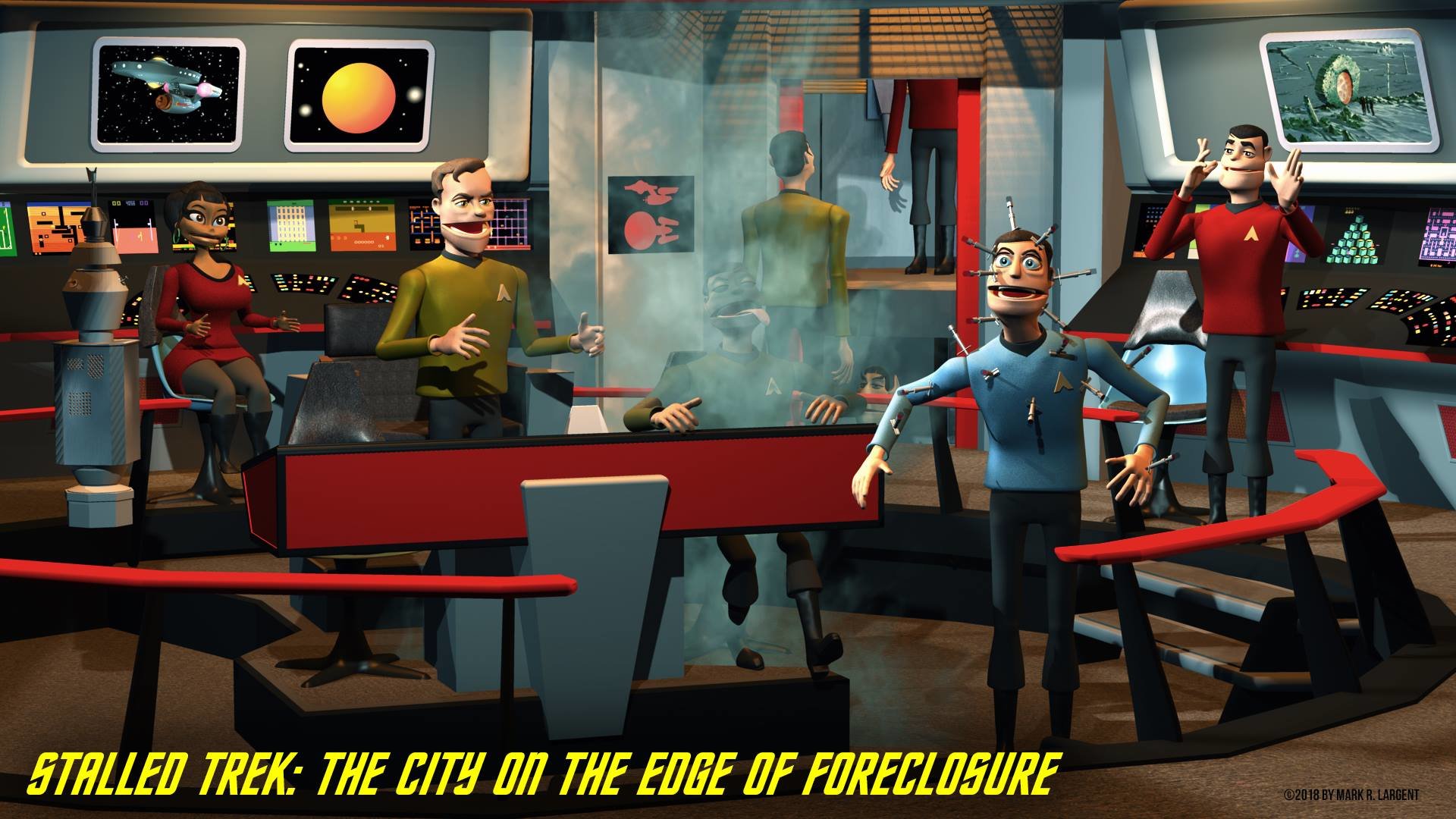
This has been a productive week for The Wobbling Dead! After several drafts and many outlines, I finally have a finished script and the storyboard/comic book is nearly 2/3rds finished. Hoping to have that done in the next week or so. Then onto animating! It's going to be tough work, but I gotta' finish it in time to have DVDs made for the Dallas ComicCon in May. I've decided to drop the arm rods from the models. It seemed like a fun idea at the time, but I don't think they really add as much as I'd hoped they would and are just big pains to have to keep track of. They are constantly intersecting things. It means I'll have to re-render the shots they were in, but it'll be worth it. Keeping my fingers crossed that things continue to go well.
-
Didn't you try to go down that path once before, Robert? The data for the camera in A:M didn't seem to be cooperative. Icarus was the free one, but it doesn't exist anymore and I couldn't find it anywhere when I looked.
-
That's pretty good! It does seem like the camera stops abruptly before the end of the shot, though. I was playing yesterday with an old shot from a home movie my friends and I made back in 1987. There was one shot with a mirror on the wall and as the camera moves, you can see my friend who is operating the camera in the mirror plain as day. I'd always wanted to replace it with a painting or something and after stumbling on something about tracking decided to give it a try. I was using Mocha AE with the idea of just replacing the rectangular mirror with a 2D image. The problem I ran into was that the camera work was very erratic, there wasn't really anything I could use as a tracking marker that would survive the shot. The mirror's image was constantly changing, so that confused the tracker, too. To be honest, though, I think even if everything else would have worked, I was still dealing with video taken from a 25+ year old VHS tape that was probably 3rd generation to begin with. It would be fun to have something like Syntheyes just to make fun videos for my nephews, but at $300, that just isn't gonna' happen in my current financial state. :-)
-
There's an application called Syntheyes (not free) but available for Mac & Windows that does camera tracking and can export the data to A:M. It will also export the same data to multiple applications, including AE & Motion. Presumably you could export the camera tracking to both A:M and AE and then be able to render elements to place in an AE project.
-
Mac: Accessing files on project load - failure
largento replied to higginsdj's topic in Animation:Master
I don't use projects to save my files (except in rare instances), but it does sound like what GAngus is referring to. You need to go up to the menu and hide A:M or Command-Tab to select another application. Then go back to A:M and everything should work normally. -
-
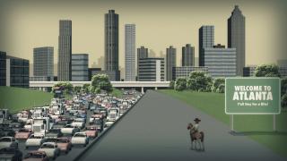
I don't know if you carried through with it, Dan, but I can highly recommend it. I think The Walking Dead is one of the great TV experiences. Well written, acted and produced. It's amazing how quickly some of the people I know have become addicted to it. Obviously, I haven't been putting everything out here, but I thought I'd share this one. This was an image I've been dreading since I started this project. In fact, I made the original Walking Dead shot my desktop picture so that I'd constantly be reminded of it. I must've had about ten or more false starts until I finally completed it this week. Everything about it just seemed too daunting. All the buildings, all the cars, the layout of the ground. And yet, there was the knowledge that it would only appear on screen for a few seconds. I tried starting with maps of the area, but the producers had created the shot from several different elements, so there wasn't a direct connection between what was on the maps and what was in the image. Finally, this week, I decided just to wing it. I created a profile of the top highway and brought it into a choreography where the camera had the original image as a rotoscope. I then began extruding the profile in a model window while watching it update in the choreography window. This worked really well and once I had one piece in play, I could start creating the other pieces in the same way. I worked hard at recognizing what I could do to simplify the image and not lose the storytelling it needed to do. I had stressed very early on about all the kinds of cars I would need before finally realizing there were so many of them, that just having different colors would work to show variety. I created a very low patchcount generic car that worked perfectly. It took about three days, and it's a little simpler than I'd originally planned, but it'll work for my little puppet movie and one of the great obstacles is now out of the way!
-
Awesome donations to the community. I know there are going to be some happy people out there. Especially with a new Sonic TV show on the way.
-
Although not perfect, I've had luck with just adding noise to the surface properties. You have to adjust the amount and the scale. Most of the felt type materials use gradients, which act strange when being animated.
-

Painting with Light? It Can't Be Done! Feb 2014
largento replied to robcat2075's topic in A:M Tutorials & Demos
That would be awesome! Maybe this is something that could benefit the new rigs we've got or even serve as an open-source type rig for the community. -
Thanks, Rodney. Although, I look at it and realize just how clumsy I was with splines when I made that hand (it's Flemm's hand.) :-) If they actually commission me to do a cover, I'll sign it in some way. I guess it's because I've been working mostly on the commercial art side, but I think of signatures being kind of amateurish.
-
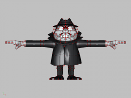
Thanks, guys! I heard back from the person who received my mail. They called it "very fun stuff" and said they would forward it to the editor. They did make a point of mentioning that with licensed properties like this, the licensees have the biggest say. If it doesn't fit in with their marketing plans (ie maybe they have a cgi project in the works), then they'll nix it no matter what they think about it. Still, at least I heard something. :-) Here's a wireframe of Boris. I'm not sure what you can learn from it.
-
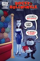
Thanks, guys! I did spend a lot of time in post on this one, trying to get it to look like my expectation of a comic book cover. Even if it was a "photo" cover. I would imagine that the airbrush look is largely due to adding a grain filter to the image. Depth of field is on, but when you add a grain, it kind of holds everything into that one plane where the grain is. The background is mostly simple (on purpose) and there's some roughness on the floor and a tile of a metallic image on the walls. I upped all the variations to 50% and then added a second material, an environmental map, to give it some specularity. Add the soft focus and then the film grain and it does look very airbrushed. For the characters themselves, I needed them to appear more white, so I added a 30% ambient color to their skin's surface settings. That kept them whiter than the lighting would have allowed with just a straight white diffuse color. I did lighten the image's levels (mostly so that Natasha's hair didn't disappear into the background and I played with a few of those "Color Lookup" adjustments to try to get a look that I felt gave it a look like an old printed 60s cover. I don't think their color separation and line screen was on par with magazines. In the end, I think the biggest factor was composition. The image has been flipped from what I rendered out of A:M. This made it more difficult to read and it was really obvious when I looked at a thumbnail. Here, the diagonal line (of the pole, Natasha and Boris) moves from Left to Right, Top-to-Bottom, which is the way we read. Before, it was going left-to-right, but Bottom-to-Top. And the dialogue was on the left side. It seemed to really be at odds. It was a revelation to see how much it immediately improved when I flipped it.
-
Thanks, David! I'm sure nothing will come from it, but I did a mock-up of a cover for a Rocky & Bullwinkle comic and sent it and some samples to IDW Publishing. I know it'll fall on deaf ears, but I think 3D cover art would make for a cool novelty cover. If nothing else, it'll make for another portfolio piece. I actually liked how the characters came out.
-
Thanks, Rodney! Yeah, it's hard not to root for the underdogs. One thing I found interesting about doing these models is there's more of an impression I have of what they should look like rather than good examples of it. The cheap production of the show meant that the characters were wildly off model most of the time. I think I've captured some of their character, anyways.
-
-

x-23, a.k.a. Laura Kinney part 2
largento replied to JackDrama's topic in Work In Progress / Sweatbox
Hey Jack, I love your enthusiasm, but you've got to remember all of us are busy on our *own* projects, too. That's why we all got A:M! :-) I can tell you from my own experience that modeling skills come from practice. So why not try out some of these modeling ideas for yourself? Animation is a slow process and like you say, hard work, so why not take a break once in awhile and challenge yourself? I find it a great way to refresh my creativity. Besides, if it's like other things, you've got to make a bunch of bad models before you get to making good ones, so why not get rid of those bad models early? :-) -
-
-
Thanks, guys! I do love the idea of seeing cartoon characters in 3D. It's definitely what prompted me to seek out A:M in the first place. Almost finished. Need to rig the fingers and clean up some stuff, but he's basically finished.
-
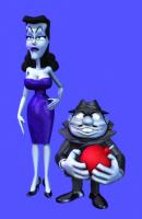
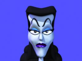
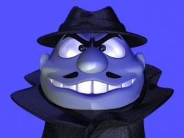
Every once in awhile, I just have to work on something different to keep my sanity (or my particular level of insanity.) :-) Started work on an illustrations of Boris & Natasha...
-
I hate to hear this, Myron. I hope they can get him patched up again and back to animating.
-

Painting with Light? It Can't Be Done! Feb 2014
largento replied to robcat2075's topic in A:M Tutorials & Demos
Bravo! There's some great info here that could apply to lots of different tasks. -
I wish I'd found about this earlier, but it just popped up on my Facebook feed today. I remember watching some stuff when they were doing a Kickstarter to get the Mac version coded. It seemed pretty impressive, but the price was still too high for somebody unemployed like me. Watching some of the videos, it looks like it could really be useful and for free, you can't beat it. Hoping as many people here who can get to take advantage of this.
-
They have a YouTube channel loaded with tutorials. You Tube Just for the fact that this a free video editor, it's worth checking out. I haven't used it myself, but there's urgency involved since the offer expires shortly and if you miss it, the program costs $149.


