KenH
-
Posts
13,816 -
Joined
-
Last visited
-
Days Won
1
Content Type
Profiles
Forums
Events
Everything posted by KenH
-
Bernd: The best way to stop this happening is to move the zspheres so that they are not as close to each other. Maybe making them smaller might do the trick also.
-
It looks like all the green dots are of the one spline(on each side). You might have to break it up. Ideally you want the splines to flow around each toe in rings....rather than do it for most of the spline and then break off to run up the toe. That's what the splines further up do. Hmm...not sure that explanation will do it. Try just tweaking the control handles first.
-
Good first test. To get rid of those join points, you need to export from Zbrush with "Merge" on and "Group" off (in export options). That will give you the smoothest transition. If after that it's still not looking good then you'll have to go in and edit the patches by hand to make them smooth. Once it looks good in AM then you're ready to export to Z2. For a texture....you can do it in Z2 or photoshop. If it's photoshop, make sure you choose the correct mapping method ie planar/spherical etc. Once you export from Z2 with the "texture" button clicked in the export options, then the obj will look for a texture named after itself. This texture can be modified or totally replaced in a paint program and it will still work....provided it's the same image fromat.
-
Nice bench! Sounds like you're on to something there. The Forums here are perfect for uploading stuff. There could be a categorized section that allows people to upload any files they want to share.
-
Just a screen shot in Wire shaded will give us a better idea of what's going on.
-
Wow man. The 60s lives.
-
It wouldn't work for me until I saved it to my desktop and then played it. If that doesn't work for you, maybe updating your player might help.
-
LOL Not bad at all. He's got character! Will....you can see it if you download it to your desktop.
-
I don't find it offensive. It's kind of a documentary with humour. You have to laugh at the mess certain "good individuals" have landed the church in. At the same time I wouldn't want any of the victims to see this. The slap took me by surprise and made me LOL. Well executed.
-
It was multi-pass. I had accidentally switched Field Render on. No idea why that effect would be needed, but it's fixed now. Thanks!
-
I'm working on a toon walk cycle. I have motion blur set, but it seems to be coming out strangely. Is MB not possible in toon? Here's what it's doing: I've since turned off motion blur and it's still happening. I don't know why it's happening now.

-
I was going to suggest claws too The fur looks good now. I don't know if it's just AMs hair, but there doesn't seem to be shadows mixed within the fur. It seems to lack definition. I'll have to experiment with hair myself soon! Keep us updated!
-
Very nice. Ditto the skin. IMO the lashes look too "soft and light". Kind of like they have been painted on. I think each individual hair needs more definition.
-
I haven't seen it all, but so far, it's all brilliant! You should get first place! Great story too.
-
Page up and Page down doesn't effect the mesh. It only effects the display quality of the mesh. It's purely visual. But you can increase the mesh resolution in Z2. Decreasing isn't possible.
-
Nice and organic looking! What's the hole in his left shoulder caused by?
-
If it's non profit, just mentioning the creator will do.
-
Looks great! I think he's too shiny though making him look more CG. There seems to be a shadow along the side of his ear making it less hair-like. Also, his hair should be slightly longer for a shaggy dog. There's no pleasing everyone! Oh and how long did that take to render?
-
I get similar results with my characters in v11. I think it's just a product of making changes to a character that results in these broken splines. If it's impeding your modeling down the line let us know what are you wanting to do by selecting that spline?
-
Looks like the Fire of London! I haven't much experience of fog, but it doesn't look that bad IMO. Just abit of toning down should do it.
-
Yes his fur seems too bright and not enough variety. Also, his brows could be groomed. Apart from that, it's shaping up to be one of the better AM hair examples so far!
-
Here's where the models are kept. I don't think Homer is on the CD due to copywrite issues. I'm not sure he's here either: ftp://ftp.hash.com/pub/Data/am2000extras/Data/Models/Actors/
-
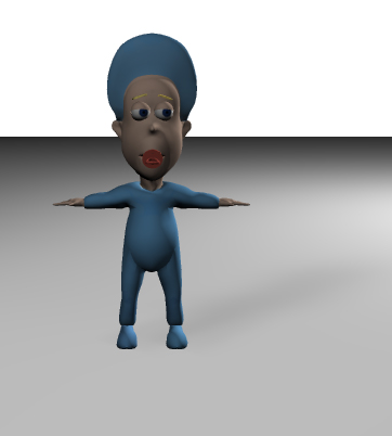
I'm trying to find the optimum lighting settings for this character. I've no problem with the keylight but the Fill and Rim wash out the shadow cast onto the ground. How can I fix this? Also, this will be a toon character, but when I render these settings in toon, it looks totally different. It seems the settings don't transfer. For example, the rim light doesn't just light the side, it also lights the front!
-
There are so many ways indeed to do clothing. One other suggestion is to model the character with none. Then when you are happy with the look, copy the splines that make up the area that will be covered in clothes. This can be manipulated into your clothing layer which can be put over the original model or even stitched into it.
-
Oh and don't forget, you only have to model half of her!